The Hon. Bob Baldwin MHR
Parliamentary Secretary to the Minister for the Environment
PO Box 6022
House of Representatives
Parliament House
CANBERRA ACT 2600
Dear Mr Baldwin
Re: Recommendations for the Review Panel appointed to review official national temperature records
As a “citizen scientist” who has been researching Australia’s climate, and the ACORN-SAT record in particular, over the past several years, I am concerned about errors in the work done by the Australian Bureau of Meteorology, in particular warming bias introduced through homogenisation and the apparent general lack of quality control. I draw your panel’s attention to these issues listed under four categories in the following submission. More information, including supporting charts and tables, is provided in numbered attachments.
1. Adjustment Issues
1.1 Homogenisation distorts temperature records causing warming bias at most locations, indicating the methods as stated in the CAWCR Technical Reports (see CTR-049) are not followed or do not work as designed. Homogenisation should lead to candidate sites having trends in temperature anomalies that are more like their neighbours’. However in many cases this does not occur, and homogenisation has resulted in wide disparities. This is obvious from a simple visual inspection of a plot of ACORN data at candidate sites versus raw data of the listed neighbours (Attachment 1.1).
1.2 A better but still simple method of comparison involves differencing. Differencing (anomaly data of candidate site minus data of reference sites) should show improved results following homogenising, with differences closer to zero. Importantly, even if the differences fluctuate, there should be zero trend in differences. Yet at a number of sites, homogenising has produced worse results. (Attachments 1.2a, 1.2b, 1.2c).
1.3 The most extreme examples of homogenising arising from warming adjustments, result in trends of candidate sites greater than the homogenised trends at neighbouring ACORN sites. (Attachment 1.3a). The converse applies where extreme cooling adjustments result in trends less than the homogenised trends of ACORN neighbours (Attachment 1.3b). This indicates over correction, resulting in the creation of artificial trends warmer or cooler than the neighbours’.
1.4 Data are homogenised by reference to up to 10 best correlated neighbours. Some of these neighbours may be hundreds of kilometres away, and with completely different climates. Deleting the two most distant neighbours greatly improves data comparison between Mackay and its remaining neighbours. (Attachment 1.4a, 1.4b).
1.5 The Bureau has belatedly tried to explain adjustments with the release of the 28 page PDF file of all adjustments ( http://www.bom.gov.au/climate/change/acorn-sat/documents/ACORN-SAT-Station-adjustment-summary.pdf) , and has also provided Summaries of Adjustments for six sites as a further explanation. ( http://www.bom.gov.au/climate/change/acorn-sat/#tabs=Adjustments ). Incredibly these Summaries don’t agree with the adjustments in the 28 page document. (Attachment 1.5).
1.6 The Bureau claims that sites exhibiting Urban Heat Island (UHI) effect are “excluded from downstream products such as the calculation of national and regional temperature anomalies for the analysis of large scale climate change” (CTR-049, pp.71-73.) These sites include Townsville, Rockhampton, Laverton RAAF, Richmond NSW, Sydney, Melbourne, Adelaide, and Hobart. Unfortunately they certainly are used as comparison sites when making adjustments. Several Queensland sites, including Cairns, Charters Towers, Mackay, and Bundaberg, have Townsville and/or Rockhampton listed as neighbours used for making adjustments. If a site’s temperatures are suspect due to UHI to the extent that they cannot be used for regional or national anomalies, it seems illogical that they can be suitable for comparison with neighbours. This apparent contradiction needs explanation.
2. Impact on trends
2.1 The Bureau of Meteorology has reportedly claimed “an extensive study has found homogeneity adjustments have little impact on national trends and changes in temperature extremes.” (Weekend Australian, August 23-24, 2014). In support of this, the Bureau displays a plot on the adjustments tab at the ACORN-SAT web page purporting to show “temperature trends since 1910 from the unadjusted temperatures from more than 700 locations (AWAP), together with those that have been carefully curated, quality controlled and corrected for artificially induced biases at 112 locations (ACORN-SAT)” (http://www.bom.gov.au/climate/change/acorn-sat/#tabs=Adjustments). However, the AWAP (Australian Water Availability Project) network is not “unadjusted”, but according to CTR-050 p.41, ‘the generation of stable climatologies implicit in the AWAP … ( analysis) … goes part of the way towards removing the temporal inhomogeneities implicit in the raw data without the explicit application of temporal-inhomogeneity adjustments. … Hence it is reasonable to describe the AWAP … (analysis) as “partially homogenised” rather than unhomogenised.’ It is therefore misleading to describe the above-mentioned plot of ACORN vs AWAP as being a comparison with “unadjusted temperatures”.
2.2 Moreover, the Bureau has made no attempt to compare ACORN data with minimally adjusted raw data (that is, adjusted only to combine two incomplete records into one through examination of overlapping data.) My comparison of annual ACORN data (1910-2012) with raw records (corrected only for overlap) at 83 sites for minima and 84 for maxima shows the increase in trend of ACORN over raw is 66% and 13% respectively (Attachments 2.2a, 2.2b). (The remaining sites had no suitable overlap between discontinued and new stations). Nearly two thirds of the sites analysed had trends increased (warmed).
2.3 A few very remote sites especially in Northern and Central Australia have an enormous impact on the ACORN record. This is demonstrated by differencing area averaged means (the official national annual means) and straight averaged means of the 104 ACORN sites (Attachment 2.3). As 7 – 10% of the national climate signal is due to Alice Springs alone (International Review Panel Report, September 2011 p. 12 http://www.bom.gov.au/climate/change/acorn-sat/documents/ACORN-SAT_IPR_Panel_Report_WEB.pdf), both the influence of remote sites, and the area averaging algorithm, need to be investigated.
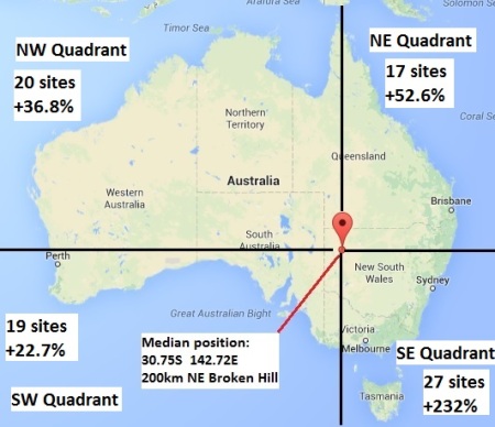
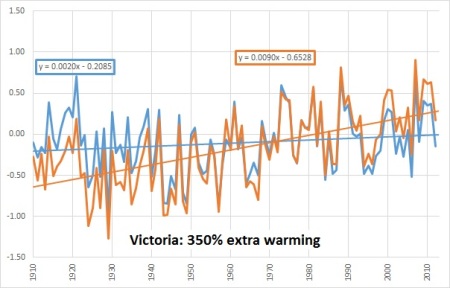
2.4 The South East portion of Australia (the area south and east of the median of ACORN stations’ latitudes and longitudes) has the greatest number of sites, and also the greatest change in trend in minima from raw to ACORN- 232% (Attachment 2.4a). The trend increase for New South Wales is 245% (Attachment 2.4b) and for Victoria is 350% (Attachment 2.4c). Homogenisation in the most heavily populated areas of the country cannot be described as having “little impact”.
2.5 I have also compared network wide ACORN data with AWAP data (1911 – 2013), for annual, seasonal, and monthly analyses (the last two the Bureau has not yet completed.) The results (Attachments 2.5a, 2.5b, 2.5c, 2.5d, 2.5e) are staggering and need urgent investigation. In particular, the 200% increase in trends for Summer Maxima is relevant to claims of increasing summer heat, especially in light of the recent Climate Institute report.
3. The effect of rounding on trends, and uncertainties in neighbouring stations’ data used for homogenising
3.1 The Bureau admits that rounding of temperatures to whole degrees in the Fahrenheit era may have led to an artificial breakpoint of +0.1C in 1972, but claims this is lost in the noisy signals of the 1970s (CTR-049 p.70). This, however, is disputable and needs thorough investigation, as an audit by several colleagues and myself of daily minima and maxima data in the Fahrenheit and Celsius eras (474 data records and 8,580,583 daily observations) found evidence that indicates the impact on trends could be between +0.1C and +0.4C. (Attachment 3.1).
3.2 Our study also found homogenising is based on records with large amounts of uncertainty (Attachment 3.2). Significantly, the first of the 2011 International Review Panel’s Recommendations (A1) was “Reduce the formal inspection tolerance on ACORN-SAT temperature sensors significantly below the present ±0.5 °C …“ (See http://www.bom.gov.au/climate/change/acorn-sat/documents/ACORN-SAT_IPR_Panel_Report_WEB.pdf8). It is inexcusable that no error bounds are given for ACORN data.
4. Lack of Quality Assurance
The apparent lack of quality assurance means ACORN-SAT is not fit for the purpose of serious climate analysis including the calculation of annual temperature trends, identifying hottest or coldest days on record, analysing the intensity, duration, and frequency of heatwaves, matching rainfall with temperature, calculating monthly means or medians, and calculating diurnal temperature range.
4.1 ACORN-SAT daily data (and consequently, monthly and annual means) provide many obstacles to rigorous analysis. Days of data are missing, slabs of data are offset by one day (daily data being assigned to the wrong date, usually one day early), and many adjustments show obvious glaring errors (Attachment 4.1).
4.2 Another glaring error gives Australia a new hottest day on record (Attachment 4.2).
4.3 Other researchers have reported at least 917 days where minimum temperature exceeds maximum (Attachment 4.3). Although a specific check for errors in recording maxima and minima was conducted before homogenising, this check could not have been done with the homogenised data. It might be claimed that this feature is normal and due to a cold change arriving after 9.00 a.m. This would be especially evident in winter at high altitudes such as Cabramurra, with 212 occurrences. However, there are no instances of maximum less than minimum in the raw data for Cabramurra. All instances occur in the adjusted data before February 1999. Further, despite the Bureau being aware of the problem since at least I July 2013 when Blair Trewin, lead author of ACORN, assured readers of the blog Open Mind at https://tamino.wordpress.com/2013/06/29/a-clue-for-willis/#more-6693 that “in the next version of the data set (later this year), in cases where the adjusted max < adjusted min, we’ll set both the max and min equal to the mean of the two” (which merely hides the fault caused by adjustments), the problem still exists- 212 occurrences are still in the ACORN record for Cabramurra.
In conclusion, ACORN-SAT is not reliable and should be scrapped. ACORN-SAT shows adjustments that distort the temperature record and do not follow the stated procedures in the Bureau’s own Technical Papers, generating warming biases at a large number of sites, thus greatly increasing the network wide trends. Furthermore, the Bureau does not take account of uncertainty, and the data are generally riddled with errors indicating poor quality assurance. Finally, its authors have not followed up on most undertakings made more than three years ago to permit replication and improve transparency (http://www.bom.gov.au/climate/change/acorn-sat/documents/ACORN-SAT_Bureau_Response_WEB.pdf ).
I am delighted with the formation of the Review Panel. I hope that this review will bring about much needed improvements at the Bureau of Meteorology in the way the Bureau collates, audits, analyses and reports on national temperature data.
Yours sincerely
Ken Stewart
Attachments
Attachment 1.1: One example of many – comparison of Acorn anomalies (black) with neighbours at Carnarvon
(For further information and full explanation see https://kenskingdom.wordpress.com/2014/07/24/carnarvon-a-closer-look/ )

Attachment 1.2a: Differencing: Rutherglen minus neighbours
(For further information and full explanation see https://kenskingdom.wordpress.com/2014/09/08/homogenisation-a-test-for-validity/ )

Attachment 1.2b: One example of many- Differences after homogenisation show worse results
(For further information and full explanation see https://kenskingdom.wordpress.com/2014/09/08/homogenisation-a-test-for-validity/ )

Attachment 1.2c: As for 1.2b, showing the mean of candidate data minus neighbours.
(For further information and full explanation see https://kenskingdom.wordpress.com/2014/09/08/homogenisation-a-test-for-validity/ )

There are many other sites with greater differences after homogenisation in minima or maxima. I have also checked Deniliquin, Bourke, Amberley, Carnarvon, Williamtown, Mackay, Kalgoorlie-Boulder and Wilcannia, which all show this problem. Some sites may show improved differences. An audit of all sites is essential.
Attachment 1.3a: One example of many of warming adjustments over correcting- Amberley Acorn vs nearest Acorn neighbours’ (mean of nearest Acorn neighbours’ homogenised data).
(For further information and full explanation see https://kenskingdom.wordpress.com/2014/07/16/the-australian-temperature-record-revisited-part-4-outliers/ )

Attachment 1.3b: An example of cooling adjustments over correcting- Acorn Tarcoola shows decreased trend compared with nearest Acorn neighbours’.
(For further information and full explanation see https://kenskingdom.wordpress.com/2014/07/28/tarcoola-a-cooling-outlier/)

Attachment 1.4a: Mackay maxima differencing including all listed neighbours
(For further information and full explanation see https://kenskingdom.wordpress.com/2014/11/03/the-bizarre-case-of-mackay-33119/ )

Attachment 1.4b: Mackay differencing with 2 most distant neighbours excluded, showing improved differences.
(For further information and full explanation see https://kenskingdom.wordpress.com/2014/11/03/the-bizarre-case-of-mackay-33119/ )

Attachment 1.5: The Bureau’s lists of adjustments at six stations are different- except one at Orbost.
(For further information and full explanation see https://kenskingdom.wordpress.com/2014/11/05/more-bizarre-adjustments/)

Attachment 2.2a: Mean of Tmin annual anomalies at 83 sites- minimally adjusted raw data vs Acorn, 1910 – 2012 data.
(For further information and full explanation see https://kenskingdom.wordpress.com/2014/05/16/the-australian-temperature-record-revisited-a-question-of-balance/ )

Attachment 2.2b: Mean of Tmax annual anomalies at 84 sites- minimally adjusted raw data vs Acorn, 1910 – 2012 data.
(For further information and full explanation see https://kenskingdom.wordpress.com/2014/05/16/the-australian-temperature-record-revisited-a-question-of-balance/ )

Attachment 2.3: Differencing shows the effect of area averaging using very remote sites, 1910 – 2012 data.
(For further information and full explanation see https://kenskingdom.wordpress.com/2014/05/16/the-australian-temperature-record-revisited-a-question-of-balance/ )

Attachment 2.4a: Tmin increase in trend in different regions, 1910 – 2012 data.
(For further information and full explanation see https://kenskingdom.wordpress.com/2014/06/01/the-australian-temperature-record-revisited-part-2-regional-effects/ ).
Attachment 2.4b: Increase in Tmin warming in NSW, 1910 – 2012 data.
(For further information and full explanation see https://kenskingdom.wordpress.com/2014/06/01/the-australian-temperature-record-revisited-part-2-regional-effects/ ).

Attachment 2.4c: Increase in Tmin warming in Victoria, 1910 – 2012 data.
(For further information and full explanation see https://kenskingdom.wordpress.com/2014/06/01/the-australian-temperature-record-revisited-part-2-regional-effects/ ).
Attachment 2.5a: ACORN vs AWAP comparison- by month (1911 – 2013 data)
(For further information and full explanation see https://kenskingdom.wordpress.com/2014/10/04/adjustments-grossly-exaggerate-monthly-and-seasonal-warming/).

Attachment 2.5b: ACORN vs AWAP comparison- annual and seasonal (1911 – 2013 data)
(For further information and full explanation see https://kenskingdom.wordpress.com/2014/10/04/adjustments-grossly-exaggerate-monthly-and-seasonal-warming/).

Attachment 2.5c: ACORN vs AWAP comparison- by season- Tmean (1911 – 2013 data)
(For further information and full explanation see https://kenskingdom.wordpress.com/2014/10/04/adjustments-grossly-exaggerate-monthly-and-seasonal-warming/).

Attachment 2.5d: ACORN vs AWAP comparison- by season- Tmin (1911 – 2013 data)
(For further information and full explanation see https://kenskingdom.wordpress.com/2014/10/04/adjustments-grossly-exaggerate-monthly-and-seasonal-warming/).

Attachment 2.5e: ACORN vs AWAP comparison- by season- Tmax (1911 – 2013 data)
(For further information and full explanation see https://kenskingdom.wordpress.com/2014/10/04/adjustments-grossly-exaggerate-monthly-and-seasonal-warming/).

Attachment 3.1: Comparison of percentage of observations recorded in values from whole (rounded to .0) to 0.9 in the Fahrenheit era, with that of the Celsius era at continuing sites, with irrelevant sites deleted, indicating suitable conditions for creation of artificial warming. (For a full discussion see https://kenskingdom.wordpress.com/2012/03/13/near-enough-for-a-sheep-station/ ).
. 
Attachment 3.2: Analysis of the impact of rounding on trends and uncertainties. (For a full discussion see https://kenskingdom.wordpress.com/2012/03/13/near-enough-for-a-sheep-station/ ).
Our study concluded:
“As more than half of all sites in Australia had rounding probably greater than 50%, truncating at significant levels (33%, 50%, or 100%) before September 1972 would cause artificial warming of between +0.1C and +0.4C per 100 years.”
“Many …. sites have recorded large amounts of data in recent years that may be in error by up to 0.50Celsius, being rounded to whole degrees, and more than half of the sample studied have recorded erroneous data at some time in the past 40 years.”
“As well, the vast majority of sites … inaccurately recorded observations in the Fahrenheit era by recording in whole degrees. For nearly half of all sites, this amounts to at least 50% of their total observations. It is probable that more than 50% of all Australian observations were rounded. This alone means that temperatures before 1972 may be inaccurate by up to 0.250 C.”
“The large amount of uncertainty in the records of so many sites means that homogenisation as practised by BOM researchers must be in question, and with it all analyses of Australia’s temperature trends.”
Attachment 4.1: Obvious errors indicate poor quality assurance.
There are numerous glaring errors for individual days at many sites. The following graphic shows Rutherglen maxima at Climate Data Online for September to November 1926 compared with ACORN-SAT maxima from 30/09/1926 – 05/11/1926.

Also on 13/10/1926, Acorn minima records -1.2 (adjusted down from +6.9).
Data for days such as 13/10/1926 with an obvious error, possibly the result of a missing leading digit, are not unusual and are found in the records of many stations.
The Acorn record for Rutherglen has some other peculiarities as well. There are several separate periods where Acorn’s maxima record frequently does not match with data from Climate Data Online, and is one day too early. These are:
1/11/1920 – 19/3/1940,
1/12/1940 – 31/10/1944,
1/5/1946 – 31/10/1947, and
1/12/1947 – 31/1/1948.
Attachment 4.2: Another glaring error- one of many
Australia’s hottest temperature is supposed to be 50.7C recorded at Oodnadatta on 02/01/1960, but ACORN-SAT has a temperature of 51.2C at Albany on 08/02/1933. Many days have been adjusted by more than +6 degrees C, resulting in this ludicrous figure which has passed quality assurance.

Attachment 4.3: List of 69 stations with ACORN minima exceeding maxima.
Station, Number of days with minimum temperature exceeding the maximum temperature.
Adelaide, 1. Albany, 2. Alice Springs, 36. Birdsville, 1. Bourke, 12. Burketown, 6. Cabramurra, 212. Cairns, 2. Canberra, 4. Cape Borda, 4. Cape Leeuwin, 2. Cape Otway Lighthouse, 63. Charleville, 30. Charters Towers, 8. Dubbo, 8. Esperance, 1. Eucla, 5. Forrest, 1. Gabo Island, 1. Gayndah, 3. Georgetown, 15. Giles, 3. Grove, 1. Halls Creek, 21. Hobart, 7. Inverell, 11. Kalgoorlie-Boulder, 11. Kalumburu, 1. Katanning, 1. Kerang, 1. Kyancutta, 2. Larapuna (Eddystone Point), 4. Longreach, 24. Low Head, 39. Mackay, 61. Marble Bar, 11. Marree, 2. Meekatharra, 12. Melbourne Regional Office, 7. Merredin, 1. Mildura, 1. Miles, 5. Morawa, 7. Moree, 3. Mount Gambier, 12. Nhill, 4. Normanton, 3. Nowra, 2. Orbost, 48. Palmerville, 1. Port Hedland, 2. Port Lincoln, 8. Rabbit Flat, 3. Richmond (NSW), 1. Richmond (Qld), 9. Robe, 2. St George, 2. Sydney, 12. Tarcoola, 4. Tennant Creek, 40. Thargomindah, 5. Tibooburra, 15. Wagga Wagga, 1. Walgett, 3. Wilcannia, 1. Wilsons Promontory, 79. Wittenoom, 4. Wyalong, 2. Yamba, 1.
(From Willis Eschenbach at http://wattsupwiththat.com/2013/06/28/australia-and-acorn-sat/ . Another study https://tamino.wordpress.com/2013/06/29/a-clue-for-willis/ claims a total of 954 days.)
Tags: Acorn, adjustments, Bureau of Meteorology

February 9, 2015 at 6:07 pm
Ken they will be trying to hide under rocks from the light you are shining on this mess.
No doubt they will have many reasonable sounding but contradictory explanations for the contradictions.
February 10, 2015 at 8:21 am
Thank you Ken, I still haven’t finished reading and trying to get my head around all the links and charts, I will by tonight… It’s a massive analysis!!!
February 10, 2015 at 10:13 am
Ken, you are a bloody legend! Watch them squiggle and squirm on this one, wait 2 weeks for them to reply (if they do at all) and then read the impending stream of bullshit if they do…
February 10, 2015 at 9:33 pm
Shhh don’t tel the BoM they lost the data from the Lowood Stevenson screen “maximum and minimum self-registering instruments ” just 21.8 Km from Amberley. It was installed in 1887 on June1.
http://trove.nla.gov.au/ndp/del/article/3471064?
I sent In a submission too and have no reply yet.
February 11, 2015 at 7:45 am
I’m not surprised. Clement Wragge was very industriously installing Stevenson screens throughout Qld from early 1887. Pity BOM have lost the records.
February 11, 2015 at 2:35 pm
I wondered why you’d been so quiet. I just want to express my gratitude and to extend my thanks to you for the work you’re doing for the rest of us. I would if I could. It’s a great effort on your part. You’re making a difference, whether you realise that or not right now. But one day…..
February 11, 2015 at 4:22 pm
Hi Brad, yes I worked pretty solidly on this for a couple of weeks. A couple of other things on the backburner but I’m having a bit of a spell. Thanks for your support. KS
February 21, 2015 at 4:33 pm
Thanks for a great effort Ken – I trust your environs are not too damaged by Marcia –
February 27, 2015 at 9:12 am
Ken, you and your readers are invited to visit my new blog on reconstructing climate history from instrumental data. I’m starting with Australia before 1910:
https://climanrecon.wordpress.com/
March 1, 2015 at 3:21 pm
[…] Check out Ken Stewarts excellent submission, which is comprehensive and not what the BoM want anyone to see. […]
April 7, 2015 at 3:56 am
What an appalling mess! I used to be an experimentalist and I did not like other people adjusting the data I had very carefully generated simply because they did not like what had been discovered. What do people think if the GISS adjustments? Equally ignorant and arrogant. It could only happen in “climate science”.
January 12, 2019 at 12:51 pm
[…] Australian Climate Observations Reference Network – Surface Air Temperature. Ken has made a very detailed submission to the panel, which can be downloaded from his blog. […]