Data from UAH Version 6.0 show the South Polar region to be unique in that it has a Pause, if not very mild cooling, for the whole of the satellite record, since December 1978. In this post I dig in a little deeper, and also look at surface data from Australia’s Antarctic bases.
Fig.1: Monthly TLT for the South Polar region (60- 85 S)
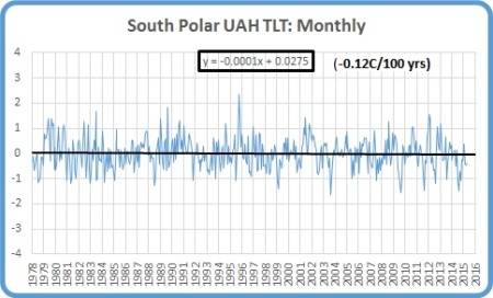
Fig. 2: Three Monthly TLT

Both plots show no evidence of any warming. However, Land areas are warming:
Fig. 3: SP Land: 3 month means

While the Ocean area is cooling:
Fig. 4: SP Oceans: 3 month means

Summers are warming:
Fig. 5: South Polar Summers (Yearly)

While winters are cooling rapidly:
Fig. 6: South Polar Winters

Especially Ocean winters, when the sea ice is at its greatest and thickest extent.
Fig.7: SP Ocean Winters

Perhaps the sea ice insulates the atmosphere from the water below the ice? If so, in summer, with sea ice extent much reduced, the atmosphere above the ocean should be warmed much more than above the land, which is almost totally covered by ice. Let’s check:
Fig.8: SP Ocean Summers

Fig.9: SP Land Summers

Nope- TLT above land area is warming at four times the rate of ocean areas.
It’s not a great mystery. Here’s why.
We should not read too much into whether individual months create records or not, nor should we stress about the seasonal differences. Here’s an example of individual Octobers.
Fig.10: Octobers from 1979-2015

Note the rising and falling pattern: a series of below average Octobers is followed by a series of above average Octobers. A trend using only Octobers would show warming, as the record starts with below average Octobers and ends with above average. (Just like some global datasets!)
These patterns are evident, but with different values, in all months, which is why winters appear to be cooling and summers appear to be warming.
Fig.11: SP Ocean Junes from 1979-2015

The most we can say is that the long term trend of ALL months shows no evidence of any warming, i.e. a Pause.
So is this just an artefact of the fairly short satellite record? We can check against surface data from Australia’s Antarctic stations at Mawson and Davis. (There is insufficient overlap to make a useful splice between closed and open sites at Casey.) These stations are on the coast far from the Antarctic Peninsula.
Fig. 12: Monthly mean temperatures, Mawson Base

There is a Pause, or slight cooling, over the past 62 years.
Fig. 13: Monthly mean temperatures, Davis Base

At Davis, a Pause, or slight warming, over the past 47 years.
The Pause in the South Polar region is real.
Tags: climate, Pause, temperature, UAH

April 17, 2016 at 12:01 pm
Readers might also be interested in this paper by Holger Schmithüsen et al, which postulates that more CO2 in Antarctic skies will cause cooling. This is because the air here (and nowhere else) is warmer than the ground, so IR transmission to space occurs higher up than in the general case.
• http://onlinelibrary.wiley.com/doi/10.1002/2015GL066749/full
April 17, 2016 at 2:02 pm
Plausible. Also polar TLTs have greater uncertainty. Which still means a ‘pause’ in the trend.
April 17, 2016 at 12:06 pm
In July 2009 the Head of Climate at BOM, Dr David Jones, emailed this to me –
“Macquarie Islands data shows strong warming – about 0.5C in the last 50 years. It also shows an unusal pattern of increasing rainfall and decreasing cloudiness, which is entirely consistent with climate change projections.”
April 17, 2016 at 1:47 pm
Since 1948 Macquarie Island is indeed warming- Tmin at +0.72/100 yrs, Tmax +0.84, including very strong warming in the 1970s. Since December 1978 the trend has been firmly negative: -0.48C/100 yrs. Southern Ocean influemce? I didn’t include Macquarie is because it’s not on the Antarctic mainland, and at 54 south, well outside the south polar region.
April 18, 2016 at 3:14 pm
I quiz you on this over at Jo’s blog, the Subtropical Ridge appears to be stuck in the Bight all year round.
Could this be a possible cause of the increasing sea ice extent in the Southern Ocean?
April 18, 2016 at 9:16 pm
Interesting, but speculation . I don’t know enough about it really but it has been a pattern for some years.
April 18, 2016 at 4:07 pm
Ken/ Yet again an interesting divergence between the UAH satellite data and ground stations.
In comparison Berkeley Earth for Antarctica ( see http://berkeleyearth.lbl.gov/regions/antarctica) gives the following trends. Since 1960 a trend of 1.05 C/century ( plus or minus 0.76C) and 2.3 C/Century (plus or minus 1.2C) since 1990.
This is for the 53 current ground stations and 89 former stations within the Antarctic region.
April 19, 2016 at 10:45 am
Berkeley has a “regional expectation” they have to live up to.
April 18, 2016 at 5:12 pm
SAM is in positive territory.
https://climatedataguide.ucar.edu/climate-data/marshall-southern-annular-mode-sam-index-station-based
April 19, 2016 at 10:43 am
Ken , you should also include the UAH So Ex Tropicals.
April 19, 2016 at 10:48 am
meant to add.. this century.. no warming.
April 19, 2016 at 11:28 am
I do. See previous post. +0.78/ 100 yrs overall, but a pause for 20 yrs 7 months, since September 1995.
April 19, 2016 at 1:48 pm
Should have known you had it somewhere. 🙂
April 19, 2016 at 10:55 am
Here is RSS south 60-70 since 1979.. Slight cooling
April 19, 2016 at 2:10 pm
Ken, I am trying to look at summer, (DJF) and winter, (JJA) trends down south using UAH SoPol and RSS South 60-70.
Trouble is, they seem to go different ways. Puzzled. 😦
April 19, 2016 at 2:27 pm
See figures 5-11 above with my explanation for UAH. I haven’t looked at RSS but I imagine something similar applies. Although why the months should have different values I don’t know.
April 19, 2016 at 4:14 pm
Cool, I have basically the same numbers as you have for UAH summer and winter SoPol. 🙂
I’ll recheck RSS at some stage., see if I goofed.
April 20, 2016 at 12:14 am
[…] Antarctic Trends […]
April 20, 2016 at 8:36 am
Steve McIntyre goes after Gavin Schmidt’s ( NASA Giss)trickery. This should be very interesting.