If global warming is driven by the influence of carbon dioxide and other man made greenhouse gases, it will have certain characteristics, as explained by Karl Braganza in his article for The Conversation (14 June 2011).
As water vapour is a very strong greenhouse gas, it will tend to mask the influence of man made greenhouse gases, and because solar radiation is such a powerful driver of temperature, this also must be taken into account. Therefore, the characteristic greenhouse warming fingerprints are best seen where solar and water vapour influences can be minimised: that is, at night time, in winter, and near the poles. So we would look for minimum temperatures rising faster than maxima; winter temperatures rising faster than summer, and polar temperatures rising faster than the tropics. Indeed, polar temperature change in winter should be an ideal metric, as in Arctic and Antarctic regions the sun is almost completely absent in winter, and the intense cold means the atmosphere contains very little water vapour. We can kill three birds with one stone, as winter months in polar regions are almost continuously night.
So let’s look at the evidence for greater winter and polar warming.
Figure 1: North Polar Summers:
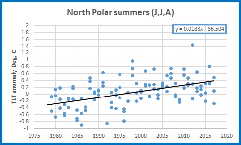
Figure 2: North Polar Winters:
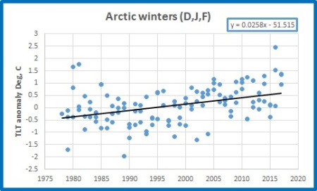
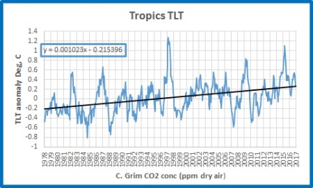
Yep, North Polar winters are warming very strongly, at +2.58C/100 years, and much faster than summers (+1.83C/100 years)- strong evidence for anthropogenic global warming. And warming is much faster than the Tropics (+1.023C/100 years):
Figure 3: Tropics
Unfortunately for the theory, the opposite happens in the South Polar region:
Figure 4: South Polar Summers
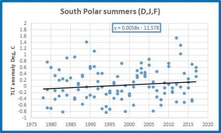
Figure 5: South Polar Winters:

While summers are warming (+0.58C/100 years), winters are cooling strongly at -1.66C/100 years. Over land areas, with little influence from the ocean, very low moisture, and very little solar warming, winters are cooling even faster:
Figure 6: Antarctic winters over land:
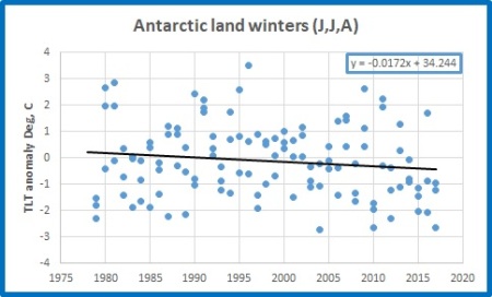
This is the exact opposite of what is supposed to happen in very dry, cold, and dark conditions- at night, in winter, at the poles. Can this be because carbon dioxide and other greenhouse gases are NOT well mixed, and are in fact decreasing in concentration near the South Pole?
Figure 7: Carbon Dioxide concentration at Cape Grim (Tasmania):
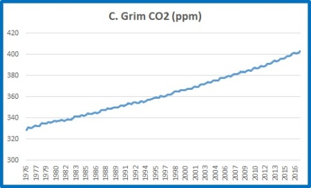
Figure 8: South Polar region TLT (all months) as a function of CO2 concentration: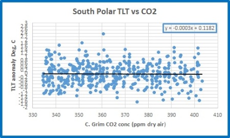
No, while Cape Grim data show CO2 concentration to be increasing in the Southern Hemisphere, but without the marked seasonal fluctuations of the Northern Hemisphere, there is NO relationship between CO2 and temperature in the South Polar region.
Is it because the oceans around Antarctica are cooling?
Figure 9: South Polar Ocean TLT:

Nope- -0.01C/100 years (+/- 0.1C). Neither cooling nor warming.
The cold, dry, dark skies over Antarctica are getting colder in winter. Summers show a small warming trend.
Conclusion: The fingerprints of man made greenhouse warming are completely absent from the South Pole, and differences between North and South Polar regions must, until shown otherwise, be due to natural factors.
Data sources:
https://www.nsstc.uah.edu/data/msu/v6.0/tlt/uahncdc_lt_6.0.txt
http://www.csiro.au/en/Research/OandA/Areas/Assessing-our-climate/Latest-greenhouse-gas-data
Mandated disclaimer:-
“Any use of the Content must acknowledge the source of the Information as CSIRO Oceans & Atmosphere and the Australian Bureau of Meteorology (Cape Grim Baseline Air Pollution Station) and include a statement that CSIRO and the Australian Bureau of Meteorology give no warranty regarding the accuracy, completeness, currency or suitability for any particular purpose and accept no liability in respect of data.”
Tags: climate, global warming, greenhouse gases, temperature

February 26, 2018 at 8:22 pm
Nice post, Ken, disclaimer noted.
Macquarie Island is another southern place that simply has not got hotter, by customary chatter guidelines, in the last 50 years, but has a BOM official making a statement that it warmed half a degree. Geoff.
February 27, 2018 at 6:49 am
Hi Geoff
If Enhanced Greenhouse Warming theory fails in Antarctica in near perfect conditions it must necessarily fail everywhere. Macquarie Island another example. South East Australia, notably Victoria and Tasmania, also have winters not warming as much as summers.
February 27, 2018 at 1:03 pm
Thanks for this very straight-forward analysis.
February 27, 2018 at 5:29 pm
Very interesting.
It would to further interesting to say WHY there is such a difference between North & South. The fact that over recent time Antartica ice is growing versus Arctic ice retracting supports the graphs. But the again why the contrast?🤔🤔🤔
February 28, 2018 at 9:52 am
The difference is due to the different amount of human activity near the North pole and the fact that North Pole ice is floating on warming water.
February 28, 2018 at 10:15 am
I’m not sure there’s a lot of human activity near the north pole! But you have nailed it with “the fact that North Pole ice is floating on warming water.” Precisely. Without that warming water, Arctic warming would be much reduced. That is why South Polar temperatures are a much better metric of any greenhouse effect, as there is little masking from other factors such as ocean currents.
February 27, 2018 at 5:34 pm
At Judith Curry’s blog Javier looks at modern global warming. Here’s his summary and the link.
Conclusions
1) Modern Global Warming is one of several multi-centennial warming periods that have taken place in the last 3000 years.
2) Holocene climate cycles project that the period 1600-2100 AD should be a period of warming.
3) A consilience of evidence supports that Modern Global Warming is within Holocene variability.
4) Modern Global Warming displays an unusual non-cyclical cryosphere retreat. The contraction appears to have undone most of the Neoglacial advance.
5) The last quarter (70 yr) of Modern Global Warming is characterized by extremely unusual and fast rising, very high CO2 levels, higher than at any time during the Late Pleistocene. This increase in CO2 is human caused.
6) The increase in temperatures over the past 120 years shows no perceptible acceleration, and contrasts with the accelerating CO2 forcing.
7) Sea level has been increasing for the past 200 years, and its modest acceleration for over a century shows no perceptible response for the last decades to strongly accelerating anthropogenic forcing.
8) The evidence supports a higher sensitivity to increased CO2 in the cryosphere, which is driving unusual melting and a small long-term sea level rise acceleration. The rest of the planet shows a lower sensitivity, indicating a negative feedback by H2O, that prevents CO2 from having the same effect elsewhere.
Acknowledgements
I thank Andy May for reviewing the manuscript, and providing useful comments towards improving its content.
February 27, 2018 at 5:58 pm
The Concordia Uni study showed that global warming since 1800 was about 0.7 c and OZ’s contribution was 0.006 C or 6 thousandths of 1 c over the last 205 years. (to 2005) Also called Mathews et al 2014.
Of course the warming up to 1950 would have a lot less attribution due to co2 warming, so the 0.7 c ( due to AGW) estimate is probably far too high. IOW well under 0.7 c would be from AGW. Here’s their FIG 2 and the link.
http://iopscience.iop.org/article/10.1088/1748-9326/9/1/014010/pdf;jsessionid=7452CF9C7135E5CE0070EEEF21762EF7.c2.iopscience.cld.iop.org
The first number in each country’s horizontal column is the total degrees c attribution since 1800.
Table 2. Top 20 contributors to global temperature change, ranked in order of their total climate contribution, and including a breakdown of
the contribution of different types of emissions. All values here are given in C of global temperature change.
Rank Country Total Fossil Fuel CO2 Landuse
CO2 All CO2 NonCO2
GHG All GHG Aerosols
1 United States 0.151 0.143 0.026 0.170 0.044 0.213 ?0.063
2 China 0.063 0.042 0.036 0.078 0.049 0.127 ?0.065
3 Russia 0.059 0.059 0.014 0.072 0.020 0.092 ?0.034
4 Brazil 0.049 0.004 0.032 0.036 0.018 0.054 ?0.005
5 India 0.047 0.013 0.025 0.037 0.025 0.062 ?0.015
6 Germany 0.033 0.035 ?0.000 0.035 0.008 0.042 ?0.009
7 United Kingdom 0.032 0.031 0.001 0.033 0.007 0.040 ?0.007
8 France 0.016 0.014 ?0.000 0.014 0.007 0.021 ?0.005
9 Indonesia 0.015 0.003 0.013 0.015 0.006 0.021 ?0.006
10 Canada 0.013 0.011 0.007 0.017 0.005 0.023 ?0.009
11 Japan 0.013 0.021 0.001 0.022 0.002 0.024 ?0.011
12 Mexico 0.010 0.006 0.008 0.014 0.003 0.017 ?0.007
13 Thailand 0.009 0.002 0.006 0.008 0.004 0.012 ?0.002
14 Columbia 0.009 0.001 0.006 0.007 0.003 0.010 ?0.001
15 Argentina 0.009 0.002 0.003 0.005 0.005 0.010 ?0.001
16 Poland 0.007 0.010 0.001 0.011 0.003 0.014 ?0.007
17 Nigeria 0.007 0.001 0.001 0.002 0.005 0.007 0.000
18 Venezuela 0.007 0.002 0.002 0.004 0.003 0.008 ?0.001
19 Australia 0.006 0.005 0.002 0.007 0.006 0.014 ?0.007
20 Netherlands 0.006 0.004 0.000 0.004 0.002 0.006 ?0.001
March 3, 2018 at 11:46 pm
[…] Fingerprints of Greenhouse Warming: Poles Apart […]
March 5, 2018 at 7:26 pm
Dr Roy Spencer has posted the UAH V 6 LT FEB temp anomaly. There has been another global drop from JAN 0.26 c to FEB 0.20 c.
http://www.drroyspencer.com/2018/03/uah-global-temperature-update-for-february-2018-0-20-deg-c/
April 16, 2018 at 10:47 am
[…] Fingerprints of Greenhouse Warming: Poles Apart […]
May 22, 2018 at 10:30 pm
To get a great insight into Antarctic temperature and pressure cganges, go here. https://reality348.wordpress.com.
About 40 chapters suggesting ozone is a player – warmed by upwelling LWIR. Interesting charts too.
December 25, 2018 at 7:01 pm
Like it