Ken Stewart, September 2010
“Please note: Stations classified as urban are excluded from the Australian annual temperature timeseries and trend map analyses. Urban stations have some urban influence during part or all of their record.”
I previously assumed that BOM’s reason for excluding urban sites was that their inclusion would introduce a spurious warming due to the Urban Heat Island (UHI) effect.
Never assume.
The reality appears to be quite different. The urban stations’ data presents an embarrassing and perplexing problem for BOM, namely:
Urban temperature trends are substantially less than non-urban sites in Australia.
There is a spurious warming, but it is as a result of BOM’s adjustments. It is not apparent in the raw data.
Here’s one example. I go to the Bureau of Meteorology’s website, look at Climate Change, click the “High Quality Site Networks”on the left, then zoom into the map and click on the time series graph for, say, Wangaratta, Victoria. Here it is:
0.1 C per decade (or 1 degree C per 100 years). Scary hey.
But here’s the raw data:
The trend is not so scary anymore, but the adjustments are.
The Australian Bureau of Meteorology (BOM) has created the Australian High-Quality Climate Site Network. I have previously analysed the 100 non-urban stations of this network, in what I believe is the first ever independent check on the official climate record of an entire continent, and also of the Australian national record.
I have now looked at the remaining 34 High Quality sites designated as urban.
Before my first post, I asked BOM to explain some of the odd things I had noticed in the Queensland data. Amongst others, this statement by Dr David Jones, Head of Climate Monitoring and Prediction, National Climate Centre, Bureau of Meteorology, in an email dated 25 April 2010, caught my eye:
“On the issue of adjustments you find that these have a near zero impact on the all Australian temperature because these tend to be equally positive and negative across the network (as would be expected given they are adjustments for random station changes).”
This statement has been the yardstick for this study.
I compared the adjusted data with the raw data of these 34 stations.
Here are the results, and they are perplexing.
- I was expecting to find a stronger warming trend in the urban data than the 100 non-urban sites. WRONG.
- I was expecting to find BOM correcting for UHI, that is, reducing the trend. PARTLY RIGHT. But less often than with the non-urban sites.
- I was expecting the urban sites to have much better quality of data, with long records, few gaps, and good overlaps if stations’ data had to be combined. WRONG.
Here is the table of all urban sites with raw trend, High Quality (adjusted) trend, and the difference between the two.
The average trend of the raw data is about 0.43 degrees C per 100 years. That’s 0.26C less than that of the non-urban sites! The average adjustment is approximately 0.3 C per 100 years. BOM’s adjustments have resulted in a warming bias of 70%. As you can see, some of the adjustments are enormous: Wangaratta’s record is turned around from -0.65C per 100 years to + 1.05C.
Here is a graph showing the range of adjustments across the 34 stations.
 The median adjustment is 0.275C.
8 sites have been cooled (including Melbourne, Sydney, and Newcastle). 4 have had essentially little adjustment. 22 sites have been warmed- several substantially more than any of the non-urban sites. (The worst of the non-urban sites was Omeo, which was warmed 1 degree, compared with 6 urban sites warmed above 1 degree, up to 1.7 degrees.)
Another way to illustrate the discrepancy is to calculate the annual average for all 34 sites for raw and adjusted data. Here is a graph of all 34 stations’ raw and adjusted data compared:
 The raw trend is about 0.4C (actually slightly less than 0.4C)- that’s a full 0.2C less than the non-urban raw trend using the same comparison; the adjusted trend is about 0.78C: and that’s a warming bias of 95%.
So much for “these tend to be equally positive and negative across the network”.
Of course, BOM says that this data is not used in their climate analyses, so my trend lines shown above are for illustration and comparison purposes only. However, they illustrate the problem quite well: there is a warming bias apparent in the High Quality data.
As well, the “quality” of the High Quality stations leaves much to be desired.
Many of the sites have large slabs of data missing, with the HQ record showing “estimates” to fill in the missing years. Some sites should not be used at all: Moree, Grafton, Warnambool, Orange, Bowral, and Bairnsdale.
While BOM asserts that these urban sites are not used in analysing Australia’s climate, and the combined trend therefore is meaningless, the great majority of Australia’s population lives near these sites. Countless people refer to the time series graphs to check the climate trend for their particular city. Media outlets refer to these when commenting on climate trends and weather records. Therefore it is essential that the record be accurate.
As well, 8 of the 34 are Reference Climate Stations (RCS) and were used by BOM and CSIRO in their State of the Climate Report released in March 2010.
To summarise, problems with the urban data include:
- The raw data and the adjusted data both show much less warming than the non-urban sites.
- Many of the sites show distinct cooling, especially in south east Australia.
- The data has been subjectively and manually adjusted.
- The methodology used is not uniformly followed, or else is not as described.
- Sites with poor comparative data have been included.
- Large quantities of data are not available, and have been filled in with estimates.
- The adjustments are not equally positive and negative, and have produced a major impact on the temperature record of many of the sites.
- The adjustments produce a trend in mean temperatures that is between roughly 0.3 degree Celsius and 0.38 degree Celsius per 100 years greater than the raw data does.
- The warming bias in the temperature trend is from 60% to 95% depending on the comparison method.
What’s going on? Some possibilities:
- Perhaps BOM has correctly adjusted for spurious historical temperature records in Australian cities. The apparent discrepancy with the raw data shows how much the earlier data was out. But that much out? And in so many sites?
- Further, there is no such thing as UHI affecting Australian cities, therefore increasing the warming of 22 cities is justified. However, BOM acknowledges that there is such an effect, in this 1997 publication: http://www.bom.gov.au/info/leaflets/urban_design.pdf
- If, as BOM acknowledges, there is a UHI phenomenon affecting Australian cities, then it follows from the urban data that Australia is NOT warming as much as they say it is.
One thing we do know:- the High Quality data does NOT give an accurate record of urban Australian temperatures over the last 100 years. BOM’s reconstruction of the temperature record is at best a guess. High Quality is an urban myth.
I ask again: If Anthropogenic Global Warming is so certain, why the need to exaggerate?
Thanks to Lance for helping download data.
Appendix
In the BOM website at http://www.bom.gov.au/climate/change/about/temp_timeseries.shtml appears this explanation:
The temperature timeseries are calculated from homogeneous or “high-quality” temperature datasets developed for monitoring long-term temperature trends and variability …….. Where possible, each station record in these datasets has been corrected for data “jumps” or artificial discontinuities caused by changes in observation site location, exposure, instrumentation or observation procedure. This involves identifying and correcting data problems using statistical techniques, visual checks and station history information or “metadata”.
and
“High-quality” Australian climate datasets have been developed in which homogeneity problems have been reduced or even eliminated.
I downloaded annual mean maxima and minima for each of the sites from BOM Climate Data Online, calculated annual means and plotted these. Frequently, two or three stations (some closed) were needed for the entire record from 1910-2009, and even then there sometimes were gaps in the record- e.g. from 1957 to 1964 many stations’ data has not been digitised. (But 8 years of missing data is nothing- many stations have many years of estimated data “filled in” to create the High Quality series). Some small gaps ( 2-3 years) I filled in with data calculated from nearby stations. I also downloaded the annual means from the High Quality page, and plotted them. I then added a linear trend for each.
Perth. Many stations contribute to the climate record. First raw:
 Adjusted: Splice made from regional office and airport.
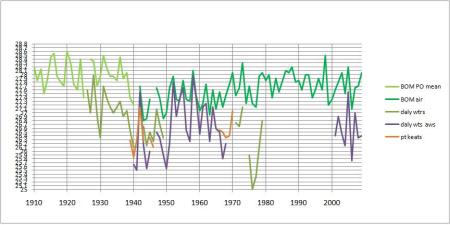 Adjusted: This has been discussed several times before e.g. Part 2: Northern Territory.
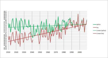 Port Lincoln, SA: (Note the outlier)

 Kent Town (Adelaide): Note Adelaide West Terrace s long record:
Splice made from Adelaide West -0.28, Kent Town, and Northfield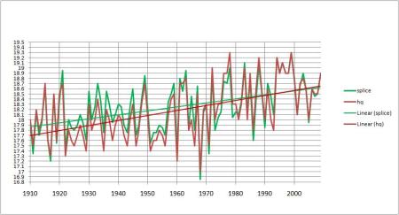 Innisfail (Queensland):

 Mackay and Te Kowai revisited!: Old PO, Airport, Met Office, and the long Te Kowai record:
By using the old PO, Te Kowai + 0.47 from 1941-1959, and the met office, I get a splice similar to BOMs:
 Maryborough (Queensland), and nearby long record stations, Sandy Cape and Gympie, correspond well:
 So why the adjustment?
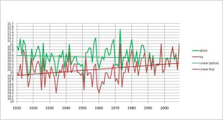
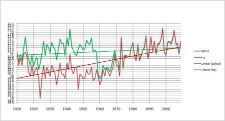 Brisbane Aero– a major city showing cooling!
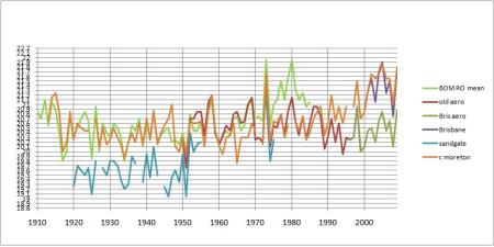 Splice made from regional office + 0.07 to 1949, then the Old Aerodrome and New Aerodrome data:
 Dalby PO and Aero, with nearby Darling Downs centres Oakey, Pittsworth, and Cambooya:
 My splice pretty much agrees with BOM:
 Hobart:
Slightly cooled- note how BOM uses Bushy Park from 1939-68 to correct the town record: Broken Hill– another messy record:
 Gaps filled with Menindee -0.64:
 Moree– large gaps, filled by Warialda (not even remotely nearby): how can this be High Quality?
 Adjusted:
 Gunnedah– one of the few towns to be cooled.
 Gaps filled from Tamworth:
 But Tamworth has been warmed!
 Inverell:
 Warmed a bit:
 Lismore has a long consistent record. Casino overlaps and can be used to estimate data to fill gaps:
 But look at the adjusted record:
 Grafton: gaps, spurious early data.
  Yamba (right on the coast) has a long, more consistent record, but cant be called urban. I had great trouble trying to produce a realistic splice- here are my best:
 and
and but both rely on Yamba for 40% of the record, and the second one uses a made up calculation to match (roughly) the BOM adjustment. In the end I gave up and used the exact HQ data in the summary table and graph; but Grafton should not be used at all.
Port Macquarie: Note how BOM doesn t use the airport data; so I didn t either.
 Newcastle– also cooled:
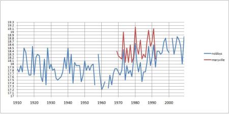 Adjusted:
 Bathurst– Airport, Agricultural Station, Gaol, and nearby Bradwardine:
 Gaps filled by Gaol -0.44 to 1964, then -0.17 in 70s. But adjusted:
 Orange- more messy data:
 I made a splice by: PO -0.8 to 1944, (gaps filled from Milthorpe) then PO – 1.47 to 1964, then Milthorpe -0.57, Air Comp, gaps filled with Ag Institute – 0.38. Heres how it compares:
 Dubbo Airport AWS and the previous Darling St:
 Adjusted:
 How does that work?
Sydney, showing characteristic UHI warming since 1950s: HQ data has been cooled:
 Bowral has many gaps:
 and the adjustments make it warmer:
 Echuca has a long record with no gaps:
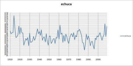 But this becomes
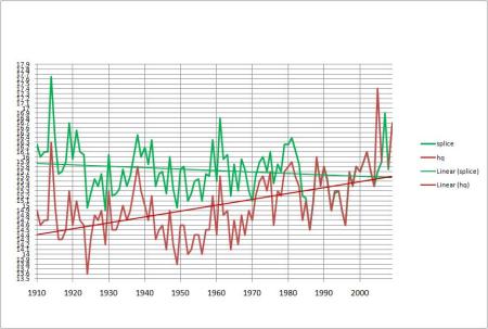 Wow!
Wow!
But wait, there s more:
Benalla: has become
 Worst of all, Wangaratta:
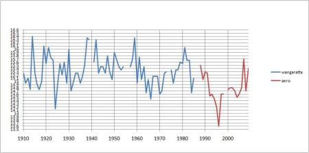 Adjusted:
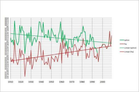 Bairnsdale– more gaps:
 Cooled, thankfully:
 Melbourne, with 2 degrees warming since 1950s:
 Cooling adjustment- is it enough?
 Geelong– more mess:
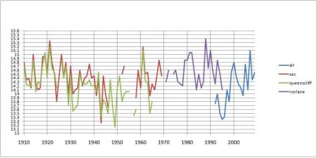 Norlane and Queenscliff are used to fill gaps. I made 2 splices and went with the more conservative second one:
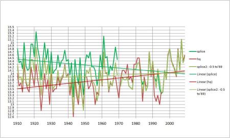 Still warmed!
Maryborough (Victoria) has many gaps. Also showing Ballarat and Clunes to compare: Use other sites to fill gaps, but check the warming:
 Ballarat and nearby sites:
 And adjusted:
 Hamilton raw:
 Old data -0.82; Research Stn +0.35; but who knows? Here is the comparison:
 Cooled!
Finally, Warnambool. What a mess: Adjusted:
 (Splice relies on data from Hamilton, 70 km away!)
References:
Della-Marta, P., Collins, D., Braganza, K. “Updating Australia’s high-quality annual temperature dataset” Australian Meteorological Magazine Vol. 53, no. 2, June 2004
Jones, D.A. and Trewin, B.C. 2000. The spatial structure of monthly temperature anomalies over Australia. Australian Meteorological Magazine, 49, 261-276.
Jones, D.A. and Trewin, B.C. 2002. On the adequacy of digitised historical Australian daily temperature data for climate monitoring. Australian Meteorological Magazine, 51, 237-250.
Torok, S.J. and Nicholls, N. 1996. A historical annual temperature dataset for Australia. Australian Meteorological Magazine, 45, 251-260.
Torok, S, Morris, C, Skinner, C, and Plummer, N. “Urban heat island features of southeast Australian towns” Australian Meteorological Magazine Vol 50, 2001.
http://www.bom.gov.au/climate/change/about/temp_trendmaps.shtml
http://www.bom.gov.au/cgi-bin/climate/change/timeseries.cgi
http://www.bom.gov.au/info/leaflets/urban_design.pdf
http://www.bom.gov.au/inside/eiab/State-of-climate-2010-updated.pdf


September 14, 2010 at 6:44 pm
Another great analysis. Seems BOM have used a weighted magic 8 ball to decide which trends to adjust and in which direction.
September 14, 2010 at 9:21 pm
Hi Ken. I made a couple of posts on JoNova. Salient point I made:
“I get Urban adjusted anomaly : 0.84 C per 100 years. And Raw anomaly of 0.51 C per 100 years. Or 60% increase”
Our numbers are in close agreement.
One thing reading your work alerted me to was that BOM gridding only includes rural stations not urban stations. My process was in error because I did rural + urban. Interesting thing though : the trend results for rural vs rural+urban at almost exactly the same, for both raw and homogenized data sets. So the rural signal completely overpowers the urban signal after gridding.
Which begs the question what exactly are the BOM doing? They publish data that on close scrutiny makes them look nefarious (60% to 70% signal is not something to be swept under the carpet), yet it has no impact at all on the final trend anomaly. Analytical rigour must be in short supply at the BOM.
September 15, 2010 at 8:15 am
Gday Andrew
What indeed are they doing. Im pleased your analysis is in close agreement… I would have been very surprised if it wasnt as the differences in the data are so obvious. What is their real reason for excluding urban?
Ken
September 15, 2010 at 11:27 am
Ken,
Thanks for this analysis. I too am mystified by these adjustments.
You may be interested in this report done by the BOM in 2002 for a submission to the ACCC on a natural gas access arrangement for Victoria. It can be found at: http://www.aer.gov.au/content/index.phtml/itemId/679412
It is Annexure 8
For Melbourne they calculated an overnight UHI of 2.5C and an increase of of 0.16C/decade from 1965 to 1995. The daytime UHI effect was calculated to be negligible. I note that they rejected the prior calculation of the UHI effect (Melbourne CBD – Avg(Laverton, Melbourne & Moorabbin Airports) )and used instead Melbourne CBD – Melbourne gridded rural interpolation. Given that all of these airports (besides being subject to airport siting deficiencies) are within the metropolitan area of Melbourne this change seems reasonable.
I wonder if there are any more of these ad hoc reports around.
September 15, 2010 at 5:54 pm
Great work guys! Do you think this is a killer blow against UHI; the allegedly real UHI not the BoM version ?
September 15, 2010 at 8:12 pm
No- UHI is real, but is not accounted for correctly IMHO. It needs much more investigation. Australia is also not warming as much as we think.
Ken
September 15, 2010 at 9:28 pm
One parameter that is hard to pin down is when UHI started. In one view, it could have been mostly under way by the start of the Melb Syd Perth graphs in 1910. Also, it is possible that UHI maxes out once a certain city size is reached. Then, one would expect a levelling off since 1910, more or less, or uncorrected cooling if that is what the weather really did, because for UHI the big leap forward ended before 1910.
Another problem is the precise location of the weather station with respect to the town (if there is one). Some places like Albany WA are quite urban, but the weather station has long been some distance North-West, about 7 km to the edge of town. Esperance is similar, but the airport is more like 15 km NNW of town. So these are candidates to be called rural. They could be useful, because your list has only one place in WA, namely Perth. I’m pretty sure that Kalgoorlie would have been an urban city for decades, don’t know why it is left out.
I tend to look for some markers, like hot times in 1973 and 1998. There could be a relation between their absence and the amount of adjustment (or the quality of the record keeping). The prominent hot in 1914-5 seems to be present in most of the records, so why should 1998 be in some and not in others if we are looking at global effects? (Answer, Yes, it’s weather versus climate). (Or invalid adjustment).
This is a valuable compilation and easy to use with the neatness of the presentation. My scroll wheel will be getting some use.
September 16, 2010 at 6:40 am
Gday Geoff
appears to be a moveable feast with BOM though they do their best. Urban areas in theory (Torok) have a population > 10,000. As I showed in Part 1, Cairns AMO , Rockhampton AMO, and Gladstone Radar are called non-urban, but Cairns airport has heaps of nearby development, Rocky is on the edge of town but with suburbs within a few hundred metres, and Gladstone is on a bushy hill but surrounded by industrial and residential areas.
I would like to follow up on UHI. Various people have proposed algorithms ( eg Torok) to estimate it but I think a lot depends on local conditions. Even a small settlement will have some UHI effect IMHO.
Ken
September 16, 2010 at 12:38 pm
Ken: if you email me I can send you some stuff on the classic McKitrick-Michaels paper on UHI and some other links
September 17, 2010 at 6:49 pm
Ken, in your chapter on Cairns, you asked if there were occasional studies on corrections. Here is one that you might well have seen, based on Melbourne. However, the references from mainly outside Australia provide insights into early estimates of UHI magnitudes and occasionally on methods of correction.
Click to access Morris%20Simmonds%20Plummer_quantif%20UHI_JAM%20%202001.pdf
You might also find interest in this April 2010 update of a 2005 article
http://mclean.ch/climate/Melbourne_UHI.htm
The references cover in additional detail some of the sites you have analysed. Diniliquin, IIRC, was one.
The second paper is one that leads me to comment that UHI can reach a maximum effect in large cities, particularly in times of low wind velocity. If this is so, it is less surprising that large urban sites appear to have warmed less than nearby small rural sites that have grown since 1910. Their main warming was already done for the large urban sites, but was caught in greatest progess for the rural sites. See their graph of the annual mean temperatures for Melbourne Urban, Laverton, Moorabbin and Tullamarine sites in the period 1971-1990. They move in unison, as if all have been maxed out by 1971.
It continues to worry me that studies like those cited have relied on BOM data. There seems to be a BOM “raw” data set and a BOM “adjusted” data set. It is not rewarding to compare these if there is an little-disclosed “original, unadjusted” data set. It is quite hard to get the BOM to discuss the possible existence of the “original, unadjusted”. I doubt if many non-BOM papers have ever used truly raw data in this category, from the BOM.
September 19, 2010 at 7:32 am
Thanks very much Geoff.
Ken
September 17, 2010 at 6:58 pm
Re Deniquilin, here is a photo:
The text is “This photo shows the position of the Stevenson screen at the back of the Post Office in Deniliquin. The temperature was sampled at this site from 1873-1971. Note the close proximity of buildings and paved areas. ”
From “Urban Heat Islands in Small Towns – Deniliquin, Australia, by Jon Morris, University of Melbourne” as part of ref 2 in the post above.
September 19, 2010 at 7:34 am
And Deniliquin has been cooling!
October 5, 2010 at 12:38 pm
Ken, The effort you have made is admirable. It is appreciated that there is no offical comment from the BoM. However have you rcvd any unofficial comment? Are they entirely unaware of your work? Do you need back-channel access to someone inside the BoM?
October 5, 2010 at 3:19 pm
I have received an email from webclim- thats all since 25 April. No response to my analysis at all. They are definitely aware. What back-channel access? That would be interesting!
Ken
October 7, 2010 at 2:51 pm
It might take some weeks to achieve.
Face to face would be best.
Are you likely to be in Melbourne in the next month or so?
October 7, 2010 at 5:23 pm
No, not likely for ages. Im in North Queensland. If it ever happens I will contact you.
Many thanks
Ken
October 10, 2010 at 8:08 am
That’s an impressive amount of hard work, and very interesting.
Is there any particular reason why you have not offered any theories as to why there seems to be UCI (Urban Cooling Island) as opposed to UHI in Australia?
Anyway, assuming the urban cooling is real- it seems highly likely to me that this would be due to the local climate being cooled by evaporation.
Whereas in Europe and the USA towns and cities generally change the environment from grassland to concrete, the opposite tends to happen in Australia- mainly very dry areas are moisturised by artificial gardens, parks, tree planting golf courses etc
My question would be, are the urban areas that show cooling in areas of low rain fall?
October 11, 2010 at 7:45 am
Thank you. Actually, no. UHI is real, but poorly understood and accounted for. What appears more certain is that Australia is not warming anywhere near as much as has been claimed. Your idea about urban areas being greener than the bush is interesting. Areas that show cooling (and many are not so urban- see parts 5,6,7,8) are not generally in low rainfall areas eg Brisbane, inland Victoria. I am working on what factors are involved at the moment.
Ken
October 17, 2010 at 1:43 am
I had another look at your charts and google-earthed some of the locations to see if there are any clues for the cooling, but a pattern doesn’t seem to jump out…
Another curious thing about these charts is that they seem to indicate that temperatures measured back in the early 1900’s were accurate to 2 decimal places eg 19.23 deg C for example. I am fairly sure these apparent highly accurate readings are due to original Fahrenheit being converted to Celsius, to 2 decimal places. Weather organisations around the world follow this process with historical temperature data and the adjusted data is then dissociated from the original data collected in Fahrenheit. This is very misleading to most non-scientists and even a lot of scientists who are not very involved in metrology don’t seem to realise the significance of this.
I worked for 25 years collecting industrial temperature and pressure data, including calibrating the measuring instruments etc
The fact is that even modern mechanical mercury or Alcohol thermometers have an accuracy of about +/- 1.00Celsius, and a realistic resolution of about +/- 0.5Celsius.
So, on the first chart from the weather service that you have on this page, if you used the original Degree F data up to at least 1960, and used error bars for all the mechanical data up to at least 1980 (as opposed to electronic sensors) you would probably find that there is zero measurable warming or cooling, +/- 1.5 Celsius. and all those adjustments etc are a complete load of rubbish…
An analogy would be that an original dot-to-dot picture of a smiley face was drawn with a fat white board marker and this has now been traced over with a fine liner and turned it into a Mona Lisa portrait!
October 17, 2010 at 4:44 pm
The 2 decimal place data points are purely a result of my averaging max and min- raw data is 1 decimal place. I have no doubt that conversion from F to C introduced rounding errors. Torok and DellaMarta say they have allowed for this with their manual adjustments.
KS
October 15, 2010 at 11:39 am
[…] […]
November 29, 2010 at 8:41 am
YES in long run Australian climate will be less moderate with
extremes of hot weather drought and huge floods.
April 5, 2012 at 9:21 pm
Polnische Band | Polnische Hochzeit | Schlesische- Polnische- Russische- Hochzeitsband…
[…]The Australian Temperature Record- Part 9: An Urban Myth « kenskingdom[…]…
May 14, 2012 at 2:14 pm
[…] problems (see my previous posts: The Australian Temperature Record Part 8: The Big Picture; Part 9: An Urban Myth, and Part 10: BOM’s “Explanations”.) Congratulations are due to the Bureau of Meteorology […]
October 4, 2012 at 10:00 am
[…] raw data from BOM (Bureau of Meteorology) which KensKingdom has analysed shows quite a different picture. The following graph shows records from the varying […]
October 27, 2012 at 10:59 am
Polnische Band | Polnische Hochzeit | Schlesische- Polnische- Russische- Hochzeitsband polnische band, schlesische hochzeitsband, polnische hochzeit, polnische hochzeitsband, polnische-band-nrw
February 20, 2013 at 5:55 am
Nice work…
Interestingly, I didn’t see the codicil at the bottom of the map you showed at the start of your article because I went straight to the Acorn-Sat section of their website which has a similar map without the codicil.
The Acorn-Sat section of the BOM website states…
“The Australian Climate Observations Reference Network – Surface Air Temperature (ACORN-SAT) dataset has been developed for monitoring climate variability and change in Australia. The dataset employs the latest analysis techniques and takes advantage of newly digitised observational data to provide a daily temperature record over the last 100 years. This data will enable climate researchers to better understand long-term changes in monthly and seasonal climate, as well as changes in day-to-day weather.”
Further to that, I downloaded their Station Catalogue which certainly does include urban stations and I cannot find any reference to them not being used as part of the over-riding statement that these sites are developed for “…monitoring climate variability and change in Australia.”
Then… in the station catalogue on the Sydney Observatory Hill station they state…
“The area is heavily built-up and has been since at least the late 19th century. An analysis of minimum temperature trends in the ACORNSAT data showed no evidence of an abnormal warming trend relative to nonurban sites in the region, indicating that any urban influence on the data was already fully developed by the time ACORN-SAT begins in 1910.” (Which of course is utter rubbish as urban expansion and development has continued at a great rate of knots since 1910!)
I was interested in a location near where I live, Richmond NSW, and did my own plots using Acorn-Sat Data -v- Raw Data, this is what I found…
Richmond NSW: Minimum daytime temperatures for the years 1958 – 2012 show an aggregate change of -45.7C between the Acorn-Sat data and the Raw data of which -26.2C occurs in the first 11 years.
The Maximum daytime temperature difference over the same years total -2.3C of which +0.3C are in the first 11 years. Note: There was a changeover from one station (67033) to another (67105) in 1994, so this can’t possibly explain these adjustments made in those first 11 years.
The resultant average daytime temperature difference is -19.22C in the Acorn-Sat data with -7.9C being in the first 11 years (41% of the adjustments in 20% of the time frame)… so it appears they have made the older data cooler to show a warming trend which is otherwise not there in the raw data?
February 20, 2013 at 9:39 am
Thanks James
Keep looking at the raw data. Only adjust it if there is at least 2 years overlap between sites- preferably 5. Our temperature record as shown in Acorn and HQ is a fiction. No one knows with any accuracy what past temperatures were, and certainly not the amount if any of warming or cooling. KS
February 27, 2014 at 4:44 pm
[…] to the climate record. First raw:Adjusted: Splice made from regional office and airport.Much of BoM’s past temperature adjustments are fantasy. Urban heat islands in fast growing cities are ignored too, including moving observatory’s to […]
November 9, 2015 at 9:19 pm
You must lead an extraordinarily boring life.