Archive for the ‘Uncategorized’ Category

Flood Disaster at Fitzroy Crossing

January 10, 2023

If you watch the ABC news or listen to Albo, you would think that the flooding in the Kimberley region of WA is “record”, “unprecedented”, and a sign that disasters are becoming more frequent and more severe.

Here’s the ABC:

“The Fitzroy River peaked at a record height of 15.8 metres at Fitzroy Crossing on Wednesday afternoon but is expected to fall below the major flood level of 12.5 metres today.”

Wow! 15.8 metres! How much above the previous record was it, intrepid ABC reporters?

A quick glance at the Fitzroy Crossing Tourism website shows how this flood compares:

YEARLEVEL
198322.37m
198422.28m
198622.09m
199122.39m
199324.38m
199620.40m
199719.80m
199919.00m
200022.05m
200121.85m
200222.66m
200719.20m
200919.90m
201122.69m

Oops!

But we’re getting used to the standard of ABC reporting, and climate catastrophism in general.

h/t Siliggy in a comment at Jen Marohasy’s blog.

Gladstone Rejects Domestic Hydrogen

April 20, 2022

Gladstone Regional Council in Central Queensland has rejected a proposal to distribute a blend of 10% hydrogen and LNG from the Gladstone hydrogen park to residential and commercial customers.

The council received 100 submissions regarding the project.  All but one were against it, citing safety concerns.

The Australian Gas Infrastructure Group has been distributing a blend with 5% hydrogen through plastic pipes at Mitchell Park in South Australia since 2021 and is planning another hydrogen park to supply Albury-Wodonga in 2024.

Colorants and odorants are added to the blend.  The Gladstone plant was only to operate in daylight hours when solar power is relatively abundant.  Water was to be sourced from the Gladstone water supply.

With residents not convinced by safety assurances (the blend was to have twice the concentration of hydrogen as the South Australian scheme), it’s back to the drawing board for AGIG.

The future of Australia’s hydrogen industry is by no means assured.

Listen to the ABC Radio news item from 1:18.

Hack attack

November 4, 2019

This blog has been hacked temporarily.

If you know anyone with either of these email addresses:

realemailturuly@gmail.com

or

arealemail@gmail.com

dob them in.

Their comments are deleted and they have been blocked (for now).

And it is indeed our friend AI, at IP address 124.47.137.7

Not very smart for a person who uses the moniker “AI”.

He is now blocked.

The Wacky World of Weather Stations: No. 136- Tambo (Qld)

October 12, 2019

Saturday 12/10/2019

Please refer back to my first post for site specifications and to No. 92- Logan City for 2018 specifications.  If you wish to check on this (or any) site for yourself, go to my post on how to check for yourself.

Station: Tambo Post Office 35069

Opened: 1877

Daily Temperature data from: 1957

Data used to adjust Acorn sites at: Barcaldine, Charleville, Longreach, Richmond.

Location:   Co-ordinates  -24.8819 146.2564

735km north-west of Brisbane.

BOM site plan 2016:

Google satellite image 2019:

The screen is close to trees, shrubs, and sheds. The grass under it is watered, unlike the neighbouring allotments.

This station is non-compliant, with temperatures reported at Latest Weather Observations and used to adjust data at Acorn sites.

FAIL

Percentage of all Australian sites not compliant: 18.78%.

Drought and Climate Change Part 1: Long Term Rainfall

September 1, 2018

The current drought conditions in New South Wales and large parts of Queensland are getting a lot of media attention, and of course the usual suspects are linking it to climate change and our apparently “unambitious” emissions targets in the NEG.  But are droughts really becoming “the new normal”, and are they becoming more frequent, more intense, and more widespread with global warming?

There are two aspects to consider: long term rainfall trends in various regions, and periods of rainfall deficiency.  In this post I will look at long term rainfall, and Part 2 will look at rainfall deficiency i.e. drought incidence.

Long term rainfall trends

Everyone “knows” southern Australia is getting drier.  Paul West in Feeding Australia Pt 2 on the ABC says there has been a 28% decrease in rainfall over the past 30 years.  The Climate Council says “Over the past 30 years, there has been a discernible decrease in rainfall across southern Australia.” That’s their headline; in the details the Climate Council’s June 2018 Fact Sheet says:

“Climate change has contributed to a southward shift in weather systems that typically bring cool season rainfall to southern Australia. Since the 1970s late autumn and early winter rainfall has decreased by 15 percent in southeast Australia, and Western Australia’s southwest region has experienced a 15 percent decline in cool season rainfall.”

Both are true, but both are only half true, and in fact the ABC and the Climate Council as usual lie by omission.

The whole story is more complex but shows a completely different, and much less dramatic picture.  Using data for cool season (April- September) rainfall from the Bureau of Meteorology we can check on different time periods.

Fig. 1:  Cool season rainfall, Southern Australia, 1988-2017

Cool rain Sth Oz 19882017

Yes, if this is what Paul West based his statement on, 2017 had about 28% less rain than in 1988.  I hope he didn’t- comparing single years would be pretty bad science.  However there has been a marked decrease in cool season rainfall over this period, so the Climate Council is quite correct.

However, Figure 2 shows the big picture- since 1900.

Fig. 2: Cool season rainfall, Southern Australia, 1900-2017

Cool rain Sth Oz 19002017

Oops! Rainfall has in fact increased over southern Australia.

The reason for the current gnashing of teeth is that “living memory” only goes back about 70 years, and we are comparing current conditions with those of a few decades ago.  Figure 3 shows the average rainfall for the 10 year periods up to 2017.

Fig. 3: 10 year average Cool season rainfall, Southern Australia, 1900-2017

Cool rain Sth Oz 19002017 10yrs

As you can see, the average rainfall of the 10 years 2008 to 2017 was about 7% less than in the 1950s, 1970s, 1980s, and 1990s, but more than the 1920s and 1930s, and nearly 10% more than the 10 years to 1947.  Of the 10 decades before this one, five had less rain and five had more.  Southern Australian cool season rainfall is not “the new normal”, it is in fact “the old normal”.

Let’s now look at South-East Australia, below 33 degrees South and east of 135 degrees East.

Fig. 4: Cool season rainfall, South-Eastern Australia, 1988-2017

Cool rain SE Oz 19882017

Again there is an obvious decrease in rain over the last 30 years.

Fig. 5: Cool season rainfall, South-Eastern Australia, 1900-2017

Cool rain SE Oz 19002017

There has been a small decrease in cool season rainfall over the whole 118 years.  Again there was a marked step up in rainfall from the mid-1940s.  The plot of 10 year averages shows this more clearly:

Fig. 6: 10 year average cool season rainfall, South-Eastern Australia, 1900-2017

Cool rain SE Oz 19002017 10yrs

There was a decreasing trend up to the 1940s, and a decreasing trend from the 1950s to now.  The current 30 to 40 year decrease is nothing new.

However, rainfall records for individual sites go back much longer.  What do these show?  Here is a plot of monthly rainfall for all months at Penola, in South Australia, starting in 1863:

Fig. 7: Monthly rainfall (all months January 1863 – December 2017) at Penola, S.A.

Penola rain monthly

A very long term decreasing trend.  Running 12 month totals show wetter and drier periods:

Fig. 8: 12 month running total rainfall (all months January 1863 – December 2017) at Penola, S.A.

Penola rain 12m

There were very severe droughts around World War 1 and the late 1960s, but a big step up in the 1950s.  This is more obvious in a plot of 10 year totals:

Fig. 8: 120 month running total rainfall (all months January 1863 – December 2017) at Penola, S.A.

Penola rain 120m

This site shows a very long term rainfall decrease, complicated by droughts and strings of wetter years, and a huge step up in the middle of last century.  This site is one of many of varying lengths in the High Quality Rainfall dataset.  Nearly all show the mid-century step up, some show a small long term increase, some show a small long term decrease.

I amalgamated all 84 stations, and here are the plots for all months. Firstly, the number of stations reporting:

Fig. 9: Count of all stations in S.E. Australia reporting, all months

All SE sites Count

There are a number of long term sites.  There were 50 sites in 1898, as in 2017 (several had not yet reported January 2018).

Note: the following plots are of naïve means: there is no area averaging.

Fig. 10: S.E. Australia monthly rainfall (all months)

SE Oz all months

Note a small increase.  Now 12 month running totals of these means:

Fig. 11:  S.E. Australia 12 month rainfall (all months)

SE Oz 12 months

Now the 10 year running total of monthly means, but since 1898 when the number of stations was the same as now:

Fig. 12:  S.E. Australia 120 month rainfall (all months)

SE Oz 120 months 1898

The mid-century step up is obvious, with a decline since then.  The 10 year rainfall to December 2017 is about what it was a century ago.

I now turn to South West Australia.

Fig. 13: Cool season rainfall, South-Western Australia, 1988-2017

Cool rain SW Oz 19882017

A very serious decline since 1988.

Fig. 14: Cool season rainfall, South-Western Australia, 1900-2017

Cool rain Sw Oz 19002017

As you can see, the decline has been around since 1900, but with a marked step down starting in 1968, with a steep but uneven decline since then.  10 year averages show this clearly.

Fig. 14: 10 year average cool season rainfall, South-Western Australia, 1900-2017

Cool rain SW Oz 19002017 10yrs

Conclusion:

The long term data show a complex picture of long term cool season rainfall decline in south-west and some parts of south-east Australia, while southern Australia as a whole shows a very small increase.  It is true that rainfall has declined, as the Climate Council and ABC claim, over the past 30 and 40 years in many parts, but that is only half the story.  The whole story is much less dramatic.  Rainfall has been declining for a long time in WA, and in south-east Australia has been declining in two stages, separated by a large step up in rainfall in the middle of last century.

The current low rainfall is not “the new normal” but entirely consistent with “the old normal” and should be seen as just plain “normal”.  This is Australia.  Get used to it.

Australian Temperature Data Are Garbage

September 14, 2017

From the Bureau’s hastily published “Fast Facts”:

“This means that each one second temperature value is not an instantaneous measurement of the air temperature but an average of the previous 40 to 80 seconds.”

That is complete nonsense.

At the end of each minute, the following data are recorded:

  1. Lowest one second reading of the previous 60 seconds
  2. Highest one second reading of the previous 60 seconds
  3. Reading at the final second of the minute.

Firstly, 40 seconds is not one minute, the integration period recommended by the WMO in 2014 and by the Bureau’s own officers in 1997.  Anything less than 60 seconds is not compliant.

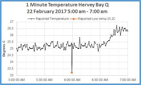
Secondly, consider this plot, which is from actual 1 minute temperatures recorded at Hervey Bay Airport on 22 February 2017.  (Data purchased by me from the Bureau).
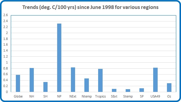
Fig. 1:

Hervey Bay 1 min 5 to7am 22 Feb

Sunrise was at about 5:40 a.m.  Temperatures do not increase until about 6:30 a.m.  Note the strangely low temperature- the daily minimum- which was reported as occurring sometime in the 60 seconds before 06:00:00.  The BOM would have us believe that each of the values in Figure 1, including the low of 23.2C, are “averages” of the previous 40 to 80 seconds.

Next consider what happens in that minute from 5:59 to 6:00, as per the following plot.

Fig. 2:

Hervey Bay 1 min 0559 to 0600am 22 Feb

We don’t know in which seconds the high and low readings for that minute occurred, so I have shown them for each of 59 seconds.  I have shown the 5:59 and 6:00 readings: both were 25.3C.

Consider how the value at 06:00 was obtained:

If by an “average” (however derived) of less than 60 seconds, the methodology is non-compliant.

If by an “average” of the previous 60 seconds, it must include values that contributed to the High of 25.4C and the Low of 23.2C.

If by an “average” of anything greater than 60 seconds, it must include values that contributed to both the Low and High values, and as well, values that contributed to the 5:59 reading- which is the same as the 06:00 reading.

Similar logic applies to the Low and High readings.

It follows that the intermediate instantaneous atmospheric temperatures that contributed to all three reported “average” values must have ranged from much higher than 25.4C to very much lower than 23.2C.

Look at Figure 1 again.  The air temperature at Hervey Bay on 22 February must have spiked down very much lower than the 23.2C plotted.

Really?

In the early morning there is very little near ground turbulence so temperatures do not fluctuate from one minute to the next by very much.  In How Temperature Is Measured in Australia Part 2 I showed that 91% of low temperatures vary from final second temperatures in the same minute by 0.2C or less.  A difference of 2.1C is extraordinary.  Fluctuations greater than that are difficult to believe.

However, in a comment at How Temperature Is Measured In Australia Part 1, Tony Banton, a retired meteorologist, says that the BOM explanation of cooler ground level air mixing upwards is correct.  If we accept that explanation, we must then face the problem of “comparability”.

In 61 seconds, the Hervey Bay AWS has reported temperatures of 25.3, 25.4, 23.2, and finally 25.3 degrees.  The BOM asserts that a liquid-in-glass thermometer will be able to respond as quickly and show similar temperatures- and remember, 23.2C was the morning’s official minimum.

My response: rubbish.  The data for 22 February at Hervey Bay show that no averaging is used at all, and the Low Temperature of 22.3C  23.2C is an instantaneous one second recording from a rogue downwards spike, whatever the cause, whether a natural event or other (e.g. electrical) factor.

Temperatures reported by the BOM are not fit for purpose of accurate reporting of maxima and minima, identifying records, or identifying warming or cooling by comparison with historic liquid-in-glass data.

The Pause Update July 2017

August 11, 2017

The complete UAH v6.0 data for July have been released. I present all the graphs for various regions, and as well summaries for easier comparison. I also include graphs for the North and South Temperate regions (20-60 North and South), estimated from Polar and Extra-Tropical data.

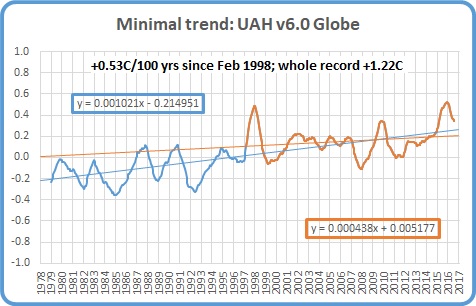
The Pause has ended globally and for all regions including the USA, Australia, and the Southern Hemisphere, except for Southern Extra-Tropics, South Temperate, and South Polar. The 12 month mean to July 2017 for the Globe is +0.35 C.

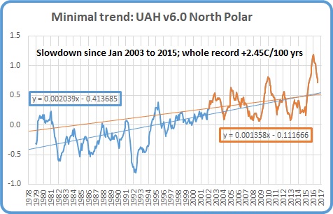
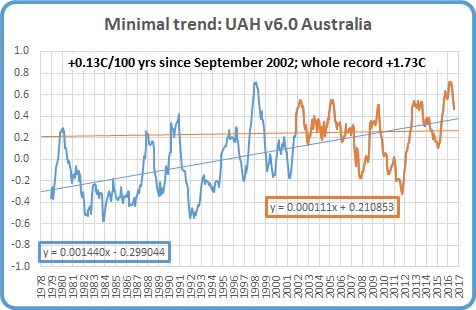
These graphs show the furthest back one can go to show a zero or negative trend (less than 0.1 +/-0.1C per 100 years) in lower tropospheric temperatures. I calculate 12 month running means to remove the small possibility of seasonal autocorrelation in the monthly anomalies. Note: The satellite record commences in December 1978- now 38 years and eight months long- 464 months. 12 month running means commence in November 1979. The y-axes in the graphs below are at December 1978, so the vertical gridlines denote Decembers. The final plotted points are July 2017.
[CLICK ON IMAGES TO ENLARGE]

Globe:

Pause July 17 globe

The Pause has ended. A trend of +0.53C/100 years (+/- 0.1C) since February 1998 is creeping up, but the 12 month means have peaked and are heading down.

And, for the special benefit of those who think that I am deliberately fudging data by using 12 month running means, here is the plot of monthly anomalies:

Pause July 17 globe mthly

Northern Hemisphere:

Pause July 17 NH

The Northern Hemisphere Pause has well and truly ended.

Southern Hemisphere:

Pause July 17 SH

The Pause has ended but temperatures for the last 19 years are rising very slowly.

Tropics:

Pause July 17 Tropics

The Pause in the Tropics (20N to 20S) has ended and the minimal trend is now +0.52C/ 100 years.

Northern Extra Tropics:

Pause July 17 NExt

The Pause has ended and the trend is increasing, but the slowdown since 1998 is obvious.

Northern Temperate Region:

Pause July 17 Nth Temp

Using estimates calculated from North Polar and Northern Extra-Tropics data, the slowdown is obvious.

Southern Extra Tropics:

Pause July 17 SExt

The Pause has weakened but still just persists, and 12 month means have peaked.

Southern Temperate Region:

Pause July 17 Sth Temp

Using estimates calculated from South Polar and Southern Extra-Tropics data, the Pause likewise persists but has shortened.

Northern Polar:

Pause July 17 NP

The trend has increased and will continue to do so even though 12 month means are falling rapidly.  The strong trend in Arctic temperatures is due to a step change from 1995 – 2002, and the strong 2015 – 2016 El Nino.

Southern Polar:

Pause July 17 SP

The South Polar region has been cooling (-0.12C) for the entire record. Although the 12 month means may have peaked, this cooling trend will slow over the next few months, and Global Warming Enthusiasts may start to get excited.

USA 49 States:

Pause July 17 USA 49

The warming trend is increasing.

USA 48 States:

Pause July 17 USA 48

Excluding Alaska the USA has only +0.23C/ 100 years warming.  This trend will increase however.

Australia:

Pause July 17 Oz

The Pause has ended, but the trend since June 1998 has reduced from +0.42C/ 100 years to +0.3C, and since September 2002 is +0.13C.

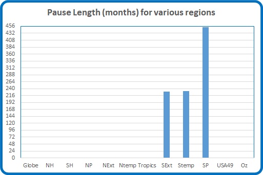
The next graphs summarise the above plots. First, a graph of the relative length of The Pause in the various regions:

Pause length July 17

Note that the Pause has ended by my criteria in all regions of Northern Hemisphere, and consequently the Globe, and the Tropics, but all southern regions have a Pause for over half the record, including the South Polar region which has been cooling for the whole record. Note that the Tropic influence has been enough to end the Pause for the Southern Hemisphere, and the Pause is likely to disappear from all southern regions except South Polar in the next couple of months.

The variation in the linear trend for the whole record, 1978 to the present:

Trends 1978 july 17

Note the decrease in trends from North Polar to South Polar.

And the variation in the linear trend since June 1998, which is about halfway between the global low point of December 1997 and the peak in December 1998:

Trends 1998 july 17

For 19 years “global” warming has been dominated by the influence of the Tropics and North Polar regions.

The imbalance between the two hemispheres is obvious.

The Pause has disappeared from the USA, Australia, and the Southern Hemisphere, but not the Southern Extra-Tropics, South Temperate, and South Polar regions.  Interestingly, July anomalies have decreased in Northern regions but increased in Southern regions and the Tropics.  The next few months will be interesting.

Land and Sea Temperature: South West Australia

November 29, 2016

This year, the south-west of Western Australia has recorded some unexpectedly low temperatures.  Has this been due to rainfall, cloud, winds, or the cooler than normal Leeuwin Current and Sea Surface Temperatures in the South West Region?

In this post I examine maximum temperature and rainfall data for Winter in South-Western Australia, and Sea Surface Temperature data for the South West Region, all straight from the Bureau of Meteorology’s Climate Change time series page .

All temperature data are in degrees Celsius anomalies from the 1961-90 average.

Figure 1 is a map showing the various Sea Surface Temperature monitoring regions around Australia.

Fig. 1

sst-regions

The Southwest Region is just to the west and southwest of the Southwest climate region, and winter south westerlies impact this part of the continent first.  2016’s winter has seen maxima drop sharply.  In fact, it was the coldest winter since 1993:

Fig. 2:  Southwestern Australia Winter TMax Anomalies

sw-tmax

There is a relationship between rainfall and Tmax- as rain goes up, Tmax goes down, so here south west rainfall is inverted and scaled down by 100:

Fig. 3:  TMax and Rain:

sw-tmax-rain

The next plot shows TMax and the South West Region’s Sea Surface Temperature anomalies (SST):

Fig. 4:  TMax & SST:

sw-tmax-sst

Again, related: both have strong warming from the 1970s.  Next I check for whether there was a real change in direction in the 1970s, and if so, when.  To do this I use CuSums.

Fig. 5:  CuSums of Winter TMax and SST compared:

sw-tmax-sst-cusums

Both have a distinct change point: 1975, with SST warming since, but TMax appears to have a step up, with another change point at 1993 with strong warming since.  Rainfall however shows a different picture:

Fig. 6:  CuSums of Winter Rainfall

sw-rain-cusums

Note the major change at 1968 (a step down: see Figure 3), another at 1975 with increasing rain to the next change point at 2000, after which rain rapidly decreases.

I now plot TMax against rainfall and SST to see which has the greater influence.  First, Rain:

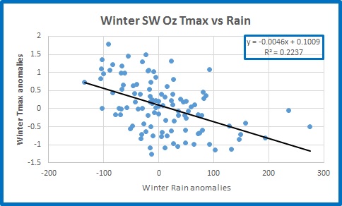
Fig. 7:  TMax vs Rain:

sw-tmax-vs-rain

100mm more rain is associated with about 0.5C lower TMax, but R-squared is only 0.22.

Fig. 8:  TMax vs SST:

sw-tmax-vs-sst

A one degree increase in SST is associated with more than 1.1C increase in TMax, and R-squared is above 0.51- a much closer fit, but still little better than fifty-fifty.

TMax is affected by rain, but more by SSTs.

I now look at data since the major change points in the 1975 winter.  The next three figures show trends in SST, Rain, and TMax.

Fig. 9:  Trends in SST:

sw-sst-trends

Warming since 1975 of +1.48C/ 100 years.

Fig. 10:  Trends in Rainfall:

sw-rain-trends

Decreasing since 1975 at 89mm per 100 years (and much more from 2000).

Fig. 11:  Trends in TMax:

sw-tmax-trends

Warming since 1975 at +2.14C per 100 years.

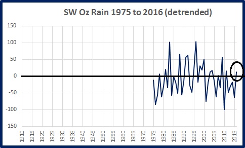
Detrending the data allows us to see where any of the winters “bucks the trend”.  In the following plots, the line at zero represents the trend as shown above.

Fig. 12:  SST Detrended:

sw-sst-detrended-75-to-16

Fig. 13:  Rainfall Detrended:

sw-rain-detrended-75-to-16

Fig. 14:  TMax Detrended:

sw-tmax-detrended-75-to-16

Note that SST in 2016 is just below trend, but still above the 1961-90 average.  Rainfall is only slightly above trend, and still below average.  However TMax is well below trend, and well below average, showing the greatest 12 month drop in temperatures of any winter since 1975.

My conclusions (and you are welcome to comment, dispute, and suggest your own):

  • Maximum temperatures in winter in Southwestern Australia are affected by rainfall, but to a much larger extent by Sea Surface Temperature of the South West Region.
  • The large decrease in winter temperature this year cannot be explained by rainfall or sea surface temperature.  Cloudiness may be a factor, but no 2016 data are publicly available.  Stronger winds blowing from further south may be responsible.

The Pause Update: September 2016

October 18, 2016

The complete UAH v6.0 data for September have just been released. I present all the graphs for various regions, and as well summaries for easier comparison. The Pause has finally ended globally and for the Northern Hemisphere, and the Tropics, but still refuses to go away in the Southern Hemisphere.

These graphs show the furthest back one can go to show a zero or negative trend (less than 0.1 +/-0.1C per 100 years) in lower tropospheric temperatures. I calculate 12 month running means to remove the small possibility of seasonal autocorrelation in the monthly anomalies. Note: The satellite record commences in December 1978- now 37 years and 10 months long- 454 months. 12 month running means commence in November 1979. The y-axes in the graphs below are at December 1978, so the vertical gridlines denote Decembers. The final plotted points are September 2016.

[CLICK ON IMAGES TO ENLARGE]

Globe:

pause-sep16-globe

The Pause has ended. A trend of +0.18 C/100 years (+/- 0.1C) since March 1998 is about one sixth of the trend for the whole record.

And, for the special benefit of those who think that I am deliberately fudging data by using 12 month running means, here is the plot of monthly anomalies:

pause-sep16-globe-monthly

Northern Hemisphere:

pause-sep16-nh

The Northern Hemisphere Pause has ended.

Southern Hemisphere:

pause-sep16-sh

For well over half the record, the Southern Hemisphere still has zero trend.  The Pause may end shortly.

Tropics:

pause-sep16-tropics

As expected, the Pause in the Tropics (20N to 20S) has ended.

Tropical Oceans:

pause-sep16-tropic-oceans

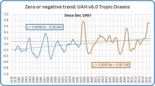
The Pause remains (just) for ocean areas.

Northern Extra Tropics:

pause-sep16-next

The minimal trend is creeping up- how high will it go before decreasing again?

Southern Extra Tropics:

pause-sep16-sext

The Pause is one month longer.

Northern Polar:

pause-sep16-np

Another big increase in temperature in this region but the minimal trend is still one seventh that of the whole record.

Southern Polar:

pause-sep16-sp

The South Polar region has been cooling for the entire record- 36 years 11 months.

USA 49 States:

pause-sep16-usa49

One month shorter.

Australia:

pause-sep16-oz

No change.

The next graphs summarise the above plots. First, a graph of the relative length of The Pause in the various regions:

pause-length-sep16

Note that the Pause has ended by my criteria in all regions of Northern Hemisphere, and consequently the Globe, and the Tropics, but all southern regions have a Pause for over half the record, including the South Polar region which has been cooling for the whole record.

The variation in the linear trend for the whole record, 1978 to the present:

trends-78-now

Note the decrease in trends from North Polar to South Polar.

And the variation in the linear trend since June 1998, which is about halfway between the global low point of December 1997 and the peak in December 1998:

trends-jun-98-sep-16

The imbalance between the two hemispheres is obvious. The lower troposphere over Australia has been strongly cooling for more than 18 years- just shy of half the record.

The next few months will be interesting. The Pause may disappear from the Southern Hemisphere soon. How long will the Pause last in the Southern Extra Tropics and South Polar regions?  ( I would like to see separate data for the Extra-tropical regions from 20 to 60 degrees north and south.)

Limited Blogging for a While

March 6, 2015

Due to family reasons, I can’t give much attention to this blog for a while.

I’ll leave you with two graphs to contrast climate alarmism about heatwaves with reality.

Dr Sarah Perkins of the Climate Change Research Centre and Dr Karl Braganza were in the news this week claiming that

“we’re definitely seeing more heatwaves across Australia”

and

“the number of days that belong in a heatwave each season — has been increasing since the 1950s.”

and

“Brisbane has been getting heatwaves in spring”

Let’s look at Brisbane.  Dr Perkins, a heatwave expert,  defines a heatwave as “three days in a row of temperatures in the top 10 per cent”.  The top 10% of days are those with a temperature above 29.5 degrees Celsius.  Yep, 29.5 C is apparently an extremely hot day at Brisbane Airport!  This shows consecutive days above 29.5 C- the red line is the 3 day heatwave benchmark.  Note the linear trend.

spring consec 29.5 brisbane

This shows the highest temperatures reached in 3 day heatwaves:

spring temps 29.5 brisbane

Just two graphs refute all of the above claims about Brisbane:

definitely NOT more heatwaves

definitely NOT more hot days each season since the 1950s

and Brisbane has ALWAYS had heatwaves in spring, but not so many nowadays.

There has been a slight increase in the number of standalone days above 29.5 C (0.17 days in 66 years), but ‘heatwaves’ have been getting COOLER.

Enough said.