Archive for March, 2010

Political Science 101

March 20, 2010

If you want to study Political Science, you should enrol in a course at University.

Or, for a simple practical introduction, you could look at the March 15 announcement from the CSIRO and Bureau of Meteorology.

Read this through, then come back:

http://www.bom.gov.au/announcements/media_releases/ho/20100315a.pdf

 Temperature will take longer to look at, but Australians are probably more affected by rainfall or lack of it than temperature change, so I’ll tackle that first.  The validity of the announcement’s section on rainfall can be tested quickly and easily, from the BOM website

http://www.bom.gov.au/cgi-bin/climate/change/trendmaps.cgi

 and

http://www.bom.gov.au/cgi-bin/climate/change/timeseries.cgi

This is what CSIRO and BOM state:

“2. Rainfall

While total rainfall on the Australian continent has been relatively stable, the geographic distribution of rainfall has changed significantly over the past 50 years. Rainfall decreased in south-west and south-east Australia, including all the major population centres, during the same period.”

 Now this is technically correct, but it is also less than honest.  Australia has rainfall records going back in some places to the 1870s.  BOM’s charts and graphs are reliable apparently from 1900.  Why not show these?  Because they do NOT support the implication that Global Warming is causing much of Australia to become drier.

This is the the trend map from 1960-2009:


 But compare with the trend map from 1900-2009!


 Note the much debated Murray-Darling Basin, the food bowl of Australia, is wetter, in some parts much wetter, than 110 years ago.

 Here are time series graphs of rainfall

 All of Australia: 

Murray Darling: 

Southern Australia

Northern Australia

Eastern Australia

 South East Australia

South West Australia

Yes, South West of WA is getting drier.

 Not the first time that BOM got it wrong:  the Seasonal Outlooks from November,  December, and January were spectacularly so.

 But the document is less science than political advocay.  This last week there have been a series of daily alarming reports on global warming in Australia.

 This was the first.

 The ordinary Australian citizen has a robust attitude to  politicians:  distrust.

 When scientists are linked with a political position, or become advocates; or when politicians such as Mr Rudd, Senator Wong, Barack Obama, or Al Gore, make scientific pronouncements, the distinction between the science and the politics becomes blurred.

 The danger for scientists is that they will become tarred with the same brush.  Science in general will be the loser.

 So after this latest announcement from CSIRO and BOM, who otherwise do a magnificent job, the ordinary Australian citizen could be excused for saying, in bold, capital letters:

WE DON’T BELIEVE YOU!

GISS Falsifies Record at Mount Isa

March 8, 2010

GISS Does It Again at The Isa
Ken Stewart, March 2010

 Mount Isa is a hot and dusty mining town in the remote north west of Queensland. It’s famous for its mine, producing vast amounts of copper, lead, and zinc, it’s candy-striped smokestack and taller new one, and arguably the best rodeo in Australia. The Isa is surrounded by grass, rocks, trees, large cattle stations, and a few isolated mines, aboriginal communities, and outback towns. The nearest “urban” site is Alice Springs 674 km away. The nearest weather station is 106km away at Cloncurry, home of the Flying Doctor and Australia’s (unofficial) highest recorded temperature, 53.3°C (128°F) on 16/1/1889.

By now being awake up to GISS, the Goddard Institute of Space Studies, I should have known better. However, they still manage to surprise me.
The good folk at GISS once again have seen fit to adjust the data, more than doubling the warming. The adjusted data implies a warming trend nearly double that of surrounding rural stations. There is a pattern emerging to which I will devote a future post.

I used the same methodology as in previous studies. I downloaded Bureau of Meteorology and GISS data for Mt Isa and nearby rural sites. I plotted this data and applied trendlines. I then compared GISS before and after, and BOM.

Here are the results:  (Click on the graphs for a larger view).
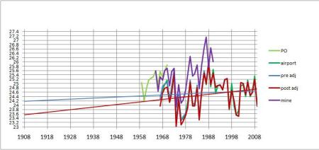
Mount Isa (Post Office, Airport, and Mine):
BOM:


GISS wisely stick to the Airport:-

But they increase the slope of the trendline from less than 0.5 to more than1.1 degrees Celsius per 102 years, by lowering the earlier data by 0.3C. They say they do this because they homogenise urban data for discontinuities caused by station shifts, Urban Heat Island (UHI) etc, by their stated method: “…urban stations are adjusted so that their long-term trend matches that of the mean of neighboring rural stations. Urban stations without nearby rural stations are dropped.”      ( http://data.giss.nasa.gov/gistemp/)

So let’s follow that worthy line and see if they do as they say. We’ll visit the rural sites listed by GISS in turn. (The graphs and discussion of them is in the Appendix, below.) I have left out Julia Creek because its data record is very short and patchy, and no trend should be inferred.

First, Cloncurry: How disappointing- absolutely flat, a trend of maybe 0.05C per 102 years.
Next, 160km south, Urandangie: 1.4C. Ah, that’s better. But the running average becomes… 0.73 degrees- still short.
Third, Camooweal, 165km northwest: 1.2C, makes the average 0.88 degrees- getting closer!
Fourth, Donors Hill, 244km north east: dead flat at 0 degrees trend! Average now 0.66C.
Fifth, 254km south to Boulia: 0.6 C, makes the average trend 0.65 degrees per 102 years!
Now you can keep on going through the next 5 closest stations, Burketown, Normanton, Richmond, Croydon, and Winton, 414km away, but it only gets worse (for GISS). The average trend of the rural sites is 0.635 degrees Celsius per the 102 years of my study. No combination of nearest long term stations puts the trend above 0.88 degrees, let alone 1.1. Even BOM’s longer records of these 10 stations produce a trend of 0.82 degrees.

There cannot be any justification for the adjustment made to the temperature data at Mount Isa. There can be no excuse- not incomplete data, sloppy entry, or even incompetence. The GISS temperature record is false.

Appendix

Cloncurry: I spliced Post Office and earlier aerodrome data as it was very close. Trend is dead flat. Is that a 33 year cycle?

Urandangie: 1.4C per Century.

Camooweal, 165km northwest: 1.2C

Donors Hill, 244km north east: dead flat at 0 degrees trend!

254km south to Boulia: 0.6 C

Julia Creek 234km east: insufficient data

Burketown 327km north east: less than 1.4C, but 20 years cooling.

Normanton 374km north east: 0.7C, 20 years cooling. 30 year cycle?


Richmond 380km east: 0.25C

Croydon, 398 km north east: -0.45C

Winton, 414km south east. GISS 1.2, BOM 2 degrees C. 30 years data missing.

There is no clear picture: some sites show warming, some show cooling, some show nothing much at all.

Trends:

References
http://data.giss.nasa.gov/gistemp/station_data/
http://www.bom.gov.au/climate/data/weather-data.shtml
http://www.bom.gov.au/other/disclaimer.shtml
http://www.bom.gov.au/other/copyright.shtml#acknowledgements
http://www.appinsys.com/GlobalWarming/climap.aspx?area=australia


BOM Seasonal Outlooks- How did they rate?

March 1, 2010

The Bureau of Meteorology regularly produces seasonal outlook forecasts for the coming 3 months.  These are immensely useful to farmers and graziers, and very interesting to those who check them versus what really happens.  The BOM does a mighty job and this is in no way a criticism of their work.  Rather, it is a reminder that we need to remember how difficult it is to forecast weather and climate.

Here are the Outlooks for summer from November, December, and January:  Firstly, Rainfall (underlining is mine): 

(21 November)  Drier summer favoured in parts of north Queensland

The national outlook for summer (December-February) rainfall shows a moderate shift in the odds favouring a drier than normal season across parts of north Queensland. However, over most of the country the chances of exceeding the seasonal median are close to 50:50, with no strong shifts in the odds pointing to either a wetter or drier than normal summer.

 (21 December) Mixed seasonal rainfall odds for the March quarter

The national outlook for total rainfall over the March quarter (January-March), shows a moderate shift in the odds favouring a drier than normal season through much of Queensland, the northeast half of NSW and southwest WA. In contrast, the odds point to above average falls in a band extending from southern SA across parts of Victoria to northern Tasmania.

The pattern of seasonal rainfall odds across Australia has been heavily influenced by the El Niño pattern of higher than average temperatures across the central to eastern Pacific Ocean. Although weaker, the contribution from above normal Indian Ocean temperatures has reinforced the Pacific influence.

(19 January) Contrasting seasonal rainfall odds for late summer to mid-autumn

The national outlook for total rainfall over late summer to mid-autumn (February to April) shows contrasting odds across the country: below average falls are more likely in northern parts of both Queensland and the NT, whereas a wetter than normal three months is indicated for northwest and central WA.

The pattern of seasonal rainfall odds across Australia has been produced using recent Pacific and Indian Ocean temperature patterns, with the warm Pacific (El Niño) having the greater influence.

Now, temperature:

(21 November) Warmer summer days indicated in northeast and western Australia

The national outlook for summer (December-February) mean maximum temperatures shows a moderate shift in the odds favouring above average values in the west of WA and in a band across northeast and northern Australia.

(21 December) Warmer in the north and west; cooler in the southeast

The national outlook for March quarter (January-March) mean maximum temperatures, shows moderate to strong shifts in the odds favouring above average values in the west of WA and in a broad region covering much of northern and northeast Australia. In contrast, cooler than average daytime temperatures are indicated in the southeast of the country.

The pattern of seasonal temperature odds across Australia is due to higher than average temperatures in both the Pacific (El Niño) and Indian Oceans, with the Pacific influence being dominant.

In contrast, there is a 60 to 70% chance of cooler than normal days averaged across the season over Tasmania, Victoria and southern SA.


This due to the Indian Ocean Dipole and the deepening El Nino.

So what happened?

Rainfall, December to February as a percentage of the mean.

And February on its own:

Rain in mm:

Temperatures- remember, the expectation was for higher maxima across north and north east Australia.  Mean maximum Nov- Jan:

And for January itself:

And judging by the rainfall, February should be cool as well!

 A pretty normal Wet season, in fact. And when you have clouds and rain, you have lower temperatures.  Unfortunately, in the tropics you also get humidity.  Lots of it! 

 Mackay’s rainfall for January and February:

January- 327.2  Mean 279.1mm

February- 374.4 Mean 326.4mm

Many rain gauges around the district reported much higher figures.  My total for the year so far is 1226.5mm, or 49 inches in the old money.  There were many way above mine!

 So the reality was much different to any of the outlook summaries, for which many farmers and graziers, as well as fishers, are very grateful. 

 Looks like the Indian Ocean won!

However, the forecast for WA was pretty much spot on.  They could certainly use some rain!