Archive for September, 2014

A Check on ACORN-SAT Adjustments: Part 1

September 18, 2014

I have commenced the long and tedious task of checking the Acorn adjustments of minimum temperatures at various stations by comparing with the lists of “highly correlated” neighbouring stations that the Bureau of Meteorology has kindly but so belatedly provided.   Up to 10 stations are listed for each adjustment date, and presumably are the sites used in the Percentile Matching process.

It is assumed by the Bureau that any climate shifts will show up in all stations in the same (though undefined) region.  Therefore, by finding the differences between the target or candidate station’s data and its neighbours, we can test for ‘inhomogeneities’ in the candidate site’s data, as explained in CTR-049, pp. 44-47.  Any inhomogeneities will show up as breakpoints when data appears to suddenly rise or fall compared with neighbours.  Importantly, we can use this method to test both the raw and adjusted data.

Ideally, a perfect station with perfect neighbours will show zero differences: the average of their differences will be a straight line at zero.  Importantly, even if the differences fluctuate, there should be zero trend.  Any trend indicates past temperatures appear to be either relatively too warm or too cool at the station being studied.  It is not my purpose here to evaluate whether or not individual adjustments are justified, but to check whether the adjusted Acorn dataset compares with neighbours more closely.   If so, the trend in differences should be close to zero.

In all cases I used differences in annual minima anomalies from the 1961-1990 mean, or if the overlap was shorter than this period, anomalies from the actual period of overlap.  Where I am unable to calculate differences for an Acorn merge or recent adjustment due to absence of suitable overlapping data (e.g. Amberley 1997 and Bourke 1999, 1994), as a further test I have assumed these adjustments are correct and applied them to the raw data.

I have completed analyses for Rutherglen, Amberley, Bourke, Deniliquin, and Williamtown.

The results are startling.

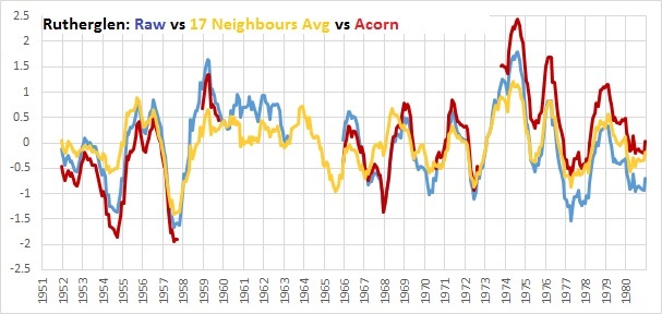
In every case, the average difference between the Acorn adjusted data and the neighbouring comparison stations shows a strongly positive trend, indicating Acorn does not accurately reflect regional climate.

Even when later adjustments are assumed to be correct the same effect is seen.

Interim Conclusion:

Based on differencing Raw and Adjusted data from listed comparison stations at five of the sites that have been discussed by Jennifer Marohasy, Jo Nova, or myself recently, Acorn adjustments to minima have a distinct warming bias.  It remains to be seen whether this is a widespread phenomenon.

I will continue analysing using this method for other Acorn sites, including those that are strongly cooled.  At those sites I expect to find the opposite: that the differences show a negative trend.

Scroll down for graphs showing the results.
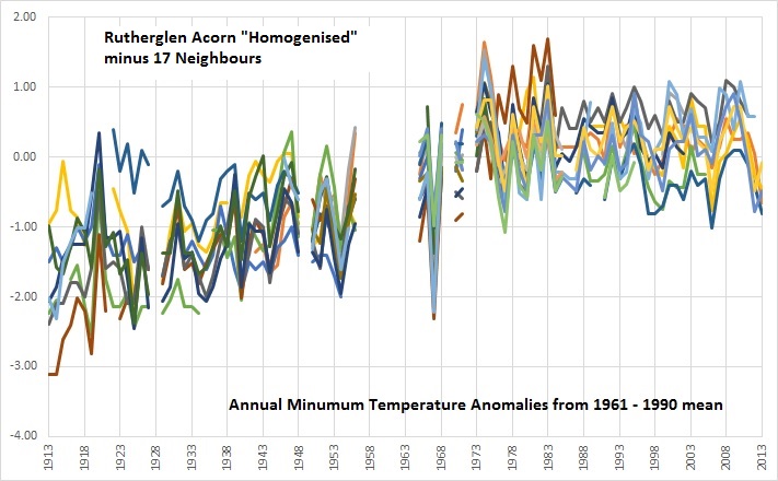
Rutherglen

rutherglen

(Note the Rutherglen raw minus neighbours trend is flat, indicating good regional comparison.  Adjustments for discontinuities should maintain this relationship.)

Amberley (a)

amberley

(Note that the 1980 discontinuity is plainly obvious but may have been over-corrected.)

Amberley (b): 1997 merge (-0.44) assumed correct

 amberley inc 1997

Treating the 1997 adjustment as correct has no effect on the trend in differences.

Bourke (a)

bourke

Bourke (b):  1999 and 1994 merges assumed correct.

bourke inc merges

No change in trend of differences.

Deniliquin

deni

(Note the adjusted differences still show a strong positive trend, but less than the other examples.)

Williamtown

williamtown

(Applying an adjustment to all years before 1969 produces a strong positive trend in differences.)

Better Late Than Never- BOM Releases Adjustment Details

September 11, 2014

On Monday, quietly and without any announcement, a new tab appeared on the Bureau’s ACORN-SAT webpage.

adj tab

This “Adjustments” tab opens to a page explaining why homogenisation is necessary, supposedly showing how the adjustments don’t make much difference to the mean temperatures, and how Australia really is warming because everyone agrees.  More on this later.  So how do we get to see the actual adjustments for each site?  Tucked away under the first graph is a tiny link:

adj tab link

Click on that and a 27 page PDF file opens, listing every Acorn station, dates and reasons for adjustments, and most importantly, a list of reference stations used for comparison.  (You have to go to Climate Data Online to find the station names, their distance away, site details, and their raw data.)

Finally it will be possible to check the methods and results using the correct comparison stations- until now we could only guess.

Back in September, 2011 the Independent Peer Review Panel made a series of recommendations, including that

“C1. A list of adjustments made as a result of the process of homogenisation should be assembled, maintained and made publicly available, along with the adjusted temperature series. Such a list will need to include the rationale for each adjustment.”

The Bureau responded on 15 February 2012, just before the release of Acorn:

“Agreed. The Bureau will provide information for all station adjustments (as transfer functions in tabular format), cumulative adjustments at the station level, the date of detected inhomogeneities and all supporting metadata that is practical. This will be provided in digital form. Summaries of the adjustments will be prepared and made available to the public.”

That was two and a half years ago.  What took so long?  Why was it not publicly available from the start?  Perhaps it is just a co-incidence that the long awaited information was released shortly after a series of articles by Graham Lloyd appeared in The Australian, pointing out some of the apparent discrepancies between raw and adjusted data.  Graham Lloyd deserves our heartfelt thanks.

The Bureau of Meteorology has been dragged kicking and screaming into the 21st Century.  The Bureau is having trouble coming to terms with this new era of transparency and accountability, an era in which decisions are held up to public scrutiny and need to be defensible.

I trust we won’t have to wait another two and a half years for the other information promised, such as “sufficient station metadata to allow independent replication of homogeneity analyses” and “computer codes… algorithms… and protocols”,  “the statistical uncertainty values associated with calculating Australian national temperature trends” and “error bounds or confidence intervals along the time series”

The final recommendation of the Review Panel, and undertaking by the Bureau:

“E6. The Review Panel recommends that the Bureau assembles and maintains for publication a thorough list of initiatives it has taken to improve transparency, public accessibility and comprehensibility of the ACORN-SAT data-set.

Agreed. The Bureau will provide such information on the Bureau website by March 2012.”

I must have missed that.


Homogenisation: A Test for Validity

September 8, 2014

This follows on from my last post where I showed a quick comparison of Rutherglen raw data and adjusted data, from 1951 to 1980, with the 17 stations listed by the Bureau as the ones they used for comparison when detecting discontinuities. 

Here is an alternate and relatively painless way to check the validity of the Bureau’s homogenisation methods at Rutherglen, based on their own discontinuity checks.  According to the “Manual” (CAWCR Technical Report No. 49), they performed pair-wise comparisons with each of the 17 neighbours to detect discontinuities.  An abbreviated version of this can be used for before and after comparisons.  For each of the 17 stations, I calculated annual anomalies from the 1961-1990 means for both Rutherglen and the comparison site, then subtracted the comparison data from Rutherglen’s.  I did the same with Rutherglen’s adjusted Acorn data.

A discontinuity is indicated by a sudden jump or drop in the output.  The ideal, if all sites were measuring accurately and there are no discontinuities, would be a steady line at zero: a zero value indicates temperatures are rising or falling at the same rate as neighbours.  In practice no two sites will ever have the same responses to weather and climate events, however, timing and sign should be the same.  Therefore pairwise differencing will indicate whether and when discontinuities should be investigated for possible adjustment.

Similarly, pairwise differencing is a valid test of the success of the homogenisation process.  Successful homogenisation will result in differences closer to zero, with zero trend in the differences over time.  The Bureau has told the media that adjustments are justified by discontinuities in 1966 and 1974.  Let’s see.

Fig. 1:  Rutherglen Raw minus each of 17 neighbours

pairwise diffs Rutherglen Raw

Note: there is a discernible drop in 1974, to 1977.  There is a very pronounced downwards spike in 1967 (ALL differences below zero, indicating Rutherglen data were definitely too low.)  There also a step up in the 1950s, and another spike upwards in 1920.  Rutherglen is also lower than most neighbours in the early 1930s.  Also note several difference lines are obviously much higher or lower than the others, needing further investigation, but the great majority cluster together.  Their differences from Rutherglen are fairly consistent, in the range +/- 1 degree Celsius.

Now let’s look at the differences AFTER homogenisation adjustments:

Fig. 2:  Rutherglen Acorn minus the neighbours: The Test

pairwise diffs Rutherglen Acorn

The contrast is obvious.  The 1920 and 1967 spikes remain.  Differences from adjusted data are NOT closer to zero, most of the differences before 1958 are now between 0 and -2 degrees Celsius, and there is now an apparent large and artificial discontinuity in the late 1950s.  This would indicate the need for Rutherglen Acorn data to be homogenised!

Compare the before and after average of the differences:

Fig. 3:

pairwise diffs Rutherglen Raw v Acorn average

There is now a large positive trend in the differences when the trend should be close to zero.

There are only two possible explanations for this:

(A)  The Bureau used a different set of comparison stations.  If so, the Bureau released false and misleading information. 

(B)   As this surely can’t be true, then if these 17 stations were the ones used, this is direct and clear evidence that the Bureau’s Percentile Matching algorithm for making homogenisation adjustments did not produce correct, successful, or useful results, and further, that no meaningful quality assurance occurred.

If homogenising did not work for Rutherglen minima, it may not have worked at the other 111 stations. 

While I am sure to be accused of “cherry picking”, this analysis is of 100% of the sites for which the identities of comparison stations have been released.  When the Bureau releases the lists of comparison stations for the other 111 sites we can continue the process.

A complete audit of the whole network is urgently needed.

Rutherglen: Spot the Outlier

September 2, 2014

In today’s Australian there was another article by Graham Lloyd, “Climate scientists defend data changes”. The Bureau of Meteorology is quoted as claiming that “statistical analysis of minimum temperatures at Rutherglen indicated jumps in the data in 1966 and 1974….. These changes were determined through comparison with 17 nearby sites”.

 Two and a half years after being asked to explain the reasons for the myriads of changes to the data, the Bureau has finally given up some of the information it should have released in 2012.  I have been given the names of these 17 sites.  They are:

74034 Corowa, 82053 Wangaratta, 82002 Benalla, 72097 Albury Pumping Station, 82100 Bonegilla

74106 Tocumwal, 81049 Tatura, 81084 Lemnos, 72023 Hume Reservoir, 82001 Beechworth

72150 Wagga Wagga, 74114 Wagga Research Centre, 80015 Echuca, 74039 Deniliquin (Falkiner Memorial)

74062 Leeton, 74128 Deniliquin, and 75032 Hillston.

 This at last allows me to understand how they went about turning a cooling trend of -0.33C per 100 years into a warming trend of +1.74C. 

 Fig. 1: Rutherglen unadjusted data vs adjusted, 1913 – 2013

rutherglen tmin

  I checked the monthly unadjusted minimum data for Rutherglen, the adjusted data for Rutherglen, and the unadjusted data at all 17 of the listed neighbours, in the period 1951 – 1980, which according to the Bureau is the critical period containing the 1966 and 1974 break points.  30 years is a suitably long period for analysis.  For the technically minded, I calculated monthly anomalies from the 1951-1980 means for each record, then 12 month averages.  This should allow us to see the problems around 1966 and 1974.

 Here is a chart of the results.  Can you spot the outlier?

 Fig. 2:  Rutherglen raw (unadjusted), the 17 neighbours’ raw data, and Rutherglen Acorn (adjusted)

 rutherglen v Acorn v neighbours all

You won’t be able to pick out the light blue line of Rutherglen raw data in the spaghetti lines of the neighbours, but you should be able to see the dark red of the adjusted data peeping above and below the others.

 For a clearer picture, here is the same information, but with the 17 neighbours averaged to a single orange line.

 Fig. 3: Rutherglen unadjusted (blue), average of the 17 neighbours (orange), and Acorn- the homogenised version of Rutherglen (dark red).

 rutherglen v Acorn v neighbours avg

Forgive me, but I thought the idea of “homogenising” was to adjust the data so that it is not so different from the neighbours.  That happens in1966.  They got that right, but not in 1974, where the adjustments have increased the difference, and have produced warming.  Odd things also happen in 1952, 1954, 1957, 1969, and 1975-80.

 It is clear that the changes to the temperatures at Rutherglen do not “homogenise” them.  They make the differences from the neighbours greater, and change a cooling trend into a warming one.

 This is not unique to Rutherglen- adjustments warm the temperature trends at 66 of the 104 Australian sites, and warm the national mean temperature trend by around 47%.

 But what would I know- I’m just an amateur according to Professor Karoly.