Ken Stewart, September 2010
“Please note: Stations classified as urban are excluded from the Australian annual temperature timeseries and trend map analyses. Urban stations have some urban influence during part or all of their record.”
I previously assumed that BOM’s reason for excluding urban sites was that their inclusion would introduce a spurious warming due to the Urban Heat Island (UHI) effect.
Never assume.
The reality appears to be quite different. The urban stations’ data presents an embarrassing and perplexing problem for BOM, namely:
Urban temperature trends are substantially less than non-urban sites in Australia.
There is a spurious warming, but it is as a result of BOM’s adjustments. It is not apparent in the raw data.
Here’s one example. I go to the Bureau of Meteorology’s website, look at Climate Change, click the “High Quality Site Networks”on the left, then zoom into the map and click on the time series graph for, say, Wangaratta, Victoria. Here it is:
0.1 C per decade (or 1 degree C per 100 years). Scary hey.
But here’s the raw data:
The trend is not so scary anymore, but the adjustments are.
The Australian Bureau of Meteorology (BOM) has created the Australian High-Quality Climate Site Network. I have previously analysed the 100 non-urban stations of this network, in what I believe is the first ever independent check on the official climate record of an entire continent, and also of the Australian national record.
I have now looked at the remaining 34 High Quality sites designated as urban.
Before my first post, I asked BOM to explain some of the odd things I had noticed in the Queensland data. Amongst others, this statement by Dr David Jones, Head of Climate Monitoring and Prediction, National Climate Centre, Bureau of Meteorology, in an email dated 25 April 2010, caught my eye:
“On the issue of adjustments you find that these have a near zero impact on the all Australian temperature because these tend to be equally positive and negative across the network (as would be expected given they are adjustments for random station changes).”
This statement has been the yardstick for this study.
I compared the adjusted data with the raw data of these 34 stations.
Here are the results, and they are perplexing.
- I was expecting to find a stronger warming trend in the urban data than the 100 non-urban sites. WRONG.
- I was expecting to find BOM correcting for UHI, that is, reducing the trend. PARTLY RIGHT. But less often than with the non-urban sites.
- I was expecting the urban sites to have much better quality of data, with long records, few gaps, and good overlaps if stations’ data had to be combined. WRONG.
Here is the table of all urban sites with raw trend, High Quality (adjusted) trend, and the difference between the two.
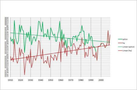
The average trend of the raw data is about 0.43 degrees C per 100 years. That’s 0.26C less than that of the non-urban sites! The average adjustment is approximately 0.3 C per 100 years. BOM’s adjustments have resulted in a warming bias of 70%. As you can see, some of the adjustments are enormous: Wangaratta’s record is turned around from -0.65C per 100 years to + 1.05C.
Here is a graph showing the range of adjustments across the 34 stations.
 The median adjustment is 0.275C.
8 sites have been cooled (including Melbourne, Sydney, and Newcastle). 4 have had essentially little adjustment. 22 sites have been warmed- several substantially more than any of the non-urban sites. (The worst of the non-urban sites was Omeo, which was warmed 1 degree, compared with 6 urban sites warmed above 1 degree, up to 1.7 degrees.)
Another way to illustrate the discrepancy is to calculate the annual average for all 34 sites for raw and adjusted data. Here is a graph of all 34 stations’ raw and adjusted data compared:
 The raw trend is about 0.4C (actually slightly less than 0.4C)- that’s a full 0.2C less than the non-urban raw trend using the same comparison; the adjusted trend is about 0.78C: and that’s a warming bias of 95%.
So much for “these tend to be equally positive and negative across the network”.
Of course, BOM says that this data is not used in their climate analyses, so my trend lines shown above are for illustration and comparison purposes only. However, they illustrate the problem quite well: there is a warming bias apparent in the High Quality data.
As well, the “quality” of the High Quality stations leaves much to be desired.
Many of the sites have large slabs of data missing, with the HQ record showing “estimates” to fill in the missing years. Some sites should not be used at all: Moree, Grafton, Warnambool, Orange, Bowral, and Bairnsdale.
While BOM asserts that these urban sites are not used in analysing Australia’s climate, and the combined trend therefore is meaningless, the great majority of Australia’s population lives near these sites. Countless people refer to the time series graphs to check the climate trend for their particular city. Media outlets refer to these when commenting on climate trends and weather records. Therefore it is essential that the record be accurate.
As well, 8 of the 34 are Reference Climate Stations (RCS) and were used by BOM and CSIRO in their State of the Climate Report released in March 2010.
To summarise, problems with the urban data include:
- The raw data and the adjusted data both show much less warming than the non-urban sites.
- Many of the sites show distinct cooling, especially in south east Australia.
- The data has been subjectively and manually adjusted.
- The methodology used is not uniformly followed, or else is not as described.
- Sites with poor comparative data have been included.
- Large quantities of data are not available, and have been filled in with estimates.
- The adjustments are not equally positive and negative, and have produced a major impact on the temperature record of many of the sites.
- The adjustments produce a trend in mean temperatures that is between roughly 0.3 degree Celsius and 0.38 degree Celsius per 100 years greater than the raw data does.
- The warming bias in the temperature trend is from 60% to 95% depending on the comparison method.
What’s going on? Some possibilities:
- Perhaps BOM has correctly adjusted for spurious historical temperature records in Australian cities. The apparent discrepancy with the raw data shows how much the earlier data was out. But that much out? And in so many sites?
- Further, there is no such thing as UHI affecting Australian cities, therefore increasing the warming of 22 cities is justified. However, BOM acknowledges that there is such an effect, in this 1997 publication: http://www.bom.gov.au/info/leaflets/urban_design.pdf
- If, as BOM acknowledges, there is a UHI phenomenon affecting Australian cities, then it follows from the urban data that Australia is NOT warming as much as they say it is.
One thing we do know:- the High Quality data does NOT give an accurate record of urban Australian temperatures over the last 100 years. BOM’s reconstruction of the temperature record is at best a guess. High Quality is an urban myth.
I ask again: If Anthropogenic Global Warming is so certain, why the need to exaggerate?
Thanks to Lance for helping download data.
Appendix
In the BOM website at http://www.bom.gov.au/climate/change/about/temp_timeseries.shtml appears this explanation:
The temperature timeseries are calculated from homogeneous or “high-quality” temperature datasets developed for monitoring long-term temperature trends and variability …….. Where possible, each station record in these datasets has been corrected for data “jumps” or artificial discontinuities caused by changes in observation site location, exposure, instrumentation or observation procedure. This involves identifying and correcting data problems using statistical techniques, visual checks and station history information or “metadata”.
and
“High-quality” Australian climate datasets have been developed in which homogeneity problems have been reduced or even eliminated.
I downloaded annual mean maxima and minima for each of the sites from BOM Climate Data Online, calculated annual means and plotted these. Frequently, two or three stations (some closed) were needed for the entire record from 1910-2009, and even then there sometimes were gaps in the record- e.g. from 1957 to 1964 many stations’ data has not been digitised. (But 8 years of missing data is nothing- many stations have many years of estimated data “filled in” to create the High Quality series). Some small gaps ( 2-3 years) I filled in with data calculated from nearby stations. I also downloaded the annual means from the High Quality page, and plotted them. I then added a linear trend for each.
Perth. Many stations contribute to the climate record. First raw:
 Adjusted: Splice made from regional office and airport.
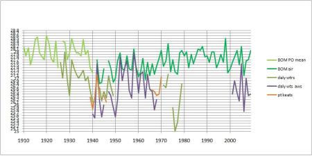 Adjusted: This has been discussed several times before e.g. Part 2: Northern Territory.
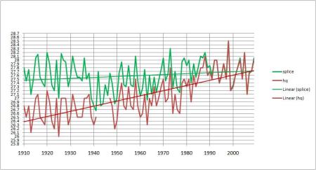 Port Lincoln, SA: (Note the outlier)

 Kent Town (Adelaide): Note Adelaide West Terrace s long record:
Splice made from Adelaide West -0.28, Kent Town, and Northfield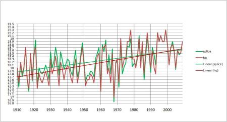 Innisfail (Queensland):

 Mackay and Te Kowai revisited!: Old PO, Airport, Met Office, and the long Te Kowai record:
By using the old PO, Te Kowai + 0.47 from 1941-1959, and the met office, I get a splice similar to BOMs:
 Maryborough (Queensland), and nearby long record stations, Sandy Cape and Gympie, correspond well:
 So why the adjustment?
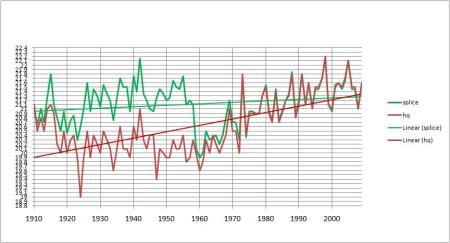 Brisbane Aero– a major city showing cooling!
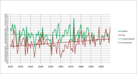
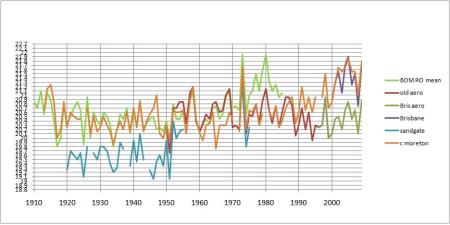 Splice made from regional office + 0.07 to 1949, then the Old Aerodrome and New Aerodrome data:
 Dalby PO and Aero, with nearby Darling Downs centres Oakey, Pittsworth, and Cambooya:
 My splice pretty much agrees with BOM:
 Hobart:
Slightly cooled- note how BOM uses Bushy Park from 1939-68 to correct the town record: Broken Hill– another messy record:
 Gaps filled with Menindee -0.64:
 Moree– large gaps, filled by Warialda (not even remotely nearby): how can this be High Quality?
 Adjusted:
 Gunnedah– one of the few towns to be cooled.
 Gaps filled from Tamworth:
 But Tamworth has been warmed!
 Inverell:
 Warmed a bit:
 Lismore has a long consistent record. Casino overlaps and can be used to estimate data to fill gaps:
 But look at the adjusted record:
 Grafton: gaps, spurious early data.
  Yamba (right on the coast) has a long, more consistent record, but cant be called urban. I had great trouble trying to produce a realistic splice- here are my best:
 and
and but both rely on Yamba for 40% of the record, and the second one uses a made up calculation to match (roughly) the BOM adjustment. In the end I gave up and used the exact HQ data in the summary table and graph; but Grafton should not be used at all.
Port Macquarie: Note how BOM doesn t use the airport data; so I didn t either.
 Newcastle– also cooled:
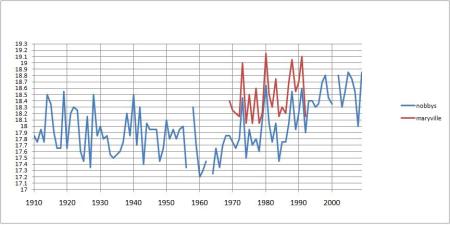 Adjusted:
 Bathurst– Airport, Agricultural Station, Gaol, and nearby Bradwardine:
 Gaps filled by Gaol -0.44 to 1964, then -0.17 in 70s. But adjusted:
 Orange- more messy data:
 I made a splice by: PO -0.8 to 1944, (gaps filled from Milthorpe) then PO – 1.47 to 1964, then Milthorpe -0.57, Air Comp, gaps filled with Ag Institute – 0.38. Heres how it compares:
 Dubbo Airport AWS and the previous Darling St:
 Adjusted:
 How does that work?
Sydney, showing characteristic UHI warming since 1950s: HQ data has been cooled:
 Bowral has many gaps:
 and the adjustments make it warmer:
 Echuca has a long record with no gaps:
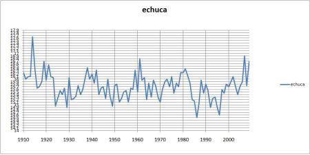 But this becomes
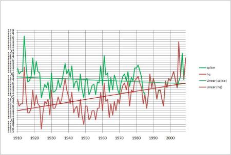 Wow!
Wow!
But wait, there s more:
Benalla: has become
 Worst of all, Wangaratta:
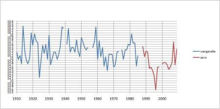 Adjusted:
 Bairnsdale– more gaps:
 Cooled, thankfully:
 Melbourne, with 2 degrees warming since 1950s:
 Cooling adjustment- is it enough?
 Geelong– more mess:
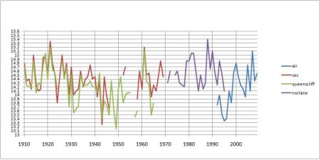 Norlane and Queenscliff are used to fill gaps. I made 2 splices and went with the more conservative second one:
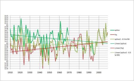 Still warmed!
Maryborough (Victoria) has many gaps. Also showing Ballarat and Clunes to compare: Use other sites to fill gaps, but check the warming:
 Ballarat and nearby sites:
 And adjusted:
 Hamilton raw:
 Old data -0.82; Research Stn +0.35; but who knows? Here is the comparison:
 Cooled!
Finally, Warnambool. What a mess: Adjusted:
 (Splice relies on data from Hamilton, 70 km away!)
References:
Della-Marta, P., Collins, D., Braganza, K. “Updating Australia’s high-quality annual temperature dataset” Australian Meteorological Magazine Vol. 53, no. 2, June 2004
Jones, D.A. and Trewin, B.C. 2000. The spatial structure of monthly temperature anomalies over Australia. Australian Meteorological Magazine, 49, 261-276.
Jones, D.A. and Trewin, B.C. 2002. On the adequacy of digitised historical Australian daily temperature data for climate monitoring. Australian Meteorological Magazine, 51, 237-250.
Torok, S.J. and Nicholls, N. 1996. A historical annual temperature dataset for Australia. Australian Meteorological Magazine, 45, 251-260.
Torok, S, Morris, C, Skinner, C, and Plummer, N. “Urban heat island features of southeast Australian towns” Australian Meteorological Magazine Vol 50, 2001.
http://www.bom.gov.au/climate/change/about/temp_trendmaps.shtml
http://www.bom.gov.au/cgi-bin/climate/change/timeseries.cgi
http://www.bom.gov.au/info/leaflets/urban_design.pdf
http://www.bom.gov.au/inside/eiab/State-of-climate-2010-updated.pdf


