Archive for July, 2019

The Wacky World of Weather Stations: No. 4- Warooka (SA)

July 31, 2019

Please refer back to my first post for site specifications.

Station:  Warooka 22018

Opened: 1861

Daily Temperature data from: 1965

Data used to adjust Acorn sites at:  Port Lincoln

Location:

Warooka map

About 120km west of Adelaide.

2019 satellite image:

Warooka aerial 22018

The screen is the white dot in the red ellipse.

2016 BOM Site Map:

Warooka plan 2016

The screen is in the backyard of the Post Office.  The yard is surrounded by a 1.2 metre galvanized iron fence and buildings.  The bare (concrete? gravel?) parking and storage area of the next door hardware store is within a few metres.

The BOM Metadata pages showing instrument locations on site maps as above indicate the site has remained in this layout since 1993.    However the 1977 plan shows a much more open site but only shows a rain gauge, not a screen.

Warooka plan 1977

This might have been a completely different location.

This site is a heat sink.  It is grossly non-compliant, so temperatures recorded here are not reliable.  Warooka’s temperatures are published at the BOM Latest Weather Observations page, and also used by the BOM in weather reports, potentially including extremes of heat or cold. As well, Warooka is one of the sites used to adjust temperatures at ACORN-SAT sites at Port Lincoln. Acorn sites are used for climate analysis- whether winters are getting warmer and summers hotter for example.  So the lack of quality at any site DOES MATTER!

Another FAIL.

Number 5 tomorrow!

The Wacky World of Weather Stations: No. 3- Maitland (SA)

July 30, 2019

From now on posts will have fewer words, concentrating on visuals.  Refer back to my first post for site specifications.

Station:  Maitland (22008)

Opened: 1879

Daily Temperature data from: 1957

Location:

Maitland map

2019 satellite image:

Maitland 22008 aerial

The screen is the white dot in the red ellipse.

2014 street view:

Maitland 22008

2017 BOM Site Map:

Maitland plan

The screen is in the backyard of the Post Office, right at the edge of the bitumen parking area.  The yard is surrounded by a 2.1 metre high galvanized steel fence.  Sheds, a tank stand, and an incinerator are within 10 metres.  The PO roof to the north-west is 10 metres high and the Police station to the north-east is 6 metres high.

The BOM Metadata pages showing instrument locations on site maps as above indicate the site has changed over the years.  The first available plan is from 1967.

Maitland plan 1967

The site was more open then, with a post and wire fence to the south-east and few buildings.  By 1974 the yard had been paved and the Post Office and Police station had been built, and the fence was now galvanized iron.

Maitland plan 1974

This layout remained until it changed to the present layout sometime between 1997 and 1999.

Maitland plan 1999

This site is a heat sink.  It is grossly non-compliant, so temperatures recorded here are not reliable.  Maitland’s temperatures are published at the BOM Latest Weather Observations page, and also used by the BOM in weather reports, potentially including extremes of heat or cold. As well, Maitland  is one of the sites used to adjust temperatures at ACORN-SAT sites at Adelaide, Cape Borda, Ceduna, Kyancutta, Port Lincoln, and Snowtown. These Acorn sites are used for climate analysis- whether winters are getting warmer and summers hotter for example.  So the lack of quality at any site DOES MATTER!

Another FAIL.

Number 4 tomorrow.

The Wacky World of Weather Stations: No. 2- Murray Bridge

July 29, 2019

The next weather station is Murray Bridge (24521).  Murray Bridge is a town on the Murray River about 80km southeast of Adelaide in South Australia.

Murray Bridge map

The station has temperature data from 1966, but the site does not meet BOM specifications as outlined in my first post of this series.

2019 satellite image:

Murray Bridge aerial

The screen is the white dot in the red ellipse.

BOM site plan:

Murray Bridge plan

2017 street view:

Murray Bridge street2

From a different angle:

Murray Bridge street4

The screen is in a houseyard near concrete paths, vegetable gardens and shrubs, close to a picket fence, within 5 metres of sheds, sheltered from the south by a 1.6 metre high fence, with buildings to the east, north, and west, and less than 10 metres from the bitumen road.

As I said in the first post, don’t blame the people who live there, it’s not their fault, and please don’t search out the location.  That’s why I have blotted out any street names and house numbers.

This is another site that is grossly non-compliant, so temperatures recorded here are not reliable.  Again, Murray Bridge’s temperatures are published at the BOM Latest Weather Observations page, and also used by the BOM in weather reports, potentially including extremes of heat or cold. As well, Murray Brudge is one of the sites used to adjust temperatures at ACORN-SAT sites at Adelaide and Mt. Gambier.  Acorn sites are used for climate analysis- whether winters are getting warmer and summers hotter for example.  So the lack of quality at any site DOES MATTER!

Another FAIL.

The Wacky World of Weather Stations: No. 1- Mount Barker

July 28, 2019

This is the first in a series identifying the worst of Australian weather stations.  At one per day, it could be a long ride- 14 % of stations in South Australia are not compliant with specifications as published by the Bureau of Meteorology (BOM).  I started this enquiry thanks to BillinOz who contacted Jo Nova a couple of weeks ago- so full credit to him.

Specifications for meteorological stations are set out in the BOM Observation Specification 2013.1 “GUIDELINES FOR THE SITING AND EXPOSURE OF METEOROLOGICAL INSTRUMENTS AND OBSERVING FACILITIES”.

http://www.bom.gov.au/climate/cdo/about/observation_specification_2013.pdf

Here are some relevant details:

3.4.1  “… the Instrument enclosure is a 17 metres by 17 metres square enclosure in the middle of a 30 metre by 30 metre square buffer zone aligned in the true North – South direction.”

3.4.2  The enclosure area is to be “level, clearly defined and covered with as much of the natural vegetation of the area that can kept cut to a height of a few centimetres…  should not be artificially watered.”  Concrete or asphalt walkways no wider than 0.5 metres should be minimal and only installed if the ground will be impassable or unsafe in wet conditions.

3.4.3  The buffer zone must also be covered with natural vegetation maintained below 0.5 metres.

3.4.4  An isolated obstruction up to 15 metres high should be 4 times its height in distance from the enclosure.

3.4.5  Obstructions higher than 15 metres or “of a more general nature” should be at a greater distance, up to 10 times their height if they cover more than 45˚ of azimuth.

3.6.2 Instrument shelters (screens) must have a base 1.1 metres above ground level.

3.6.4  “If a shelter is required at locations where no instrument enclosure is to be provided, it must be installed in an area that is level and covered with either the natural vegetation of the area or unwatered grass, which needs to be kept trimmed to a few centimetres in height.  The site should not be in a hollow or on a steep slope.  The shelter should be freely exposed to the sun and wind, and not shielded by or close to trees, buildings, fences, walls or other obstructions.  It should also not be close to extensive areas of concrete, asphalt, rock or other surfaces which may locally alter the air temperature of the site.  In areas where these surfaces are unavoidable, a minimum clearance of 5 times the width of the unrepresentative surface is recommended.”

3.6.7  “Shelters should not be installed on the tops of roofs, or near the exhausts or heat exchangers of such equipment as air conditioners, refrigerators and the like.”

I use co-ordinates for each site published by the BOM to find the site in Google Earth.  (Thank you Mr Google!)

Mount Barker is a town about 30km southeast of Adelaide in South Australia. The town is surrounded by farmland, but is growing as it is within commuting distance from Adelaide.

Google Maps image:

Mt Barker 2019 map

The weather station (BOM station number 23733) has temperature data from 1957, when it was probably in an open area, but a suburb has grown around it.

Mt Barker 2019 closemap

The screen is now in a suburban street, but only 60 metres from a farm paddock, that’s two house yards and a road.  The screen is the white dot in the red ellipse.

So what’s wrong with the Mount Barker weather station?  How many non-compliant features can you find? 2019 satellite image:

Mt Barker 2019 aerial

2019 street view:

Mt Barker 2019 street

Close to houses… close to a fence… close to a tree… on a slope… on a watered lawn… close to a bitumen street.

The position of the screen has changed.  In 2015 it was on the other side of the yard….

Mt Barker 2015

… right beside a concrete driveway with a van parked alongside.

Don’t blame the people who live in the house, it’s not their fault, and please don’t search out the location.  That’s why I have blotted out any street names and house numbers.

This site is grossly non-compliant, so temperatures recorded here are not reliable.  However, Mt Barker’s temperatures are published at their Latest Weather Observations page, and also used by the BOM in weather reports, potentially including extremes of heat or cold. As well, Mount Barker is one of the sites used to adjust temperatures at ACORN-SAT sites at Adelaide, Cape Borda, Nuriootpa, Robe, and Snowtown.  Acorn sites are used for climate analysis- whether winters are getting warmer and summers hotter for example.  So the lack of quality at Mount Barker DOES MATTER!

My assessment?  FAIL

More on Energy Consumption

July 20, 2019

In my previous post was this plot showing relative penetration of renewable energy of all types (including geo-thermal, bio-fuel, and bio-waste) in world economies in 2018.

Fig. 1: Renewable energy as a percentage of total energy consumption

Renewable cons %

Many European countries have relatively large renewables penetration. (New Zealand’s position is due to geo-thermal energy providing up to 17% of its electricity.)  Australia at 5% is ahead of several very large economies, including China, the USA, and India.

However, Figure 2 shows absolute figures for renewable energy.  (All comparisons are in million tonnes of oil equivalent, taken from the 2019 BP Statistical Review of World Energy).

Fig. 2: Actual renewable energy consumption

Renewable cons MTOE

China is by far the largest consumer at about 20 times Australia’s consumption- and almost equalling Australia’s total energy consumption with renewables alone.

But China’s renewable consumption is dwarfed by fossil fuels.  China leads the world in fossil fuel consumption.

Fig. 3: Fossil fuel energy consumption

Fossil cons MTOE

Australia is a minnow.  China consumes 21 times as much fossil fuel as Australia- and New Zealand is far smaller.

Figure 4 shows each country’s fossil fuel consumption as a percentage of its total.

Fig. 4: Fossil fuel energy as a percentage of total energy consumption

Fossil cons %

A long list of countries obtain more than 95% of their total energy needs from fossil fuels.  Australia is in a group (including India) with fossil fuel accounting for 90 to 95% of energy needs.  I have made lists of countries in Figure 4 with 80 to 90%, 70 to 80%, and 60 to 70%.  France, Finland, and some former Soviet states use more than 50% fossil fuel.  Only three countries- Switzerland (47.5%), Sweden (32.6%), and Norway (31.9%)- have fossil fuel consumption less than 50%.  In all but these three, fossil fuels rule.

I now turn to nuclear energy.

Fig. 5: Nuclear energy as a percentage of total energy consumption

Nuclear cons %jpg

France leads the world with emission-free nuclear power at 38.5%, followed by Sweden at 29%.  Ukraine and Switzerland are above 20%.  China and India are well down the list.  Australia, despite enormous uranium reserves, is not in the nuclear club.

Fig. 6: Nuclear energy consumption

Nuclear cons MTOE

In absolute consumption, the USA is way in front, with twice as much consumption as its nearest rival, France.

The other major emission-free energy source is hydroelectricity.  Countries with high mountains and large rivers (and little opposition from environmentalists) can make good use of hydroelectricity.

Fig. 7: Hydro electric energy consumption

Hydro cons MTOE

China consumes nearly three times as much as Brazil or Canada.  Australia has very little potential for more than the small amount we now consume.

Fig. 8: Hydro electric energy consumption as a percentage of total energy

Hydro cons %

Norway gets 67.8% of its total consumption from hydro energy.  Switzerland and Sweden both have above 27% from hydro.

Generally speaking, large countries, even those blessed with hydro and nuclear resources, use more fossil fuels for transport.  Very small countries (Singapore, Hong Kong) have no room for nuclear, hydro or renewable facilities and so must rely on fossil fuels and imported electricity.  Countries with abundant oil and gas reserves naturally use more fossil fuels.

Finally, electricity generation.

Figure 9 shows the percentage of total electricity generation by each fuel type, ordered from least to most fossil fuel use.

Fig. 9: Electricity generation by fuel type

Electricity by fuel %

Note that fossil fuels dominate.  Brazil is the only major country where electricity generated by renewables exceeds that by fossil fuels, and then only because hydroelectricity provides 66% of all generation.  Hydro and nuclear generation are the real and proven alternatives to fossil fuels.  Only the UK and Germany have more than 30% renewable electricity, still less than fossil fuels.  As electricity generation accounts for 43.4% of energy consumption globally, and considering Figure 1, it is obvious that renewable electricity is only a small part of the energy mix.

Currently only nuclear and hydro are viable emission-free alternatives.  Solar panels and windmills cannot hope to replace fossil fuels for electricity generation, let alone for the wider economy.  It is time governments showed some leadership and acknowledged this truth.

The Renewable Energy Transition

July 11, 2019

The Australian Greens’ number one aim in their Climate Change and Energy Policy is:

“Net zero or net negative Australian greenhouse gas emissions by no later than 2040.”

And the Lowy Institute believes that Australia can set an example for the rest of the world.  In their article ‘An Australian model for the renewable-energy transition’ published on 11 March 2019, they assert that across the world “A very rapid transition to renewables is in process” and that “Most countries can follow the Australian path and transition rapidly to renewables with consequent large avoidance of future greenhouse emissions.”

Time for a reality check.

In this assessment I use energy consumption and carbon dioxide emissions data from the 2019 BP Statistical Review of World Energy.

First of all, greenhouse gas emissions.  In the BP Review,

…carbon emissions … reflect only those through consumption of oil, gas and coal for combustion related activities, and are based on ‘Default CO2 Emissions Factors for Combustion’ listed by the IPCC in its Guidelines for National Greenhouse Gas Inventories (2006).  This does not allow for any carbon that is sequestered, for other sources of carbon emissions, or for emissions of other greenhouse gases. Our data is therefore not comparable to official national emissions data.

Excluded sources would include for example cement production and land clearing.  However, given that we are focussing on the transition away from fossil fuels towards renewables, that is not a problem.

Figure 1 shows the growth in carbon dioxide emissions (from fossil fuels) since 1965.

Fig. 1: Global CO2 emissions in millions of Tonnes

CO2 emissions global

The big hitters are China, the USA, and India, who together account for more than half of the world total.

Fig. 2: CO2 emissions by the Big Three and the rest

CO2 emissions top3 rest

Note that America’s emissions peaked in 2007 and have since declined.  China’s emissions rose rapidly from 2002 to 2013.  From a low base, India’s emissions growth rate is practically exponential.

Figure 3 shows how Australia “compares”.

Fig. 3: CO2 emissions by the Big Three and Australia

CO2 emissions top3 Oz

Australia’s emissions from fossil fuels peaked in 2008.

The BP Review’s CO2 emissions data are based on fossil fuel combustion, so I now look at energy consumption since 1965.  Energy units are million tonnes of oil equivalent (MTOE), from the BP Review, “Converted on the basis of thermal equivalence assuming 38% conversion efficiency in a modern thermal power station.”

Fig. 4: Global energy consumption by fuel type in millions of tonnes of oil equivalent

World energy cons 65 to 18

(Note:

Apart from 2009 (the GFC) gas has risen steadily, especially the last five years.

Since the oil shocks of the seventies and early eighties and apart from the GFC, oil has mostly enjoyed a steady rise.

Coal consumption increased rapidly from 2002 to 2013 (mostly due to Chinese expansion) followed by a small decrease to 2016.

Hydro power has seen a steady increase.

Nuclear power peaked in 2006 and declined slightly before increasing over the last six years.

Wind and Solar are in the bottom right hand corner.  Both are increasing rapidly but are dwarfed by other forms of energy.)

How close are we to the renewable energy transition?  Figures 5 to 9 show 1965 – 2018 energy consumption for conventional sources (fossil fuels plus hydro and nuclear) and the total.  The gap between conventional and total energy use is filled by renewables OF ALL TYPES- solar, wind, geothermal, bio-waste (e.g. sugar cane bagasse), and bio-mass used for electricity production, (but excluding firewood, charcoal, and dung).  I have highlighted the gaps with a little green arrow.

Fig. 5: Total and conventional energy consumption in millions of tonnes of oil equivalent

World energy cons 65 to 18 fossil hydro nuclear

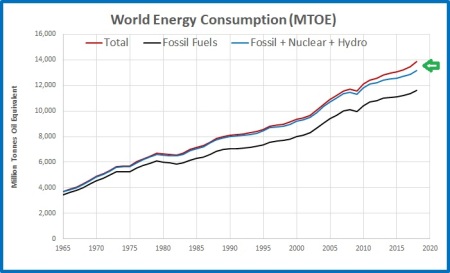
In 2018, renewables of all types accounted for just 4.05% of the world’s energy, fossil fuels 83.7%.  So much for rapid transition to renewables.

The next three plots show energy consumption of the big emitters.

Fig. 6: Total and conventional energy consumption- China

CO2 emissions China

4.38% of Chinese energy came from renewables in 2018.  Nuclear and hydro power have increased enormously over the past 15 years and make up 10.35% of usage but fossil fuels (mostly coal) make up 85.3% of energy consumption.

Fig. 7: Total and conventional energy consumption- USA

CO2 emissions USA

Renewables accounted for 4.51% of US energy.  Fossil fuel and total energy consumption peaked in 2007 but has recently started increasing mostly due to gas and oil use.   (Coal has slipped from more than a quarter of the fossil fuel total in 2007 to less than a sixth in 2018.)  Fossil fuels make up 84.3% of energy use.

Fig. 8: Total and conventional energy consumption- India

CO2 emissions India

Only 3.4% of India’s energy comes from renewables.  India’s energy consumption is growing very rapidly, and 91.6% of consumption is from fossil fuels.

What of Australia, supposedly setting an example for the rest of the world to follow?

Fig. 9: Total and conventional energy consumption- Australia

CO2 emissions Australia

After years of building solar and wind farms, and at enormous expense, renewable energy of all types accounts for just 5% of Australia’s energy use- and the Greens aim to have zero net emissions in 21 years from now.

In the past 10 years, renewable consumption has increased by 5.5 million tonnes of oil equivalent- but fossil fuels have increased by 6.4 million tonnes.  While coal use has dropped by 12 million tonnes, this has been more than replaced by 18.4 million tonnes of oil and gas.  That’s not much of a rapid transition.

Figure 10 shows in order renewables consumption in all countries.  Remember, this includes all types including geothermal energy and bio-mass.

Fig. 10: Comparative penetration of renewables

Renewable cons %

Australia at 5 % renewable consumption is 19th and ahead of the big emitters, the USA, China, and India.

Perhaps the Extinction Rebellion activists who are unhappy with lack of action against climate change in Germany, the UK, and Australia, could glue themselves to the roadways in China, India, or Russia.

There is no rapid renewable energy transition.   Oil, coal, and gas are cheap and readily available and are powering growth in developing economies.  At some time in the future there will not be enough accessible fossil fuel to sustain the world’s economies alone; uranium too will one day be in short supply.  However, necessity and technological innovation, not legislation, will drive the adoption of alternative fuels.

Rumours of the imminent death of fossil fuels appear to be greatly exaggerated (with apologies to Mark Twain).