What drives changes in the wholesale price of electricity in the National Electricity Market (NEM)? Here are some plots that may help understand the problem.
Figure 1 shows electricity generation and wholesale price for the 12 months to 3 July.
Figure 1: Total generation and price
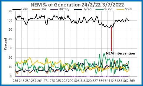
The price had nearly doubled from August 2021 with no great increase in demand, but began to rise more and more sharply since the invasion of Ukraine on 24 February. Figure 2 shows the percentage contribution to total generation of various sources since then. I have included batteries for entertainment value.
Figure 2: Percentage contribution to total generation since the start of the Ukraine war.
On 12 June the AEMO intervened in the market and set a cap on prices. Prices were claimed to have risen because of the shortage of gas and coal and the failure of coal generating sets. Certainly coal’s contribution had fallen from around 60% of total generation to the low 50s over the three week period leading up to the intervention.
In this post I analyse how the price of electricity varied with changes in the energy mix during the period of rapid rise.
As both price and generation was changing, it is necessary to remove the trend in price to get an accurate analysis. Figure 3 shows the price of electricity from the day after the Ukraine invasion to the day after the AEMO price cap, fitted with a 2nd order polynomial trend line.
Figure 3: NEM wholesale price
Figure 4 shows the detrended price timeseries.
Figure 4: NEM wholesale price detrended
This shows that the price was becoming more volatile.
Now I look at the contribution of each main generation source in relation to the average wholesale price of all electricity (detrended). In each, the line at zero represents the actual trend.
Figure 5: Price and percentage contribution of solar generation
As solar generation increased by one percent, the price decreased by $1.63 per Megawatt. That would be excellent news if the sun shone 24 hours a day.
Figure 6: Price and percentage contribution of wind generation
Again we see the cost decreasing with more renewable generation- $4.23 less for each extra percent of total generation. However, the plot also shows the converse- when there is little wind the cost is much greater.
Figure 7: Price and percentage contribution of hydro generation
Great faith has been placed in the necessity of having pumped hydro as a store of renewable energy, but Figure 7 shows that the cost increases by $7.77 for each extra percentage point of total need that hydro back up provides- well above trend.
Figure 8: Price and percentage contribution of gas generation
Gas is in short supply and very expensive, so the cost of providing each additional percentage point of the total generation is $11.08.
Figure 9: Price and percentage contribution of coal generation
Here’s something the renewables industry and the ABC won’t tell you. The wholesale price of electricity actually decreases as the proportion of coal generation increases. As well, price volatility decreases. Above 62% the average price across the network is relatively stable, varying by +/- $100 per Megawatt. Below 62% the price becomes more and more volatile.
As more and more renewables come on line, coal usage will drop, to apparently near universal acclaim. Figure 10 shows how wind pushes out coal:
Figure 10: Percentage contribution of wind and coal
But there was no new additional wind capacity during this period.
And Figure 9 above shows cost and price volatility will increase as reliability decreases.
How should we keep prices down, and maintain reliability?
Coal is your friend.


