Archive for the ‘Sea level’ Category

Trade Winds and Australian Sea levels

May 1, 2022

In my post Is Climate Change Threatening the Solomon Islands? I showed that sea levels at Honiara are predominantly caused by variations and strengthening of the south-east trade winds blowing across the Pacific.

Trade wind strength is also an indicator of sea levels all around Australia- as far south as Tasmania.

I use scaled trade wind index data from NOAA, and mean sea level data from the BOM’s Australian Baseline Sea Level Monitoring Project.  Sea level is in metres and all data are monthly anomalies.

Here’s a map showing the location of the ABSLMP stations.

Figure 1:  Sea level stations

I did not use those stations with large gaps (e.g. Thevenard) or very short records (Thursday Island).

Figure 2 shows sea level and the trade wind index (scaled down by a factor of 60).

Figure 2:  Trade Winds and East Coast Sea Levels

Sea levels appear to loosely match trade winds (a symptom of the El Nino- Southern Oscillation-ENSO).  Sea levels are averaged in Figure 3.

Figure 3:  Trade Winds and Averaged East Coast Sea Levels

Across the north of Australia, the match is close and strong.

Figure 4:  Trade Winds and North Australian Sea Levels

Figure 5 shows the average of the tide gauges, including Cocos Island, far out in the Indian Ocean.

Figure 5:  Trade Winds and Average North Australian Sea Levels

Figure 6:  Trade Winds and Average North Australian Sea Levels Excluding Cocos Island

The surprise is that the same effect is seen across southern Australian ports, with the TWI scaled down by 30.

Figure 7:  Trade Winds and Southern Australian Sea Levels

Figure 8:  Trade Winds and Average Southern Australian Sea Levels

When the trades are weak, sea level is lower, and vice versa, with a delay of one or two months.  The trade winds have become stronger over the last 40 years, and sea levels have increased.

Across southern Australia the intensity of high pressure systems has also increased:

Figure 9:  Strength of southern high pressure systems

The strength of high pressure systems in the sub-tropical ridge has increased.  On the southern side blow the Roaring Forties, and on the northern side the South-East Trades.  Stronger winds in the Pacific roughly match stronger winds in the Southern Ocean, pushing the sea up against the coastlines in the north and south.

It could be that stronger circulation is a symptom of global warming (which you may remember I don’t doubt, just the amount and cause).   However water finds its own level.   Sea level rise at Australian ports and some Pacific islands that has been caused by wind-driven water movement has to be matched by sea level fall across broad areas elsewhere.  That’s why coastal tide gauges are not good at measuring global sea level.

There’s more to sea level than you might think.

Is Climate Change Threatening the Solomon Islands?

April 23, 2022

Since the first talk of an agreement between China and the Solomon Islands to establish a Chinese presence there, accusations have flown thick and fast between the Australian government and their opponents.

One of the points of contention is whether Australia’s supposed lack of urgency in addressing climate change has led to distrust of Australia by Pacific island nations, thus encouraging them to seek help from China.  Considering China’s record and plans for emissions, that is hardly likely.  However, The Guardian thinks so, saying two days ago:

There might not be a direct link between Australia’s climate policy and the security deal – Morrison certainly thinks there isn’t, dismissing such a connection as “nonsense” today – but it is without doubt that Australia’s climate policy has contributed to the dimming of Australia’s reputation in the region, especially given Australia claims to be family.

So is climate change – specifically sea level rise- threatening the Solomons?

Time for a reality check.  Here is a map courtesy of Google, showing where the tide gauge in the Solomons is in relation to Australia.

Figure 1:  Solomons tide gauge location

Not that far away.

Over the last 28 years since the BOM began monitoring sea level at Honiara, sea level has definitely risen.  Figure 2 shows monthly anomalies of mean tidal data.

Figure 2:  Monthly mean sea level, Honiara

Oh no!  Climate change!

Figure 3 shows inverted mean barometric pressure anomalies plotted with mean sea level.

Figure 3:  Monthly sea level and barometric pressure (inverted)

Hmm.  As air pressure falls, sea level rises, and vice versa.  Figure 4 shows 12 month means (from July to June, which covers most ENSO events):

Figure 4:  12 month means of monthly sea level and inverted barometric pressure

Still not a close match, but let’s include the effect of the trade winds (data from NOAA).

12 month means of trade wind anomalies, scaled down by a factor of 10 show a much better match:

Figure 5:  12 month means of monthly sea level and scaled trade winds index

Now we see the connection, and cause of the apparent trend in sea level- the combination of air pressure and trade winds.  Barometric pressure has been decreasing, and trade wind strength has increased.  These are symptoms of the El Nino Southern Oscillation (ENSO).  When atmospheric pressure is unusually high (as in very big El Ninos), sea levels are lower, mainly because the normal trade winds slacken and less water than normal is pushed westwards across the Pacific.  As trade winds strengthen, more water is pushed westwards and sea level rises.  (This also affects the eastern coast of Australia, and strengthens the East Australian current as well.) 

When we get the next big El Nino (cue droughts, bushfires, and wailing and gnashing of teeth) it is likely that the sea level trend will mysteriously flatten.

Sorry, guys, unless climate change predicts fewer and weaker El Ninos, climate change is not to blame: and certainly not the Australian government.

It’s all about the money.

The World’s Biggest Thermometer

August 23, 2021

Are temperatures today unprecedented and dangerously high?  Apparently- the IPCC’s 6th Assessment Report says that current temperatures are higher than at any time in the last 125,000 years

But that is wrong.  Temperatures today are cooler than they were in the past.

In making that statement I am not referring to data from ice cores (as in my previous posts here and here), but a simple and accessible temperature measurement device: the biggest thermometer in the world.

The following statements are uncontroversial:

1 Sea level rise is largely due to melting of glaciers and thermal expansion of the oceans.

2 Thermal expansion and glacial melting are symptoms of temperature increase.

3 Higher sea level indicates warmer conditions, lower sea level indicates colder conditions.

4 Sea levels are currently rising (by a small amount- NOAA says Fort Denison, Sydney, has a rise of 0.65mm per year).

5 This indicates temperatures have been rising.

6 But sea levels and therefore temperatures were higher than now about 4,000 to 7,000 years ago.

If you doubt point 6, you can easily tell whether it was warmer or cooler in the past relative to today.

How?  By looking for evidence of sea level change in areas that are not affected by tectonic rising or falling coastal land, or by large scale water run off or glacial melting, or by very large underground water extraction.

Areas such as the eastern coastline of Australia- the world’s biggest thermometer.

The continent of Australia is very old and flat.  It is in the middle of its continental plate with very little tectonic activity.  Australia’s coastlines are therefore largely stable with little vertical movement, apart from a small tilt down at the northern edge and a small uplift along the southern coast.  Australia is also a very long way from ancient ice sheets.

Evidence of higher sea level is plain to see in many places around Australia.  For example, at Phillip Island in Victoria, Victorian Resources Online describes raised Holocene beaches at Chambers Point, 0.5m and 3 to 5m above high water mark.  Arrows on this Google Maps image show where to find them.

More evidence at Wooloweyah Lagoon, near Maclean in NSW:

And Bulli, NSW:

There are many, many other locations where you can find Holocene beaches well above current sea level. 

Some of the height of these stranded beaches is probably due to the weight of deeper seawater from the melting ice sheets gradually tilting up continental coastlines as the sea floor deepened leading to an apparent drop in sea level at the coast.  However, as Lewis et al (2013) and Sloss et al (2018) (see Appendix below) show, this was of lesser importance especially in northern Australia.  Sea level fall was largely due to climatic influences- in particular, cooling and drying since the Holocene Optimum.

To conclude:  Sea levels were higher in the past, so temperatures must have been higher. 

Therefore there is no evidence that current temperature rise is anything unusual.  Just check the world’s biggest thermometer.

Appendix:  Here are a few of many references to higher Australian sea levels in the Holocene, and reasons for variation.

Sloss et al (2007)  Holocene sea-level change on the southeast coast of Australia: a review

“Present sea level was attained between 7900 and 7700 cal. yr BP, approximately 700—900 years earlier than previously proposed. Sea level continued to rise to between +1 and +1.5 m between 7700 and 7400 cal. yr BP, followed by a sea-level highstand that lasted until about 2000 cal. yr BP followed by a gradual fall to present. A series of minor negative and positive oscillations in relative sea level during the late-Holocene sea-level highstand appear to be superimposed over the general sea-level trend.”

ABC TV catalyst 19/6/2008

Even the ABC says sea levels were higher in the Holocene!

Lewis et al (2008) Mid‐late Holocene sea‐level variability in eastern Australia

“We demonstrate that the Holocene sea-level highstand of +1.0–1.5 m was reached ∼7000 cal yr bp and fell to its present position after 2000 yr bp.”

Moreton Bay Regional Council, Shoreline Erosion Management Plan for Bongaree, Bellara, Banksia Beach and Sandstone Point (2010)

“Sea levels ceased rising about 6,500 years ago (the Holocene Stillstand) when they reached approximately 0.4 to 1m above current levels. By 3,000 years before present they had stabilised at current levels”

Switzer et al (2010) Geomorphic evidence for mid–late Holocene higher sea level from southeastern Australia

“This beach sequence provides new evidence for a period of higher sea level 1–1.5 m higher than present that lasted until at least c. 2000–2500 cal BP and adds complementary geomorphic evidence for the mid to late Holocene sea-level highstand previously identified along other parts of the southeast Australian coast using other methods.”

Lewis et al (2013) Post-glacial sea-level changes around the Australian margin: a review

“The Australian region is relatively stable tectonically and is situated in the ‘far-field’ of former ice sheets. It therefore preserves important records of post-glacial sea levels that are less complicated by neotectonics or glacio-isostatic adjustments. Accordingly, the relative sea-level record of this region is dominantly one of glacio-eustatic (ice equivalent) sea-level changes. ….Divergent opinions remain about: (1) exactly when sea level attained present levels following the most recent post-glacial marine transgression (PMT); (2) the elevation that sea-level reached during the Holocene sea-level highstand; (3) whether sea-level fell smoothly from a metre or more above its present level following the PMT; (4) whether sea level remained at these highstand levels for a considerable period before falling to its present position; or (5) whether it underwent a series of moderate oscillations during the Holocene highstand.”

Leonard et al (2015) Holocene sea level instability in the southern Great Barrier Reef, Australia: high-precision U–Th dating of fossil microatolls

“RSL (relative sea level) was as least 0.75 m above present from ~6500 to 5500 yr before present (yr BP; where “present” is 1950). Following this highstand, two sites indicated a coeval lowering of RSL of at least 0.4 m from 5500 to 5300 yr BP which was maintained for ~200 yr. After the lowstand, RSL returned to higher levels before a 2000-yr hiatus in reef flat corals after 4600 yr BP at all three sites. A second possible RSL lowering event of ~0.3 m from ~2800 to 1600 yr BP was detected before RSL stabilised ~0.2 m above present levels by 900 yr BP. While the mechanism of the RSL instability is still uncertain, the alignment with previously reported RSL oscillations, rapid global climate changes and mid-Holocene reef “turn-off” on the GBR are discussed.”

Sloss et al (2018) Holocene sea-level change and coastal landscape evolution in the southern Gulf of Carpentaria, Australia

“ By 7700 cal. yr BP, sea-level reached present mean sea-level (PMSL) and continued to rise to an elevation of between 1.5 m and 2 m above PMSL. Sea level remained ca. + 1.5 between 7000 and 4000 cal. yr BP, followed by rapid regression to within ± 0.5 m of PMSL by ca. 3500 cal. yr BP. When placed into a wider regional context results from this study show that coastal landscape evolution in the tropical north of Australia was not only dependent on sea-level change but also show a direct correlation with Holocene climate variability….  Results indicate that Holocene sea-level histories are driven by regional eustatic driving forces, and not by localized hydro-isostatic influences. “

Dougherty et al (2019)  Redating the earliest evidence of the mid-Holocene relative sea-level highstand in Australia and implications for global sea-level rise

“The east coast of Australia provides an excellent arena in which to investigate changes in relative sea level during the Holocene…. improved dating of the earliest evidence for a highstand at 6,880±50 cal BP, approximately a millennium later than previously reported. Our results from Bulli now closely align with other sea-level reconstructions along the east coast of Australia, and provide evidence for a synchronous relative sea-level highstand that extends from the Gulf of Carpentaria to Tasmania. Our refined age appears to be coincident with major ice mass loss from Northern Hemisphere and Antarctic ice sheets, supporting previous studies that suggest these may have played a role in the relative sea-level highstand. Further work is now needed to investigate the environmental impacts of regional sea levels, and refine the timing of the subsequent sea-level fall in the Holocene and its influence on coastal evolution.”

Helfensdorfer et al (2020) Atypical responses of a large catchment river to the Holocene sea-level highstand: The Murray River, Australia

“Three-dimensional numerical modelling of the marine and fluvial dynamics of the lower Murray River demonstrate that the mid-Holocene sea-level highstand generated an extensive central basin environment extending at least 140 kilometres upstream from the river mouth and occupying the entire one to three kilometre width of the Murray Gorge. This unusually extensive, extremely low-gradient backwater environment generated by the two metre sea-level highstand….”

BBC Accused of Misleading Reporting About Melting Antarctic Glacier

January 30, 2020

Every morning I get these annoying “click bait” pop-ups on my phone, which I usually ignore. This morning I weakened, and tapped the headline:

Antarctica Melting: Climate change and the journey to the “doomsday glacier”.

Knowing a bit about Antarctica, I dismissed it as more BBC rubbish, but just a few minutes ago I received a message from the Institute of Public Affairs with a link to a press release and article by the Global Warming Policy Forum. Here it is in full:

Press Release 29/01/20
 
BBC Accused of Misleading Reporting About Melting Antarctic Glacier
 
Why did the BBC fail to mention the volcanoes underneath?

London, 29 January: The Global Warming Policy Forum has criticised the BBC for misleading the public about the melting of the Thwaites Glacier.
 
In its numerous reports online, on radio and on television, the BBC blamed the melting of this Antarctic glacier on climate change. However, the BBC’s reports do not mention an important fact that has been widely known and that the BBC itself has reported previously – the influence of volcanoes beneath the glacier.
 
Scientists have known for years that subglacial volcanoes and other geothermal “hotspots” underneath the glacier are contributing to the melting of the Thwaites Glacier.

“Despite claims about climate change and admonition to lower our greenhouse gas emission as a way to ameliorate the melting of Thwaites, the BBC should have been pointing out that what is happening underneath the glacier could be in large parts an act of geology and one of those natural and globally-important dynamics that have been occurring throughout the ages,” said GWPF science editor Dr David Whitehouse.

What is more, the scientists will remain on Thwaites for a while. They have not analysed their data yet, so claims that they have confirmed “the Thwaites glacier is melting even faster than scientists thought…” are premature.

…..

More information about the Thwaites Glacier and the BBC’s misleading reporting can be found on the GWPF website.

I have long suspected that any warming in Antarctica might be due to the large volcanic province beneath West Antarctica, when UAH satellite temperatures show no sign of Antarctic warming, as I have shown here.

I’m pleased the GWPF is onto it so quickly, and many thanks to the IPA for alerting me.

Why are Australian Sea Levels Rising?

October 22, 2018

The answer, my friend, is blowin’ in the wind…. literally.

In brief…

  • At Sydney, the long term sea level rise is about 1 mm per year, with short periods of rapid increase and a long plateau of very small or zero trend in the second half of last century.  As Australia is geologically stable, it is likely that a similar pattern occurred all around the coast.
  • This gradual sea level rise is consistent with oceanic warming since the Little Ice Age, with fluctuations resulting from El Nino-Southern Oscillation (ENSO) changes.
  • Tide gauge data since 1990 from different locations show rises varying from 2.4 mm to 7.2 mm per year.  A significant proportion of this is due to ENSO wind circulation changes.
  • There is no sign of any unusual acceleration in Australian tide gauge data.

The Bureau of Meteorology maintains the Australian Baseline Sea Level Monitoring Project, with a number of tide gauges around the coastline, shown here:

Fig. 1:  Australian Baseline Sea Level Monitoring Project

MSL map

These sites have monthly data only from 1990, mostly later, and two (Thursday Island and Port Stanvac) have very limited data and were not used in this study.   I have used data for Mean Sea Level for all sites on the Australian coastline to find the current situation with sea level rise, and use the much longer dataset from Fort Denison in Sydney Harbour as well for a longer term perspective.  Figure 2 is a plot of all monthly data from all sites.

Fig. 2: Australian Mean Sea Levels

MSL plot abs

Points to note:

  • The mean is a measure of central tendency: the full tidal range is at least twice the values shown for each site.  Broome’s range is well over 11 metres.  Portland has a very small range.
  • An Australian average of these means is meaningless.
  • Each site has a seasonal signal which is not regular.
  • It is difficult to make any meaningful comparison.

However if we look at sites individually, we can at least compare any trends.  Figures 3 and 4 show MSL at sites with the greatest and least trends.

Fig. 3:  MSL at Hillarys

MSL plot abs Hillarys

Fig. 4:  MSL at Stony Point

MSL plot abs StonyPt

According to this very short record, the rate of Australian sea level rise varies in different locations, from a low of 2.4 mm per year in Bass Strait to 7.2 mm per year at Hillarys in Western Australia.  Why is this?

Australia is very stable geologically, and these tide gauges are carefully checked with levelling connections between them and Global Navigation Satellite System (GNSS) sites maintained by State land and survey departments.  Therefore differing rates of land movement are unlikely to be responsible.

We need to compare all sites, and as well remove the seasonal signal.  To do this I calculate monthly anomalies for each site, then plot the results in Figure 5.

Fig. 5:  Monthly anomalies for all Australian sites:

MSL plot all anoms

With the seasonal signal removed, the data show some roughly similar patterns for all sites.  I now plot the mean of these anomalies, to find an “average” Australian sea level trend.

Fig. 6:  Average of all MSL anomalies

MSL anoms trend

All sites show marked dips in 1997-98 and 2015-16, clearly shown in the average.  The influence of El Nino perhaps?  Figure 7 shows the mean of all MSL anomalies with the scaled Southern Oscillation Index (SOI).

Fig. 7:  Average of all MSL anomalies and SOI/200

Aust MSL and soi

My first response was “Wow!”  Next, sea level plotted against SOI:

Fig. 8: MSL as a function of SOI

MSL scatterplot all v soi

For every one point increase in the SOI, Australian sea level rises an average of 3.2 mm, and SOI change can account for more than a third of sea level rise.  Now we check how the SOI has behaved over the last 27 years.

Fig. 9:  Trend in SOI, 1991-2018

SOI plot trend

In this short record, the SOI has increased by about 8 points.

From this, we can deduce that a portion of the perceived sea level rise since 1991 is due to the influence of the El Nino- Southern Oscillation (ENSO), of which SOI is a strong indicator.

What mechanism could there be for this?  The SOI is calculated from the difference in atmospheric pressure between Tahiti and Darwin.  Darwin’s sea level is compared with the SOI in Figure 10.

Fig. 10:  Darwin MSL anomalies and SOI/100

MSL plot Darwin SOI

The match is very close, as the plot of MSL vs SOI shows:

Fig. 11:  Darwin MSL as a function of SOI

MSL plot Darwin vs SOI

SOI has about twice the effect on MSL at Darwin as it has on the Australian average, and more than half sea level rise can be accounted for by change in SOI.  Here’s my explanation:

During La Nina, when SOI is high, the northwest monsoon is strengthened, the monsoon trough penetrates further into northern Australia in summer with lower atmospheric pressure and stronger northwest winds.  This combination pushes the sea up against the northwest coast, raising the sea level.  In winter, the monsoon disappears and winds are predominantly from the east.  During El Nino, the monsoon is weakened and may fail completely.  Thus northwest winds are weaker and the sea level is markedly lower.

That’s all very well for Darwin and other sites in northern Australia, but take a look at Figure 12, which compares seal level at Darwin with Spring Bay, in southern Tasmania, and about as far from Darwin as you can get without a passport.

Fig. 12: MSL at Darwin and Spring Bay

MSL plot Darwin Springbay all

Note that in some (but not all) El Ninos (marked) Spring Bay sea level is also strongly affected.  Note also that sea level at Spring Bay appears to start rising again several months before Darwin, in other words before the SOI starts rising.

The 2015-16 comparison of anomalies shows the Spring Bay sea level at its lowest in September 2015, rising strongly and four months before Darwin’s.

Fig. 13: MSL at Darwin and Spring Bay 2015-16

Darwin SpringBay anoms 20152016

To understand this we need to consider circulation patterns as they change through the year and with ENSO events, and their effect on local sea levels.  The following plots show the absolute 2015-2016 monthly mean sea levels and the long term average for each month.

Fig. 14: MSL at Darwin 2015-16 compared with average monthly levels

Darwin abs 20152016

Darwin’s long term average sea level is highest at the peak of the Wet season (February – March) and lowest in the Dry (July – August).  In 2015, the high was reached in January and the low in July- both one month earlier- and the 2016 high was in March- one month later.  Below normal sea levels lasted from April 2015 to April 2016.

In contrast, Spring Bay’s average sea level is highest in the southern wet season (Winter-July) and lowest in the summer dry season (November to February).  In 2015 the high was reached in May and the low in September, and the 2016 high in May.

Fig. 15: MSL at Spring Bay 2015-16 compared with average monthly levels

Spring Bay abs 20152016

This happens at other sites in the southeast of Australia (from Portland to Port Kembla including Tasmania).

Fig. 16:  Australian sea level at sites in the north and southeast.

MSL plot Nth SE

Note that the same pattern applies: sea level is lower in strong El Ninos and rises before the north (in 1997-98 and 2015-16 but not so clearly in 2006-07).

A possible explanation is that circulation changes associated with the ENSO are not restricted to the tropics, although that is where the effects are largest and most visible. In normal (non-El Nino) years, the sub-tropical ridge moves north over the continent in winter, and the winter storms around the lows to its south bring rain and winds from the south-west quarter to the southern coast, particularly South Australia, Victoria, and Tasmania.  These winds cause the sea to pile up (by a few centimetres) against the southern coast.  In summer, the sub-tropical ridge moves south, rain bearing storms mostly pass to the south of the Australian region, and blocking highs in the Tasman Sea bring strong north-west winds across the south-east of Australia.  This causes sea level to fall.

In a strong El Nino, these conditions occur earlier, with a rapid retreat south of the sub-tropical ridge so that winter storms with south-westerly winds are fewer and weaker and sea level is lower in winter and spring.  Summer sea levels (November to January) are close to normal.

Figure 17 tests the response of sea level to barometric pressure at Spring Bay.

Fig. 17:  Spring Bay MSL anomalies as a function of barometric pressure anomalies

SpringBay MSL vs Press.jpg

The result is clear.  More than half of sea level change is due to pressure variation, which causes winds to change.

The effect is much greater at Darwin.

Fig. 18:  Darwin MSL anomalies as a function of barometric pressure anomalies

Darwin MSL vs Press

By the way, how much does increase in sea temperature affect sea level?

Fig. 19:  Spring Bay MSL anomalies as a function of temperature anomalies

SpringBay MSL vs SST

At Spring Bay, very little.  An increase of one degree could raise sea level by 17 mm, but R-squared of 0.033 is tiny compared with 0.527 for air pressure.

Whatever causes El Nino also causes the southern seasonal weather cycle to occur earlier, and sea levels rebound several months before they do in the tropics.

What of the longer term?

The Australian Baseline Sea Level Monitoring Project data are limited to sea levels since 1990, so the record is too short to make assumptions about long term sea level rise, and certainly not about the future.  There are longer datasets available however.  Sydney Harbour (Fort Denison) has data from 1914.

Fig. 20: MSL anomalies at Fort Denison (Sydney)

Sydney 1914 to 2018

That’s a long term sea level rise of 1 mm per year, or 104 mm in 100 years- a bit over 4 inches.  Now there has been an apparent “acceleration” since 1991, matching the data at nearby Port Kembla:

Fig. 21: MSL anomalies at Fort Denison (Sydney) 1991-2018

Sydney 19912018

But once again note the correspondence with the SOI:

Fig. 22: MSL anomalies and scaled SOI Sydney 1991-2018

Sydney 19912018 soi

A significant portion of the recent sea level rise at Sydney can be attributed to a short term rise in the SOI.

So is this recent rapid rise unique?  By calculating the trend in sea level over 10 year periods, we can see periods when sea level rise has accelerated or slowed in the past:

Fig. 23:  10 year running trend in MSL at Sydney

10yr trends MSLSydney

The most recent rise in sea level of 7 to 8 mm per year over 10 years is less than that of the rise to 1953, when sea level rose by 10 mm per year.

If you think 10 year trends are too short, Figure 21 shows 30 year trends at Sydney:

Fig. 24:  30 year running trend in MSL at Sydney

30yr trends MSL Sydney

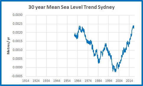
The current 30 year trend is exactly the same as the trend to 1965:  2.4 mm per year.  For the 30 year period to the mid-1990s the trend was zero.

Conclusion:

Across all tide gauges of the Australian Baseline Sea Level Monitoring Project, a significant proportion of sea level rise since 1990 is due to circulation changes associated with the El Nino- Southern Oscillation.  The effect is much greater in the north and west, where sea level rise is highest, but also is evident in the south-east.

Sydney’s long term record tells us that sea level has been rising at an average rate of about 1 mm per year.  There have been short periods of rapid increase and a long plateau of very small or zero trend in the second half of last century.  As Australia is geologically stable, it is likely that a similar pattern occurred all around the coast.

This gradual sea level rise is consistent with oceanic warming since the Little Ice Age, with fluctuations resulting from ENSO changes.

There is no sign of any unusual acceleration in Australian tide gauge data.  In 100 years from now sea level could be expected to be 100 mm to 200 mm higher.  A sea level rise of 5 to 10 times this amount is purely speculative and not based on empirical data, but instead is based on the worst case scenario of computer models.

Pacific Sea Level One Year On

November 9, 2016

I was reminded by Jennifer Marohasy of my post a year ago (Pacific Sea Levels- Warming, ENSO, or Wind?) in which I showed that “Sea level rise in Kiribati and the Marshalls has nothing to do with climate change and everything to do with the ENSO cycle, and winds in particular.”

I wonder how things are going after 12 months?

Back then I had a brief exchange with one of the commenters, MorinMoss, a Global Warming Enthusiast, part of which included the following:

Me:

So Morin, getting back to sea levels in the Pacific, what do you think sea level at Kiribati will be a year from now- higher, lower, or the same as now, and why? I reckon it will be lower- because of the ENSO cycle. The Pacific will be in neutral or La Nina phase by then, trades will be dominant, with less westerly wind bursts on the Equator.

 MorinMoss:

Hard to say – there’s so much warm water in the Pacific that I think it’s too early to say how the cycle will progress.
We could be looking at a double-dip El Nino or a strong neutral (or would that be weak neutral?) phase, not proceeding immediately to a La Nina.

http://www.nytimes.com/2015/11/03/science/global-warming-pacific-ocean-el-nino-blob.html

 Me:

Good-oh, we shall see!

So 12 months ago I predicted sea level at Kiribati would be lower because of the ENSO cycle.

Time for a reality check.

This was the position in my post last year:

k-msl-v-nino4

And this is the position now.

kiribati-msl-v-nino4

Kiribati sea level change still precedes NINO4 change, and sea level has fallen from the highest it had been in this record to about average.

Q.E.D.

Pacific Sea Levels- Warming, ENSO, or Wind?

November 1, 2015

Apparently our Opposition Leader Bill Shorten, his deputy Tanya Plibersek, and immigration spokesman Richard Marles are heading off to the Pacific to discuss “the dangerous consequences of climate change”, all paid for by media baron Harold Mitchell, according to yesterday’s Weekend Australian.
They will visit Papua New Guinea, the Marshall Islands, and Kiribati (pronounced “Kiri-bahss”).
The President of Kiribati leads the complaints about the threat of global warming to his island nation. Kiribati has indeed seen foreshore erosion and salt water intrusion in recent years- just don’t mention causeway construction and underground water extraction.
Time for a reality check.
Sea level rise in Kiribati and the Marshalls has nothing to do with climate change and everything to do with the ENSO cycle, and winds in particular.
In this post I use data from the Australian Bureau of Meteorology’s Pacific Sea Level Monitoring Project at http://www.bom.gov.au/pacific/projects/pslm/. I also use NINO 4 data from http://www.cpc.ncep.noaa.gov/data/indices/sstoi.indices and Trade Wind Index data from http://www.cpc.ncep.noaa.gov/data/indices/wpac850.
Fig. 1: Island nations in the Pacific Sea Level Monitoring Project, also showing the area of the NINO 4 index. (Click graphics to enlarge).

Pacific MSL map
I have converted raw mean sea level data to monthly anomalies from 1995-2014 means, and scaled down NINO 4 and Trade Wind data, in order to make comparison easier.
This figure shows sea level data at all of the islands in the BOM’s Pacific Sea Level Monitoring Project.
Fig. 2: 12 month smoothed sea level anomalies, 1992-2015, for all islands in the Sea Level Monitoring Project. The vertical axis is in metres.

MSL graph all
Point 1: While there is broad agreement on rises and falls, the timing of the rises and falls is very mixed- some rise at the same time as others fall.

This is clearly shown by Kiribati and the Marshalls- when one is rising the other is falling.
Fig. 3: 12 month sea level anomalies at Kiribati and Marshalls, 1992 to 2015.

MSL M & K
Perhaps Mr Shorten can discuss why sea level changes at the Marshalls precede those at Kiribati by many months, such that they are presently moving in opposite directions.
Point 2: There is no doubt that from 1992 to 2015, throughout this region sea levels have been rising: both the Marshalls and Kiribati by 4.8 mm per year. However, since sea level rise occurs at different times, it cannot be due to temperature change. This is further reinforced by the next graphic.
Fig. 4: NINO sea surface temperature anomalies, January 1982- September 2015, 12 month means.

NINO indices
NINO 4 sea surface temperature anomalies since 1982 have almost zero (+0.01C per decade) trend (and the other indices show negative trend in sea surface temperatures). The tropical Pacific has not warmed.
At first glance, sea level change at these islands appears to correlate well with El Ninos and La Ninas, however close analysis shows a much more complex picture.
Fig. 5: 12 month running means of Kiribati sea level anomalies compared to NINO 4

K MSL v NINO4
Note that sea level changes several months before the NINO 4 index.
Fig. 6: 12 month running means of Marshall Islands sea level anomalies compared to the Trade Winds Index.

Tr Winds v MSL Marshalls
Note that the Trade Winds mostly change simultaneously with or some months before sea levels change.
Point 3: Sea level changes at Kiribati precede ENSO events, as measured by the NINO 4 index, but follow or match the Trades at the Marshalls (just to the north of the NINO 4 region).
However, in Figure 3 above, note that sea level anomalies at the Marshalls PRECEDE Kiribati.
So what is the cause of sea level rise in the western Pacific, which is an alarming 4.8mm per year at Kiribati and the Marshall islands?
Fig. 7: Trade Wind Index, December 1992 to September 2015

Trades trend
The Trade Winds have been increasing throughout the period of the Sea Level Monitoring Project, pushing surface water from east to west across the Pacific.
Fig. 8: Western Pacific winds at 1 November 2015

Pacific winds 1Nov 15(From http://earth.nullschool.net/#current/wind/surface/level/orthographic=163.83,1.50,277 )
At Kiribati westerly wind pulses, which help to initiate and strengthen El Ninos, push water against the low coral cay and raise the sea level at the tide gauge, (located on the western side of Tarawa, which is in normal and La Nina years the leeward side).


Fig. 9:  Tarawa Atoll

Tarawa atoll
When these winds slacken and trade winds strengthen, the sea level drops. In the rising sea level phase, the westerly winds push warmer water eastwards, and the weaker trades do not bring in as much cooler water from higher latitudes. Thus the rise in sea level at Kiribati precedes a rise in sea surface temperature, and the peak in sea level occurs about 5 months before the peak in NINO 4, one of the El Nino indicators.
Conversely, weaker trade winds bottom out some months before the bottom of sea levels at the Marshalls, which are to the north of the area affected by westerly wind pulses.
Therefore we can reassure Mr Shorten and his pals that sea level rise has little to do with climate change (unless alarmists claim that global warming will lead to stronger La Ninas, which lead to cooler temperatures- but I thought the plan was for more El Ninos).
Sea level rise is largely due to wind. And no doubt Mr Shorten will contribute to that.

Catalyst- still deceptive

November 18, 2012

An update on my recent post about Catalyst.

Most viewers (myself included) would not have realised that the “330 months since February 1985 of above average temperatures” reference had nothing to do with Australia, but was in fact based on an as yet unpublished paper by Dr Mark Howden of the CSIRO, who seems to have obtained his data from the NCDC.  (Unpublished? So not yet peer-reviewed?  Tut-tut, ABC!)  As it is not yet published, we can’t access it or check Dr Howden’s methods and calculations, so the 1:100,000 chance of having 330 months in a row of above average temperature not being caused by the greenhouse effect seems a bit odd. 2 to the power of 330 is somewhat more than 100,000!

Whatever.  I’m sure it’s very interesting.  But that had nothing to do with the stated subject of the program, which was “Taking Australia’s Temperature”.  It appeared to be thrown in as a late filler.  Perhaps there was no deliberate deception planned, however to include that claim without clarifying that it was not Australian data but global data resulted in at least one viewer (me) being misled.

But let’s have a closer look at this claim, seeing as it has been raised.  Yes the world has warmed, and so has Australia, over the last 100 or so years, somewhere between 0.4 and 0.7 degrees Celsius.  Thanks to Chris Gillham, here is a graph of the NCDC data, from 1880.

I’ve marked in the period between 1944 and 1976, when there was a distinct cooling period.

And this is the monthly data since 1985.

Warming?  Of course.  Continuously?  No.  The warming has definitely slowed, plateaued, or possibly even reversed since 2001-2002.

Yet every month of this data series is above the average for the 20th Century, which apparently was reached at the beginning of 1985, so Dr Howden and the CSIRO are technically correct.

But let’s look at some completely different data.

This is a graph of the Australian share index, courtesy of the ASX.

In spite of the 1987 crash, the Asian bust, the GFC, every point since 1985 is above the value then.

Another example.  Imagine driving from say Brisbane to western Queensland.  The average altitude of Australia is 330m.  Half way up the Toowoomba Range you pass this altitude.  Past Toowoomba, driving across the fairly flat Darling Downs, be warned that every kilometre is above the average altitude.  So when you reach Roma we can say that for more than 300 kilometres every kilometre has been above the average altitude.  (OK, there are a few dips when you get close to Roma, but let’s homogenise them.)  Scarey hey!

The point?  The world has been warming since the mid 19th century.  In a warming climate a point will eventually be reached where despite cooling episodes, every data point will be above the average.  The little exercise with the wine bottles in Catalyst proves absolutely nothing, especially not about Australia’s temperature.

Oh, and by the way, the poor birds dropping dead in mid flight from the heat.  The presenters failed to report that this is nothing new, and was documented in newspapers many times before World war II:-

http://trove.nla.gov.au/ndp/del/article/85767152 – 1896

http://trove.nla.gov.au/ndp/del/article/63914363 – 1899

http://trove.nla.gov.au/ndp/del/article/15468919 – 1913

http://trove.nla.gov.au/ndp/del/article/66926094 – 1924

http://trove.nla.gov.au/ndp/del/article/32333002 – 1929

The trouble is, some people believe the mis-information spread by the BOM, the CSIRO, and the ABC.

Catalyst, the BOM, the CSIRO- caught out again

November 16, 2012

Last night I watched the ABC “science” program Catalyst, featuring “Taking Australia’s Temperature.”  I tried to post a comment at the Catalyst page but got a Server Error and my comment disappeared.  Amongst so much misinformation in the program, here was the real clanger:

” since February 1985, we have had… 330 months in a row of above-average temperatures. “

There was no mention of where or what temperatures were being referred to, although the context was grape growers moving from Victoria to Tasmania, so let’s check with the Bureau’s High Quality temperature records, for Victoria,Tasmania, South East Australia, and Australia as a whole.  I’ve marked 1985 to make it clearer.

Minima

Maxima:

And Australia as a whole, means:So there have been several years of below average temperature, and you can’t get a below average year without a number of below average months.  Don’t take my word for it, search the Bureau’s web pages for yourself: there is no State or Region with 330 consecutive months of above average temperature since February 1985.

Perhaps they were referring to the specific locality of the Brown Brothers vineyards at Milawa?  Milawa’s closest town is Wangaratta.  Here’s the Bureau’s record for Wangaratta Aero (opened 1987):

If the data from such a site as Milawa is so obviously not consistent with that of other sites around it, its State,or Region, the following possibilities must be checked:

a) a problem with the siting

b) a problem with the instruments

c) a problem with the recording

d) a problem with the adjustments to the data

e) a problem with the basic honesty of the presenters of this program in not highlighting that this was not representative of the broader record.

It was Dr Mark Howden of the CSIRO Climate Adaptation Flagship who made this fantastic claim.  Dr Jonica Newby, scientist/ journalist that she is, accepted and repeated it without question, so is jointly responsible.  If I am not looking at the relevant data, I stand to be corrected, and will apologize.  Unless they can offer some explanation or correction, they must obviously stand by their untruth.

UPDATE:  I have since found out from Chris Gillham that the “330 Months” is from an upcoming CSIRO paper, based on NCDC data- for global temperatures.  Which raises the questions:  why was there no reference to this in the program? and why are we referring to global temperatures when we are discussing Australia’s temperature?  So my criticism stands- this was deceptive behaviour- the average viewer would think the 330 months were in Australia’s data.  (And no comments have been allowed at Catalyst since midday.)

Once we could trust and be proud of our great institutions.  Now it seems it’s up to ordinary people to hold them to account.

Glaciers, Icebergs Melt As World Gets Warmer

July 4, 2012
 
DON’T scoff when you hear an oldtimer say: “Summers are hotter than they used to be.” This remark could once have been classed with “Stairs are steeper than they used to be” and “Young people are wilder than when I was a boy.” But today an impressive number of scientists, both old and young, are convinced that the oldtimers are right.
 
Summers are getting warmer and, despite the unusual temperatures this year along Australia’s east coast, winters generally are not as cold as they used to be.
 
Familiar, isn’t it?  But scroll down to take a look at where this was found. (Click on the image to see a larger image.)


 That’s right, the Sydney Morning Herald from 61 years ago.
 
Do you think Bob Menzies would have introduced a Carbon Tax?
 
Thanks to Chris Gillham for finding this.
 
Read on:
 
This climatic fluctuation which began a century ago and has become more noticeable in the last 20 years has been discussed since the nineteen-twenties almost exclusively in scientific circles.
 
Recently, however, it has become a subject of more than academic interest. The scientists hasten to assure the world that there is no immediate cause for alarm. The change is merely part of the endless cycle of heat and cold which started with the first ice age about one million years before the birth of Christ.
 
There is not yet reason to assume, say the scientists, that the mercury in the world’s thermometers will now rise any higher than it would have risen during two or three other unusually warm periods since the beginning of our calendar. These were not years which scorched the globe as fatally as the ice ages had frozen it. But they were years of mild winters and hard summers. In some parts of Central Europe, Africa and the Americas they brought drought.
 
Since the turn of this century, meteorologists and their grander associates, the climatologists, have been laboriously gathering evidence of the latest change. The account of these labours from Alaskan glaciers to African lakes is as fascinating as any detective story.
 
New seasons come gently with falling leaves, the glint of hoar, frost and the song of birds. New climates come spectacularly. Their harbingers are shrinking glaciers, disappearing lakes and the crunching of a moving ice-pack.
 
Dr. Hans W. Ahlmann, director of the Swedish Geographic Institute, is an authority who has spent most of his life reading these signs. A recent report based on his work shows that the new climate is coming just as surely as winter or summer.
 
Sub-zero temperatures occur only half as frequently in northern cities as they did 75 years ago.
 
Greenland’s ice is melting and the ruins of mediaeval farmhouses hidden by ice for centuries have already been exposed.
 
In Spitsbergen the mean annual temperature has risen by four degrees since 1912.
 
Ships ply the White Sea and the Gulf of Bothnia three or four weeks longer than they used to.
 
In Iceland and the higher latitudes of Norway farmers are growing barley in soil that was once frozen for seven months each year.
 
But the coming of the new climate is most noticeable above the world’s snow lines. Glaciers present the most striking evidence. The American geographer, F. E. Matthes, has reported that “glaciers in nearly all parts of the world receded regularly during the last sixty years but especially rapidly during the 1930-40 decade.”
 
All glaciers examined from Greenland through Scandinavia to Europe are shrinking. And the shrinkage is not limited to high latitudes. Some glaciers in the European Alps have vanished completely. In East Africa, the glaciers on three high volcanoes – Kilimanjaro, Mt. Kenya and Ruwenzori – have been diminishing since they were first observed in 1880. The vast Muir Glacier in Alaska’s Glacier Bay has retreated a full 14 miles since 1902.
 
A young professor at the University of Wisconsin in the far north of the United States, Joseph Hickey, has been watching the birds of his State for the last ten years and he, too, is convinced that the climate is warming up.
 
Comparing his observations with existing records, he says that many species of American birds and mammals have moved as much as 100 miles northward over the last 40 years. The Titmouse, the Turkey Vulture, the Whip-poor-will, the Swallow and the Opossum have detected the change in the climate much more quickly than we have and have moved north to find their accustomed climatic environment.
 
Even the fish in the ocean know about it, too. Ahlmann reports that Eskimos are catching and eating cod, a fish that they never saw before 1900. Julian Huxley has reported that herring and haddock have been moving north off Greenland at 24 miles per year for the last 30 years.
 
The seas themselves are changing. Sea levels rose when the glaciers of the last ice age began to melt. And now they are rising again.
 
One geographer reports a general rise throughout the world to the order of one millimetre during the last 30 years. Ahlmann, however, has measured a specific increase of one millimetre each year in the level of waters off Spitsbergen. That distance may be only .039 of one inch but geographers think it important.
 
Inland lakes have fared worse. With no melting glaciers to replenish them, many lakes are slowly disappearing.
 
Dr. E. Nilsson, of Stockholm University, visited Africa in 1947 and found that the water level in Lake Victoria had fallen seven feet in the last 10 years! In America, the Great Salt Lake in Utah has lost nearly 50 per cent of its volume since 1850. Its salt content has doubled during that time.
 
These cases of the Vanishing Lakes, the Shrinking Glaciers, and the Frightened Birds have now been solved and the sun stands accused. Dr. L. B. Aldrich, an astrophysicist at the Smithsonian Institute in the United States, published a report this year showing that the sun has poured enough extra heat onto the surface of the earth to affect our climate noticeably.
 
The Danish Royal Geographical Society issued a more conservative statement. In the Danes’ opinion, “the question of the cause will remain open until sufficiently exact measurements of solar radiation for a longer time are available.”
 
Other scientists, however, feel that Aldrich’s data is sufficiently detailed to provide an explanation for the curious evidence of a changing climate which has been gathered.
 
Aldrich’s explanation is this that the radiation of the sun has increased by one quarter of one per cent over the last 20 years And this theory is based on 16,000 measurements made in Chile during those years. Aldrich says that summer is getting warmer all the time. His data has been gathered in recent years by two young American university graduates.
 
These young men spend two years in Chile before they are relieved by another pair from the United States. At a weather station on Mount Montezuma, high above the Atacama Desert in Northern Chile, these observers have been measuring the unit of the sun’s radiation-the solar constant. Blue enamel skies over this rugged, nitrate desert are clear the year round.
 
Some scientists may not yet be prepared to agree with Dr Aldrich when he says that the solar constant is rising. But all of them, even the cautious Danes, agree that something is changing our climate.
 
What effect is this having?
 
Russia already has good cause to be thankful for that increase of one quarter of one per cent. Navigation conditions along her northern coasts have improved considerably since the turn of the century. In 1910 most of the sea lanes were open for only three months. Now they are open eight months each year.
 
Equally important is the economic benefit derived from increased vegetation in northern latitudes. Barley cultivation in Iceland has already been extended, while the prospects for agriculture in northern Sweden and Finland have similarly improved. Timber is now growing beyond what was once the snow line in northern Scandinavia and Alaska.
 
Dr Ahlmann has pointed out another effect which the new climate may have. If the Antarctic ice regions and the major Greenland ice-cap should continue to melt at their present rates, he says, the surface of the ocean may rise lo catastrophic proportions. “People living in lowlands along the shores would be inundated,” he warns.
 
In a happier vein, this same scientist adds: “It is the first fluctuation in the endless series ot past and future climatic variations in the history of the earth which we can measure, investigate and possibly explain.”
 
 
The more things change, hey!