Archive for February, 2017

The Pause Update: January 2017

February 12, 2017

The complete UAH v6.0 data for January have been released. I present all the graphs for various regions, and as well summaries for easier comparison. I also include graphs for the North and South Temperate regions (20-60 North and South), estimated from Polar and Extra-Tropical data.

The Pause has ended globally and for all regions including the USA and the Southern Hemisphere, except for Southern Extra-Tropics, South Temperate, South Polar, and Australia. The 12 month mean to January 2017 for the Globe is +0.48 C.

These graphs show the furthest back one can go to show a zero or negative trend (less than 0.1 +/-0.1C per 100 years) in lower tropospheric temperatures. I calculate 12 month running means to remove the small possibility of seasonal autocorrelation in the monthly anomalies. Note: The satellite record commences in December 1978- now 38 years and two months long- 458 months. 12 month running means commence in November 1979. The y-axes in the graphs below are at December 1978, so the vertical gridlines denote Decembers. The final plotted points are January 2017.
[CLICK ON IMAGES TO ENLARGE]

Globe:

pause-globe-jan17

The Pause has ended. A trend of +0.36 C/100 years (+/- 0.1C) since March 1998 is creeping up, but the 12 month means have peaked and are heading down.

And, for the special benefit of those who think that I am deliberately fudging data by using 12 month running means, here is the plot of monthly anomalies:

pause-globe-jan17-monthly

That’s since December 1997.

Northern Hemisphere:

pause-nh-jan17

The Northern Hemisphere Pause has well and truly ended.

Southern Hemisphere:

pause-sh-jan17

The Pause has ended- just.

Tropics:

pause-jan17-tropics

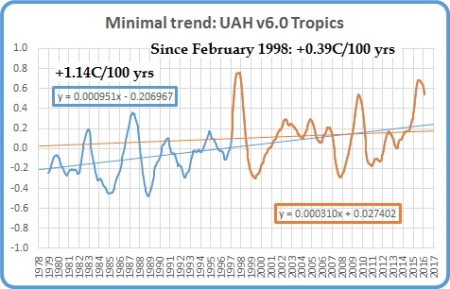
The Pause in the Tropics (20N to 20S) has ended and the minimal trend is now +.39C/ 100 years. 12 month means are dropping fast.

As Tropical Oceans closely mimic the Tropics overall, I won’t show their plot.

Northern Extra Tropics:

pause-jan17-next

The minimal trend is up to +0.64C/ 100 years= that’s one degree less than the whole trend.

Northern Temperate Region:

pause-jan17-ntemp

Using estimates calculated from North Polar and Northern Extra-Tropics data, while the trend since June 1998 of +0.28 +/- 0.1C per 100 years is more than my criterion for a Pause, it is 1.2C less than the trend for the whole period. The slowdown is obvious, and for Land areas the trend is zero.

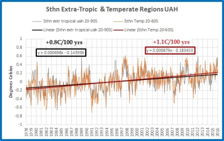
Southern Extra Tropics:

pause-jan17-sext

The Pause persists strongly, however 12 month means are still rising, and the Pause may shorten or even disappear.

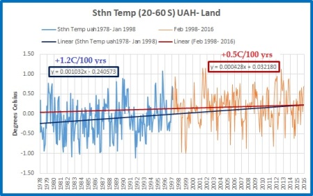
Southern Temperate Region:

pause-jan17-stemp

Using estimates calculated from South Polar and Southern Extra-Tropics data, the Pause is shorter than for Southern Extra-Tropics.

Northern Polar:

pause-jan17-np

The trend has increased rapidly and will continue to do so even though 12 month means have started to fall.

Southern Polar:

pause-jan17-sp

The South Polar region has been cooling for the entire record. With 12 month means still rising, this cooling trend will slow over the next few months.

USA 49 States:

pause-jan17-usa49

The Pause has ended- just. It will not re-appear for some time.

Australia:

pause-jan17-oz

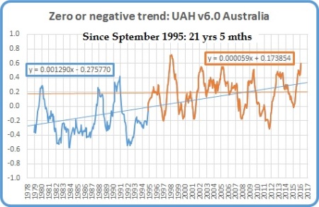
The Pause is still 21 years 5 months. Heat in recent weeks may push the 12 month mean higher and shorten the Pause. (September, oops!)

The next graphs summarise the above plots. First, a graph of the relative length of The Pause in the various regions:

pause-length-jan17

Note that the Pause has ended by my criteria in all regions of Northern Hemisphere, and consequently the Globe, and the Tropics, but all southern regions have a Pause for over half the record, including the South Polar region which has been cooling for the whole record. Note that the Tropic influence has been enough to end the Pause for the Southern Hemisphere.

The variation in the linear trend for the whole record, 1978 to the present:

trend-78-jan-17

Note the decrease in trends from North Polar to South Polar.

And the variation in the linear trend since June 1998, which is about halfway between the global low point of December 1997 and the peak in December 1998:

trend-98-jan-17

The imbalance between the two hemispheres is obvious. The lower troposphere over Australia has been strongly cooling for more than 18 years- just shy of half the record.
The Pause has disappeared from the USA and Southern Hemisphere, but not the Southern Extra-Tropics, South Temperate, and South Polar regions, or Australia. El Nino tropical heat is rapidly decreasing, with all northern means falling, but will continue to affect the Southern Hemisphere in coming months.  Global TLT anomalies are now dropping rapidly. The next few months will be interesting.

Another ABC Fail

February 5, 2017

Viewers of ABC-TV news, and followers of ABC News Online, were treated to a story on Friday night about “Turtle hatchlings dying in extreme heat at Mon Repos”, as it was headlined at ABC News Online:

Piles of dead turtle hatchlings are lining Queensland’s famous Mon Repos beach amid a heatwave which has pushed the sand’s temperature to a record 75 degrees Celsius.

While the majority of hatchlings break free from their nests at night when the sand is cooler, those escaping in the day face overheating.

“They can’t sweat, they can’t pant, so they’ve got no mechanism for cooling,” Department of Environment and Heritage Protection chief scientist Dr Col Limpus said.

….

The extreme heat is also conducted down to the turtle’s nest, pushing the temperature to about 34C, which is approaching the lethal level for incubation.

That is the hottest temperature recorded in a nest in more than a decade.

A record 75 degrees sand temperature? Hottest nest temperature in more than a decade?

Time for a reality check.

I have no data on temperatures inside turtle nests, but I do have data on temperature at nearby Bundaberg Aero (Hinkler Airport), which is an ACORN site.

Using monthly Acorn data, here is a plot of all January maxima at Bundy.

bundy-jan-max

January’s mean maximum of 31.6 degrees C was equalled or exceeded in 1924, 1931, 1969, 1998, 2002, 2006, 2013, and 2014.  While monthly mean doesn’t tell us about individual days, it does give us a clue about daily temperatures in hot years.  For that I also use ACORN daily data- adjusted, homogenised, and world’s best practice apparently.

How do temperatures at this time of year compare with those of previous years?  The next figures show data for the first 45 days of every year, that is from January 1 to February 14.

bundy-jan-max-daily-45

The past three weeks at Bundaberg have been at the high end of the range, but no records have been broken, and no days have been even close to 35C.  What about previous years?  The next plot shows the number of consecutive days above 35 degrees: very likely to raise sand temperature above what it has been this year.

bundy-jan-max-daily-45-over-35

No days this year above 35C, but at least 27 occasions in previous years of single days reaching 35C, at least 6 of 2 days in a row, and one of 3 days in a row above 35C.

A 7 day running mean will show whether temperatures have been consistently high.

bundy-jan-max-7d-av-45

As you can see 2017 is high but not extreme.  2002 had a 7 day average just under 35C.

This graph plots temperatures of the first 45 days of years with similarly hot January temperatures.  2017 is the thick black line.

bundy-jan-max-daily-45-hot-yrs

On one day- January 20- 2017 was hotter than the other years.  Note how in several years the temperature drops to the mid 20s when heavy rain falls.  Note also the temperature reached the high 30s in February 2002.

The final graph shows the 7 day average of the same period of similarly hot years.

bundy-jan-max-7d-av-45-hot-yrs

Several previous periods were hotter than so far this year.

Once again we see misleading claims being made and reported by the ABC as gospel, without any attempt at fact checking.  A simple check shows that, while it may be true that the reported temperatures are the hottest recorded by these researchers, it is extremely unlikely that these were as high as they were in past years.  On every count- daily, monthly mean, 7 day mean, consecutive hot days- it can be shown that this year, while hot, is not as hot as many previously, and it follows that sand temperatures would similarly have been hotter in the past.

And that’s without considering the Holocene Optimum and the Eemian.

Another ABC fail.

Dig and Delve Part III: Temperate Regions

February 1, 2017

In this post I draw together ideas developed in previous posts- Poles Apart, Pause Updates, Dig and Delve Parts I and II– in which I lamented the lack of tropospheric data for the regions of the northern and southern hemispheres from 20 to 60 degrees North and South.  These regions between the Tropics and Polar regions I shall call Temperate regions, as that’s what I was taught in school.

A commenter of long standing, MikeR, who has always endeavoured to keep me on the straight and narrow, suggested a method of estimating temperature data for these regions using existing Polar and Extra-Tropical data.  I’ve finally got around to checking, and can now present the results.

The correct formula is:

T (20 to 60 degrees) = 1.256 x TexT ( 20 to 90 degrees) – 0.256 X T pole(60 to 90 degrees).

This gives an approximation for these regions in lieu of UAH data specifically for them.

And the results are very, very interesting.  Hello again, Pause.

All data are from the University of Alabama (Huntsville) (UAH) lower troposphere, V.6.0.

First of all, here are plots showing the Extra-Tropics (20-90), compared with  the corresponding Temperate regions (20-60).

Fig. 1:  Monthly UAH data for Northern Extra-Tropics (20-90N) and Estimate for Northern Temperate Region (20-60N)

 nth-temp-v-next

Fig. 2:  Monthly UAH data for Southern Extra-Tropics (20-90S) and Estimate for Southern Temperate Region (20-60S)

sth-temp-v-sext

As expected, the result of very slight differences is a slight cooling of the Northern Extra Tropics trend, and a slight warming for the Southern.   No surprise there.

The real surprise is in the Land and Ocean data.  In the Northern Temperate region, CuSum analysis reveals a large regime change which occurred at the beginning of 1998.  The following plots show trends in the data up to January 1998 and from February 1998 to December 2016.

Fig. 3: Estimated Northern Temperate data trends to January 1998 and from February 1998 to December 2016.

nth-temp-2-trends

Fig. 4: Estimated Northern Temperate data trends to January 1998 and from February 1998 to December 2016: Ocean areas.

nth-temp-2-trends-ocean

Fig. 5: Estimated Northern Temperate data trends to January 1998 and from February 1998 to December 2016: Land areas.

nth-temp-2-trends-land

Say hello to the Pause again.  Northern Temperate land areas- most of North America, Asia, Europe, and North Africa, containing the bulk of the world’s population, agriculture, industry, and CO2 emissions- has had zero trend for 18 years and 11 months.  While the trend for the whole record is +1.8C per 100 years, the record is clearly made of two halves, the first with a much milder +0.7C trend, then after an abrupt step change, the second half is flat- in spite of the “super El Nino” and the “hottest year ever”.

Compare this with the Extra-Tropics data, 20-90N.

Fig. 6: Northern Extra-Tropics data (20-90N) trends to January 1998 and from February 1998 to December 2016: Land areas.

next-land-2-trends

The step change is still there, but the trends are virtually unchanged- only 0.1C different +/- 0.1C.

Why the difference?  Northern Extra Tropics data (20-90N) includes the North Polar data (60-90N).  The major change in the North Polar region occurred in early 1995, as the next two figures show:

Fig. 7: Northern Polar data (60-90N) trends to February 1995 and from March 1995 to December 2016: Land areas.

np-land-2-trends

Fig. 8: Northern Polar data (60-90N) trends to February 1995 and from March 1995 to December 2016: Ocean areas.

np-ocean-2-trends

Massive changes in trend.  Note the change apparently occurred in land data before ocean, which is peculiar, and both in the dead of winter.  Polar regions, though much smaller, have a large impact on trends for the Extra-Tropics.

In the Southern part of the globe, once again say hello to the Pause.

Fig. 9: Estimated Southern Temperate data trends to January 1998 and from February 1998 to December 2016.

sth-temp-2-trends

While the step change is much smaller, using the same dates the Pause is still undeniable.

Fig. 10: Estimated Southern Temperate data trends to January 1998 and from February 1998 to December 2016- Land areas.

sth-temp-2-trends-land

Fig. 11: Estimated Southern Temperate data trends to January 1998 and from February 1998 to December 2016- Ocean areas.

sth-temp-2-trends-ocean

Most of the Southern Hemisphere is ocean, so it follows that a Pause in the ocean leads to a Pause overall.

It is important to stress that the figures I show for Northern and Southern Temperate regions are estimates, not actual data from UAH.  However, they are pretty good estimates, and until we have data from UAH, the best available.

Of the world’s regions, South Polar and Southern Temperate regions are paused, as is the Northern Temperate Land region, which is arguably the most important.  The Tropics fluctuate with ENSO.  Only the Arctic is strongly warming.

The Temperate regions are arguably the most important of the globe.  Together they cover more than half the surface area, and contain the bulk of the world’s population, agriculture, industry, and emissions.  I hope that Dr Spencer will be able to provide datasets for these regions as soon as possible.