Archive for the ‘adjustments’ Category

More Problems With Australia’s Temperature Record: Part 3

April 13, 2022

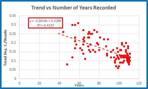
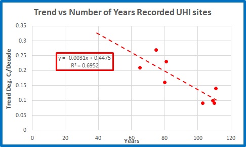
We have seen in Parts 1 and 2 that every extra year of annual data can decrease the temperature trend at a weather station by from -0.02 to -0.03℃ per decade, and that less than half (47% actually) of Australia’s weather stations used for climate analysis have data from 1910, and three of them have insufficient data to calculate trends.

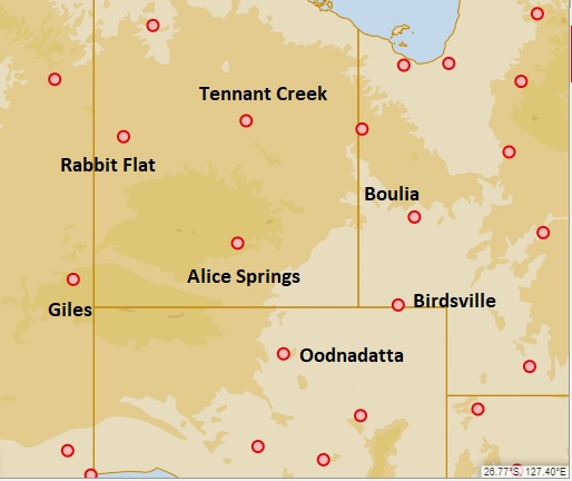
Figure 1 shows a map of non-urban Acorn stations with enough data to calculate trends, at 1910.  The others I have blanked out.

Figure 1: Acorn stations with data for 1910

The network is very sparse.  To estimate a national temperature for 1910 enormous weighting must be given to the values of a few remote stations like Alice Springs, Boulia and Kalgoorlie, so we hope they got the adjustments right!  Unfortunately, in 2015 I found adjustments at Kalgoorlie and Alice Springs were very problemmatic.

The Bureau explains the process of calculating average temperatures here.

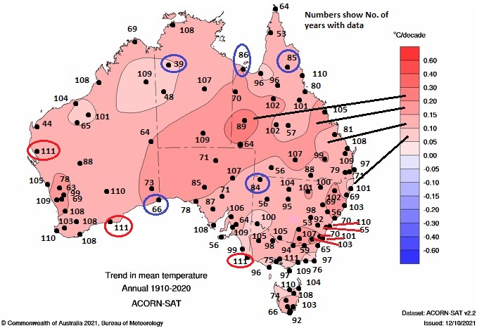
Figure 2 shows the BOM map of trends from 1910 to 2020:

Figure 2:  Australian Tmean trends 1910-2020

Note that there a few “bullseyes” which surround stations whose temperature trends are out of phase with areas around them- e.g. Boulia is warmer, Marble Bar is cooler. 

Now here is a paradox.  As the years go by and more stations have data available, the area weighting for each station will decrease, however trends at the newer stations will show increased warming compared with the older ones.  However they will also have more variability.  This will result in oddities as I shall show, and reveals something of the difficulties with the BOM methods.

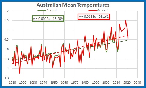
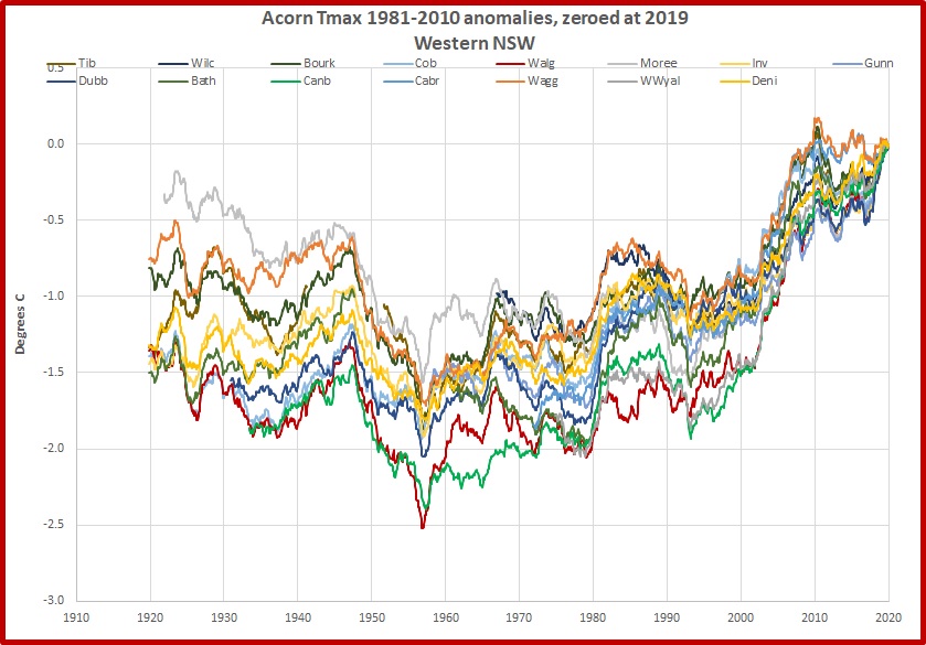
 Figure 2 is a plot of mean temperature from 1970 to 2020.

Figure 2:  Australian Tmean 1970-2020

The Acorn 2 trend is now +0.23℃ per decade or +2.3℃ per 100 years- a full degree more than the trend from 1910.

Now let’s look at the trend map for 1970 to2020:

Figure 3:  Australian Tmean trends 1970-2020

Note the little “bullseye” around Victoria River Downs, the little “balloon” around Halls Creek to the south-west of VRD, and the little surge to the south-southwest of VRD of 0.05 to 0.1℃ per decade.  Note also that north-eastern Arnhem Land, with no stations, has a warmer pocket.  Figure 4 is the BOM data for VRD.

Figure 4: Annual mean temperature at Victoria River Downs

VRD opened in 1965 and has too much data missing for BOM to calculate a trend.  The area weighting algorithm still gives it a cooling trend of between minus 0.05 and 0℃ per decade (Figure 3).  Que?

With more than 27% of data missing I wouldn’t calculate a trend either, but with only six of 43 years missing I can calculate a trend from 1978:

Figure 5: Annual mean temperature at Victoria River Downs

The trend is -0.09℃ per decade, which is a bit more cooling than the trend map (Figure 3) shows.  Now let’s look at trends from 1980 to 2020.

Figure 6:  Australian Tmean trends 1980-2020

There are more bullseyes, and I have shown temperature trends for some- Carnarvon, Meekatharra, Forrest, Thargomindah, and Gayndah.  But remember Figure 3’s little surge to the SSW?   It now has its own bullseye, and that is Rabbit Flat.

Figure 7: Annual mean temperature at Rabbit Flat

Rabbit Flat opened in 1970 and has a trend of +0.08℃ per decade, which agrees with the trend map in Figure 3.  Now from 1980:

Figure 8: Annual mean temperature at Rabbit Flat

What a difference a few years make in a short timeseries.  The trend of -0.06℃ per decade also agrees with the 1980-2020 trend map.

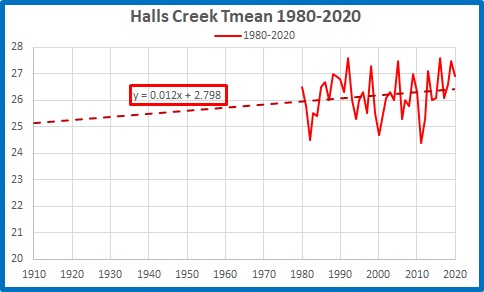
However, just 328km away Halls Creek shows a warming trend of +0.17C per decade from 1980 – 2020:

Figure 9: Annual mean temperature at Halls Creek 1980-2020

But from 1970 to 2020 Halls Ck is warmer still at +0.19C per decade:

Figure 10: Annual mean temperature at Halls Creek 1970-2020

And at Tennant Creek 441km away the 1970-2020 trend is +0.19C per decade:

Figure 11: Annual mean temperature at Tennant Creek 1970-2020

From 1980 it is +0.06C per decade.

Figure 12: Annual mean temperature at Tennant Creek 1980-2020

Temperatures are trending in different directions and wildly different rates at the closest stations: they can’t all be right!

The method of drawing trend maps is to use anomalies of temperatures of all years of all stations whether or not an individual trend can be calculated, then calculate a gridded average, and from that calculate trends, then spread those trends hundreds of kilometres in every direction- even across the Gulf of Carpentaria from Horn Island to Arnhem Land, as seen in Figures 3 and 6- averaged with the trends propagated by other stations.  If a site has data missing, the grid is infilled with the weighted data from other sites.  

In recent decades this causes great variability because of the short records, which leads to grave doubts about the reliability of some records.  Further back in time, there is less variability because there are more stations, and the longer records smooth and decrease the trends- however the weighting has to be much greater because of the large areas with no data at all for many years. 

The problem is: we can have either a long record, or an accurate record, but not both.

This leads to the obvious conclusion:

The official temperature record since 1910 is just a guesstimate.

More Problems With Australia’s Temperature Record: Part 2

April 10, 2022

My colleague Chris Gillham at WAClimate uses 58 long term weather stations for his analyses.

And with good reason.  Here’s why.

Figure 1 is a screenshot of the annual mean temperature record at a typical Acorn station, Longreach (Qld) with the linear trend shown.

Figure 1: Annual mean temperature at Longreach

The linear trend is +0.12℃ per decade.  Nine (9) of the 111 years of data from 1910 to 2020 are missing, leaving 102 years.

Australia’s official climate record is based on 112 sites like Longreach.  Of those, 8 are not used for seasonal and annual analyses because they are affected by Urban Heat Island (UHI) effect.  Five (5) of the non-urban stations have more than 20% of their data missing, so the BOM does not calculate trends for them. Of those remaining, only 50 started in 1910, and another 8 before 1915.  What is the effect of different length records on our understanding of how temperatures have changed over the years?

Figure 2 is a plot of the trends of mean temperatures per decade as a factor of the number of years of annual temperature data on record at those 107 Acorn stations with enough data to calculate trends.

Figure 2:  Trend as a factor of amount of data

Stations with  longer data records have lower trends.  The trends at stations with shorter records vary wildly, with some obvious outliers. 

At those stations with UHI effect, the relationship is even stronger.

Figure 3:  Trend as a factor of amount of data at sites with UHI

These sites are in larger towns and cities, possibly with better maintenance and observation practices (although not necessarily better siting).

The slope of the trendlines in the above two figures show that for every additional year of data, temperature trend decreases by about -0.02 to -0.03℃ per decade. In 100 years that could make a difference of as much as three degrees Celsius 0.3C at a well maintained site.

Figure 4 is a map of trends across Australia from 1910 to 2020.  I have shown the years of available data at each site (locations only approximate) and I have circled in blue those 5 sites that have insufficient data.

 Figure 4:  Years of data contributing to 1910 to 2020 trend map

Trends in different regions vary from less than 0.1C per decade to up to 0.3C per decade.  As you can see there is a large variation in the amount of available data in each different coloured band.  That’s for 1910 to 2020.  Note that there are only three (3) non-urban stations with no missing years- Carnarvon, Esperance, and Mt Gambier- which I have circled in red.  There are some big gaps.

In Part 3 I will look at some individual stations and how trends vary in the 51 years from 1970 to 2020.

More Problems With Australia’s Temperature Record: Part 1

April 8, 2022

Since 2010 I have been documenting problems with different versions of Australia’s official temperature record as produced by the Bureau of Meteorology (BOM).  Since the High Quality (HQ) dataset was quietly withdrawn in 2012 we have seen regularly updated versions of the Australian Climate Observation Reference Network- Surface Air Temperature (ACORN-SAT or Acorn).  We are now up to Version 2.2.  In this Part I shall show the effect of these changes on temperature trends.  In Part 2 I will show how record length affects trends, and in Part 3 I will look at the record since 1970 at some individual stations.

Figure 1 is from the BOM Climate Change Time Series page.

Figure 1:  Australian Official Temperature Record 1910 to 2021

The linear trend is shown as +0.13℃ per decade, or 1.3C per 100 years.  My colleague Chris Gillham of WAClimate has provided me with archived Acorn 1 annual mean temperature data to 2013 which allows this comparison:

Figure 2:  TMean: Acorn 1 and Acorn 2

The result of introducing Acorn 2 has been a much steeper trend:  Acorn 1 trend to 2013 was 0.9℃ per decade.  The trend has now become 0.13℃ per decade. (The extra 9 years have added an extra 0.017C per decade to the trend.)

Figure 3 shows when and how large the changes were:

Figure 3:  Difference between Acorn 1 and Acorn 2

Acorn2 is cooler than Acorn 1 before 1971 and warmer in all but three years since.  Since these were based on the same raw temperatures (with some small additions of digitised data and a couple of changes to stations) the changes were brought about entirely by adjustments to the data.

I calculated running trends from every year to 2013 for both datasets.  As trends shorter than 30 years become less reliable I truncated the running trends at 1984.  Figure 4 compares thre trends to 2013 of Acorn 1 and Acorn 2.

Figure 4:  Acorn 1 and Acorn 2 running trends per decade to 2013

The weather fluctuations of the mid-1970s to 1980s played havoc with trends.

Figure 5 shows the difference between the trends.

Figure 5:  Difference between Acorn 1 and Acorn 2 Trends

The difference ranges from +0.024C per decade for 1910 to 2013, to +0.039C for 1950 to 2013.  Having increased warming by from 0.25C to 0.4C per 100 years (just by making different adjustments) Acorn 2’s trend is much more alarming than Acorn 1’s.

Conclusion:

This is from the BOM’s explanation for Acorn:  

“A panel of world-leading experts convened in Melbourne in 2011 to review the methods used in developing the dataset. It ranked the Bureau’s procedures and data analysis as amongst the best in the world. ‘The Panel is convinced that, as the world’s first national-scale homogenised dataset of daily temperatures, the ACORNSAT dataset will be of great national and international value. We encourage the Bureau to consider the dataset an important long-term national asset.’” ACORN-SAT International Peer Review Panel Report, 2011.

 Acorn 1.0 was apparently such an important long-term asset that it was quickly superseded by Acorn 2 with a much more alarming trend.

Diurnal Temperature Range and the Australian Temperature Record: More Evidence

January 19, 2022

In an earlier post, I demonstrated through analysing Diurnal Temperature Range (DTR) that the Bureau of Meteorology is either incompetent or has knowingly allowed inaccurate data to garble the record.

A couple of readers suggested avenues for deeper analysis. 

Siliggy asked, “Is the exaggerated difference now caused by the deletion of old hot maximums and or whole old long warmer records?”

Graeme No. 3 asked, “Is there any way of extracting seasonal figures from this composition?”

This post seeks to answer both, and the short answer is “Yes”.

Using BOM Time Series data (from the thoroughly adjusted Acorn dataset) I have looked at data for Spring, Summer, Autumn, and Winter (although those seasons lose their meaning the further north you go).

DTR is very much governed by rainfall differences as shown by this plot.

Figure 1:  Winter DTR anomalies plotted against rainfall anomalies- all years 1910-2020

This shows that in winter DTR decreases with increasing rainfall.  The R squared value of 0.79 means that for the whole period, rainfall explained DTR 79% of the time on average.  However, the average conceals the long term changes in the relationship.

To show this, I simply calculated running 10 year correlations between DTR and Rainfall anomalies for each season, and squared these to show the “R squared” value.  This is a good rule of thumb indicator for how well DTR matches rainfall over 10 year periods.  A value of 0.5 indicates only half of the DTR for that decade can be explained by rainfall alone.  As you will see in the following figures, there are plenty of 10 year periods when the relationship was 0.9 or better, meaning it is ideally possible for 90% of DTR variation to be explained by rainfall.  Here are the results.

Figure 2:  Spring Running R-squared values: DTR vs Rain

There was a good relationship before 1930.  In the decades from then to the mid-1970s it was much worse, and very poor in the decade to 1946. It was poor again in the decade to 2001, and the 10 years to 2020 shows another smaller dip, showing something not quite right with 2020.

Figure 3: Summer Running R-squared values: DTR vs Rain

Summer values were very poor before the 1960s, especially the decades to 1944 and 1961, and dipped again in the 1990s.

Figure 4:  Autumn Running R-squared values: DTR vs Rain

The DTR/Rain relationship was very poor in the decades to 1928, and again before 2001.  The recent decade has also been poor- less than half of DTR to 2020 can be explained by rainfall.

Figure 5:  Winter Running R-squared values: DTR vs Rain

The DTR/rainfall relationship was fairly good, apart from two short episodes, until the 1990s.

I now turn to the northern half of the continent.

A large area of Northern Australia is dominated by just two seasons, wet and dry.  Here is the plot of northern DTR vs Rain for the wet season (October to April).

Figure 6:  Northern Australia Wet Season Running R-squared values: DTR vs Rain

Apart from the 1950s, the late 1970s-early 1980s, and 1998 to 2020, the DTR : Rainfall relationship is very poor, with a long period in the 1930s and 1940s in which rainfall explains less than half of DTR variation (only 13% in the decade to 1943). 

Because the northern half of Australia accounts for the bulk of Australian rainfall, and the wet season is from October to April, this perhaps explains the problems in spring, summer, and autumn for the whole country.

We can get some clues as to the reasons by comparing long term average maximum temperatures with inverted rain (as wet years are cool and dry years are warm).

Figure 7:  Northern Australia Wet Season Decadal Maxima and Rain

The divergence before 1972 and after 2001 is obvious.

The above plots show how poorly DTR (and therefore temperature, from which it is derived) has matched rainfall over the past 111 years.  Low correlations indicate something other than rainfall was influencing temperatures.

In reply to Siliggy, who asked “Is the exaggerated difference now caused by the deletion of old hot maximums and or whole old long warmer records?” the answer appears to be: both, however Figure 7 shows old temperatures (before 1972) appear incorrect, but recent temperatures are at fault too.

The mismatch shows that the Acorn temperature record is not to be trusted as an indicator of past temperatures- and even recent ones.

How Accurate Is Australia’s Temperature Record? Part 3

March 17, 2021

In previous posts (here and here) I have shown how maximum temperatures (Tmax) as recorded by ACORN-SAT (Australian Climate Observations Reference Network- Surface Air Temperature- ‘Acorn’ for short) have diverged from other measures of climate change, in particular, rainfall.

I’ll continue looking at the Tmax ~ Rainfall relationship, and show how the Bureau of Meteorology (BOM) must never have used it as a quality control measure for temperature recording.  Result: garbage.

Tmax is negatively correlated with rainfall.  Wet years are cooler, dry years are warmer.  If the incoming solar radiation, the landscape and the measuring sites remain the same, over a number of years this physical relationship remains constant.  What is true of rainfall and temperature in my lifetime was also true in my grandfather’s lifetime, and will still be true in my grandchildren’s lifetime.  If the relationship appears to vary, it must be as a result of some other cause, such as:

changes in solar radiation;

changes in the landscape (urban development, tree clearing, irrigation);

changes in the weather station sites (movement to new sites, tree growth, proximity to heat sources,  buildings, or areas of pavement, change of screen size);

changes in measuring equipment or methods (electronic probes instead of mercury in glass, time of observation, recording in Celsius instead of Fahrenheit, millimetres instead of inches); or

changes in the recorded data (wrong dates applied, or adjustments).

Solar exposure has not changed (and it would be a huge problem for Global Warming Enthusiasts and the whole Climate Change industry if it had).  Across Australia, urban development is a minuscule fraction of land area; tree clearing and irrigation have affected a larger area in several regions, but the vast arid interior remains largely unchanged.  We do know however that weather station sites, observation methods, and equipment have changed, and temperature data (and to a much smaller extent, rainfall data) have been “homogenized” in an attempt to correct for these changes.

The 1961 – 1990 Tmax ~ rainfall relationship

The Bureau of Meteorology uses the period from 1961 to 1990 as the baseline for calculating temperature and rainfall means and anomalies.  Figure 1 shows the relationship between Tmax and Rainfall for all years from 1961 to 1990.  I am using BOM data from their Climate Change Time Series page.

Fig. 1:  Annual Tmax plotted against Rainfall, 1961 – 1990

The x-axis represents rainfall, the y-axis represents maximum temperatures.  The trendline is marked, showing Tmax decreases with rainfall. 

In the top left is the trendline label, showing the value for Tmax (y) for the any value of rainfall (x).   I have magnified this in Figure 2.

Fig. 2:  Trendline label, Tmax vs Rain 1961-90

Circled in red is the slope of the trendline (-0.0029:  there is an inverse relationship, with temperature decreasing 0.0029 of a degree Celsius for every extra millimeter of rain). 

Circled in green is the intercept (+29.9476: if rainfall was zero, the trendline would intercept the y-axis at 29.9476 degrees). 

Circled in blue is the R-squared value (0.3744: R^2 indicates how well Tmax and rainfall match, 0 being not at all and 1 being perfectly.  This value indicates a correlation of about -0.61.  Another way of thinking about it is that 37% of Tmax is explained by rainfall.)

Now this is important: the relationship shown in the trendline label should be similar for the whole record, or else something other than the climate has changed.

I will now show how we can use the information in Figure 1 to test the accuracy of Tmax data in three separate ways.

Comparison of Acorn Tmax with theoretical values derived from rainfall.

Using the trendline equation (Tmax = -0.0029 x Rain + 29.9476) we can calculate an estimate of Tmax from rainfall in any given year.  Figure 3 shows the result.

Fig. 3:  1910 – 2020 Acorn Tmax and Theoretical Tmax calculated from rainfall

For most of the 1961-90 period there is a fair match (37%, remember).  Before the mid-1950s Tmax is mostly lower than the rainfall derived estimate, and after 1990 is nearly always very much higher than we would expect for the rainfall. 

A plot of annual differences between Acorn Tmax and Theoretical Tmax (the residuals if you like), the Tmax variation that is not explained by rainfall, shows how much they differ.

Fig. 4:  Annual Differences: Acorn Tmax minus Theoretical Tmax

We would expect some random differences, but not that much and not strongly trending up.

Correlation between Tmax and rain over time

The next figure shows the “goodness of fit” between Tmax and Rainfall from any given year to 2020.  (The plotline stops at 2010 as correlation fluctuates too much with only a few datapoints.)

Fig. 5:  Running R-squared values of Tmax vs Rain for all years to 2010, from any given year to 2020

The relationship plainly changes (and improves) with time. From 1998 to 2020 there is a good correlation between Tmax and rainfall: before this it is woeful. 

The next figure shows running 21 year calculations of R-squared ‘goodness of fit’ between annual maxima and rainfall, and is included for your entertainment. 

Fig. 6:  Centred running 21 year R-squared values of Tmax vs Rainfall

In 1989, the 21 year period from 1979 to 1999 has a correlation between Tmax and Rain of -0.35: less than 12 % of temperature change is explained by rainfall.  20 years later, the value for 1999 to 2019 is -0.9, or 81% of Tmax explained by rainfall.  That amount of difference is farcical.

Moreover, recent data shows a completely different Tmax~Rain relationship from Figure 1. 

Which brings me to the third point.

Change in Tmax ~ Rainfall relationship over time

From the trendline equation in Figure 2, the Tmax ~ Rainfall relationship may be calculated as

(Tmax – intercept)/ Rainfall.   The value for 1961-90 is -0.29C per 100mm.

This plot of the 21 year moving average shows how much this changes.

Fig. 7:  21 Year Centred Running Average of ((Tmax – intercept)/Rainfall) x 100

The expected value of -0.29C/ 100mm is reached from 1973 to 1976, in the middle of the 1961 – 1990 period, as expected.  Based on the 1961-1990 trendline equation, over the last 21 years 100mm of rain reduces Tmax by one tenth of a degree Celsius (and if we extrapolate- not a good idea- that figure will approach zero in about 10 years’ time).   100 years ago that same 100mm of rain would have reduced Tmax by 0.38 degrees.  Why has rain lost its power?

Conclusion

Three plots of the Tmax ~ Rainfall relationship- Figures 4, 5, and 7- show a similar pattern of change in the difference between recorded and theoretical Tmax, the correlation between Tmax and rainfall, and the Tmax ~ Rainfall equation. 

Why has rain lost its power?  It hasn’t- Tmax has become relatively too high.  Historical maximum temperatures as reported in Acorn are not just inaccurate but deeply flawed. 

The Acorn dataset is garbage.

How Accurate Is Australia’s Temperature Record? Part 2

January 19, 2021

In my last post I showed that Australia wide the Tmax ~ rainfall relationship has remained constant for the past 110 years (as it should) but Tmax reported in the Acorn dataset has increased by more than 1.5 degrees Celsius relative to rainfall.  Consequently, the ACORN-SAT temperature dataset is an unreliable record of Australia’s maximum temperatures.

Of course there are other aspects of climate besides rainfall.   In this post I will compare annual ACORN-SAT Tmax data with:

Rainfall

Sea Surface Temperatures (SST)

The Southern Annular Mode (SAM)

Cloudiness

Evaporation

all for the Australian region.

I have sourced all data from the Bureau of Meteorology’s Climate time Series pages

except for SAM data from Marshall, Gareth & National Center for Atmospheric Research Staff (Eds). Last modified 19 Mar 2018. “The Climate Data Guide: Marshall Southern Annular Mode (SAM) Index (Station-based).” 

Tmax, Rainfall, and SST data are from 1910; SAM and Daytime Cloud from 1957, and Pan Evaporation from 1975.  Cloud observations apparently ceased after 2014, and Evaporation after 2017, possibly because of staffing cuts.

Because Pan Evaporation data are only available from 1975 and are reported as anomalies from 1975 to 2004 means, I have recalculated Tmax, Rainfall, SST, SAM, and Daytime Cloud anomalies for the same period so all data are directly comparable.

As in the previous post, I have calculated decadal averages for all indicators to show broad long term climate changes.  Decadal averages show how indicators perform over longer periods.  Each point in the figures below shows the average of the 10 years to that point.  This can then indicate times of sudden shifts or questionable data. (For example in Figure 1 SAM (the green line) makes a sudden jump in 2015.  Was this a climate shift or a data problem?)

Figure 1 shows the 10 year means for all climate indicators.  I have scaled Rain and SST to match Tmax at 2019, Cloud and SAM to match Tmax at 1966, and Evaporation to match Tmax in 1984.  Rain and Cloud are inverted as they have an inverse relationship with temperature.

Figure 1:  10 Year Means of Climate Indicators

Tmax has stayed close to SST until 2001.  Clearly Tmax has increased far more than any of the others, especially since 2001.

The next plots show the difference between decadal averages of Tmax and the other indicators.  Zero difference means an excellent relationship with Tmax.

Figure 2:  Difference: 10 Year Means of Tmax minus Rain and SSTs.

Starting from 1919 (zero difference), Rainfall is close to Tmax until 1957, after which Tmax takes off until it is 1.6 degrees Celsius greater than expected in the 10 years to 2020.  Tmax diverges from SST values in 2001 and in 2020 is 0.7 degrees greater than expected.

In Figure 3, Rain, SST, SAM, and Cloudiness are scaled to match Tmax at 1966.

Figure 3:  Difference: 10 Year Means of Tmax minus Rain, SST, SAM, and Cloud

Figure 3 shows how closely Rain and Cloud are related: differences from Tmax are almost identical.  Compared with 1966, Tmax is 1.3 degrees more than rainfall would suggest in the 10 years to 2020.  SST and the SAM index are less different from Tmax but Tmax divergence is still clear.  You may notice that Tmax differences from all climate indicators seem to change at similar times, apart from SAM in 2015.

In Figure 4, all indicators are scaled to match Tmax at 1984.

Figure 4:  Difference: 10 Year Means of Tmax minus Rain, SST, SAM, Cloud and Evaporation

Differences increase rapidly after 2001, so in Figure 5 indicators match Tmax at 2001.

Figure 5:  Difference: 10 Year Means of Tmax minus Rain, SST, SAM, Cloud and Evaporation

There appears to be a problem with SAM in 2015, and it’s a shame that the BOM have discontinued Cloud and Evaporation observations.  In the last 20 years, it is obvious that Tmax has diverged from other indicators.

Conclusion:

All factors- Rainfall, SAM, SST, Clouds, and Pan Evaporation- point to a clear divergence of temperature nationwide, especially in the last 20 years.  In other words, ACORN-SAT, our official record of temperatures, is unreliable.

How Accurate Is Australia’s Temperature Record? Part 1

January 7, 2021

In my last post I showed that maximum temperature (Tmax) as reported by ACORN-SAT (Australian Climate Observations Reference Network-Surface Air Temperature) appears to be responsible for the growing divergence of the difference between Tmax and tropospheric temperatures from Australia’s rainfall.

In this post I show how Tmax is related to rainfall, and show that while this relationship holds for discrete periods throughout the last 110 years, Tmax has apparently diverged from what we would expect.  In other words, the Acorn Tmax record is faulty and unreliable.

For much of this analysis I am indebted to Dr Bill Johnston who has posted a number of papers at Bomwatch using the relationship between Tmax and rainfall.

At any land based location annual maximum temperature varies with rainfall: wet years are cooler, dry years are warmer.  More rainfall (with accompanying clouds that reflect solar radiation) brings cooler air to the ground; provides more moisture in the air, streams, waterholes, and the soil which cools by evaporation; causes vegetation to grow, the extra vegetation shading the ground and retaining moisture, with transpiration providing further cooling; and in moist conditions deep convective overturning moves vast amounts of water and heat high into the troposphere- especially evident in thunderstorms.  Less rainfall means the opposite: more solar radiation reaches the ground with fewer clouds and less vegetation; there is less moisture available to evaporate; less vegetation growth and transpiration; and much less heat is transferred to the troposphere through convective overturning.

While more rainfall than the landscape can hold results in runoff in rivers and streams, thus removing some moisture from the immediate area, this affects large regions only in tropical coastal catchments- the Kimberleys, the Gulf rivers, the Burdekin and Fitzroy.  Across the bulk of Australia there is very little discharge of water to the oceans.  In the Murray-Darling Basin, on average less than 0.005% of rainfall is discharged from the Murray mouth. (BOM rainfall data and 1891-1985 discharge data from Simpson et al (1993))

This temperature ~ rainfall relationship is particularly evident in desert areas far from any marine influence.  Alice Springs provides a good example.  Figure 1 shows how annual maximum temperatures at Alice Springs Airport vary with rainfall since 1997.  Data are from ACORN.

Fig. 1: Tmax and Rainfall, Alice Springs

The slope of the trend line shows that for every extra millimetre of rain, Tmax falls by 0.0047 of a degree Celsius, which is about half a degree less for every 100 mm.  The R-squared value shows that there is a good fit for the data- 79% of temperature change is due to rainfall.

I said above that this relationship holds for land locations.  An island, with a little land surrounded by water, is mostly affected by sea temperature and wind direction.  Locations near the coast are also affected by marine influence.  At Amberley in south-east Queensland daily maximum temperature can be moderated by the time of arrival of a sea breeze or whether it arrives at all.  (Site changes also can change Tmax recorded.)

Fig. 2: Tmax and Rainfall, Amberley

Further inland, the relationship is strong: at Bathurst, there is 0.4C temperature variation per 100mm of rainfall and 61% of temperature change is due to rainfall alone.

Fig. 3: Tmax and Rainfall, Bathurst

The BOM has sophisticated algorithms for area averaging temperature and rainfall across Australia and provide national climate records back to 1900 for rainfall and 1910 for maxima.  Averaged across Australia individual station idiosyncrasies are submerged so that the 1997 to 2019 relationship between Tmax and rainfall is very strong (and similar to that of Alice Springs):

Fig. 4: Tmax and Rainfall, Australia 1997-2019

However, the relationship is not strong throughout the whole record:

Fig. 5: Tmax and Rainfall, Australia 1910-2019

The relationship from 1910 to 2019 is poor.

In the next figure I compare the Tmax – rainfall relationships for the first 10 years of the record with the last 10 years.

Fig. 6: Tmax and Rainfall, Australia, first and last decades

The trendlines are almost exactly parallel, with tight fits, showing strong relationships 100 years apart- but the trendline for 2010 to 2019 is about 1.7 degrees above that for 1910 – 1919.  How can that be?

It is possible to compare rainfall and temperature throughout the last 110 years.  In the next figure, rainfall is inverted and scaled down so as to match Tmax at 1910.

Fig. 7: Tmax and Inverted Scaled Rain, Australia

Running 10 year means allow us to see long term patterns of rainfall and temperature more easily:

Fig. 8: Tmax and Inverted Scaled Rain, Decadal Means, Australia

Rainfall has increased over the last 110 years (despite what you might hear in the media), and so apparently have maximum temperatures.  In the above figures Tmax and rainfall track roughly together until the mid-1950s, then Tmax takes off.

I calculated an “index” of temperature ~ rainfall variation by subtracting scaled, inverted rainfall from Tmax, commencing at zero in 1919.  This allows us to identify when temperature appears to diverge markedly from inverted rainfall:

Fig. 9: Index of Temperature ~ Rainfall Variation: Tmax minus Inverted Scaled Rain, Decadal Means, Australia

There is a small increase from the mid-1950s, but the really large divergence commences in the 1970s, with the decade from 1973 to 1982 about 0.6 units above the decade to 1972.  The index decreases to 1995, then there is another steep increase to 2007, and a final surge to 2019.

This index alone shows how poorly the official temperature record represents the temperature of the past.

 While there are other times, in the next figures I compare four periods: 1910 to 1972, 1973 to 1995, 1996 to 2007, and 2008 to 2019.  Here I use annual data.

Fig. 10: Tmax and Rainfall, Australia, four periods

Again, trendlines are almost parallel with similar slopes, showing that the Tmax ~ rainfall relationship is fairly constant for all periods- (about 0.5C per 100mm after 1995 and about 0.4C per 100mm before 1995).  However, the lines are separated.  Temperature for each later period is higher than the ones preceding, such that the temperature recorded now is about 1.5 degrees Celsius higher than it would have been for similar rainfall before 1973. And rainfall has increased in that time.

Global Warming Enthusiasts and apologists for the BOM will claim that these breaks between separate periods are real and caused by changes in circulation patterns due to climate change- in particular the Southern Annular Mode.  That will be the subject of Part 2.

Whatever the reasons, Australia wide the Tmax ~ rainfall relationship has remained constant for the past 110 years (as it should) but the temperatures reported in the Acorn dataset have increased by more than 1.5 degrees Celsius relative to rainfall.

Conclusion:

The ACORN-SAT temperature dataset is an unreliable record of Australia’s maximum temperatures.

Surface and Satellite Temperatures: 2020 Update

December 19, 2020

What’s gone wrong?

In November 2015 in my post “Why are Surface and Satellite temperatures Different?” and two follow up posts I showed that the difference is very largely due to rainfall.  You are urged to read these posts in full.

I repeat a key paragraph:

Firstly, surface temperatures are supposed to be different from atmospheric temperatures. Both are useful, both have limitations. The TLT is a metric of the temperature of the bulk of the atmosphere from the surface to several kilometres above the whole continent, in the realm of the greenhouse gases- useful for analysing any greenhouse signals and regional and global climate change. Surface temperature is a metric of temperature 1.5 metres above the ground at 104 ACORN-SAT locations around Australia, area averaged across the continent- useful for describing and predicting weather conditions as they relate to such things as human comfort, crop and stock needs, and bushfire behaviour.

Here are three plots from my 2015 post.

Fig.1:  Tmax and Scaled, Inverted Rain (from Figure 7 from my 2015 post)

Dry periods are hotter, wet periods are cooler.

Fig. 2:  Surface maxima minus atmospheric temperatures and inverted rain (Figure 10 from my 2015 post)

Fig. 3:  Temperature difference compared with rainfall (from Figure 12)

The difference between Australian surface and satellite temperatures was very largely explained by rainfall. However, after five more years of satellite and surface data there is a problem (and I thank Chris Gillham for alerting me to this.)

Fig. 4:  Surface maxima minus atmospheric temperatures and inverted rain

Since about 2013 the difference between surface Tmax and satellite data has visibly increased above rainfall.

Now I have a confession to make.

In previous analyses I used running 12 month means in calculating correlation.  This can lead to inaccuracy as the means can be highly auto-correlated.  From now on I will use annual data, either with calendar years or, as in this post, annual means from December to November (so that summer months and most of the northern Wet season are included in the one datapoint).

I downloaded data from:

Monthly maxima

Monthly rainfall

Temperature of the Lower Troposphere- Australia Land

As with my 2015 post, I have recalculated rainfall and maxima from 1981-2010 means to match UAH.

In the past five years there have been changes:  the Australian maximum temperature record is now based on ACORN-SAT Version 2 instead of Version 1, including new adjustments and some station changes.  No doubt UAH has been tweaked a little as well.

However correlation between the difference between the surface maxima as recorded by Acorn and temperature of the lower troposphere (TLT) as recorded by UAH, and rainfall, has decreased.

Fig. 5:  Temperature difference compared with rainfall

The close connection between the temperature differences and rainfall became broken from about 2005, as can be seen in Figure 4.  Another step up occurred in 2013.

So there appear to be three distinct periods: 1979 to 2004, 2005 to 2012, and after 2013.  Plotting temperature differences against rainfall allows us to compare each period.

 Fig. 6:  Temperature difference compared with rainfall

From 1979 to 2004 and from 2005 to 2012 slopes are identical at 0.4 degrees lower temperature for each 10 mm of rain, with 76% and 93% of temperature variance explained by rainfall. The trend lines are parallel but offset by 0.26 degrees indicating either atmospheric temperatures have reduced or surface maxima have increased in the middle period.  From 2013 the relationship is different with closer to 0.5 degrees lower temperature per 10mm of rainfall, with rainfall explaining 78% of the variance.  Again, the offset shows either UAH has suddenly decreased or Acorn has suddenly increased.

Conclusion:  Something has gone wrong with the relationship between rainfall and temperature in Australia.  In recent years, and certainly since 2013, the surface- atmospheric temperature difference has rapidly increased relative to rainfall.  That should not have happened.

My suspicion is that Acorn’s maxima are to blame.   Figure 1 showed Acorn appeared to step up relative to rainfall in 2001 or 2002, or perhaps earlier in 1997, and again in 2013.  There can be no meteorological explanation for this.

The accuracy, and therefore usefulness, of the ACORN-SAT adjusted temperature record will be the topic of my next post.

Stay tuned.

Acorn Mish-Mash Part 2: Scone

December 13, 2020

In Part 1 we saw that Scone in NSW has the fastest increase in 120 month mean maximum temperatures of all 112 Acorn stations.  The Station Catalogue shows a recent photo of the site with long grass at least 60cm high surrounding the screen- not a very good advertisement for compliance with siting specifications.

Fig. 1:  BOM photograph of Scone site

However the Metadata for this site reveals how much the site has changed.  Before 2005 the screen was close to the runway and a service road, and there was considerable earthworks nearby in 2001.  By April 2005 the screen had been moved to its current location.  In 2012 the grass was 60cm high as in the above photo, and was whipper-snipped during the annual inspection.  In 2015 and 2019 the grass around the instruments was “sparse” as weed control had been used i.e. it had been sprayed out with herbicide.  Temperature data for the airport may be questionable based solely on site information.

The Acorn record has been created by merging data from 01/01/1995 to 31/12/1995 from the present site at the airport with that of a Soil Conservation Research Station (SCS) 10 km away from 1965 to 1994.

Data before 1975 were adjusted downwards because of a change or repair to the screen.

Fig. 2:  Adjustments to annual data at Scone

This resulted in an increase in trend of +0.43C per 100 years.

Fig. 3:  Scone raw and Acorn annual data

However, comparison with the average of the Bureau’s nominated neighbouring stations used to make this adjustment shows the adjustment was much too great.  While the raw record from 1965 to 1973 shows Scone warming 0.29C per 100 years faster than the neighbours, the Acorn record is warming at 1.46C per 100 years- much faster than the neighbours.

Fig. 4:  Difference between Scone and average of neighbours, 1965 – 1973

While that alone is enough to cast doubt on the Acorn adjustments, an analysis of the relationship between maxima and rainfall shows that little reliance can be placed on temperature data before 1974, and after 1995.

At every well maintained site there is a relationship between maximum temperature and rainfall: periods of dry weather are hotter and periods of wet weather are cooler, because of the effects of more or less cloud cover, evaporation and transpiration.  (Wind direction will also have an influence, especially in dry seasons.)  At a well maintained station much more than half of temperature variation is due to rainfall. Therefore, if this relationship varies markedly we can deduce that either temperature or rainfall data are questionable.  This is shown by Dr Bill Johnston at his website, BomWatch, which I urge you to visit, and my analysis is loosely based on his methods.

I calculated 12 month running means of temperature and rainfall for the Airport and the Soil Conservation (SCS) sites.  Figures 5 to 7 show 12 month average temperature plotted against 12 month average rainfall for the three periods, 1965 – 1973 (in which Acorn temperatures are adjusted), 1974 – 1994 (when Acorn and raw are the same), and 1995 – 2018 (when the temperature record switches from the SCS to the airport).

Figure 5:  Scone adjusted maxima plotted against local rainfall

That is a very poor relationship: either temperature data or rainfall data are unreliable.

Figure 6:  Scone unadjusted maxima plotted against local rainfall

Here, more than half of temperature variation can be explained by rainfall.  It is not brilliant, but much better than what comes before and after.

Figure 7:  Scone Airport maxima plotted against local rainfall

While not as bad as pre-1974, less than 30% of temperature variation is explained by rainfall.  Either temperature or rainfall data, or both, are dubious.  Considering the site history and varying vegetation, this is not surprising.

It is unlikely that Acorn is a true record of temperatures at this location. Scone Acorn data are not reliable and should not be included in regional and national climate analysis.

Acorn Mishmash- Part 1: They can’t all be right

November 23, 2020

The Bureau of Meteorology (BOM) produces climate analyses and forecasts based on their best efforts at estimating long term climate trends around the nation- the latest being their suitably scary State of the Climate 2020. 

The main datasets used are ACORN-SAT (Australian Climate Observations Recording Network- Surface Air Temperature) Version 2.1, Daily and Monthly Rainfall Networks, Monthly Pan Evaporation Network, and Monthly Cloud Amount Network.  In future posts I hope to look at some of the BOM’s claims in more detail, however in this series of posts I will look at climate trends at individual stations.  In this post I will look solely at monthly maximum temperatures at all 112 ACORN-SAT sites.  This information is freely available at http://www.bom.gov.au/climate/change/index.shtml#tabs=Tracker&tracker=site-networks and is adjusted and homogenized Acorn V.2.1 data.

Like the Bureau, in order to compare data from all stations I calculate anomalies from monthly means for all months from 1981 to 2010.  I then calculate 120 month running means.  120 month (decadal) means allows us to see long term patterns and changes.  For example, Figure 1 shows decadal monthly means of rainfall that fell at Alice Springs since October 1900. 

Figure 1:  Decadal rainfall at Alice Springs

I would not use the term “cycles” to describe what we see, but clearly there are wetter and drier periods: rainfall is not random from year to year at Alice Springs.

The same decadal averaging when applied to maximum temperatures should show how temperature changes over years, and because Acorn 2.1 is homogenized using neighbouring stations for adjustments, there should be similarities between stations in the same regions.  Let’s see.

I have made all means zero at December 2019 (except Boulia, which ends in June 2013, Point Perpendicular, ending in January 2017,and Gunnedah, ending in June 2019), so in the following plots all data points are relative to the most recent available.  Each data point is the mean of all monthly maxima of the previous 10 years.

Figure 2:  Running 120 month means, maxima anomalies (from 1981-2010 means), relative to most recent data (mostly December 2019), all 112 Acorn stations

That spaghetti plot shows decadal Tmax for all 112 Australian stations, with a few stations identified.  What a mess.  There is a range of 1.5 to 2.5 degrees between highest and lowest in most years before 2000.  We need to look at different regions to make more sense of it.  I will show a map for each region.

Figure 3: Tasmanian stations

Figure 4: Decadal anomalies, Tasmania

Tasmania is a small, compact region, and all stations appear to show the same decadal climate variations.  However, Grove seems to have much less increase than the others, and Larapuna has a much greater increase than its close neighbours, Low Head and Launceston.

Figure 5: East coast of Queensland

Figure 6: Decadal anomalies, east coast of Queensland

Similarity between stations barely extends back as far as 2005.  There is little sign of common climatic patterns except in very recent years.  Brisbane Aero and its closest neighbour Cape Moreton Lighthouse diverge between 1986 and 2007.  And Mackay in particular is an outlier: what reason can there be for Mackay to be more than one degree cooler in all decades to 1940 than Bundaberg to the south and Cairns to the north?

Figure 7:  North-east NSW stations

Figure 8: Decadal anomalies, north-east NSW

Again, while there are some similarities, there is much variety.  Inverell is more than one degree cooler than neighbouring Moree in the decade to the early 1920s, then their decadal means converge to within 0.3 of a degree in the 1950s.  And Scone has had a meteoric rise from 1.6 degrees less than now in November 2001- faster than anywhere else in Australia.

Figure 9:  South-west Western Australian stations

Figure 10: Decadal anomalies, South-west Western Australian stations

This climate region has fairly consistent records, at least back to the 1930s, when Perth’s diverges from the others.  Perth goes from coolest in the 1920s to warmest (relative to now) in the 1980s.

The northern part of Western Australia is messier.

Figure 11:  Northern Western Australian stations

Figure 12: Decadal anomalies, northern Western Australia

Halls Creek and Broome are much cooler than Port Hedland, Marble Bar, and Carnarvon in the decades before the 1930s.  There is a range of 1.3 degrees between decadal means of Marble Bar and neighbouring Karijini North (the former Wittenoom) in 1969, and there is a large divergence between Kalumburu and Carnarvon (at opposite ends of the coast), and the rest of the stations, between 2000 and 2008.

Central Australian stations, because of their remoteness, have a large impact on our climate signal.

Figure 13:  Central Australia

Figure 14: Decadal anomalies, Central Australian stations

While there are similar decadal patterns in maximum temperatures, you will note that Alice’s record rises from the coolest in the 1920s and 1930s to warmest from the 1940s to 1970s, in steps rather than rises and falls.

The Top End is subject to the annual north-west monsoon, with climatic seasons alternating between Wet and Dry.

Figure 15:  Top End stations

Figure 16: Decadal anomalies, Top End

Again we see in most stations rises in the 1970s and 1990s, and falls in the 1980s and early 2000s.  The exception is Darwin, with an almost linear increase with a small acceleration in the 1990s.  Normanton in the far east is an outlier before the 1980s, and VRD in the 1990s.

Inland New South Wales is another region showing common climate patterns, but a few surprises.

Figure 17:  Western NSW stations

Figure 18: Decadal anomalies, western NSW

Here is a good example of many stations showing common climate patterns, rising and falling almost in unison.  However there is still well over one degree between highest and lowest in nearly every year before 1990.  Further, it is not perfect unison: not all stations show similar responses to regional climate swings.  In 1956 and 1957 Canberra at 2.4 degrees cooler than now and Walgett at more than 2.5 degrees cooler are clear outliers, and are well below the pack from 1950 to 1972, and again from 1980 to 2002.  Walgett in particular shows little response to the 1980s surge shown by most other stations.  These two are joined by West Wyalong in the 1970s, and are just under 1.5 degrees cooler than now in 2000 before surging rapidly.

Finally, for comparison, the next plot shows some of the big movers in the Acorn stations, most of which we have seen before.

Figure 19: Decadal anomalies, big hitters

Linearly rising Darwin and recent rapid riser Scone we have met before.  Alice Springs and Perth are joined by Geraldton and Eucla, both in Western Ausralia, in rising from about 2 degrees cooler than now in the decade to the 1920s.  In the 1930s another WA station, Morawa, is almost 2.5 degrees cooler than now.  In the previous figure we saw Canberra in the 1950s 2.4 degrees cooler than now and Walgett more than 2.5 degrees cooler than now: the coolest of any station in Australia. 

Conclusion:

Decadal means show broad patterns of climate change in various regions but there are many examples of individual stations within these regions standing out from these patterns.  They can’t all be right.  The accuracy of the BOM’s ACORN-SAT dataset for maximum temperatures must therefore be called into question at a number of its stations.  This must then throw doubt on the Bureau’s climate analyses and future projections.

In future posts I will look more closely at some of these individual stations’ records.