The Bureau of Meteorology (BOM) produces climate analyses and forecasts based on their best efforts at estimating long term climate trends around the nation- the latest being their suitably scary State of the Climate 2020.
The main datasets used are ACORN-SAT (Australian Climate Observations Recording Network- Surface Air Temperature) Version 2.1, Daily and Monthly Rainfall Networks, Monthly Pan Evaporation Network, and Monthly Cloud Amount Network. In future posts I hope to look at some of the BOM’s claims in more detail, however in this series of posts I will look at climate trends at individual stations. In this post I will look solely at monthly maximum temperatures at all 112 ACORN-SAT sites. This information is freely available at http://www.bom.gov.au/climate/change/index.shtml#tabs=Tracker&tracker=site-networks and is adjusted and homogenized Acorn V.2.1 data.
Like the Bureau, in order to compare data from all stations I calculate anomalies from monthly means for all months from 1981 to 2010. I then calculate 120 month running means. 120 month (decadal) means allows us to see long term patterns and changes. For example, Figure 1 shows decadal monthly means of rainfall that fell at Alice Springs since October 1900.
Figure 1: Decadal rainfall at Alice Springs

I would not use the term “cycles” to describe what we see, but clearly there are wetter and drier periods: rainfall is not random from year to year at Alice Springs.
The same decadal averaging when applied to maximum temperatures should show how temperature changes over years, and because Acorn 2.1 is homogenized using neighbouring stations for adjustments, there should be similarities between stations in the same regions. Let’s see.
I have made all means zero at December 2019 (except Boulia, which ends in June 2013, Point Perpendicular, ending in January 2017,and Gunnedah, ending in June 2019), so in the following plots all data points are relative to the most recent available. Each data point is the mean of all monthly maxima of the previous 10 years.
Figure 2: Running 120 month means, maxima anomalies (from 1981-2010 means), relative to most recent data (mostly December 2019), all 112 Acorn stations

That spaghetti plot shows decadal Tmax for all 112 Australian stations, with a few stations identified. What a mess. There is a range of 1.5 to 2.5 degrees between highest and lowest in most years before 2000. We need to look at different regions to make more sense of it. I will show a map for each region.
Figure 3: Tasmanian stations
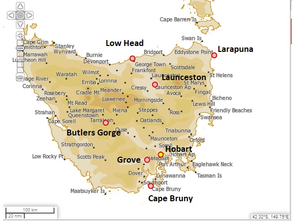
Figure 4: Decadal anomalies, Tasmania
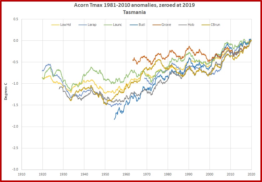
Tasmania is a small, compact region, and all stations appear to show the same decadal climate variations. However, Grove seems to have much less increase than the others, and Larapuna has a much greater increase than its close neighbours, Low Head and Launceston.
Figure 5: East coast of Queensland

Figure 6: Decadal anomalies, east coast of Queensland

Similarity between stations barely extends back as far as 2005. There is little sign of common climatic patterns except in very recent years. Brisbane Aero and its closest neighbour Cape Moreton Lighthouse diverge between 1986 and 2007. And Mackay in particular is an outlier: what reason can there be for Mackay to be more than one degree cooler in all decades to 1940 than Bundaberg to the south and Cairns to the north?
Figure 7: North-east NSW stations
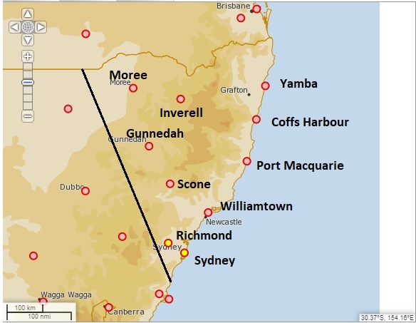
Figure 8: Decadal anomalies, north-east NSW

Again, while there are some similarities, there is much variety. Inverell is more than one degree cooler than neighbouring Moree in the decade to the early 1920s, then their decadal means converge to within 0.3 of a degree in the 1950s. And Scone has had a meteoric rise from 1.6 degrees less than now in November 2001- faster than anywhere else in Australia.
Figure 9: South-west Western Australian stations

Figure 10: Decadal anomalies, South-west Western Australian stations

This climate region has fairly consistent records, at least back to the 1930s, when Perth’s diverges from the others. Perth goes from coolest in the 1920s to warmest (relative to now) in the 1980s.
The northern part of Western Australia is messier.
Figure 11: Northern Western Australian stations

Figure 12: Decadal anomalies, northern Western Australia

Halls Creek and Broome are much cooler than Port Hedland, Marble Bar, and Carnarvon in the decades before the 1930s. There is a range of 1.3 degrees between decadal means of Marble Bar and neighbouring Karijini North (the former Wittenoom) in 1969, and there is a large divergence between Kalumburu and Carnarvon (at opposite ends of the coast), and the rest of the stations, between 2000 and 2008.
Central Australian stations, because of their remoteness, have a large impact on our climate signal.
Figure 13: Central Australia
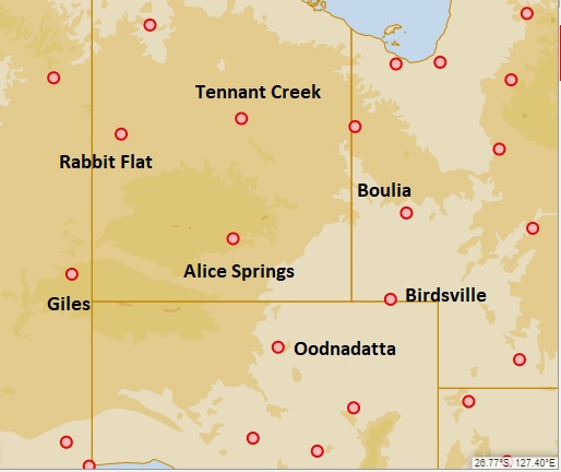
Figure 14: Decadal anomalies, Central Australian stations

While there are similar decadal patterns in maximum temperatures, you will note that Alice’s record rises from the coolest in the 1920s and 1930s to warmest from the 1940s to 1970s, in steps rather than rises and falls.
The Top End is subject to the annual north-west monsoon, with climatic seasons alternating between Wet and Dry.
Figure 15: Top End stations

Figure 16: Decadal anomalies, Top End
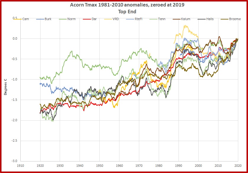
Again we see in most stations rises in the 1970s and 1990s, and falls in the 1980s and early 2000s. The exception is Darwin, with an almost linear increase with a small acceleration in the 1990s. Normanton in the far east is an outlier before the 1980s, and VRD in the 1990s.
Inland New South Wales is another region showing common climate patterns, but a few surprises.
Figure 17: Western NSW stations
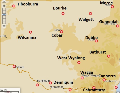
Figure 18: Decadal anomalies, western NSW
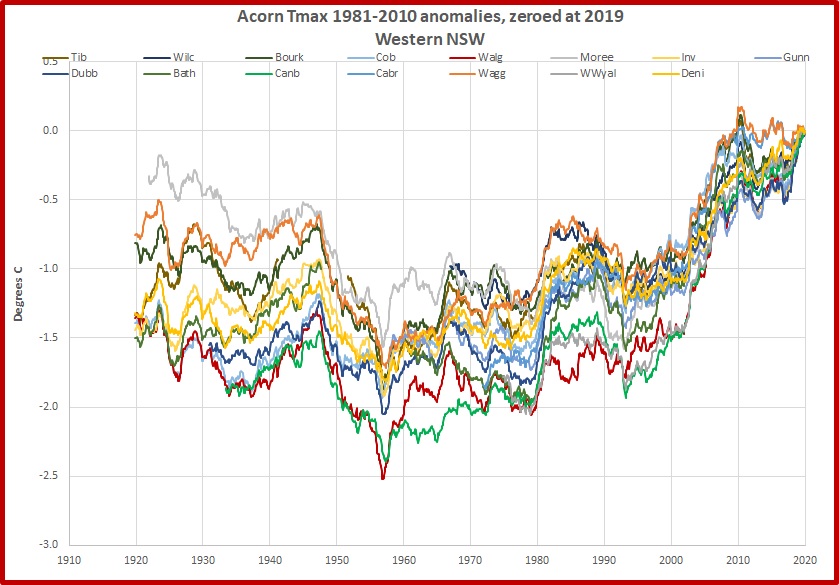
Here is a good example of many stations showing common climate patterns, rising and falling almost in unison. However there is still well over one degree between highest and lowest in nearly every year before 1990. Further, it is not perfect unison: not all stations show similar responses to regional climate swings. In 1956 and 1957 Canberra at 2.4 degrees cooler than now and Walgett at more than 2.5 degrees cooler are clear outliers, and are well below the pack from 1950 to 1972, and again from 1980 to 2002. Walgett in particular shows little response to the 1980s surge shown by most other stations. These two are joined by West Wyalong in the 1970s, and are just under 1.5 degrees cooler than now in 2000 before surging rapidly.
Finally, for comparison, the next plot shows some of the big movers in the Acorn stations, most of which we have seen before.
Figure 19: Decadal anomalies, big hitters

Linearly rising Darwin and recent rapid riser Scone we have met before. Alice Springs and Perth are joined by Geraldton and Eucla, both in Western Ausralia, in rising from about 2 degrees cooler than now in the decade to the 1920s. In the 1930s another WA station, Morawa, is almost 2.5 degrees cooler than now. In the previous figure we saw Canberra in the 1950s 2.4 degrees cooler than now and Walgett more than 2.5 degrees cooler than now: the coolest of any station in Australia.
Conclusion:
Decadal means show broad patterns of climate change in various regions but there are many examples of individual stations within these regions standing out from these patterns. They can’t all be right. The accuracy of the BOM’s ACORN-SAT dataset for maximum temperatures must therefore be called into question at a number of its stations. This must then throw doubt on the Bureau’s climate analyses and future projections.
In future posts I will look more closely at some of these individual stations’ records.
Tags: Acorn, adjustments, Australia, bom, maximum temperatures

December 13, 2020 at 12:00 pm
[…] A Reality Check on Global Warming « Acorn Mishmash- Part 1: They can’t all be right […]