Posts Tagged ‘maximum temperatures’

How Accurate Is Australia’s Temperature Record? Part 2

January 19, 2021

In my last post I showed that Australia wide the Tmax ~ rainfall relationship has remained constant for the past 110 years (as it should) but Tmax reported in the Acorn dataset has increased by more than 1.5 degrees Celsius relative to rainfall.  Consequently, the ACORN-SAT temperature dataset is an unreliable record of Australia’s maximum temperatures.

Of course there are other aspects of climate besides rainfall.   In this post I will compare annual ACORN-SAT Tmax data with:

Rainfall

Sea Surface Temperatures (SST)

The Southern Annular Mode (SAM)

Cloudiness

Evaporation

all for the Australian region.

I have sourced all data from the Bureau of Meteorology’s Climate time Series pages

except for SAM data from Marshall, Gareth & National Center for Atmospheric Research Staff (Eds). Last modified 19 Mar 2018. “The Climate Data Guide: Marshall Southern Annular Mode (SAM) Index (Station-based).” 

Tmax, Rainfall, and SST data are from 1910; SAM and Daytime Cloud from 1957, and Pan Evaporation from 1975.  Cloud observations apparently ceased after 2014, and Evaporation after 2017, possibly because of staffing cuts.

Because Pan Evaporation data are only available from 1975 and are reported as anomalies from 1975 to 2004 means, I have recalculated Tmax, Rainfall, SST, SAM, and Daytime Cloud anomalies for the same period so all data are directly comparable.

As in the previous post, I have calculated decadal averages for all indicators to show broad long term climate changes.  Decadal averages show how indicators perform over longer periods.  Each point in the figures below shows the average of the 10 years to that point.  This can then indicate times of sudden shifts or questionable data. (For example in Figure 1 SAM (the green line) makes a sudden jump in 2015.  Was this a climate shift or a data problem?)

Figure 1 shows the 10 year means for all climate indicators.  I have scaled Rain and SST to match Tmax at 2019, Cloud and SAM to match Tmax at 1966, and Evaporation to match Tmax in 1984.  Rain and Cloud are inverted as they have an inverse relationship with temperature.

Figure 1:  10 Year Means of Climate Indicators

Tmax has stayed close to SST until 2001.  Clearly Tmax has increased far more than any of the others, especially since 2001.

The next plots show the difference between decadal averages of Tmax and the other indicators.  Zero difference means an excellent relationship with Tmax.

Figure 2:  Difference: 10 Year Means of Tmax minus Rain and SSTs.

Starting from 1919 (zero difference), Rainfall is close to Tmax until 1957, after which Tmax takes off until it is 1.6 degrees Celsius greater than expected in the 10 years to 2020.  Tmax diverges from SST values in 2001 and in 2020 is 0.7 degrees greater than expected.

In Figure 3, Rain, SST, SAM, and Cloudiness are scaled to match Tmax at 1966.

Figure 3:  Difference: 10 Year Means of Tmax minus Rain, SST, SAM, and Cloud

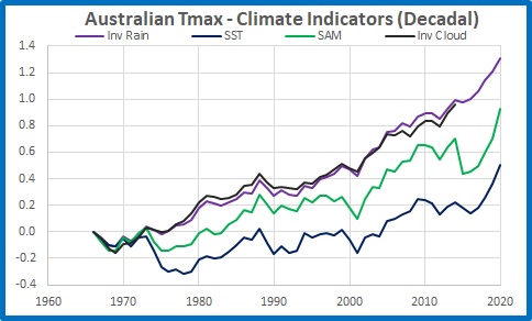
Figure 3 shows how closely Rain and Cloud are related: differences from Tmax are almost identical.  Compared with 1966, Tmax is 1.3 degrees more than rainfall would suggest in the 10 years to 2020.  SST and the SAM index are less different from Tmax but Tmax divergence is still clear.  You may notice that Tmax differences from all climate indicators seem to change at similar times, apart from SAM in 2015.

In Figure 4, all indicators are scaled to match Tmax at 1984.

Figure 4:  Difference: 10 Year Means of Tmax minus Rain, SST, SAM, Cloud and Evaporation

Differences increase rapidly after 2001, so in Figure 5 indicators match Tmax at 2001.

Figure 5:  Difference: 10 Year Means of Tmax minus Rain, SST, SAM, Cloud and Evaporation

There appears to be a problem with SAM in 2015, and it’s a shame that the BOM have discontinued Cloud and Evaporation observations.  In the last 20 years, it is obvious that Tmax has diverged from other indicators.

Conclusion:

All factors- Rainfall, SAM, SST, Clouds, and Pan Evaporation- point to a clear divergence of temperature nationwide, especially in the last 20 years.  In other words, ACORN-SAT, our official record of temperatures, is unreliable.

Acorn Mishmash- Part 1: They can’t all be right

November 23, 2020

The Bureau of Meteorology (BOM) produces climate analyses and forecasts based on their best efforts at estimating long term climate trends around the nation- the latest being their suitably scary State of the Climate 2020. 

The main datasets used are ACORN-SAT (Australian Climate Observations Recording Network- Surface Air Temperature) Version 2.1, Daily and Monthly Rainfall Networks, Monthly Pan Evaporation Network, and Monthly Cloud Amount Network.  In future posts I hope to look at some of the BOM’s claims in more detail, however in this series of posts I will look at climate trends at individual stations.  In this post I will look solely at monthly maximum temperatures at all 112 ACORN-SAT sites.  This information is freely available at http://www.bom.gov.au/climate/change/index.shtml#tabs=Tracker&tracker=site-networks and is adjusted and homogenized Acorn V.2.1 data.

Like the Bureau, in order to compare data from all stations I calculate anomalies from monthly means for all months from 1981 to 2010.  I then calculate 120 month running means.  120 month (decadal) means allows us to see long term patterns and changes.  For example, Figure 1 shows decadal monthly means of rainfall that fell at Alice Springs since October 1900. 

Figure 1:  Decadal rainfall at Alice Springs

I would not use the term “cycles” to describe what we see, but clearly there are wetter and drier periods: rainfall is not random from year to year at Alice Springs.

The same decadal averaging when applied to maximum temperatures should show how temperature changes over years, and because Acorn 2.1 is homogenized using neighbouring stations for adjustments, there should be similarities between stations in the same regions.  Let’s see.

I have made all means zero at December 2019 (except Boulia, which ends in June 2013, Point Perpendicular, ending in January 2017,and Gunnedah, ending in June 2019), so in the following plots all data points are relative to the most recent available.  Each data point is the mean of all monthly maxima of the previous 10 years.

Figure 2:  Running 120 month means, maxima anomalies (from 1981-2010 means), relative to most recent data (mostly December 2019), all 112 Acorn stations

That spaghetti plot shows decadal Tmax for all 112 Australian stations, with a few stations identified.  What a mess.  There is a range of 1.5 to 2.5 degrees between highest and lowest in most years before 2000.  We need to look at different regions to make more sense of it.  I will show a map for each region.

Figure 3: Tasmanian stations

Figure 4: Decadal anomalies, Tasmania

Tasmania is a small, compact region, and all stations appear to show the same decadal climate variations.  However, Grove seems to have much less increase than the others, and Larapuna has a much greater increase than its close neighbours, Low Head and Launceston.

Figure 5: East coast of Queensland

Figure 6: Decadal anomalies, east coast of Queensland

Similarity between stations barely extends back as far as 2005.  There is little sign of common climatic patterns except in very recent years.  Brisbane Aero and its closest neighbour Cape Moreton Lighthouse diverge between 1986 and 2007.  And Mackay in particular is an outlier: what reason can there be for Mackay to be more than one degree cooler in all decades to 1940 than Bundaberg to the south and Cairns to the north?

Figure 7:  North-east NSW stations

Figure 8: Decadal anomalies, north-east NSW

Again, while there are some similarities, there is much variety.  Inverell is more than one degree cooler than neighbouring Moree in the decade to the early 1920s, then their decadal means converge to within 0.3 of a degree in the 1950s.  And Scone has had a meteoric rise from 1.6 degrees less than now in November 2001- faster than anywhere else in Australia.

Figure 9:  South-west Western Australian stations

Figure 10: Decadal anomalies, South-west Western Australian stations

This climate region has fairly consistent records, at least back to the 1930s, when Perth’s diverges from the others.  Perth goes from coolest in the 1920s to warmest (relative to now) in the 1980s.

The northern part of Western Australia is messier.

Figure 11:  Northern Western Australian stations

Figure 12: Decadal anomalies, northern Western Australia

Halls Creek and Broome are much cooler than Port Hedland, Marble Bar, and Carnarvon in the decades before the 1930s.  There is a range of 1.3 degrees between decadal means of Marble Bar and neighbouring Karijini North (the former Wittenoom) in 1969, and there is a large divergence between Kalumburu and Carnarvon (at opposite ends of the coast), and the rest of the stations, between 2000 and 2008.

Central Australian stations, because of their remoteness, have a large impact on our climate signal.

Figure 13:  Central Australia

Figure 14: Decadal anomalies, Central Australian stations

While there are similar decadal patterns in maximum temperatures, you will note that Alice’s record rises from the coolest in the 1920s and 1930s to warmest from the 1940s to 1970s, in steps rather than rises and falls.

The Top End is subject to the annual north-west monsoon, with climatic seasons alternating between Wet and Dry.

Figure 15:  Top End stations

Figure 16: Decadal anomalies, Top End

Again we see in most stations rises in the 1970s and 1990s, and falls in the 1980s and early 2000s.  The exception is Darwin, with an almost linear increase with a small acceleration in the 1990s.  Normanton in the far east is an outlier before the 1980s, and VRD in the 1990s.

Inland New South Wales is another region showing common climate patterns, but a few surprises.

Figure 17:  Western NSW stations

Figure 18: Decadal anomalies, western NSW

Here is a good example of many stations showing common climate patterns, rising and falling almost in unison.  However there is still well over one degree between highest and lowest in nearly every year before 1990.  Further, it is not perfect unison: not all stations show similar responses to regional climate swings.  In 1956 and 1957 Canberra at 2.4 degrees cooler than now and Walgett at more than 2.5 degrees cooler are clear outliers, and are well below the pack from 1950 to 1972, and again from 1980 to 2002.  Walgett in particular shows little response to the 1980s surge shown by most other stations.  These two are joined by West Wyalong in the 1970s, and are just under 1.5 degrees cooler than now in 2000 before surging rapidly.

Finally, for comparison, the next plot shows some of the big movers in the Acorn stations, most of which we have seen before.

Figure 19: Decadal anomalies, big hitters

Linearly rising Darwin and recent rapid riser Scone we have met before.  Alice Springs and Perth are joined by Geraldton and Eucla, both in Western Ausralia, in rising from about 2 degrees cooler than now in the decade to the 1920s.  In the 1930s another WA station, Morawa, is almost 2.5 degrees cooler than now.  In the previous figure we saw Canberra in the 1950s 2.4 degrees cooler than now and Walgett more than 2.5 degrees cooler than now: the coolest of any station in Australia. 

Conclusion:

Decadal means show broad patterns of climate change in various regions but there are many examples of individual stations within these regions standing out from these patterns.  They can’t all be right.  The accuracy of the BOM’s ACORN-SAT dataset for maximum temperatures must therefore be called into question at a number of its stations.  This must then throw doubt on the Bureau’s climate analyses and future projections.

In future posts I will look more closely at some of these individual stations’ records.

The effect of two adjustments on the climate record

June 24, 2015

The warming bias in Australia’s ACORN-SAT maximum dataset is largely due to just two adjustments.

Last week’s Report of the Technical Advisory Forum’s review of the ACORN-SAT temperature reconstruction produced some rather bland, motherhood type statements.  However, hidden in the public service speak was a distinct message for the Bureau of Meteorology: lift your game.  Two of the areas I have been interested in are (a) whether individual adjustments are justified, and (b) the effect of these adjustments on national and regional temperature trends.  In this post I look at adjustments at just two sites, which are responsible for the single largest increase in national trend.

On page 17 of the Report we find the following graphic:

Fig. 1: Scatterplot of difference between AWAP and Acorn annual mean temperature anomalies.

scatterplot awap acorn mean diff

This is a clear statement of how much Acorn adjustments have cooled past temperatures, as AWAP is regarded as being only “partially homogenised”, and close to raw temperatures.   There is a considerable difference- more than 0.2 degrees- between the two interpretations of temperatures 100 years ago.

Mean temperature is the average of maximum and minimum.  In this post I shall look at just maximum temperatures, from 1911 to 2013.  The following graph is a plot of the difference between monthly Acorn and AWAP maximum anomalies, which I think is much more informative:

Fig. 2:

scatterplot awap acorn max months

Note there is a trend of +0.22 degrees / 100 years in the differences, indicating a predominance of cooling of earlier data; there is a very large range in the first 50 years, from about -0.7C to +0.3C, and one outlier at +0.4C, reducing to a much narrower band in the 1960s before increasing in the last 20 years; and the bulk of differences are negative before 1970.

Now let’s look at what has been happening in the past 35 years- in fact, in the satellite era:

Fig. 3: Monthly differences between AWAP and Acorn before and after December 1978

scatterplot awap acorn max phases

The trend in differences for the first 67 years is 0.33C / 100 years, but there is a very small tendency for Acorn to be cooler than AWAP recently- and the range of differences has been increasing.

That’s an interesting find, but I want to examine in more detail the effect of the adjustments which cause those differences.  Here are annual maxima in AWAP compared with Acorn.

Fig. 4: Annual mean of monthly maximum anomalies: AWAP and Acorn

graph awap acorn max

Again we see that Acorn has increased the warming trend from +0.59C to +0.81C per 100 years, an increase of +0.22C, or 37.3%.

However, the difference appears more marked before the mid 1950s.  The next graph shows the trends from 1911 to 1955 compared with the trends from 1956 to 2013.

Fig. 5: Comparison of trends in maxima before and after the middle of the 20th Century.

graph awap acorn phases

Note: while the trends of AWAP and Acorn are very similar (+1.32 to 1.4C per 100 years) since the 1950s- which the Bureau never tires of proclaiming- before then the plot tells a different story.  Acorn reduces the cooling trend by 0.44C per 100 years, a reduction of 86%.

How was this achieved?

On page 44 of the technical paper CTR-050 we find this explanation:

Returning now to maximum temperature, the differences between the AWAP and ACORN analyses show a marked drop in the early 1930s, with a sudden decrease of about 0.15 °C. This is most likely attributable to substantial negative adjustments between 1929 and 1932 in the ACORN-SAT dataset, indicating substantial discontinuities (expressed as artificial cooling) at a number of individual locations with a large influence on national analyses, because of the sparsity of data in their regions in that period. These discontinuities are mostly related to site moves that are associated with concatenated records for single locations. These include Alice Springs, Kalgoorlie and Meekatharra. Alice Springs, where the adjustment is associated with a site move in late 1931 or early 1932 from the Telegraph Station to a climatologically cooler site in the town, has a notably large “footprint”; at that time there were only two other locations within 600 kilometres (Tennant Creek and Charlotte Waters) which were observing temperatures, while the nearest neighbours to the west (Marble Bar and Wiluna) were more than 1200 kilometres away.

This large change between AWAP and Acorn is shown in the next graph.

Fig. 6: 12 month mean difference in monthly maxima anomalies

graph awap acorn diff 1930 drop

As I explained in my post in September 2014, Acorn sites are homogenised by an algorithm which references up to 10 neighbouring sites.  A test for the validity of the adjustments is to compare the Acorn site’s raw and adjusted data with those of its neighbours, by finding the differences between them.  Ideally, a perfect station with perfect neighbours will show zero differences: the average of their differences will be a straight line at zero.  Importantly, even if the differences fluctuate, there should be zero trend.  Any trend indicates past temperatures appear to be either relatively too warm or too cool at the station being studied.  My aim is to check whether or not individual adjustments make the adjusted Acorn dataset compare with neighbours more closely.   If so, the trend in differences should be close to zero.

I have tested the three sites named above.  I use differences in anomalies calculated from the mean of maxima for the 30 year period centred on 1931, or for the period of overlap if the records are shorter.  The neighbours are those listed by the Bureau on their Adjustments page.

Fig. 7:  Meekatharra differences from neighbours (averaged)

Meek acorn v neighbours avg

Note that the Acorn adjustment (-0.77C at 1/1/1929- the adjustment of +0.54C at 1/1/1934 does not show up in the national signal) is indeed valid: the resultant trend in differences is close to zero, indicating good comparison with neighbours.  However, since Meekatharra’s record starts only in 1927, two years of the Meekatharra adjustment cannot have had a large influence on the national trend as claimed.

Fig. 8:  Kalgoorlie differences from neighbours

Kalg acorn v neighbours avg

Kalgoorlie’s steep cooling compared with neighbours (from 170 km to 546 km away) has been reversed by the Acorn adjustment (-0.62C at 1/1/1930- the adjustment of -0.54C at 1/12/1936 does not show up in the national signal), so that Kalgoorlie now is warming too much (+1.02C / 100 years more than the neighbours).  Kalgoorlie’s adjustment is too great, affecting all previous years.

I now turn to Alice Springs, which ‘has a notably large “footprint”’.  Too right it does- its impact on the national climate signal is 7% to 10%, according to the 2011 Review Panel, p. 12.

Fig. 9:  Alice Springs differences from neighbours

Alice acorn v neighbours avg

Alice Springs, cooling slightly compared with neighbours, has been adjusted (-0.57C at 1/1/1932) so that the Acorn reconstruction is warming (+0.66C / 100 years) relative to its neighbours.  The adjustment is much too large.

And exactly where are these neighbours?

Tennant Creek (450 km away), Boulia (620 km), Old Halls Creek (880 km), Tibooburra (1030 km), Bourke (1390 km), and Cobar (1460 km)!

The site with the largest impact on Australia’s climate signal has been “homogenised” with neighbours from 450 km to 1460 km away- except the adjustment was too great, resulting in the reconstruction warming too much (+0.66C / 100 years) relative to these neighbours.  The same applies at Kalgoorlie.  Meekatharra’s record only starts in 1927 so its effect can be discounted.  These are the only remote Acorn sites that had large adjustments at this time.  All other remote Acorn sites open at this time either have similar trends in raw and Acorn or had no adjustments in this period.

The 37.3% increase in the trend of Australian maxima anomalies in the “world’s best practice” ACORN-SAT dataset compared with the “raw” AWAP dataset is largely due to just two adjustments- at Kalgoorlie and Alice Springs- and these adjustments are based on comparison with distant neighbours and are demonstrably too great.

If it wasn’t so serious it would be laughable.

North Australian Temperatures

January 24, 2014

For those of you think- “Gee it’s been hot with all these heat waves lately- it must be even worse up north”.

Here’s a plot of maximum temperatures across Northern Australia (the area north of 26 degrees south)  since 1985- the 29 years to the end of the hottest year on record.

tmax n aust 85-13

That trend is actually (very slightly) negative.

And yes of course it’s cherry picked- but 2014 will have to be a hotter than average year to make the 30 year trend positive- a 2014 anomaly of +0.35C gives a 30 year trend of: zero.  (The  mean of 1985-2013 maxima is +0.28C, the median is +0.34C.)

I guess the BOM is not hoping for a La Nina.

Data from Acorn.

Still No Evidence of Greenhouse Warming!

January 8, 2014

This morning I noticed at Jennifer Marohasy’s post http://jennifermarohasy.com/2014/01/last-year-2013-a-hot-year-for-australia/

a comment from “Luke” (who else) objecting to my use of 2nd order polynomials in yesterday’s post.  Strictly I should stick to linear trends for a 35 year timescale, and use polynomials only for much longer periods.   Therefore, here is a plot of Australian annual minima and maxima for the 104 years from 1910 to 2013, using data straight from the BOM.minvmax poly2

Note that the red 2nd polynomial curve (maxima) shows a fairly flat trend until the 1950s, with an increasing rise since then. (Yes! It’s getting hotter!)

Note how the blue (minima ) curve also gradually rises over the years and apparently continues to do so.

However I have circled the graphs in the 1980s and the last few years.   I have blown this up so you can see more clearly what is happening.minvmax blownup

Since the mid 1980s there is a divergence in trends.  Daytime temperatures are rising faster than night time temperatures.

This is a problem because increasing CO2 and other greenhouse gases should be slowing back radiation, which should be evident in night time temperatures increasing faster.

Something else is happening.


The Hottest Year, but NOT due to Greenhouse Warming

January 7, 2014

ACORN-SAT- the gift that keeps on giving!

Unfortunately for doomsayers, the fact that 2013 was the hottest year on record in Australia is no evidence for the effects of greenhouse warming.  In fact, it is the very opposite.

Why?  Any sort of warming will eventually produce the hottest year on record.  But warming due to the enhanced greenhouse effect is quite special.  Warming due to greenhouse gases is evidenced by

greater warming of night time temperatures than daytime temperatures”

amongst other things, according to Dr Karl Braganza (http://theconversation.com/the-greenhouse-effect-is-real-heres-why-1515)

I discussed this in April  last year.  Now, with the updated data for 2013, it’s time for a reality check to see whether there is now evidence of greenhouse warming in Australia (a region as large as Antarctica, Greenland, the USA, or Europe, and supposed to be especially vulnerable to the effects of global warming.)

Once again I am using data straight from the Bureau’s website.

Fig. 1: Monthly maxima and minima with 12 month smoothing, December 1978 – December 2013, from http://www.bom.gov.au/climate/change/index.shtml#tabs=Tracker&tracker=timeseries&tQ%5Bgraph%5D=tmax&tQ%5Barea%5D=aus&tQ%5Bseason%5D=01&tQ%5Bave_yr%5D=0

max v min linear

For the past 35 years, there is much LESS warming of night time temperatures than daytime temperatures.  And the divergence is increasing:

Fig 2: fitted with a 2nd order polynomialmax v min poly

Sorry, but this is not evidence of greenhouse warming over the period of the satellite era, when greenhouse gases have been increasing rapidly.  It is merely evidence of warming.

What did Chris Turney expect?

January 5, 2014

Professor Turney did not have to take an unsuitable ship full of “climate tourists” to Antarctica.  He could have just checked the Bureau of Meteorology’s website.

As the Aurora Australis will be calling at Casey base to deliver delayed supplies before returning the hapless Turney and the rest of the expedition to Australia, I thought I’d help with what conditions to expect at Casey.  I used official ACORN-SAT monthly data to 2011 and Climate Data Online daily temperatures since then.

Here are the actual monthly maximum temperatures at Casey for 2013:Casey max 2013

As you can see, temperatures were below the mean (calculated from 1970-1990) for most of the year, and the monthly mean maximum temperatures were above freezing (the straight blue line) only in January and December.  Monthly mean minimum temperatures never get above freezing.   (The highest daily minimum in 2013 was +1.7 C on 15 January.  The warmest minima this summer were on 29 and 30 December.  It got to +0.3.)

And has there been recent warming?

This graph is of maximum and minimum anomalies from the 1970-1990 means, smoothed with running 12 month means:Casey 1970-2013

Australia has three bases on the Antarctic coast, Casey, Davis, and Mawson.  Davis and Mawson show some slight warming:Davis 1958-2013Mawson 1958-2013

The mean anomalies of all three sites:Antarctic means

show a linear trend of about  +0.15 C- but the rise (such as it is)  is by no means steady.

To show how insignificant the warming is in Antarctica, here are annual mean anomalies compared with those of Australia:Antarctic-Oz comp

Remember, one of the so-called “fingerprints of greenhouse warming” is that warming should be greater towards the poles.

Professor Turney could have saved himself a lot of time, trouble, and embarrassment.