Archive for the ‘climate’ Category

Extreme Weather Events 3: Sydney

January 29, 2023

Are extreme weather events showing up in Australia’s largest city?

Floods and bushfires might affect smaller areas, but droughts, heatwaves, and very heavy rainfall from large weather systems affect large areas. All of the above have occurred near Sydney in the past few years: surely there should be visible signs in temperature and rainfall.
First, rainfall.


In July and October 2022 flooding affected the western Sydney region again, with The Conversation of course saying “climate change is projected to bring far worse extreme rain events than in the past.”

For long term rainfall I look at Sydney’s longest rain records, at Observatory Hill and the Botanic Gardens. Figure 1 shows their location.


Figure 1: Central Sydney, courtesy of Google Maps

Observatory Hill rain records start in July 1858, but the original data ends in August 2020. I choose not to splice data from old and new gauges. Botanic Gardens start in 1885 but there is a large gap, with continuous data from late 1909 to the present. Figures 2 and 3 plot daily rainfall for each:


Figure 2: Observatory Hill daily rain

Figure 3: Botanic Gardens daily rain (1910 to 2022)

Long term means:


Figure 4: 10 year running means of rainfall at Observatory Hill and Botanic Gardens

Note that the means are similar until about 2010 when they start to diverge. Reasons might include changes to the sites. Rainfall was clearly higher in several previous decades.


Figure 5: 10 year running Standard Deviations

There was much greater variability in Sydney’s rainfall for most of the 50 years from 1950 to 2000. To show Standard Deviation relative to mean rainfall:


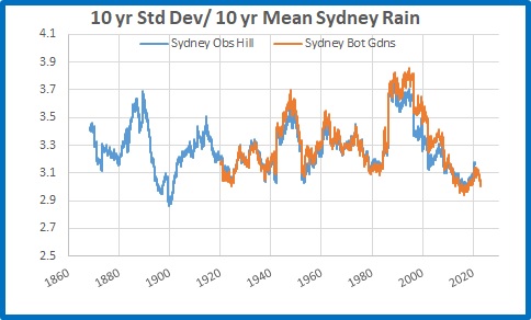
Figure 6: 10 year running Standard Deviations divided by 10 year means

Which shows there is little daily variability in rainfall in recent years, and both sites are comparable.


I will now analyse Botanic Gardens data in more detail.


Figure 7: Running 365 day means

2022 was the wettest year on record, followed by 1950.


Rainfall accumulated over several days is a factor in large scale riverine flooding such as occurred in Sydney’s west.


Figure 8: Four day total rainfall

Clearly there were many much greater 4 day rain events in the past than in the latest floods.


I measure “droughts” by counting the number of days with less than 4mm of rain in running 365 day periods.


Figure 9: Running 365 day counts of days with under 4mm of rain

2022 was by far the most consistently wet. There is no sign of increased drought in Sydney.


Conversely, do recent years have more days with high rainfall?


Figure 10: Running 365 day counts of days with over 100mm of rain

No. Only 3 days in 2022, while 1999 had 5, and many others in previous years had more than 2022. It seems that the Sydney region, going by the Botanic Gardens rain gauge, has less extreme rainfall than the past.


I now analyse temperature at Sydney Observatory Hill, using the latest version of Acorn to 2021, and Climate Data Online for 2022 and January 2023 up to Australia Day.


Figure 11: Daily Maxima Sydney Observatory Hill 1910 to 26/1/2023

Maximum temperatures in Sydney, according to the best the Bureau can provide, have warmed at 0.9 degrees Celsius per 100 years. Decadal means show an almost identical trend.


Figure 12: 10 year mean Tmax

Standard Deviation measures daily variability, and 10 year mean Standard Deviations show some interesting patterns:


Figure 13: 10 year running Standard Deviation, Sydney Tmax

Variability is greater with higher temperatures and less with lower temperatures, and temperatures should be related to rainfall- because a dry period will have hotter days and usually cooler nights. Temperature adjustments might interfere with this.


Whatever, there were several past periods with higher Standard Deviations than the past decade, and when divided by the 10 year means the contrast is even greater:


Figure 14: 10 year running Standard Deviations divided by 10 year means

Are days getting hotter? Well, years are, mostly:


Figure 15: 365 day running means of Tmax

Highest and lowest daily maxima in 365 day periods are not co-operating:


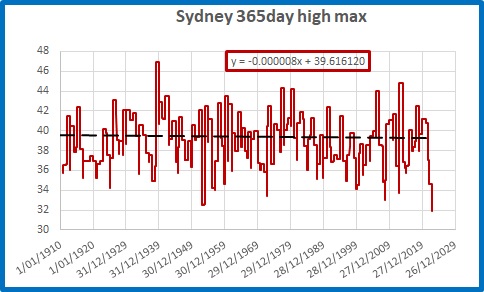
Figure 16: Highest Tmax in 365 day periods

The hottest day was back in 1939, and 2022 had the lowest “hottest day” in a 365 day period on record, with the hottest day being 31.9 degrees.


Figure 17: Lowest Tmax in 365 day periods

Several past winters had cooler maxima.


But is Sydney getting more frequent hot and very hot days?

Figure 18: Running 10 year counts of days over 34.9 degrees

Figure 19: Running 10 year counts of days over 39.9 degrees

The last 10 years have had fewer hot and very hot days than in the past.


What about heat waves, when there are strings of hot days? The definition appears to have changed, but if we consider three hot days in a row to be a heat wave:


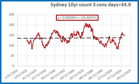
Figure 20: Running 10 year counts of 3 consecutive days over 34.9 degrees

There is a very small trend (0.8 in 100 years) but there were many more 3 day heatwaves in the past.


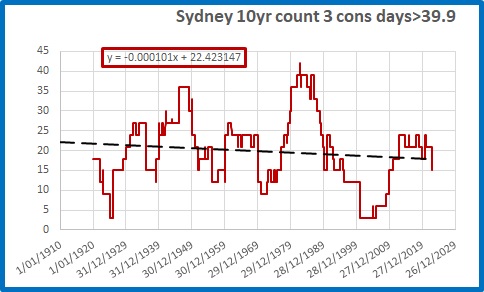
Figure 21: Running 10 year counts of 3 consecutive days over 39.9 degrees

There is a decreasing trend of very hot heat waves (more than 3 less per 100 years), with nearly three times as many 3 day heatwaves of 40 degrees or more in the 10 years to 1982 as in the past 10 years.


Conclusion:


Contrary to popular belief encouraged by politicians and the media, in Australia’s largest city it is clear that:


Rainfall and temperature variability is LOWER than in the past


Droughts are NOT increasing


Extreme rainfall is NOT increasing


Dry years are NOT increasing


Very hot days are DECREASING in frequency


Heatwaves are NOT increasing and are very much LESS COMMON than 40 years ago.


If anything, Sydney’s weather is becoming less extreme and more benign. That should be good news.


We are still waiting for the “projections” of more extreme weather to arrive.

Extreme Weather Events: 2

January 20, 2023

Further to my post yesterday about the Climate Council’s recent fear mongering, with my look at whether the recent flooding at Fitzroy Crossing could be due to increasingly severe rain events, here are two more locations.

I calculate the 10 year running standard deviation of daily rainfall, the 10 year mean, and because the standard deviation must change as the mean changes, I divide the 10 year standard deviation by the 10 year mean.

Early this year there was sever flooding in northern New South Wales. Brays Creek is near Mt Warning about 40 km north of Lismore. Here is the standard deviation divided by average rainfall:

Rainfall over the past 10 years is less extreme than it was 40 to 50 years ago.

The Bruce Highway to north Queensland was blocked for several days, as it normally is every Wet season, by flooding at Goorganga Plains just south of Proserpine. Is rainfall becoming more extreme? Here is the raingauge at Lethebrook, using the same technique.

Nothing exciting to see there either.

Extreme Weather Events: 1

January 19, 2023

Last night On Wednesday night 18 January, the Climate Council released their latest doomsday publication, with the support of Beyond Blue (they’re now off my list of charities to donate to.)

“HIDDEN MENTAL HEALTH TOLL OF WORSENING CLIMATE DISASTERS ON AUSTRALIANS REVEALED WITH NEW NATIONAL POLL”


Climate Councillor, climate scientist at the Australian National University and author of Humanity’s Moment: a Climate Scientist’s Case for Hope, Dr Joelle Gergis said: “The results of this poll are confronting. It’s heartbreaking to realise that many Australians are living with significant levels of distress related to the reality of our changing climate. It shines a light on this invisible mental health crisis that is undermining the stability of our local communities all over the country.

“We need to have a national conversation about climate change adaptation and listen to the experiences of people who have lived through these disasters.

Extreme weather events are going to escalate as our planet continues to warm, so the impacts we have witnessed in recent years are really just the tip of the iceberg. We urgently need to develop plans that protect and support our local communities as climate change-fuelled disasters continue to upend the lives of countless Australians.”

Time for a reality check:

Is there evidence of increasing climate extremes?  Rainfall and temperature are easily measured and data is freely available from the BOM.

First example:  The recent flooding at Fitzroy Crossing. 

A useful measure of extremes is Standard Deviation.  For this technique I am indebted to Willis Eschenbach whose recent post at WattsUpWithThat sparked my interest.

I calculate the 10 year running standard deviation of daily rainfall, the 10 year mean, and because the standard deviation must change as the mean changes, I divide the 10 year standard deviation by the 10 year mean.

The nearest rain gauge with a reasonably long record is Fossil Downs.  Here is the 10 year average daily rainfall:

As you can see average daily rainfall (which nearly all falls in the Wet) has nearly doubled since the decades to the 1960s.

10 year standard deviation:

No wonder people are anxious!  The 10 year figure is very high (but not as high as the 1980s!  Was it more extreme 40 to 50 years ago?)

But here is the standard deviation divided by average rainfall:

This shows that relative to the average, rainfall extremes are actually getting smaller.

Over the next few days I will show rainfall and temperature plots for several Australian cities.  Stay tuned.

Queensland’s Energy and Jobs Plan

October 1, 2022

Last Wednesday Queensland Premier Anastasia Palaszczuk released her $62 billion Energy and Jobs Plan

I can feel an election coming on.  This is pure political spin, pie in the sky stuff, that can’t and won’t work, designed to woo the city voters.  If I’m wrong and she’s serious, Queensland is in for big trouble.

However, part of it I can agree with.

It will involve building 1,500 km of 500 KVA transmission lines to strengthen the grid between north and south Queensland.  That I do applaud.

More from the statement:

The super grid will support 22 gigawatts of new wind and solar power, from between 2,000 and 3,000 more wind turbines and 36 million solar panels.

There will be another $2.5 billion to top up the $2 billion Queensland Renewable Energy and Hydrogen Jobs Fund.  That’s now $4.5 billion.

The government will finance 3 new wind farms, a new battery at Swanbank power station, and

A new hydrogen-ready gas peaking power station at Kogan Creek.

This project will provide power initially from gas blended with hydrogen with the future ability to use 100 per cent renewable hydrogen.

This will provide 3GW by 2035.

Pure hydrogen?  What can possibly go wrong?

Pumped Hydro:

However, the big ticket item is pumped hydro – $17 billion.  This will involve enlarging and redesigning Borumba Dam near Gympie to supply 2GW of electricity.  The major one is the Pioneer-Burdekin pumped hydro scheme.

Why am I concerned about this?

A sudden change of heart:

A government that is reluctant to build dams for agriculture (Rookwood Weir took years for approval) can suddenly build dams purely for renewable energy.

Poor record in dam building:

Let’s hope these dams are better designed and built than Paradise Dam, where 58% of the storage had to be released to lower the water height to a safe level. 

Effect on Community, Agriculture, and Environment:

The Pioneer-Burdekin project will involve two dams on the western side of the Clarke Range and a dam at Netherdale at the top of the Pioneer Valley.

Quoting from the Brisbane Times,   

A map of the site shows the lower reservoir — from which water would be pumped into higher dams to be released back down when energy is needed — would inundate a community of about 100 people, including cattle and cane farms, at the locality of Netherdale.

Figure 1:  Official map

I used to live close to Netherdale.  It is a beautiful part of the world, in most picturesque surroundings, in a high rainfall area.

Figure 2: Looking down the valley from Eungella

Figure 3:  Aerial image from Google Maps

To appease the greens and environmentalists,  no national park land will be affected- just farms, houses, and people.

In an indication that the Netherdale plan may not be politically viable, the government has announced that alternative sites are being considered “in the event the project is unable to proceed”.

Flooding Danger:

This proposal is not just dumb, it is dangerous.  This is a high rainfall area.  Nearby Dalrymple Heights has no BOM data since January 2010, but had 1264mm in December 1990, 1246 mm in January 1991, and 1520mm in February 1991.  That’s 161 inches in 3 months.  In February 1958 there was 1737mm and in March 1955 there was 1804mm.  In a wet season with a cyclone knocking out wind and solar farms, and cloud reducing rooftop solar over most of eastern Queensland, all these three reservoirs will be overflowing and the Pioneer River will be in flood.  Any attempt to release enough water to “keep the lights on” will cause much greater flooding.  But that’s OK- it will be caused by climate change.

The Premier claims that this plan is proof the government is returning taxes to the regions, but the pumped hydro plan will do nothing for agriculture, water supply, or flood mitigation.  It’s purely for a renewable dream that can’t and won’t work.  Here’s why.

Limited Size:

The Pioneer-Burdekin hydro project will supposedly produce 5 Gigawatts (GW) for 24 hours, or 120 Gigawatt hours (GWhr).

The Borumba Dam will produce 2 GW, or 48 GWhr.

The next plots use data from OpenNEM.

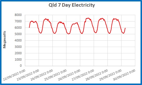
Figure 4:  Total Qld Electricity Use to 29 September

In the week to 7.30 a.m. on 29 September, Queensland’s baseload electricity usage (generation less exports) was a touch over 5 GW, the lowest being 5.036 GW at 3:30 a.m. on Sunday 25th September.  That wasn’t to “keep the lights on”.  That was to run hospitals, electric trains, street lights, traffic lights, cold stores, mines, aluminium smelters- and all before sunrise or a normal working day.  Baseload power is the minimum amount of electricity that has to be maintained for 24 hours a day every day- that is at least 120 GWhr.  Pioneer-Burdekin could do that for just one day.

Figure 5: Electricity Usage for the Year to 27 September.

In the past year, Queensland’s average daily usage was 165.2 GWhr.  (That rose to more than 180 GWhr for most of summer).  Just 31 GWhr on average was produced by solar and wind generation, with up to 39.6 GWhr of solar on one day last summer, but only 4 GWhr on July 4 .

Our grand hydro “batteries” would last for just over 24 hours, at today’s usage. 

Inefficiency:

How efficient would the pumped hydro scheme be?  From the Premier’s own Statement:

Each megawatt of pumped hydro energy storage unlocks investment in another three megawatts of wind and solar generation.
That’s because more renewable energy is needed to pump water up hill during the day storing renewable power for when it’s needed.
Supporting around 21 gigawatts of renewables – or more than 150 new wind and solar farms.

There it is: to store 1 GW of existing renewable energy we need an additional 3 GW of wind (at about 33% efficiency) and solar (at 15 to 20% efficiency).

Transport and Industry Needs:

Further, we’re supposed to be transitioning to electric vehicles.  According to Budget Direct’s Fuel Consumption Survey & Statistics 2022 in 2021 Queensland used 3,343 billion litres of petrol (excluding diesel).  At roughly 9 KWhr equivalent per litre, if only 10% of cars are electric in 2035, another 310 566.5 GWhr of electricity per year would be needed. Include diesel and the figure is 1,020 GWhr. (I’m not confident about my calculation- but this will need a huge amount of electricity.)

And Queensland is meant to be supplying hydrogen for industry as well, so the demand will be much, much greater.

Conclusion:

I am pleased with the proposal to improve Queensland’s electricity grid.  However, the rest of the plan- especially the pumped hydro- is nonsense.

Hello, Anastasia- Queensland voters aren’t so gullible.  If it sounds too good to be true, it probably is.

Trade Winds and Australian Sea levels

May 1, 2022

In my post Is Climate Change Threatening the Solomon Islands? I showed that sea levels at Honiara are predominantly caused by variations and strengthening of the south-east trade winds blowing across the Pacific.

Trade wind strength is also an indicator of sea levels all around Australia- as far south as Tasmania.

I use scaled trade wind index data from NOAA, and mean sea level data from the BOM’s Australian Baseline Sea Level Monitoring Project.  Sea level is in metres and all data are monthly anomalies.

Here’s a map showing the location of the ABSLMP stations.

Figure 1:  Sea level stations

I did not use those stations with large gaps (e.g. Thevenard) or very short records (Thursday Island).

Figure 2 shows sea level and the trade wind index (scaled down by a factor of 60).

Figure 2:  Trade Winds and East Coast Sea Levels

Sea levels appear to loosely match trade winds (a symptom of the El Nino- Southern Oscillation-ENSO).  Sea levels are averaged in Figure 3.

Figure 3:  Trade Winds and Averaged East Coast Sea Levels

Across the north of Australia, the match is close and strong.

Figure 4:  Trade Winds and North Australian Sea Levels

Figure 5 shows the average of the tide gauges, including Cocos Island, far out in the Indian Ocean.

Figure 5:  Trade Winds and Average North Australian Sea Levels

Figure 6:  Trade Winds and Average North Australian Sea Levels Excluding Cocos Island

The surprise is that the same effect is seen across southern Australian ports, with the TWI scaled down by 30.

Figure 7:  Trade Winds and Southern Australian Sea Levels

Figure 8:  Trade Winds and Average Southern Australian Sea Levels

When the trades are weak, sea level is lower, and vice versa, with a delay of one or two months.  The trade winds have become stronger over the last 40 years, and sea levels have increased.

Across southern Australia the intensity of high pressure systems has also increased:

Figure 9:  Strength of southern high pressure systems

The strength of high pressure systems in the sub-tropical ridge has increased.  On the southern side blow the Roaring Forties, and on the northern side the South-East Trades.  Stronger winds in the Pacific roughly match stronger winds in the Southern Ocean, pushing the sea up against the coastlines in the north and south.

It could be that stronger circulation is a symptom of global warming (which you may remember I don’t doubt, just the amount and cause).   However water finds its own level.   Sea level rise at Australian ports and some Pacific islands that has been caused by wind-driven water movement has to be matched by sea level fall across broad areas elsewhere.  That’s why coastal tide gauges are not good at measuring global sea level.

There’s more to sea level than you might think.

Is Climate Change Threatening the Solomon Islands?

April 23, 2022

Since the first talk of an agreement between China and the Solomon Islands to establish a Chinese presence there, accusations have flown thick and fast between the Australian government and their opponents.

One of the points of contention is whether Australia’s supposed lack of urgency in addressing climate change has led to distrust of Australia by Pacific island nations, thus encouraging them to seek help from China.  Considering China’s record and plans for emissions, that is hardly likely.  However, The Guardian thinks so, saying two days ago:

There might not be a direct link between Australia’s climate policy and the security deal – Morrison certainly thinks there isn’t, dismissing such a connection as “nonsense” today – but it is without doubt that Australia’s climate policy has contributed to the dimming of Australia’s reputation in the region, especially given Australia claims to be family.

So is climate change – specifically sea level rise- threatening the Solomons?

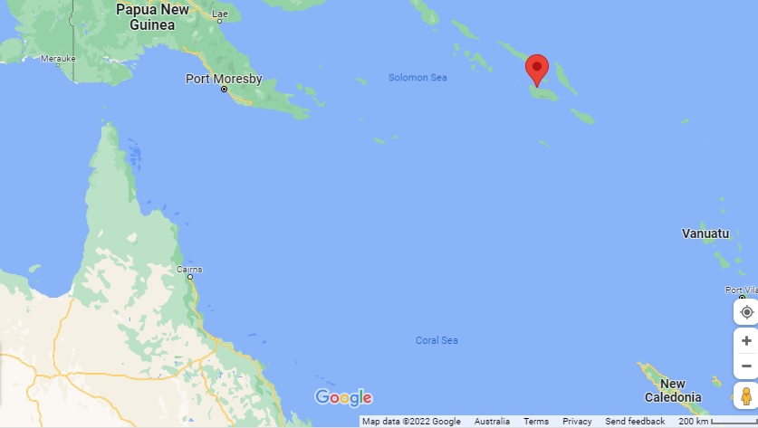
Time for a reality check.  Here is a map courtesy of Google, showing where the tide gauge in the Solomons is in relation to Australia.

Figure 1:  Solomons tide gauge location

Not that far away.

Over the last 28 years since the BOM began monitoring sea level at Honiara, sea level has definitely risen.  Figure 2 shows monthly anomalies of mean tidal data.

Figure 2:  Monthly mean sea level, Honiara

Oh no!  Climate change!

Figure 3 shows inverted mean barometric pressure anomalies plotted with mean sea level.

Figure 3:  Monthly sea level and barometric pressure (inverted)

Hmm.  As air pressure falls, sea level rises, and vice versa.  Figure 4 shows 12 month means (from July to June, which covers most ENSO events):

Figure 4:  12 month means of monthly sea level and inverted barometric pressure

Still not a close match, but let’s include the effect of the trade winds (data from NOAA).

12 month means of trade wind anomalies, scaled down by a factor of 10 show a much better match:

Figure 5:  12 month means of monthly sea level and scaled trade winds index

Now we see the connection, and cause of the apparent trend in sea level- the combination of air pressure and trade winds.  Barometric pressure has been decreasing, and trade wind strength has increased.  These are symptoms of the El Nino Southern Oscillation (ENSO).  When atmospheric pressure is unusually high (as in very big El Ninos), sea levels are lower, mainly because the normal trade winds slacken and less water than normal is pushed westwards across the Pacific.  As trade winds strengthen, more water is pushed westwards and sea level rises.  (This also affects the eastern coast of Australia, and strengthens the East Australian current as well.) 

When we get the next big El Nino (cue droughts, bushfires, and wailing and gnashing of teeth) it is likely that the sea level trend will mysteriously flatten.

Sorry, guys, unless climate change predicts fewer and weaker El Ninos, climate change is not to blame: and certainly not the Australian government.

It’s all about the money.

Is Australia Getting Harder To Live In?

March 23, 2022

Update: see link below kindly supplied by Big M

According to Scomo it is.

And are natural disasters becoming worse and more frequent?

If you listen to or look at commentary in the mass media and social media, largely fuelled by politicians and journalists with no contact with nature and no life experience, you might think so.

The Conversation says:

It’s too soon to say whether the current floods are directly linked to climate change. But we know such disasters are becoming more frequent and severe as the climate heats up.

Time for a reality check.

Flood and fire and famine are the three great normals of Australia, as so well expressed by Dorothea McKellar in My Country, and we in the north also have cyclones.   

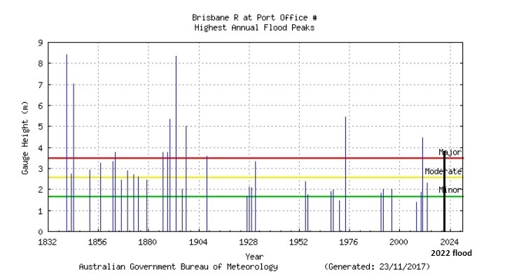
First, floods.  Brisbane was hit hard by floods last month.  Figure 1 is from a previous post, showing historic floods in the Brisbane River with the 2022 flood inserted.  No cause for alarm there.

Figure 1: Historic Brisbane Flood heights 

What about fatalities?  Figure 2 shows the 2022 floods compared with some historic floods from all over Australia.  Fatalities are totalled if several floods occurred in one year.

Figure 2:  Death tolls of flooding events

Are flood disasters getting deadlier? No.

Fatalities and housing damage are the result of people living in flood prone areas- or from being trapped in vehicles in rising waters.   After the 1916 flood, the people of Clermont in Queensland moved their town to higher ground- without any government assistance.  This photo from Bonzle shows the Commercial Hotel being moved on log rollers by a steam traction engine.  The Commercial is still standing- I’ve had a few coldies there.

Figure 3: Moving the Commercial Hotel to higher ground

And no one asked where Billy Hughes was.

What about fires?

Figure 4 shows the area of land burnt by bushfires by notable fires across Australia.  I have marked some fires that are fairly well known- but does anyone mention the fires of the 1960s and 1970s?  These were in largely savannah country of WA, Queensland, and the NT.

Figure 4:  Area Burnt by Bushfires

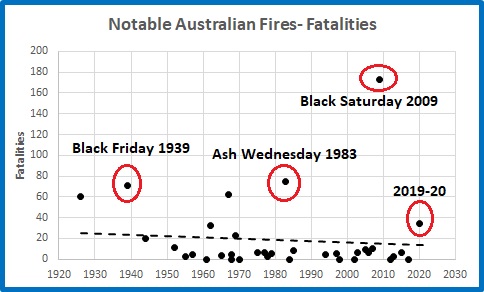
Figure 5 shows fatalities due to bushfires.

Figure 5:  Bushfire Fatalities 1920-2020

Despite the terrible 2009 fires, fatalities due to bushfires in the last 100 years have been trending down.  Lessons must be learned from these tragic events.  We should remember that fire is part of the Australian bush.  Many fatalities occur where housing is surrounded by bushland, with poor escape routes.

The downtrend in fire fatalities is even more apparent when you consider Australia’s population has grown enormously since 1920.  The following plot shows how the risk of death by bushfire has changed.

Figure 6:  Bushfire Fatalities per 1,000 people 1920-2020

No, by no measure are bushfires getting worse, or making Australia harder to live in.

Droughts are also in decline across most of Australia.  The following plots use BOM data.

Figure 7:  Percentage of Land in Severe Drought (lowest 10% of rainfall)

Even though 2019 was an extremely dry year, over 120 years the area of land in drought is decreasing at the rate of 0.23% per decade.

The only areas where drought has increased are Southwestern Western Australia, Victoria, and southern South Australia. 

In southern Australia as a whole, there is no trend in droughts, even with the 2018-2019 drought.

Decadal averages are an excellent way of showing long term patterns.  In southern Australia the worst period of long lasting dry years was the 60 years from 1920 to 1980.

Figure 8:  Percentage of Land in Severe Drought- Decadal Averages Southern Australia

But are dry periods getting drier, and wet periods wetter?  And are dry areas getting drier, and wet areas wetter?  Here are long term rainfall records for Sydney, Cairns (very wet) and Alice Springs (very dry), and Adelaide (drying trend) again with decadal means.  Values are anomalies from months of overlap of weather stations, in millimetres of rain.

Figure 9:  Decadal Mean Rainfall- Sydney

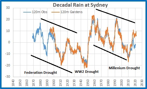
The three major droughts stand out, as does the major reset of the 1950s.  Note the decreasing values to the 1940s, and again from the 1960s.  There is no indication of wet periods getting wetter and dry periods drier.

Figure 10:  Decadal Mean Rainfall- Cairns

Figure 11:  Decadal Mean Rainfall- Alice Springs

It seems that dry periods are getting wetter at Cairns and Alice Springs, and apart from the 1970s-1980s, wet periods show no great difference.

Figure 12:  Decadal Mean Rainfall- Adelaide

Here we see the gradual fall off in rainfall in southern SA, gradually since the 1930s but more rapidly since the 1970s.  The shift in the Southern Annular Mode has caused drying in southern parts of the continent.  It is too early to draw any conclusions from that.

The alternately wet – dry feature of Australian climate is obvious from all the above plots.  However, wet periods are not getting wetter, and dry periods are not getting drier.

What about cyclones?  Here is a plot straight from the Bureau:

Figure 13:  Tropical Cyclones 1970-2021

Cyclones are NOT becoming more frequent or more severe.  The trend is clearly downwards.

Finally, heatwaves.  In reality we have no idea, as the temperature record managed by the Bureau is so bastardised- as shown here, here, here, here, here, and here.  We just don’t know, no matter what they claim.

Those who live in the cities, who have little contact with nature, and who have no knowledge of the history of Australia’s climate, will accept whatever they’re told about natural disasters as gospel.  The truth is different.

Scomo has nothing to worry about (apart from the next election).  Australia is NOT getting harder to live in: floods, fires, droughts, and cyclones are NOT getting worse or more frequent. 

UPDATE: Big M has kindly supplied this link, which I missed.

https://www.abc.net.au/news/2021-05-26/australias-hidden-history-of-megadroughts/100160174

The 1760s WA drought seems to match data from the Barrier Reef showing a 30 year drought in NQ.

Diurnal Temperature Range and the Australian Temperature Record: More Evidence

January 19, 2022

In an earlier post, I demonstrated through analysing Diurnal Temperature Range (DTR) that the Bureau of Meteorology is either incompetent or has knowingly allowed inaccurate data to garble the record.

A couple of readers suggested avenues for deeper analysis. 

Siliggy asked, “Is the exaggerated difference now caused by the deletion of old hot maximums and or whole old long warmer records?”

Graeme No. 3 asked, “Is there any way of extracting seasonal figures from this composition?”

This post seeks to answer both, and the short answer is “Yes”.

Using BOM Time Series data (from the thoroughly adjusted Acorn dataset) I have looked at data for Spring, Summer, Autumn, and Winter (although those seasons lose their meaning the further north you go).

DTR is very much governed by rainfall differences as shown by this plot.

Figure 1:  Winter DTR anomalies plotted against rainfall anomalies- all years 1910-2020

This shows that in winter DTR decreases with increasing rainfall.  The R squared value of 0.79 means that for the whole period, rainfall explained DTR 79% of the time on average.  However, the average conceals the long term changes in the relationship.

To show this, I simply calculated running 10 year correlations between DTR and Rainfall anomalies for each season, and squared these to show the “R squared” value.  This is a good rule of thumb indicator for how well DTR matches rainfall over 10 year periods.  A value of 0.5 indicates only half of the DTR for that decade can be explained by rainfall alone.  As you will see in the following figures, there are plenty of 10 year periods when the relationship was 0.9 or better, meaning it is ideally possible for 90% of DTR variation to be explained by rainfall.  Here are the results.

Figure 2:  Spring Running R-squared values: DTR vs Rain

There was a good relationship before 1930.  In the decades from then to the mid-1970s it was much worse, and very poor in the decade to 1946. It was poor again in the decade to 2001, and the 10 years to 2020 shows another smaller dip, showing something not quite right with 2020.

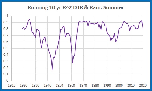
Figure 3: Summer Running R-squared values: DTR vs Rain

Summer values were very poor before the 1960s, especially the decades to 1944 and 1961, and dipped again in the 1990s.

Figure 4:  Autumn Running R-squared values: DTR vs Rain

The DTR/Rain relationship was very poor in the decades to 1928, and again before 2001.  The recent decade has also been poor- less than half of DTR to 2020 can be explained by rainfall.

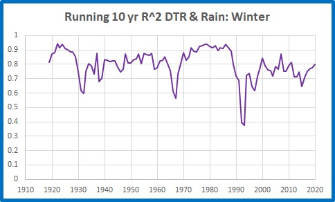
Figure 5:  Winter Running R-squared values: DTR vs Rain

The DTR/rainfall relationship was fairly good, apart from two short episodes, until the 1990s.

I now turn to the northern half of the continent.

A large area of Northern Australia is dominated by just two seasons, wet and dry.  Here is the plot of northern DTR vs Rain for the wet season (October to April).

Figure 6:  Northern Australia Wet Season Running R-squared values: DTR vs Rain

Apart from the 1950s, the late 1970s-early 1980s, and 1998 to 2020, the DTR : Rainfall relationship is very poor, with a long period in the 1930s and 1940s in which rainfall explains less than half of DTR variation (only 13% in the decade to 1943). 

Because the northern half of Australia accounts for the bulk of Australian rainfall, and the wet season is from October to April, this perhaps explains the problems in spring, summer, and autumn for the whole country.

We can get some clues as to the reasons by comparing long term average maximum temperatures with inverted rain (as wet years are cool and dry years are warm).

Figure 7:  Northern Australia Wet Season Decadal Maxima and Rain

The divergence before 1972 and after 2001 is obvious.

The above plots show how poorly DTR (and therefore temperature, from which it is derived) has matched rainfall over the past 111 years.  Low correlations indicate something other than rainfall was influencing temperatures.

In reply to Siliggy, who asked “Is the exaggerated difference now caused by the deletion of old hot maximums and or whole old long warmer records?” the answer appears to be: both, however Figure 7 shows old temperatures (before 1972) appear incorrect, but recent temperatures are at fault too.

The mismatch shows that the Acorn temperature record is not to be trusted as an indicator of past temperatures- and even recent ones.

More Evidence That The Australian Temperature Record Is Complete Garbage

December 8, 2021

The Bureau of Meteorology is either incompetent or has knowingly allowed inaccurate data to garble the record.

My colleague Chris Gillham at http://www.waclimate.net/ has alerted me to growing problems with the BOM’s record for Diurnal Temperature Range (DTR).  DTR is the difference between daytime temperature (Tmax) and night-time temperature (Tmin). 

According to Dr Karl Braganza’s paper at https://agupubs.onlinelibrary.wiley.com/doi/10.1029/2004GL019998 , “an index of climate change” is that DTR should decrease as greenhouse gases accumulate. To oversimplify, greenhouse gases will enhance daytime temperature while at night greenhouse gases will slow down cooling.  With increasing greenhouse gas concentration, daytime maxima are expected to increase, certainly, but the effect on night-time minima will be relatively greater.  Thus, minimum temperatures will increase faster than maxima, and DTR will decrease.  While Dr Braganza was referring to global values, Australia is a large dry continent where DTR should show up clearly.

We now have 111 years of temperature data in ACORN-SAT (Australian Climate Observation Reporting Network- Surface Air Temperatures).  In this post I only use Acorn temperature data and corresponding rainfall data.  Skeptics have been bagging Acorn ever since it was introduced, and for good reasons as you will see.

Figure 1 is straight from the Bureau’s climate time series page, and shows how DTR has varied over the years.  There is a centred 15 year running mean overlaid. 

Figure 1: Official plot of annual DTR

Melbourne, We Have A Problem… DTR has been increasing recently.

I have used BOM data to make plots that show this more clearly.  First, Figure 2 shows annual DTR from 1910 to 2020 has no trend.  It should be decreasing.

Figure 2:  Annual DTR

There appears to be a distinct step up around 2000-2002.

Figure 3 shows the same data for the last 70 years, broken into two periods, from 1951 to 2000, and 2001 to 2020.

Figure 3:  DTR since 1951

From 1951 to 2000, DTR behaves as it should, with a long term decrease.  After 2000, DTR steps up well above expected values.  The average from 1981-2000 is -0.12 C.  From 2001-2020 the average is +0.35C.  DTR suddenly increases by nearly 0.5C. Why?

DTR is very much governed by that other greenhouse gas, H2O.  Dry days, months and years produce hot days and cooler nights; wet periods result in cooler than average days and warmer than average nights.  This relationship is shown in Figure 4.

Figure 4:  DTR anomalies plotted against rainfall anomalies- all years 1910-2020

As rainfall increases, DTR decreases.  The effect is more marked in very wet (>100mm above average) and very dry (100mm or more below average) years.

Figure 5 shows time series of DTR (as in Figure 2) and rainfall.  Rainfall has been inverted and scaled down by a factor of 250.

Figure 5:  DTR and Inverted, Scaled Rainfall

There is close match between the two.

Using 10 year averages in Figure 6 makes the change after 2001 much clearer.

Figure 6:  Decadal means of DTR and inverted, scaled rainfall

The 10 year average rainfall to 2020 is about the same as the 1961-1990 average (the period the BOM uses for calculating anomalies).  The 10 year average DTR should be about the same value- not at a record level.

As DTR decrease due to greenhouse gas accumulation is caused by minimum temperatures increasing faster than maximum temperatures, Figure 7 shows 10 year averages of maxima and minima for all years to 2020.

Figure 7:  10 year running means of Tmax and Tmin

Tmax has clearly accelerated in the last 20 years, increasing much faster than Tmin.

This is NOT what should be happening: indeed it is the exact opposite of what greenhouse theory predicts.

Something happened to Australian maximum temperature recording or reporting early this century.  I suspect that the BOM changed from using the highest one-minute average of temperatures recorded in Automatic Weather Systems to the current highest one-second value for the day becoming the reported maximum; or else the design of a significant number of AWS changed, with new, faster-responding probes replacing old ones.

I also suspect I know why this was allowed to happen and continue.

Warmer minimum temperatures at night and in winter are not very scary, but record high temperatures and heatwaves make headlines.

It would suit the Global Warming Enthusiasts in the Bureau for apparently rapidly rising maxima and ever higher records being broken to make headlines, frighten the public, put pressure on governments, and generally support The Narrative.

But someone forgot to tell the left hand what the right hand was doing.

The result is that they are now faced with a contradiction- Diurnal Temperature Range is not decreasing as it should. 

The Bureau is either incompetent or has knowingly allowed inaccurate data to garble the record.

The World’s Biggest Thermometer

August 23, 2021

Are temperatures today unprecedented and dangerously high?  Apparently- the IPCC’s 6th Assessment Report says that current temperatures are higher than at any time in the last 125,000 years

But that is wrong.  Temperatures today are cooler than they were in the past.

In making that statement I am not referring to data from ice cores (as in my previous posts here and here), but a simple and accessible temperature measurement device: the biggest thermometer in the world.

The following statements are uncontroversial:

1 Sea level rise is largely due to melting of glaciers and thermal expansion of the oceans.

2 Thermal expansion and glacial melting are symptoms of temperature increase.

3 Higher sea level indicates warmer conditions, lower sea level indicates colder conditions.

4 Sea levels are currently rising (by a small amount- NOAA says Fort Denison, Sydney, has a rise of 0.65mm per year).

5 This indicates temperatures have been rising.

6 But sea levels and therefore temperatures were higher than now about 4,000 to 7,000 years ago.

If you doubt point 6, you can easily tell whether it was warmer or cooler in the past relative to today.

How?  By looking for evidence of sea level change in areas that are not affected by tectonic rising or falling coastal land, or by large scale water run off or glacial melting, or by very large underground water extraction.

Areas such as the eastern coastline of Australia- the world’s biggest thermometer.

The continent of Australia is very old and flat.  It is in the middle of its continental plate with very little tectonic activity.  Australia’s coastlines are therefore largely stable with little vertical movement, apart from a small tilt down at the northern edge and a small uplift along the southern coast.  Australia is also a very long way from ancient ice sheets.

Evidence of higher sea level is plain to see in many places around Australia.  For example, at Phillip Island in Victoria, Victorian Resources Online describes raised Holocene beaches at Chambers Point, 0.5m and 3 to 5m above high water mark.  Arrows on this Google Maps image show where to find them.

More evidence at Wooloweyah Lagoon, near Maclean in NSW:

And Bulli, NSW:

There are many, many other locations where you can find Holocene beaches well above current sea level. 

Some of the height of these stranded beaches is probably due to the weight of deeper seawater from the melting ice sheets gradually tilting up continental coastlines as the sea floor deepened leading to an apparent drop in sea level at the coast.  However, as Lewis et al (2013) and Sloss et al (2018) (see Appendix below) show, this was of lesser importance especially in northern Australia.  Sea level fall was largely due to climatic influences- in particular, cooling and drying since the Holocene Optimum.

To conclude:  Sea levels were higher in the past, so temperatures must have been higher. 

Therefore there is no evidence that current temperature rise is anything unusual.  Just check the world’s biggest thermometer.

Appendix:  Here are a few of many references to higher Australian sea levels in the Holocene, and reasons for variation.

Sloss et al (2007)  Holocene sea-level change on the southeast coast of Australia: a review

“Present sea level was attained between 7900 and 7700 cal. yr BP, approximately 700—900 years earlier than previously proposed. Sea level continued to rise to between +1 and +1.5 m between 7700 and 7400 cal. yr BP, followed by a sea-level highstand that lasted until about 2000 cal. yr BP followed by a gradual fall to present. A series of minor negative and positive oscillations in relative sea level during the late-Holocene sea-level highstand appear to be superimposed over the general sea-level trend.”

ABC TV catalyst 19/6/2008

Even the ABC says sea levels were higher in the Holocene!

Lewis et al (2008) Mid‐late Holocene sea‐level variability in eastern Australia

“We demonstrate that the Holocene sea-level highstand of +1.0–1.5 m was reached ∼7000 cal yr bp and fell to its present position after 2000 yr bp.”

Moreton Bay Regional Council, Shoreline Erosion Management Plan for Bongaree, Bellara, Banksia Beach and Sandstone Point (2010)

“Sea levels ceased rising about 6,500 years ago (the Holocene Stillstand) when they reached approximately 0.4 to 1m above current levels. By 3,000 years before present they had stabilised at current levels”

Switzer et al (2010) Geomorphic evidence for mid–late Holocene higher sea level from southeastern Australia

“This beach sequence provides new evidence for a period of higher sea level 1–1.5 m higher than present that lasted until at least c. 2000–2500 cal BP and adds complementary geomorphic evidence for the mid to late Holocene sea-level highstand previously identified along other parts of the southeast Australian coast using other methods.”

Lewis et al (2013) Post-glacial sea-level changes around the Australian margin: a review

“The Australian region is relatively stable tectonically and is situated in the ‘far-field’ of former ice sheets. It therefore preserves important records of post-glacial sea levels that are less complicated by neotectonics or glacio-isostatic adjustments. Accordingly, the relative sea-level record of this region is dominantly one of glacio-eustatic (ice equivalent) sea-level changes. ….Divergent opinions remain about: (1) exactly when sea level attained present levels following the most recent post-glacial marine transgression (PMT); (2) the elevation that sea-level reached during the Holocene sea-level highstand; (3) whether sea-level fell smoothly from a metre or more above its present level following the PMT; (4) whether sea level remained at these highstand levels for a considerable period before falling to its present position; or (5) whether it underwent a series of moderate oscillations during the Holocene highstand.”

Leonard et al (2015) Holocene sea level instability in the southern Great Barrier Reef, Australia: high-precision U–Th dating of fossil microatolls

“RSL (relative sea level) was as least 0.75 m above present from ~6500 to 5500 yr before present (yr BP; where “present” is 1950). Following this highstand, two sites indicated a coeval lowering of RSL of at least 0.4 m from 5500 to 5300 yr BP which was maintained for ~200 yr. After the lowstand, RSL returned to higher levels before a 2000-yr hiatus in reef flat corals after 4600 yr BP at all three sites. A second possible RSL lowering event of ~0.3 m from ~2800 to 1600 yr BP was detected before RSL stabilised ~0.2 m above present levels by 900 yr BP. While the mechanism of the RSL instability is still uncertain, the alignment with previously reported RSL oscillations, rapid global climate changes and mid-Holocene reef “turn-off” on the GBR are discussed.”

Sloss et al (2018) Holocene sea-level change and coastal landscape evolution in the southern Gulf of Carpentaria, Australia

“ By 7700 cal. yr BP, sea-level reached present mean sea-level (PMSL) and continued to rise to an elevation of between 1.5 m and 2 m above PMSL. Sea level remained ca. + 1.5 between 7000 and 4000 cal. yr BP, followed by rapid regression to within ± 0.5 m of PMSL by ca. 3500 cal. yr BP. When placed into a wider regional context results from this study show that coastal landscape evolution in the tropical north of Australia was not only dependent on sea-level change but also show a direct correlation with Holocene climate variability….  Results indicate that Holocene sea-level histories are driven by regional eustatic driving forces, and not by localized hydro-isostatic influences. “

Dougherty et al (2019)  Redating the earliest evidence of the mid-Holocene relative sea-level highstand in Australia and implications for global sea-level rise

“The east coast of Australia provides an excellent arena in which to investigate changes in relative sea level during the Holocene…. improved dating of the earliest evidence for a highstand at 6,880±50 cal BP, approximately a millennium later than previously reported. Our results from Bulli now closely align with other sea-level reconstructions along the east coast of Australia, and provide evidence for a synchronous relative sea-level highstand that extends from the Gulf of Carpentaria to Tasmania. Our refined age appears to be coincident with major ice mass loss from Northern Hemisphere and Antarctic ice sheets, supporting previous studies that suggest these may have played a role in the relative sea-level highstand. Further work is now needed to investigate the environmental impacts of regional sea levels, and refine the timing of the subsequent sea-level fall in the Holocene and its influence on coastal evolution.”

Helfensdorfer et al (2020) Atypical responses of a large catchment river to the Holocene sea-level highstand: The Murray River, Australia

“Three-dimensional numerical modelling of the marine and fluvial dynamics of the lower Murray River demonstrate that the mid-Holocene sea-level highstand generated an extensive central basin environment extending at least 140 kilometres upstream from the river mouth and occupying the entire one to three kilometre width of the Murray Gorge. This unusually extensive, extremely low-gradient backwater environment generated by the two metre sea-level highstand….”