In an earlier post, I demonstrated through analysing Diurnal Temperature Range (DTR) that the Bureau of Meteorology is either incompetent or has knowingly allowed inaccurate data to garble the record.
A couple of readers suggested avenues for deeper analysis.
Siliggy asked, “Is the exaggerated difference now caused by the deletion of old hot maximums and or whole old long warmer records?”
Graeme No. 3 asked, “Is there any way of extracting seasonal figures from this composition?”
This post seeks to answer both, and the short answer is “Yes”.
Using BOM Time Series data (from the thoroughly adjusted Acorn dataset) I have looked at data for Spring, Summer, Autumn, and Winter (although those seasons lose their meaning the further north you go).
DTR is very much governed by rainfall differences as shown by this plot.
Figure 1: Winter DTR anomalies plotted against rainfall anomalies- all years 1910-2020
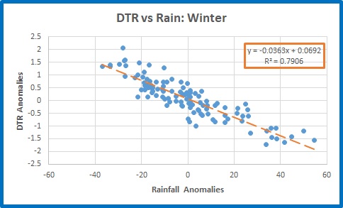
This shows that in winter DTR decreases with increasing rainfall. The R squared value of 0.79 means that for the whole period, rainfall explained DTR 79% of the time on average. However, the average conceals the long term changes in the relationship.
To show this, I simply calculated running 10 year correlations between DTR and Rainfall anomalies for each season, and squared these to show the “R squared” value. This is a good rule of thumb indicator for how well DTR matches rainfall over 10 year periods. A value of 0.5 indicates only half of the DTR for that decade can be explained by rainfall alone. As you will see in the following figures, there are plenty of 10 year periods when the relationship was 0.9 or better, meaning it is ideally possible for 90% of DTR variation to be explained by rainfall. Here are the results.
Figure 2: Spring Running R-squared values: DTR vs Rain
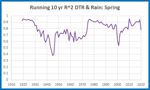
There was a good relationship before 1930. In the decades from then to the mid-1970s it was much worse, and very poor in the decade to 1946. It was poor again in the decade to 2001, and the 10 years to 2020 shows another smaller dip, showing something not quite right with 2020.
Figure 3: Summer Running R-squared values: DTR vs Rain
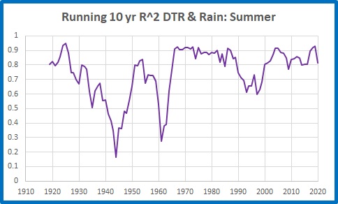
Summer values were very poor before the 1960s, especially the decades to 1944 and 1961, and dipped again in the 1990s.
Figure 4: Autumn Running R-squared values: DTR vs Rain
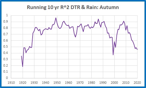
The DTR/Rain relationship was very poor in the decades to 1928, and again before 2001. The recent decade has also been poor- less than half of DTR to 2020 can be explained by rainfall.
Figure 5: Winter Running R-squared values: DTR vs Rain

The DTR/rainfall relationship was fairly good, apart from two short episodes, until the 1990s.
I now turn to the northern half of the continent.
A large area of Northern Australia is dominated by just two seasons, wet and dry. Here is the plot of northern DTR vs Rain for the wet season (October to April).
Figure 6: Northern Australia Wet Season Running R-squared values: DTR vs Rain

Apart from the 1950s, the late 1970s-early 1980s, and 1998 to 2020, the DTR : Rainfall relationship is very poor, with a long period in the 1930s and 1940s in which rainfall explains less than half of DTR variation (only 13% in the decade to 1943).
Because the northern half of Australia accounts for the bulk of Australian rainfall, and the wet season is from October to April, this perhaps explains the problems in spring, summer, and autumn for the whole country.
We can get some clues as to the reasons by comparing long term average maximum temperatures with inverted rain (as wet years are cool and dry years are warm).
Figure 7: Northern Australia Wet Season Decadal Maxima and Rain
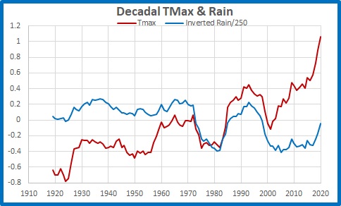
The divergence before 1972 and after 2001 is obvious.
The above plots show how poorly DTR (and therefore temperature, from which it is derived) has matched rainfall over the past 111 years. Low correlations indicate something other than rainfall was influencing temperatures.
In reply to Siliggy, who asked “Is the exaggerated difference now caused by the deletion of old hot maximums and or whole old long warmer records?” the answer appears to be: both, however Figure 7 shows old temperatures (before 1972) appear incorrect, but recent temperatures are at fault too.
The mismatch shows that the Acorn temperature record is not to be trusted as an indicator of past temperatures- and even recent ones.
Tags: Acorn, adjustments, Australia, bom, Bureau of Meteorology, temperature

January 19, 2022 at 9:11 pm
Am I the only one understood none of that.
I don’t suppose some whiz kid could explain what that meant in everyday Humpty Doo Pub-approved Territory English.
January 20, 2022 at 7:00 am
“When the Bureau of Meteorology or the ABC tell you it’s the hottest year on record or climate change will get you, don’t believe a word of it, because they’ve cooked the books.”
January 23, 2022 at 7:15 am
Hi Ken. Thank you for all this effort. A bit like tonyryan43 I am taking some time to absorb what you have done and what it means. Am emailing you a chart i have done of the daily sunspot number averaged over time much like your 10 year running average of maximum temperature compared to inverted rainfall. It has that cog tooth shape in the middle but does a third thing at the ends. The old N.S.W weather prophet from 130 years ago Charles Egeson who predicted the federation drought said that the natural rain cycles could best be seen in five year averages. As did the scientist from Brisbane 100 years ago Inigo Jones. Am wondering if that is why the Millenium drought and the more recent drought can’t be seen in your chart.
January 23, 2022 at 1:01 pm
Ken… I do appreciate what you are doing, and I twigged to the NGW bullshit in 2008 and traced IPCC bullshit to Maurice Strong, and from him to the Rothschilds, and then Rockefellers.
it did not take long to work out what they were up to because I had already exposed their financial manipulations way back to 1815 (see oziz4ozoz.com/) and to the globalisation of Australia beginning in 1975.
I also noted that NSW dairy farmers, who kept meticulous records for a century or so, recorded the hottest year as 1934, as did NASA on their more discreet data.
My problem is your technical text, which leaves me floundering.
January 23, 2022 at 1:02 pm
Correction… oziz4oziz.com/
February 19, 2022 at 4:57 am
Hi Ken. I came across your impressive blog while looking for old BoM temperature data. Excellent work! So I thought I’d let you know that I have also been analysing global temperature data over the last two years but using the original raw monthly data from Berkeley Earth. Not surprisingly my results (without homogenization and adjustments) are rather different from the published trends. You can find my results for NSW here:
https://climatescienceinvestigations.blogspot.com/2020/07/18-new-south-wales-temperature-trends.html
Basically, there has been no warming in NSW that I can find since 1880. I have also analysed all the other states in Australia and the national trend in other subsequent posts. Only WA and QLD show any significant warming and even then it is less than the BoM value. See:
https://climatescienceinvestigations.blogspot.com/2020/07/25-summary-of-warming-trends-in.html
It is also interesting to compare the BoM temperature trends today with those published 10 or 15 years ago such as the data you posted in July 2010:
There now seems to be an extra 0.2°C of warming in some of the BoM data before 2000 that wasn’t there 10 years ago. But I suspect you knew that.
February 19, 2022 at 4:26 pm
Welcome, Climate Detective! You are on the money. In a couple of days time I will be starting a new series of posts on Australian long term temperature series from a variety of stations. It will be interesting to compare results. KS