What’s gone wrong?
In November 2015 in my post “Why are Surface and Satellite temperatures Different?” and two follow up posts I showed that the difference is very largely due to rainfall. You are urged to read these posts in full.
I repeat a key paragraph:
Firstly, surface temperatures are supposed to be different from atmospheric temperatures. Both are useful, both have limitations. The TLT is a metric of the temperature of the bulk of the atmosphere from the surface to several kilometres above the whole continent, in the realm of the greenhouse gases- useful for analysing any greenhouse signals and regional and global climate change. Surface temperature is a metric of temperature 1.5 metres above the ground at 104 ACORN-SAT locations around Australia, area averaged across the continent- useful for describing and predicting weather conditions as they relate to such things as human comfort, crop and stock needs, and bushfire behaviour.
Here are three plots from my 2015 post.
Fig.1: Tmax and Scaled, Inverted Rain (from Figure 7 from my 2015 post)

Dry periods are hotter, wet periods are cooler.
Fig. 2: Surface maxima minus atmospheric temperatures and inverted rain (Figure 10 from my 2015 post)

Fig. 3: Temperature difference compared with rainfall (from Figure 12)

The difference between Australian surface and satellite temperatures was very largely explained by rainfall. However, after five more years of satellite and surface data there is a problem (and I thank Chris Gillham for alerting me to this.)
Fig. 4: Surface maxima minus atmospheric temperatures and inverted rain

Since about 2013 the difference between surface Tmax and satellite data has visibly increased above rainfall.
Now I have a confession to make.
In previous analyses I used running 12 month means in calculating correlation. This can lead to inaccuracy as the means can be highly auto-correlated. From now on I will use annual data, either with calendar years or, as in this post, annual means from December to November (so that summer months and most of the northern Wet season are included in the one datapoint).
I downloaded data from:
Temperature of the Lower Troposphere- Australia Land
As with my 2015 post, I have recalculated rainfall and maxima from 1981-2010 means to match UAH.
In the past five years there have been changes: the Australian maximum temperature record is now based on ACORN-SAT Version 2 instead of Version 1, including new adjustments and some station changes. No doubt UAH has been tweaked a little as well.
However correlation between the difference between the surface maxima as recorded by Acorn and temperature of the lower troposphere (TLT) as recorded by UAH, and rainfall, has decreased.
Fig. 5: Temperature difference compared with rainfall

The close connection between the temperature differences and rainfall became broken from about 2005, as can be seen in Figure 4. Another step up occurred in 2013.
So there appear to be three distinct periods: 1979 to 2004, 2005 to 2012, and after 2013. Plotting temperature differences against rainfall allows us to compare each period.
Fig. 6: Temperature difference compared with rainfall
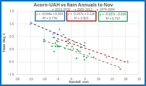
From 1979 to 2004 and from 2005 to 2012 slopes are identical at 0.4 degrees lower temperature for each 10 mm of rain, with 76% and 93% of temperature variance explained by rainfall. The trend lines are parallel but offset by 0.26 degrees indicating either atmospheric temperatures have reduced or surface maxima have increased in the middle period. From 2013 the relationship is different with closer to 0.5 degrees lower temperature per 10mm of rainfall, with rainfall explaining 78% of the variance. Again, the offset shows either UAH has suddenly decreased or Acorn has suddenly increased.
Conclusion: Something has gone wrong with the relationship between rainfall and temperature in Australia. In recent years, and certainly since 2013, the surface- atmospheric temperature difference has rapidly increased relative to rainfall. That should not have happened.
My suspicion is that Acorn’s maxima are to blame. Figure 1 showed Acorn appeared to step up relative to rainfall in 2001 or 2002, or perhaps earlier in 1997, and again in 2013. There can be no meteorological explanation for this.
The accuracy, and therefore usefulness, of the ACORN-SAT adjusted temperature record will be the topic of my next post.
Stay tuned.
Tags: Acorn, adjustments, Australia, bom, Rainfall, Surface Air Temperatures, UAH

December 19, 2020 at 7:26 pm
Thank you Ken for the hard work that you put in to portray these insights – you indeed deserve a medal,
December 19, 2020 at 7:38 pm
Worth looking at http://www.bom.gov.au/climate/data/acorn-sat/#tabs=FAQs under FAQ 15. How do the trends in ACORN-SAT compare to other datasets?
The BoM charts show a UAH and RSS separation from ACORN 2.1, with sea surface temps showing a separation seemingly beginning in the early 2000s.
I note that from 1979-2012 to 2013-2020 the global UAH monthly anomalies increased by an average 0.34, the Australian UAH monthly anomalies increased by an average 0.51, and the ACORN 2.1 monthly anomalies increased by an average 0.78.
There’s little difference between RAW and ACORN since 2013 and I’m suspicious of instruments rather than ACORN itself … i.e. Australia had 10.7% less average annual rainfall in 2013-2019 compared to 1980-2012 (486.3mm > 434.4mm), with the record low rainfall of 2019 being a major contributor.
Comparing 1980-2009 with 2010-2019, the number of 35C+ days in Australia increased 12.2%, the number of 40C+ days increased 31.1%, and the number of 45C+ days increased 93.2%.
The increasingly disproportionate number of extreme days suggests to me that the hotter the day, the more the one second readings of automatic weather stations are susceptible to recording extremes.
The below average rainfall and reduced raincloud cover have indeed warmed the surface stations but it’s also allowed the AWS rapid response exaggeration of brief extreme heat to be in its element.
December 20, 2020 at 9:58 am
Excellent analysis Chris, exactly my suspicions too. Sorry for the late moderation, only just checked my emails.
December 20, 2020 at 7:41 pm
PS – a clarification for …
“Comparing 1980-2009 with 2010-2019, the number of 35C+ days in Australia increased 12.2%, the number of 40C+ days increased 31.1%, and the number of 45C+ days increased 93.2%.”
This relates to the 59 long-term ACORN stations with a start year of 1910 and a full set of comparable daily maxima. That’s the dataset I have at hand but it’s more than half all 112 ACORN stations.
Relating to 45C+, the 59 stations cumulatively had 143 such days in 1980-89, 189 in 1990-99, 250 in 2000-10, and 380 in 2010-2019.
Apart from one second AWS readings, other factors may include the introduction of smaller Stevenson screens and the comparatively dry 2010-19 resulting in less green vegetation in the immediate weather station environment – e.g. the growth of grass and weeds beneath or surrounding a screen (e.g. see pic in Ken’s post re Scone – https://kenskingdom.wordpress.com/2020/12/13/acorn-mish-mash-part-2-scone/).
My rainfall data also relates only to those 59 weather stations. In 2010-19 they averaged 679.5mm annually.
In 1940-49, the 59 stations averaged 671.8mm, so that decade had similar rainfall conditions.
Comparing 1940-49 with 2010-19, the number of 35C+ days increased 17.7%, 40C+ increased by 34.7%, and 45C+ increased by 108.8%.
Another way to express that is in 5C blocks of annual average temperature categories …
20C to 25C : 4,296.7 > 4,454.7 : 158 difference or 3.7% increase from 1940-49 to 2010-19
25C to 30C : 3,911.7 > 4,209.4 : 297.7 difference or 5.5% increase from 1940-49 to 2010-19
30C to 35C : 3,759.2 > 4,183.5 : 424.3 difference or 11.3% increase from 1940-49 to 2010-19
35C to 40C : 1,968.5 > 2,237.7 : 269.2 difference or 13.7% increase from 1940-49 to 2010-19
40C to 45C : 442.4 > 582.4 : 140 difference or 31.6% increase from 1940-49 to 2010-19
45C to 50C : 18.2 > 38.0 : 19.8 difference or 108.8% increase from 1940-49 to 2010-19
With the 2013 separation of UAH and ACORN 2.1 anomalies, its worth comparing the frequency of maximum temperature days from 20C to 35C with days between 35C and 50C at the 59 long-term ACORN stations …
20-35C in RAW
2006 – 12,835 (average rainfall 537.3mm)
2007 – 12,955 (average rainfall 662.6mm)
2008 – 12,834 (average rainfall 668.8mm)
2009 – 12,737 (average rainfall 689.0mm)
2010 – 13,229 (average rainfall 884.6mm)
2011 – 13,613 (average rainfall 855.9mm)
2012 – 13,000 (average rainfall 685.3mm)
2013 – 12,735 (average rainfall 673.9mm)
2014 – 13,123 (average rainfall 588.1mm)
2015 – 12,540 (average rainfall 593.5mm)
2016 – 12,225 (average rainfall 746.3mm)
2017 – 12,837 (average rainfall 638.0mm)
2018 – 12,887 (average rainfall 621.7mm)
2019 – 12,387 (average rainfall 471.3mm)
35-50C in RAW
2006 – 2,689 (average rainfall 537.3mm)
2007 – 2,648 (average rainfall 662.6mm)
2008 – 2,468 (average rainfall 668.8mm)
2009 – 2,922 (average rainfall 689.0mm)
2010 – 1,945 (average rainfall 884.6mm)
2011 – 1,922 (average rainfall 855.9mm)
2012 – 2,612 (average rainfall 685.3mm)
2013 – 3,208 (average rainfall 673.9mm)
2014 – 3,004 (average rainfall 588.1mm)
2015 – 3,032 (average rainfall 593.5mm)
2016 – 3,105 (average rainfall 746.3mm)
2017 – 3,087 (average rainfall 638.0mm)
2018 – 3,115 (average rainfall 621.7mm)
2019 – 3,551 (average rainfall 471.3mm)
Averaged from 20C to 35C, the frequency decreased 2.8% (91,203 > 88,634) comparing 2006-2012 with 2013-2019.
Averaged from 35C to 50C, the frequency increased 28.5% (17,206 > 22,102) comparing 2006-2012 with 2013-2019.
In the 35-50C category there’s a clear frequency shift in 2013 that doesn’t happen in the 20-35C category.
Bear in mind these numbers are calculated for 12 months of each year and include cool season maxima, so if the climate is warming then, for example, 19.9C or a bit cooler should warm into the 20-35C category and swell those numbers.
40-45C in RAW
2006 – 557 (average rainfall 537.3mm)
2007 – 420 (average rainfall 662.6mm)
2008 – 445 (average rainfall 668.8mm)
2009 – 571 (average rainfall 689.0mm)
2010 – 276 (average rainfall 884.6mm)
2011 – 246 (average rainfall 855.9mm)
2012 – 455 (average rainfall 685.3mm)
2013 – 613 (average rainfall 673.9mm)
2014 – 688 (average rainfall 588.1mm)
2015 – 547 (average rainfall 593.5mm)
2016 – 557 (average rainfall 746.3mm)
2017 – 612 (average rainfall 638.0mm)
2018 – 772 (average rainfall 621.7mm)
2019 – 1058 (average rainfall 471.3mm)
45-50C in RAW
2006 – 25 (average rainfall 537.3mm)
2007 – 37 (average rainfall 662.6mm)
2008 – 11 (average rainfall 668.8mm)
2009 – 41 (average rainfall 689.0mm)
2010 – 25 (average rainfall 884.6mm)
2011 – 12 (average rainfall 855.9mm)
2012 – 7 (average rainfall 685.3mm)
2013 – 43 (average rainfall 673.9mm)
2014 – 33 (average rainfall 588.1mm)
2015 – 35 (average rainfall 593.5mm)
2016 – 13 (average rainfall 746.3mm)
2017 – 36 (average rainfall 638.0mm)
2018 – 55 (average rainfall 621.7mm)
2019 – 121 (average rainfall 471.3mm)
If the climate is warming it should be a uniform increase in the frequency of maxima from 20C to 50C, and the data suggests the increase is in the hot to extreme range where AWS one second sensitivity is most reactive to the the 13% reduction in average annual rainfall from 2006-2012 to 2013-2019 at the 59 stations (711.9mm > 619.0mm).
Frequency counts … e.g. if 365 days have 50 days at 40C and the rest at 25C, the annual average is 27.1C. If they have 60 days at 40C and the rest at 25C, the annual average is 27.5C.
The data suggests surface temperatures suddenly increased rather than UAH suddenly decreased in 2013, but the cause is a bit of a mystery because neither rainfall or instrument sensitivity to hotter temperatures can explain why it was so sudden.
December 19, 2020 at 9:26 pm
Yes ! Thanks from me as well Ken. I have no idea how much time you put into developing these posts but I suspect that the time & effort involved is huge.
I’m looking forward to the next post about the accuracy, and therefore usefulness, of the ACORN-SAT adjusted temperature record.
Mind you I’m already a confirmed sceptic about the BOM’s ACORN weather stations
December 20, 2020 at 6:40 am
Splendid work Ken, I look forward to the next addition.
December 21, 2020 at 1:01 pm
Long standing BoM rainfall gridded data (AWAP) were replaced by a new methodology in September 2020 (AGCD).
Re:
http://www.bom.gov.au/climate/change/about/rain_timeseries.shtml
And, multiple links therein including a “peer reviewed” mighty tome by David Jones et al:
Click to access BRR-041.pdf
Personally, I think that any average rainfall data for the whole of Oz is a greater nonsense than ACORN
Extract: Why has the Bureau of Meteorology changed its monthly gridded rainfall analysis?
The Bureau of Meteorology is committed to improving the services it provides to the Australian community and industry. This means looking at ways to further enhance and build upon the products we provide.
AGCD commenced operation in September 2020, replacing the previous monthly gridded rainfall analysis, known as the Australian Water Availability Project (AWAP). AGCD incorporates enhanced analysis and scientific methods, as well as state of the art computer modelling. Funding to develop the AGCD dataset was provided by the NSW Government as part of their 2015 Drought Strategy.
The Bureau will continue to enhance its gridded rainfall analysis by harnessing future developments in scientific understanding, analysis techniques and computer modelling.
More detailed explanations on the improvements can be found in the technical report.
December 25, 2020 at 10:18 am
Presumably, BOM-ACORN have not released their computer code for their homogenisation/adjustment algorithm?
(I have been out of the loop for a while.)
December 25, 2020 at 2:37 pm
You can read the technical papers that describe it, and supposedly you can download the Python code. I’ve never tried to.
December 25, 2020 at 8:40 pm
Thank you, I’ll have a look.
December 25, 2020 at 10:08 pm
It seems that one must ask via their helpdesk.
In this response document http://www.bom.gov.au/climate/data/acorn-sat/documents/ACORN-SAT-TAF-Response-to-Report.pdf
they state “Python computer code for ACORN-SAT has been available on request. The Bureau will provide a downloadable link on the ACORN-SAT website and monitor the level of access to the code.”
The second part of the statement doesn’t seem to have been implemented.
January 7, 2021 at 11:03 am
[…] A Reality Check on Global Warming « Surface and Satellite Temperatures: 2020 Update […]