Posts Tagged ‘UAH’

Australian Temperature- Satellites or Surface Stations?

May 13, 2022

For years we have been very sceptical about the official Bureau of Meteorology (BOM) temperature record which is based on 104 surface stations in the ACORN-SAT (Acorn) network.  In this post I look at one of the main reasons for doubting the veracity of the surface record- the increasing divergence from the satellite record.

First up I should say that the two records should not necessarily agree, because they measure two completely different things.  Surface stations measure the temperature of the air 1.2 metres above the ground and report the highest and lowest one second samples each day at 104 locations.  These are combined in a grid average to give monthly, seasonal, and annual temperatures.  Satellites measure temperatures of the atmosphere from the ground to many kilometres up, every second, over a wide area for each pass.  These are similarly combined by algorithms to calculate a monthly average for (in this case) the land area of Australia’s Temperature of the Lower Troposphere (TLT). 

They are both useful for different purposes but are not easily compared.  Because minimum surface temperatures poorly match TLT, mean surface temperature is also a poor match.  Maxima are a better match, but still not perfect.

For this post I use data from the University of Alabama (Huntsville) (UAH) which calculates anomalies from 1991 to 2020 means.  I have converted Acorn data from anomalies from 1961-1990 means, to anomalies from 1991-2020 means, to match.

Figure 1 shows monthly Acorn maxima data and UAH means from December 1978.

Figure 1: Monthly Surface Tmax and UAH data

Although surface maxima have a much larger range than TLT anomalies, they plainly follow similar trajectories.  12 month running means smooth the data and allow easier visual comparison.

Figure 2: Running 12 Month Means: Surface Tmax and UAH data

Similar, but different at several times.   Annual means show that in some years Tmax and TLT are close to identical, while in other years they have large differences.

Figure 3: Annual Means: Surface Tmax and UAH data

In 2015 I showed the reason for these differences (but not the difference in trends).  The differences between the two datasets are very largely due to variations in rainfall.  In wet years surface maxima are relatively much cooler than TLT; in dry years surface maxima are much warmer.  In Figure 4 I have calculated rainfall anomalies scaled down by a factor of 20 and inverted, to compare with the difference between Tmax and TLT.

Figure 4: Running 12 month Means: Surface Tmax minus UAH and Inverted Rainfall

The match is close.  Figure 5 shows annual values, and trend lines.

Figure 5: Annual Means: Surface Tmax minus UAH and Inverted Rainfall

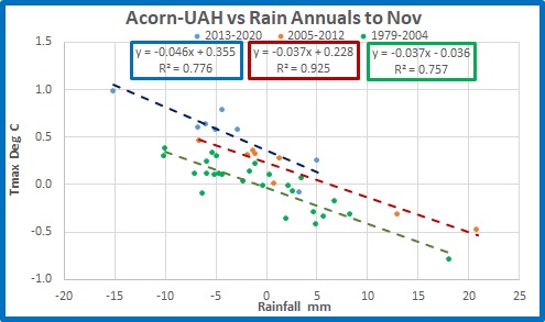
While annual rain has been slightly increasing (it’s inverted, remember) the relative difference between surface temperature and atmospheric temperature has been increasing at a rate of one degree per hundred years.  That’s odd.  Figure 6 shows the relationship between the temperature difference and rainfall.

Figure 6: Annual Surface Tmax minus UAH versus Scaled Rainfall

For every extra 20mm of rainfall, the difference between surface maxima and TLT decreases by 0.85 degrees Celsius.  The trend lines in Figure 5 should be close to parallel, not diverging.

As well, as rainfall increases, Tmax should decrease, as Figure 7 shows.

Figure 7: Surface Tmax as a Product of Rain

But as we saw in Figure 3, Tmax is increasing faster than UAH.

Furthermore, as surface Tmax increases, TLT should be increasing as well, which it is, but at a slower rate.

Figure 8:  Atmospheric Temperature as a Product of Surface Tmax

Is the atmospheric temperature lagging behind surface temperature?  Figure 9 shows the last two years of monthly values.

Figure 9:  Monthly Atmospheric Temperature and Surface Tmax, January 2020-March 2022

The values are mostly synchronous, with sometimes a delay in one or the other of one month.  (Remember, we are comparing data from 104 stations scattered across the continent, with that of the atmosphere with constantly changing and circulating winds).  When the land warms, the atmosphere warms with it; when the land cools, so does the atmosphere.

Conclusion:

Tmax should not be increasing faster than atmospheric temperature.  There is no real delay in any temperature change, as the atmosphere is heated each day by the land.  Therefore it appears that there must be some fault with the maximum temperatures reported by ACORN-SAT, which appears to be warming too rapidly.

Explanation of the mechanism for rainfall moderation of surface-atmospheric temperature differences:

In wet years more moisture carried upwards condenses, releasing heat, thus warming the atmosphere, while the surface is cooled by cloud cover, evaporation, and transpiration.  In dry years much less moisture is convected, so less heat is released in the atmosphere, while the surface is hotter because of less cloud cover and less evaporation and transpiration.  Thus dry years have a greater relative difference between Tmax and TLT than wet years.

The only energy source is solar radiation heating the land surface in daylight hours, which in turn heats the atmosphere by conduction and convection.  At night as radiation to space rapidly cools the earth, convection also rapidly decreases, so maxima, not minima, are responsible for the relationship with TLT. 

A complication is that in summer (and more so in very wet La Nina years) large volumes of very moist air from the tropical seas to the north converge over northern Australia and penetrate even into southern Australia.  This warm moist air cannot heat the surface but through condensation transfers heat to the upper atmosphere- therefore the difference between surface and atmosphere is even smaller.

Surface and Satellite Temperatures: 2020 Update

December 19, 2020

What’s gone wrong?

In November 2015 in my post “Why are Surface and Satellite temperatures Different?” and two follow up posts I showed that the difference is very largely due to rainfall.  You are urged to read these posts in full.

I repeat a key paragraph:

Firstly, surface temperatures are supposed to be different from atmospheric temperatures. Both are useful, both have limitations. The TLT is a metric of the temperature of the bulk of the atmosphere from the surface to several kilometres above the whole continent, in the realm of the greenhouse gases- useful for analysing any greenhouse signals and regional and global climate change. Surface temperature is a metric of temperature 1.5 metres above the ground at 104 ACORN-SAT locations around Australia, area averaged across the continent- useful for describing and predicting weather conditions as they relate to such things as human comfort, crop and stock needs, and bushfire behaviour.

Here are three plots from my 2015 post.

Fig.1:  Tmax and Scaled, Inverted Rain (from Figure 7 from my 2015 post)

Dry periods are hotter, wet periods are cooler.

Fig. 2:  Surface maxima minus atmospheric temperatures and inverted rain (Figure 10 from my 2015 post)

Fig. 3:  Temperature difference compared with rainfall (from Figure 12)

The difference between Australian surface and satellite temperatures was very largely explained by rainfall. However, after five more years of satellite and surface data there is a problem (and I thank Chris Gillham for alerting me to this.)

Fig. 4:  Surface maxima minus atmospheric temperatures and inverted rain

Since about 2013 the difference between surface Tmax and satellite data has visibly increased above rainfall.

Now I have a confession to make.

In previous analyses I used running 12 month means in calculating correlation.  This can lead to inaccuracy as the means can be highly auto-correlated.  From now on I will use annual data, either with calendar years or, as in this post, annual means from December to November (so that summer months and most of the northern Wet season are included in the one datapoint).

I downloaded data from:

Monthly maxima

Monthly rainfall

Temperature of the Lower Troposphere- Australia Land

As with my 2015 post, I have recalculated rainfall and maxima from 1981-2010 means to match UAH.

In the past five years there have been changes:  the Australian maximum temperature record is now based on ACORN-SAT Version 2 instead of Version 1, including new adjustments and some station changes.  No doubt UAH has been tweaked a little as well.

However correlation between the difference between the surface maxima as recorded by Acorn and temperature of the lower troposphere (TLT) as recorded by UAH, and rainfall, has decreased.

Fig. 5:  Temperature difference compared with rainfall

The close connection between the temperature differences and rainfall became broken from about 2005, as can be seen in Figure 4.  Another step up occurred in 2013.

So there appear to be three distinct periods: 1979 to 2004, 2005 to 2012, and after 2013.  Plotting temperature differences against rainfall allows us to compare each period.

 Fig. 6:  Temperature difference compared with rainfall

From 1979 to 2004 and from 2005 to 2012 slopes are identical at 0.4 degrees lower temperature for each 10 mm of rain, with 76% and 93% of temperature variance explained by rainfall. The trend lines are parallel but offset by 0.26 degrees indicating either atmospheric temperatures have reduced or surface maxima have increased in the middle period.  From 2013 the relationship is different with closer to 0.5 degrees lower temperature per 10mm of rainfall, with rainfall explaining 78% of the variance.  Again, the offset shows either UAH has suddenly decreased or Acorn has suddenly increased.

Conclusion:  Something has gone wrong with the relationship between rainfall and temperature in Australia.  In recent years, and certainly since 2013, the surface- atmospheric temperature difference has rapidly increased relative to rainfall.  That should not have happened.

My suspicion is that Acorn’s maxima are to blame.   Figure 1 showed Acorn appeared to step up relative to rainfall in 2001 or 2002, or perhaps earlier in 1997, and again in 2013.  There can be no meteorological explanation for this.

The accuracy, and therefore usefulness, of the ACORN-SAT adjusted temperature record will be the topic of my next post.

Stay tuned.

The Pause Update: August 2016

September 12, 2016

The complete UAH v6.0 data for August were released on yesterday. I present all the graphs for various regions, and as well summaries for easier comparison. The Pause has finally ended globally and for the Northern hemisphere, but still refuses to go away in the Southern Hemisphere.

These graphs show the furthest back one can go to show a zero or negative trend (less than 0.1 +/-0.1C per 100 years) in lower tropospheric temperatures. I calculate 12 month running means to remove the small possibility of seasonal autocorrelation in the monthly anomalies. Note: The satellite record commences in December 1978- now 37 years and 9 months long- 453 months. 12 month running means commence in November 1979. The y-axes in the graphs below are at December 1978, so the vertical gridlines denote Decembers. The final plotted points are August 2016.

[CLICK ON IMAGES TO ENLARGE]

Globe:

pause-aug-16-globe

The Pause has ended. A trend of +0.13C/100 years (+/- 0.1C) since March 1998 must make GWEs tremble with joy.

And, for the special benefit of those who think that I am deliberately fudging data by using 12 month running means, here is the plot of monthly anomalies:
pause-aug-16-globe-monthly

Still +0.33C/100 years since December 1997- not exactly alarming. The Pause will return sooner with monthly anomalies than 12 month means of course.

Northern Hemisphere:

pause-aug-16-nh

The Northern Hemisphere Pause has ended. Note the not very alarming warming of 0.33C +/- 0.1C per 100 years for half the record compared with 1.39C for the whole period.

Southern Hemisphere:

pause-aug-16-sh

For well over half the record, the Southern Hemisphere has zero trend.

Tropics:

pause-aug-16-tropics

The Pause has shortened again with the El Nino influence, but is still over half the record. However, don’t be surprised if the Pause disappears next month.

Tropical Oceans:

pause-aug-16-tropic-oceans

The Pause has shortened by another 3 months- the El Nino now having a strong effect on the 12 month means.

Northern Extra Tropics:

pause-aug-16-nh-extt

The Pause by this criterion has ended in this region, however note that the slope since 1998 is +0.39 +/- 0.1C per 100 years compared with +1.61C for the whole period- a quarter of the rate.

Southern Extra Tropics:

pause-aug-16-sh-extt

No change.

Northern Polar:

pause-aug-16-np

The Pause has ended in this region. (No cause for celebration- we definitely would not want to see cooling here!)

Southern Polar:

pause-aug-16-sp

The South Polar region has been cooling for the entire record- 36 years 10 months.

USA 49 States:

pause-aug-16-usa49

No change in length of the Pause.

Australia:

pause-aug-16-oz

No change here either.

The next graphs summarise the above plots. First, a graph of the relative length of The Pause in the various regions:

pause-length-aug-16

Note that the Pause has ended by my criteria in all regions of Northern Hemisphere, and consequently the Globe, but the Tropics and all southern regions have a Pause for over half the record, including the South Polar region which has been cooling for the whole record.

The variation in the linear trend for the whole record, 1978 to the present:

trends-78-to-now

Note the decrease in trends from North Polar to South Polar.

And the variation in the linear trend since June 1998, which is about halfway between the global low point of December 1997 and the peak in December 1998:

trends-98-to-now

The only region to show strong warming for this period (18 years 3 months) is the North Polar region: the Northern Extra Tropics, Tropics, the Northern Hemisphere, and the Globe have mild warming but all other regions (including all of the Southern Hemisphere) are Paused or cooling. The imbalance between the two hemispheres is obvious. The lower troposphere over Australia has been strongly cooling for more than 18 years- just shy of half the record.

The next few months will be interesting. The Pause should disappear from the Tropics next month and the Southern Hemisphere should follow. How long will the Pause last in the Southern Extra Tropics and South Polar regions?

The Pause Update: July 2016

August 7, 2016

The complete UAH v6.0 data for July were released on Friday.  I present all the graphs for various regions, and as well summaries for easier comparison.  The Pause still refuses to go away, despite all expectations.

These graphs show the furthest back one can go to show a zero or negative trend (less than 0.1 +/-0.1C per 100 years) in lower tropospheric temperatures. I calculate 12 month running means to remove the small possibility of seasonal autocorrelation in the monthly anomalies. Note: The satellite record commences in December 1978- now 37 years and 8 months long- 452 months. 12 month running means commence in November 1979. The y-axes in the graphs below are at December 1978, so the vertical gridlines denote Decembers. The final plotted points are July 2016.

 [CLICK ON IMAGES TO ENLARGE]

Globe:

Pause july 16 globe

The Pause is 3 months shorter.

And, for the special benefit of those who think that I am deliberately fudging data by using 12 month running means, here is the plot of monthly anomalies, which shows that The Pause is over by my rather strict criterion:

Pause july 16 globe monthly

+0.33C/100 years since December 1997- not exactly alarming.  The Pause will return sooner with monthly anomalies than 12 month means of course.

Northern Hemisphere:


Pause july 16 nh

The Northern Hemisphere Pause has ended as expected.  Note the not very alarming warming of 0.28 +/- 0.1C per 100 years for half the record compared with 1.38C for the whole period.

Southern Hemisphere:

Pause july 16 sh

The Pause has shortened by another 4 months, but still, for well over half the record, the Southern Hemisphere has zero trend.

Tropics:

Pause july 16 tropics

The Pause has shortened by another 2 months with the El Nino influence, but is still over half the record.

Tropical Oceans:

Pause july 16 tropic ocean

The Pause has shortened by another 3 months- the El Nino now having a strong effect on the 12 month means.

Northern Extra Tropics:

Pause july 16 NH Ext tropics

The Pause by this criterion has ended in this region, however note that the slope since 1998 is +0.34 +/- 0.1C per 100 years compared with +1.6C for the whole period.  That’s still embarassingly slow warming.

Southern Extra Tropics:

Pause july 16 SH Ext tropics

The Pause has lengthened again by another month.

Northern Polar:

Pause july 16 NP

The Pause has decreased by 1 month.

Southern Polar:

Pause july 16 SP

The South Polar region has been cooling for the entire record- 36 years 9 months.

USA 49 States:

Pause july 16 USA

The Pause is 2 months shorter.

Australia:

Pause july 16 Oz

The Australian Pause is one month longer.

The next graphs summarise the above plots. First, a graph of the relative length of The Pause in the various regions:

Pause length jul16

Note that the Pause has ended by my criteria in the Northern Extra Tropics and the Northern Hemisphere, but apart from the North Polar region, all other regions have a Pause for over half the record, including the South Polar region which has been cooling for the whole record.

The variation in the linear trend for the whole record, 1978 to the present:

Trends 1978 july 16

Note the decrease in trends from North Polar to South Polar.

And the variation in the linear trend since June 1998, which is about halfway between the global low point of December 1997 and the peak in December 1998:

Trends 1998 july 16

The only region to show strong warming for this period (18 years 2 months) is the North Polar region: the Northern Extra Tropics, Tropics, the Northern Hemisphere, and the Globe have very mild warming but all other regions (including all of the Southern Hemisphere) are Paused or cooling. The imbalance between the two hemispheres is obvious. The lower troposphere over Australia has been strongly cooling for more than 18 years- just shy of half the record.

And finally, here is a plot of Global UAH versus CO2 concentration at Cape Grim from January 1996 to June 2016:

UAH vs C Grim co2 to 1996 June 2016

Now that’s a Pause!

Interim Pause Update: July 2016

August 2, 2016

This is a brief initial post with the UAH data for July 2016 with Global, Northern Hemisphere, Southern Hemisphere, and Tropical data only, which were released this morning.  I will post all graphs when the full dataset is available in about one week’s time.

Globe:

Pause july 16 globe

The Pause is hanging on but the trend will probably go above +0.1C per 100 years next month.

Northern Hemisphere:

Pause july 16 nh

The Pause is over, but the trend for the past 18 years and 3 months is +0.28C, which is about one fifth of the trend for the whole satellite period.

Southern Hemisphere:

Pause july 16 sh

The Pause has shortened by 4 months to 20 years and 2 months.

Tropics:

Pause july 16 tropics

The Pause has decreased to 19 years 1 month.

All graphs will be available shortly.

Temperature Variation Due to ENSO

July 25, 2016

In this post I use the Multivariate ENSO Index (MEI) supplied by NOAA at http://www.esrl.noaa.gov/psd/enso/mei/index.html and lower tropospheric temperature data supplied by UAH to show how much of temperature variation over the past 20 years is due to ENSO and how little is due to CO2.  I will keep words brief and let graphics do the talking.

Firstly, here is the MEI data from 1950:

Fig. 1:  Monthly MEI from 1950

mei monthly

As an aside, this is how it compares with SOI data.  The SOI is inverted and both are scaled for comparison.

Fig. 2:  MEI compared with SOI inverted

mei vs soi

Now compare scaled MEI with Global UAH:

Fig. 3: MEI (scaled) and UAH

mei monthly w uah

Notice tropospheric temperatures appear to lag the MEI by some 5 months:

Fig. 4: MEI advanced 5 months and UAH

mei monthly advd 5m w uah graph

Notice both datasets are noisy, and there is a clear discrepancy in the early 1990s.  12 month running means show this more clearly:

Fig. 5:  12 month means of UAH and MEI advanced 5 months:

mei advd w uah 12m

The slump in UAH data is shown by the arrow.  Mt Pinatubo’s main eruption was in June 1991. (Without El Chichon in 1982, there may well have been a much higher spike in the mid-1980s).

Now let’s look at the correlation between monthly MEI and UAH.  Firstly, the whole period from December 1978:

Fig. 6:  UAH vs MEI advanced 5 months 1978 – 2016

mei monthly advd 5m w uah

About 13% of temperature variation is associated with MEI variation.  Doesn’t tell us much does it.  What if we exclude the UAH data for two years from April 1982, and from July 1991 to December 1995?

Fig. 7:  UAH vs MEI advanced 5 months 1978 – 2016 with periods after volcanic eruptions excluded

mei monthly advd 5m v uah excl volcanoes

Considering the fluctuations in both datasets, that shows a fairly strong correlation.

Next, we examine the periods, before, during, and after the Pinatubo influence.

Fig. 8:  :  UAH vs MEI advanced 5 months December 1978 – June 1991, excluding April 1982 to March 1984

mei monthly advd 5m w uah 78-91

Again we see a similar correlation.

Fig. 9:  UAH vs MEI advanced 5 months July 1991 – December 1995

mei monthly advd 5m w uah 91-95.jpg

The strong positive correlation of the previous plots has broken down.

Fig. 10:  UAH vs MEI advanced 5 months January 1996 – June 2016

mei monthly advd 5m w uah 96-16

The correlation is even higher.  Over half of temperature variation is associated with ENSO variation five months previously.  Here is the same 1996-2016 plot but with 12 month running means:

Fig. 11  UAH vs MEI advanced 5 months January 1996 – June 2016, with 12 month running means

mei  advd 5m w uah 96-16 12m

74% of temperature variation for the past 20 years and 6 months can be explained by previous ENSO variation alone.  In the same period, carbon dioxide concentration at Mauna Loa has increased by 44.77 ppm, which is more than 49% of the entire increase from 1958, and Global temperature as measured by UAH has increased by a little over 0.1 degree C.

No wonder Global Warming Enthusiasts were pinning their hopes on the 2015-16 El Nino to put an end to the Pause, but they must also hope for the ENSO- temperature correlation to break down shortly, as a deep La Nina will mean cooler temperatures and further embarrassment for them.  However, the correlation breaks down when volcanoes cause lower temperatures in El Nino conditions as we have seen, but what mechanism could there be for higher temperatures in La Nina conditions?  Perhaps that magical greenhouse gas CO2?  That would indeed be spectacular- there are no outliers at the low end of any of the above plots.  The most UAH has been higher than expected with low MEI is about +0.2C to +0.3C, and those values cannot be described as outliers.  Besides, UAH for June is already down to +0.34C, and we are only four months past the peak- the cooling has barely begun.

Finally, this is a plot of the centred 37 month mean MEI (because La Ninas can last for three years).

Fig. 12: 37 month centred mean MEI

mei 37m avg

Notice that before 1975 the 37 month average never exceeded +0.5, the majority of the time was in negative territory, and in the 1950s and 1970s reached below -1.0.  Since 1975 the MEI has dropped below -0.5 only once in 2000 and approached -0.5 in 2012, but has been in positive territory for the vast majority of the time, exceeded +0.5 in six events, and was above +1.0 in the early 1990s.  It would be surprising if global temperatures had not seen a large increase.

How low will the monthly MEI go with the coming La Nina, and how low will the following global temperatures go?  All depends on La Nina’s length and strength, but the monthly MEI data are falling fast.  Stand by.

The Pause Update: June 2016

July 8, 2016

The complete UAH v6.0 data for June were released yesterday.  I present all the graphs for various regions, and as well summaries for easier comparison.  The Pause still refuses to go away, despite all expectations.

These graphs show the furthest back one can go to show a zero or negative trend (less than 0.1 +/-0.1C per 100 years) in lower tropospheric temperatures. I calculate 12 month running means to remove the small possibility of seasonal autocorrelation in the monthly anomalies. Note: The satellite record commences in December 1978- now 37 years and 7 months long- 451 months. 12 month running means commence in November 1979. The y-axes in the graphs below are at December 1978, so the vertical gridlines denote Decembers. The final plotted points are June 2016.

 [CLICK ON IMAGES TO ENLARGE]

Globe:

pause jun16 globe

The 12 month mean to June 2016 remains at +0.46C and should stay at about this value for the next two months.  If so, The Pause, (now 1 month shorter), will continue to be an embarrassing reality! However, it may end soon after with a small positive trend.

And, for the special benefit of those who think that I am deliberately fudging data by using 12 month running means, here is the plot of monthly anomalies, which shows that The Pause is over by my rather strict criterion:

pause jun16 globe mthly

+0.3C/100 years since December 1997- not exactly alarming.  The Pause will return sooner with monthly anomalies than 12 month means of course.

Northern Hemisphere:

pause jun16 NH

The Northern Hemisphere Pause has ended as expected.  Note the not very alarming warming of 0.21 +/- 0.1C per 100 years for half the record compared with 1.37C for the whole period.

Southern Hemisphere:

pause jun16 SH

The Pause has shortened by 2 months.  For well over half the record the Southern Hemisphere has zero trend.

Tropics:

pause jun16 tropics

The Pause has shortened by another 3 months with the El Nino influence, but is still over half the record.

Tropical Oceans:

pause jun16 tropic oceans

The Pause has shortened by another 2 years- the El Nino now having a strong effect on the 12 month means.

Northern Extra Tropics:

pause jun16 NH ExtT

The Pause by this criterion has ended in this region, however note that the slope since 1998 is +0.29 +/- 0.1C per 100 years compared with +1.59C for the whole period.  That’s still embarassingly slow warming.

Southern Extra Tropics:

pause jun16 SH ExtT

The Pause has lengthened by another month.

Northern Polar:

pause jun16 NP

The Pause has decreased by 1 month.

Southern Polar:

pause jun16 SP

The South Polar region has been cooling for the entire record.

USA 49 States:

pause jun16 USA49

No change.

Australia:

pause jun16 Oz

The Australian Pause has not changed.

The next graphs summarise the above plots. First, a graph of the relative length of The Pause in the various regions:

Pause length jun 16

Note that the Pause has ended by my criteria in the Northern Extra Tropics and the Northern Hemisphere, but apart from the North Polar region, all other regions have a Pause of 18 years 8 months or longer- well over half the record, including the South Polar region which has been cooling for the whole record.

The variation in the linear trend for the whole record, 1978 to the present:

Trends 1978 jun 16

Note the decrease in trends from North Polar to South Polar.

And the variation in the linear trend since June 1998, which is about halfway between the global low point of December 1997 and the peak in December 1998:

Trends 1998 jun 16

The only region to show strong warming for this period (18 years 1 month) is the North Polar region: the Northern Extra Tropics, Tropics, and the Northern Hemisphere have very mild warming but all other regions (including the Globe as a whole and all of the Southern Hemisphere) are Paused or cooling. The imbalance between the two hemispheres is obvious. The lower troposphere over Australia has been strongly cooling for more than 18 years.

12 month means will continue to grow in some regions for the next few months, so the Pause as here defined may end in some regions shortly (probably North Polar, Tropics, and Tropical Oceans), and may not reappear until early 2018.  The impact of the coming La Nina will be worth watching.  Unless temperatures reset at a new, higher level and continue rising, very low trends will remain.

The Pause Update: May 2016

June 5, 2016

The complete UAH v6.0 data for May were released on today.  I present all the graphs for various regions, and as well summaries for easier comparison.  The Pause still refuses to go away, despite all expectations.

These graphs show the furthest back one can go to show a zero or negative trend (less than 0.1 +/-0.1C per 100 years) in lower tropospheric temperatures. I calculate 12 month running means to remove the small possibility of seasonal autocorrelation in the monthly anomalies. Note: The satellite record commences in December 1978- now 37 years and 6 months long- 450 months. 12 month running means commence in November 1979. The y-axes in the graphs below are at December 1978, so the vertical gridlines denote Decembers. The final plotted points are May 2016.

 [CLICK ON IMAGES TO ENLARGE]

Globe:

May16 globe

The 12 month mean to May 2016 is +0.46C.  The Pause is still an embarrassing reality! However, it may “disappear” soon with a small positive trend.

And, for the special benefit of those who think that I am deliberately fudging data by using 12 month running means, here is the plot of monthly anomalies, which shows that The Pause is over by my rather strict criterion:

May16 globe mthly

+0.27C/100 years since December 1997- not exactly alarming.  The Pause will return sooner with monthly anomalies than 12 month means of course.

Northern Hemisphere:

May16 NH

The Northern Hemisphere Pause has “disappeared” as expected.  Note the not very alarming warming of 0.14+/- 0.1C per 100 years for half the record compared with 1.35C for the whole period.

Southern Hemisphere:

May16 SH

The pause has shortened by one month.  For well over half the record the Southern Hemisphere has zero trend.

Tropics:

May16 Tropics

The Pause has shortened dramatically with the El Nino influence, but is still over half the record.

Tropical Oceans:

May16 Tropic oceans

The Pause has shortened by 19 months.

Northern Extra Tropics:

May16 Nth ExTropics

The Pause by this criterion has ended in this region, however note that the slope since 1998 is +0.23 +/- 0.1C per 100 years compared with +1.58C for the whole period.  That’s still embarassingly slow warming.

Southern Extra Tropics:

May16 Sth ExTropics

The Pause has lengthened by another month.

Northern Polar:

May16 NP

The Pause has decreased by 2 months.

Southern Polar:

May16 SP

The South Polar region has been cooling for the entire record.

USA 49 States:

May16 USA49

No change.

Australia:

May16 Oz

The Australian Pause has lengthened rapidly.

The next graphs summarise the above plots. First, a graph of the relative length of The Pause in the various regions:

Pause length may16

Note that the Pause has ended by my criteria in the Northern Extra Tropics and the Northern Hemisphere, but apart from the North Polar region, all other regions have a Pause of 18 years 9 months or longer- well over half the record, including the South Polar region which has been cooling for the whole record.

The variation in the linear trend for the whole record, 1978 to the present:

Trends 1978 may16

Note the decrease in trends from North Polar to South Polar.

And the variation in the linear trend since June 1998, which is about halfway between the global low point of December 1997 and the peak in December 1998:

Trends Jun98 may16

The only region to show strong warming for this period (18 years) is the North Polar region: the Northern Extra Tropics and the Northern Hemisphere have very mild warming but all other regions are Paused or cooling. In fact “global” warming since June 1998 is limited to that part of the globe north of 20 degrees North.  And the lower troposphere over Australia has had strong cooling for the past 18 years.

12 month means will continue to grow for the next few months, so the Pause as  here defined may disappear shortly, and may not reappear until early 2018.  The impact of the coming La Nina will be worth watching.  Unless temperatures reset at a new, higher level and continue rising, very low trends will remain.

The Pause Update: April 2016

May 9, 2016

The complete UAH v6.0 data for April were released on Friday.  I could have presented this earlier, but there are some more important things in my life, like grandkids’ sleepovers and Mothers’ Day.  Back to business.  I present all the graphs for various regions, and as well summaries for easier comparison.  The Pause still refuses to go away, despite all expectations.

These graphs show the furthest back one can go to show a zero or negative trend (less than +0.1C/ 100 years) in lower tropospheric temperatures. I calculate 12 month running means to remove the small possibility of seasonal autocorrelation in the monthly anomalies. Note: The satellite record commences in December 1978- now 37 years and 5 months long- 448 months. 12 month running means commence in November 1979. The graphs below start in December 1978, so the vertical gridlines denote Decembers. The final plotted points are April 2016.

 [CLICK ON IMAGES TO ENLARGE]

Globe:

Apr 16 globe

The 12 month mean to April 2016 is +0.43C.  However, the Pause is still an embarrassing reality! For how much longer we don’t know.

And, for the special benefit of those who think that I am deliberately fudging data by using 12 month running means, here is the plot of monthly anomalies, which shows that The Pause is over by my rather strict criterion:

Apr 16 globe mthly

+0.22C/100 years since December 1997- not exactly alarming.  The Pause will return sooner with monthly anomalies than 12 month means of course.

Northern Hemisphere:

Apr 16 NH

The Northern Hemisphere Pause refuses to go quietly and remains at the same length. It may well disappear in the next month or two.

Southern Hemisphere:

Apr 16 SH

The pause has shortened by one month.  For well over half the record the Southern Hemisphere has zero trend.

Tropics:

Apr 16 Tropics

The Pause has shortened by 3 months.

Tropical Oceans:

Apr 16 Tropic Oceans

The Pause has shortened by 3 months.

Northern Extra Tropics:

Apr 16  NH ExtraTropics

The Pause by this criterion has ended in this region, however note that the slope since 1998 is +0.17 +/- 0.1C per 100 years compared with +1.56C for the whole period.  That’s not much above dead flat.

Southern Extra Tropics:

Apr 16  SH ExtraTropics

The Pause has lengthened by one month.

Northern Polar:

Apr 16 NP

No change.

Southern Polar:

Apr 16 SP

At -0.18C/ 100 years, this region is cooling for the entire record.

USA 49 States:

Apr 16 USA 49

No change

Australia:

Apr 16 Oz

One month longer.

The next graphs summarise the above plots. First, a graph of the relative length of The Pause in the various regions:

Pause length

Apart from  the North Polar, whose Pause is shorter, and the Northern Extra Tropics, whose Pause has ended, all other regions have a Pause of 18 years 3 months (half the record) or longer- including the South Polar region which has been cooling for the whole record,

The variation in the linear trend for the whole record, 1978 to the present:

Trends 1978 regions

Note the decrease in trends from North Polar to South Polar.

And the variation in the linear trend since June 1998, which is about halfway between the global low point of December 1997 and the peak in December 1998:

Trends 1998 regions

The only region to show strong warming for this period is the North Polar region: the Northern Extra Tropics at +0.18C/ 100 years has very mild warming, and the Northern Hemisphere at +0.12C/ 100 years is virtually flat: all other regions are Paused or cooling.

12 month means will continue to grow for the next few months, so the Pause as  here defined may disappear shortly, and may not reappear until early 2018.  The impact of the coming La Nina will be worth watching.  Unless temperatures reset at a new, higher level and continue rising, very low trends will remain.

Antarctic Trends

April 17, 2016

Data from UAH Version 6.0 show the South Polar region to be unique in that it has a Pause, if not very mild cooling, for the whole of the satellite record, since December 1978. In this post I dig in a little deeper, and also look at surface data from Australia’s Antarctic bases.

Fig.1: Monthly TLT for the South Polar region (60- 85 S)

SP monthly

Fig. 2: Three Monthly TLT

SP 3m

Both plots show no evidence of any warming. However, Land areas are warming:

Fig. 3: SP Land: 3 month means

SP land 3m

While the Ocean area is cooling:

Fig. 4: SP Oceans: 3 month means

SP ocean 3m

Summers are warming:

Fig. 5: South Polar Summers (Yearly)

SP summer

While winters are cooling rapidly:

Fig. 6: South Polar Winters

SP winter

Especially Ocean winters, when the sea ice is at its greatest and thickest extent.

Fig.7:  SP Ocean Winters

SP ocean winter

Perhaps the sea ice insulates the atmosphere from the water below the ice? If so, in summer, with sea ice extent much reduced, the atmosphere above the ocean should be warmed much more than above the land, which is almost totally covered by ice. Let’s check:

Fig.8:  SP Ocean Summers

SP summer ocean

Fig.9:  SP Land Summers

SP summer land

Nope- TLT above land area is warming at four times the rate of ocean areas.

It’s not a great mystery. Here’s why.

We should not read too much into whether individual months create records or not, nor should we stress about the seasonal differences. Here’s an example of individual Octobers.

Fig.10: Octobers from 1979-2015

SP land october

Note the rising and falling pattern: a series of below average Octobers is followed by a series of above average Octobers.  A trend using only Octobers would show warming, as the record starts with below average Octobers and ends with above average. (Just like some global datasets!)

These patterns are evident, but with different values, in all months, which is why winters appear to be cooling and summers appear to be warming.

Fig.11:  SP Ocean Junes from 1979-2015

SP ocean junes

The most we can say is that the long term trend of ALL months shows no evidence of any warming, i.e. a Pause.

So is this just an artefact of the fairly short satellite record? We can check against surface data from Australia’s Antarctic stations at Mawson and Davis. (There is insufficient overlap to make a useful splice between closed and open sites at Casey.) These stations are on the coast far from the Antarctic Peninsula.

Fig. 12:  Monthly mean temperatures, Mawson Base

mawson mean

There is a Pause, or slight cooling, over the past 62 years.

Fig. 13: Monthly mean temperatures, Davis Base

davis mean

At Davis, a Pause, or slight warming, over the past 47 years.

The Pause in the South Polar region is real.