Archive for August, 2017

Watch an AWS Fail

August 30, 2017

(With thanks to Lance, Phill, and others)

A week ago, a colleague alerted me to strange behaviour at an Automatic Weather System at Borrona Downs in NSW.  This is a brand new weather station, with its first observation on 21 July.

Phill writes in an email:  Do you ever wonder why you get a shiver down your spine?  Pity the poor folks in the NSW far west.  

 From this mornings (20th  August) NSW observation list: The minimum temperature at Borrona Downs AWS was -62.5C at 9:59pm last night.  Probably some clowns with a bucket of dry ice or liquid nitrogen.  Perhaps Odin’s host crossed the night sky or maybe death just walked on by…  The individual reads don’t show anything lower than -37.5C also at 9:59 so the cold spike was quite sudden.  It went from -62.5C sometime between 21:58:00 and 21:59:00 to -37.5C at exactly 21:59:00 to -4.4C at 22:00:00.

I was too busy and preoccupied until now to follow this up, but I have a few days now.

Borrona Downs Station is in sandhill and claypan country in the far northwest of NSW:

Borrona Dns map

Borrona Dns aerial

Here is the Climate Data Online minima record (note minima indicated on two days):

Borrona Dns cdo

The following plots show the deterioration in the performance of the AWS.  Firstly, the comparison with Tibooburra, 110km away, showing a sudden change at 29 July:  Subtracting Borrona Downs data from Tibooburra shows that Borrona Downs Tmin is too high from this date.  The whole (brief) record should be scrapped.

Borrona Dns Tibooburra comp

But the devil, as Phill found, is in the detail.  Here is part of the record for the 19th:  Note the Low Temp at 9.59 pm, and I have indicated the official minimum for the day which would have occurred early that morning.

Borrona Dns 19 Aug

The Bureau has the minimum at 4.6C, but how was this value obtained?  The erroneous values, (including that of liquid nitrogen), are flagged, then manually removed, and the previous lowest temperature is retrieved from the one minute data for the day.  This also happened on the 26th:

Borrona Dns 26 Aug

Things got much worse on August 27th:

Borrona Dns 27 Aug

Why could no minimum be found?  Did the BOM realise that none of the data were reliable, and were essentially random errors?  Remember that the AWS records values every second, and the highest, lowest, and final second values for each minute are stored.  My guess is that many of these values were unreliable as well, even though many of the final second half hour values seem reasonable- for example 4.4C at 5.30 am.

This continued on August 28th   with an all time low of -69.5C:Borrona Dns 28 Aug

And the BOM ceased reporting values at 3:30 pm.

This description of events was confirmed by the Bureau’s response to a query:

“Do you know what is causing the very low temperature recordings?

There is a hardware fault within the AWS which is generating spurious values. The Bureau’s technicians are investigating but a site visit will be required.

Why was the August 19 low temperature recording not left blank?

Manual quality checking confirmed that the spiking on 19 August did not occur near the minimum  temperature for that day, as a result, the minimum temperature was recorded.”

This begs the question: is this what happened at Goulburn Airport on 2 July ? The initially reported figure of -10.4C was flagged as suspicious, so the previous low temperature of -10C was then reported, then this was removed , then the initial -10.4C was reinstated.  Perhaps.

-10.4C certainly should not have been flagged as too low for that location, as many other  values below 10C have been observed, including the record -10.9C recorded on 17 August 1994.  However, perhaps it was flagged as suspicious by comparison with the series of values before and after: too large a change in temperature from second to second.  But if so, why didn’t the BOM CEO just say so, instead of getting tangled in a web of conflicting explanations?

The AWS at Borrona Downs has failed.  So has the Bureau of Meteorology.


The Pause Update July 2017

August 11, 2017

The complete UAH v6.0 data for July have been released. I present all the graphs for various regions, and as well summaries for easier comparison. I also include graphs for the North and South Temperate regions (20-60 North and South), estimated from Polar and Extra-Tropical data.

The Pause has ended globally and for all regions including the USA, Australia, and the Southern Hemisphere, except for Southern Extra-Tropics, South Temperate, and South Polar. The 12 month mean to July 2017 for the Globe is +0.35 C.

These graphs show the furthest back one can go to show a zero or negative trend (less than 0.1 +/-0.1C per 100 years) in lower tropospheric temperatures. I calculate 12 month running means to remove the small possibility of seasonal autocorrelation in the monthly anomalies. Note: The satellite record commences in December 1978- now 38 years and eight months long- 464 months. 12 month running means commence in November 1979. The y-axes in the graphs below are at December 1978, so the vertical gridlines denote Decembers. The final plotted points are July 2017.
[CLICK ON IMAGES TO ENLARGE]

Globe:

Pause July 17 globe

The Pause has ended. A trend of +0.53C/100 years (+/- 0.1C) since February 1998 is creeping up, but the 12 month means have peaked and are heading down.

And, for the special benefit of those who think that I am deliberately fudging data by using 12 month running means, here is the plot of monthly anomalies:

Pause July 17 globe mthly

Northern Hemisphere:

Pause July 17 NH

The Northern Hemisphere Pause has well and truly ended.

Southern Hemisphere:

Pause July 17 SH

The Pause has ended but temperatures for the last 19 years are rising very slowly.

Tropics:

Pause July 17 Tropics

The Pause in the Tropics (20N to 20S) has ended and the minimal trend is now +0.52C/ 100 years.

Northern Extra Tropics:

Pause July 17 NExt

The Pause has ended and the trend is increasing, but the slowdown since 1998 is obvious.

Northern Temperate Region:

Pause July 17 Nth Temp

Using estimates calculated from North Polar and Northern Extra-Tropics data, the slowdown is obvious.

Southern Extra Tropics:

Pause July 17 SExt

The Pause has weakened but still just persists, and 12 month means have peaked.

Southern Temperate Region:

Pause July 17 Sth Temp

Using estimates calculated from South Polar and Southern Extra-Tropics data, the Pause likewise persists but has shortened.

Northern Polar:

Pause July 17 NP

The trend has increased and will continue to do so even though 12 month means are falling rapidly.  The strong trend in Arctic temperatures is due to a step change from 1995 – 2002, and the strong 2015 – 2016 El Nino.

Southern Polar:

Pause July 17 SP

The South Polar region has been cooling (-0.12C) for the entire record. Although the 12 month means may have peaked, this cooling trend will slow over the next few months, and Global Warming Enthusiasts may start to get excited.

USA 49 States:

Pause July 17 USA 49

The warming trend is increasing.

USA 48 States:

Pause July 17 USA 48

Excluding Alaska the USA has only +0.23C/ 100 years warming.  This trend will increase however.

Australia:

Pause July 17 Oz

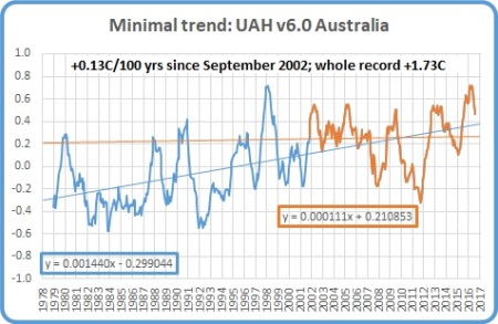
The Pause has ended, but the trend since June 1998 has reduced from +0.42C/ 100 years to +0.3C, and since September 2002 is +0.13C.

The next graphs summarise the above plots. First, a graph of the relative length of The Pause in the various regions:

Pause length July 17

Note that the Pause has ended by my criteria in all regions of Northern Hemisphere, and consequently the Globe, and the Tropics, but all southern regions have a Pause for over half the record, including the South Polar region which has been cooling for the whole record. Note that the Tropic influence has been enough to end the Pause for the Southern Hemisphere, and the Pause is likely to disappear from all southern regions except South Polar in the next couple of months.

The variation in the linear trend for the whole record, 1978 to the present:

Trends 1978 july 17

Note the decrease in trends from North Polar to South Polar.

And the variation in the linear trend since June 1998, which is about halfway between the global low point of December 1997 and the peak in December 1998:

Trends 1998 july 17

For 19 years “global” warming has been dominated by the influence of the Tropics and North Polar regions.

The imbalance between the two hemispheres is obvious.

The Pause has disappeared from the USA, Australia, and the Southern Hemisphere, but not the Southern Extra-Tropics, South Temperate, and South Polar regions.  Interestingly, July anomalies have decreased in Northern regions but increased in Southern regions and the Tropics.  The next few months will be interesting.

Garbage In, Garbage Out

August 7, 2017

(By Ken Stewart, assisted by Bill Johnston and Phill Goode; and cross-posted with Jo Nova)

Early ABC Radio news bulletins last Wednesday morning were led by this item, which you can read in full at ABC Online.

More climate scientists needed to avoid expensive mistakes, review urges

Apparently we urgently need 77 climate scientists to predict the future of areas like the Murray-Darling Basin with climate modelling.

Interestingly, Professor McDougall of the Australian Academy of Science points out that one of those “expensive mistakes” was the $2 billion desalination plant built in Queensland as a response to the millennium drought, “which really wasn’t an indication of climate change at all”.   Why didn’t the good professor raise his voice before the money was wasted?

But I digress.

Reliable modelling and projections for the future are surely desirable.

But such modelling must be based on reliable data, and the reliability of temperature data in Australia is demonstrably poor.

Example 1:  As has been widely reported in The Australian, and by Jennifer Marohasy and Jo Nova, cold temperatures at two separate sites (and possibly many others) were altered to appear warmer, then changed back, then deleted.  The BOM gave two conflicting explanations, both of which cast grave doubt on the reliability of “raw” temperature data from an unknown number of stations.

Example 2:  After enquiring why there are frequently two different temperature readings for exactly the same minute at various weather stations, a Bureau spokesperson told me that:

Firstly, we receive AWS data every minute. There are 3 temperature values:
1. Most recent one second measurement
2. Highest one second measurement (for the previous 60 secs)
3. Lowest one second measurement (for the previous 60 secs)

(See here and here.)

In other words, Australian maximum and minimum temperatures are taken from ONE SECOND readings from Automatic Weather Stations.  Spikes due to localised gusts of hot air, or instrument error, become the maximum for the day.  (This rarely has a large effect on minima, as night time temperatures are fairly smooth, whereas during the day temperature bounces rapidly up and down.  This is shown in this plot of temperatures at Thangool Airport in Queensland on Australia Day this year.)

Thangool 26 Jan 17 1 min

And this is for the same day between 3.00pm and 4.00pm.

Thangool 26 Jan 17 3 to 4pm

As you can see the temperature spikes up and down in the heat of the day by up to one degree between one minute and the next.  But these are the temperatures at the final second of each minute: during the intervening 59 seconds the temperature is spiking up and down as well, which we know because occasionally the highest or lowest temperature for the day occurs in the same minute as a final second recording on the BOM database (usually on the hour or half hour).  This can be up or down by two or three degrees in less than 60 seconds.

This is in contrast to the rest of the world.  The WMO recommends 1 minute (60 second) averages of temperature to be recorded to combat this very problem of noisy data, and this is followed in the UK.  In the USA 5 minute (300 second) averages are calculated.

From THE WEATHER OBSERVER’S HANDBOOK by Stephen Burt (Cambridge University Press, 2012):

Observers handbook

Even without software or human interference as in Example 1, this means Australian temperature data, in particular maxima, are not reliable.

Example 3:  Historically, temperatures were observed from Liquid In Glass (LIG) thermometers.  From the 1990s, Automatic Weather Stations (AWS) were installed using Platinum Resistance Thermometers (PRT) and are now the source for daily data.  AWS thermometers are very precise, but as I showed in Example 2, their data is used idiosyncratically to record 1 second spikes, frequently resulting in higher maxima and less often slightly lower minima than a 1 or 5 minute average.

One would think that with such a major change in technology there would be comparative studies reported in the BOM’s meteorological journal or other “peer reviewed” literature.  Apparently not.

Dr Bill Johnston has investigated this and says:

Parallel data were collected all over Australia for over a decade, some until last year when thermometers were removed, at manned sites, mainly major airports (Ceduna, Sydney, Hobart, Perth, Darwin, Alice Springs, Albany, Norfolk Island, Wagga to name a few) and also met-offices such as Cobar and Giles. However, comparisons between screens were done at one site only (Broadmeadows, Melbourne, which is not even an official weather station) using PRT only and reported as a “preliminary report”, which is available (https://www.wmo.int/pages/prog/www/IMOP/WebPortal-AWS/Tests/ITR649.pdf) however, after AWS became primary instruments, as I’ve reported before, the Bureau had an internal policy that parallel liquid-in-glass thermometer data were not databased. Furthermore, they had another policy that paper-data was destroyed after 2-years. So there is nothing that is easily available…. there is also no multi-site replicated study involving screen types and thermometers vs. PRT probes ….

Deliberate destruction of data is scandalous; the only way now to compare Automatic Weather Stations (AWS) and Liquid in Glass, is to hunt for sites where there is overlap between two stations; where the AWS is given a new number. This is possible BUT the problem is that the change-over is invariably confounded with either a site move or the change to a small screen.

Therefore we suspect that the introduction and reliance on AWS has led to artificially higher maxima (and thus record temperatures) than in the past, but we have no way of knowing for sure or how much.

So we now have (1) temperatures that are altered before they even become ‘raw’ data; (2) use of one second spikes for recording daily maximum and minimum temperatures, very probably resulting in artificially high maxima and slightly lower minima; and (3) no way of telling how the resulting data compare with those from historical liquid-in-glass thermometers.

How can the CSIRO hope to produce reliable climate modelling with any number of climate scientists when the BOM cannot produce reliable temperature data?  Garbage in, garbage out.