Archive for the ‘soi’ Category

Why are Australian Sea Levels Rising?

October 22, 2018

The answer, my friend, is blowin’ in the wind…. literally.

In brief…

  • At Sydney, the long term sea level rise is about 1 mm per year, with short periods of rapid increase and a long plateau of very small or zero trend in the second half of last century.  As Australia is geologically stable, it is likely that a similar pattern occurred all around the coast.
  • This gradual sea level rise is consistent with oceanic warming since the Little Ice Age, with fluctuations resulting from El Nino-Southern Oscillation (ENSO) changes.
  • Tide gauge data since 1990 from different locations show rises varying from 2.4 mm to 7.2 mm per year.  A significant proportion of this is due to ENSO wind circulation changes.
  • There is no sign of any unusual acceleration in Australian tide gauge data.

The Bureau of Meteorology maintains the Australian Baseline Sea Level Monitoring Project, with a number of tide gauges around the coastline, shown here:

Fig. 1:  Australian Baseline Sea Level Monitoring Project

MSL map

These sites have monthly data only from 1990, mostly later, and two (Thursday Island and Port Stanvac) have very limited data and were not used in this study.   I have used data for Mean Sea Level for all sites on the Australian coastline to find the current situation with sea level rise, and use the much longer dataset from Fort Denison in Sydney Harbour as well for a longer term perspective.  Figure 2 is a plot of all monthly data from all sites.

Fig. 2: Australian Mean Sea Levels

MSL plot abs

Points to note:

  • The mean is a measure of central tendency: the full tidal range is at least twice the values shown for each site.  Broome’s range is well over 11 metres.  Portland has a very small range.
  • An Australian average of these means is meaningless.
  • Each site has a seasonal signal which is not regular.
  • It is difficult to make any meaningful comparison.

However if we look at sites individually, we can at least compare any trends.  Figures 3 and 4 show MSL at sites with the greatest and least trends.

Fig. 3:  MSL at Hillarys

MSL plot abs Hillarys

Fig. 4:  MSL at Stony Point

MSL plot abs StonyPt

According to this very short record, the rate of Australian sea level rise varies in different locations, from a low of 2.4 mm per year in Bass Strait to 7.2 mm per year at Hillarys in Western Australia.  Why is this?

Australia is very stable geologically, and these tide gauges are carefully checked with levelling connections between them and Global Navigation Satellite System (GNSS) sites maintained by State land and survey departments.  Therefore differing rates of land movement are unlikely to be responsible.

We need to compare all sites, and as well remove the seasonal signal.  To do this I calculate monthly anomalies for each site, then plot the results in Figure 5.

Fig. 5:  Monthly anomalies for all Australian sites:

MSL plot all anoms

With the seasonal signal removed, the data show some roughly similar patterns for all sites.  I now plot the mean of these anomalies, to find an “average” Australian sea level trend.

Fig. 6:  Average of all MSL anomalies

MSL anoms trend

All sites show marked dips in 1997-98 and 2015-16, clearly shown in the average.  The influence of El Nino perhaps?  Figure 7 shows the mean of all MSL anomalies with the scaled Southern Oscillation Index (SOI).

Fig. 7:  Average of all MSL anomalies and SOI/200

Aust MSL and soi

My first response was “Wow!”  Next, sea level plotted against SOI:

Fig. 8: MSL as a function of SOI

MSL scatterplot all v soi

For every one point increase in the SOI, Australian sea level rises an average of 3.2 mm, and SOI change can account for more than a third of sea level rise.  Now we check how the SOI has behaved over the last 27 years.

Fig. 9:  Trend in SOI, 1991-2018

SOI plot trend

In this short record, the SOI has increased by about 8 points.

From this, we can deduce that a portion of the perceived sea level rise since 1991 is due to the influence of the El Nino- Southern Oscillation (ENSO), of which SOI is a strong indicator.

What mechanism could there be for this?  The SOI is calculated from the difference in atmospheric pressure between Tahiti and Darwin.  Darwin’s sea level is compared with the SOI in Figure 10.

Fig. 10:  Darwin MSL anomalies and SOI/100

MSL plot Darwin SOI

The match is very close, as the plot of MSL vs SOI shows:

Fig. 11:  Darwin MSL as a function of SOI

MSL plot Darwin vs SOI

SOI has about twice the effect on MSL at Darwin as it has on the Australian average, and more than half sea level rise can be accounted for by change in SOI.  Here’s my explanation:

During La Nina, when SOI is high, the northwest monsoon is strengthened, the monsoon trough penetrates further into northern Australia in summer with lower atmospheric pressure and stronger northwest winds.  This combination pushes the sea up against the northwest coast, raising the sea level.  In winter, the monsoon disappears and winds are predominantly from the east.  During El Nino, the monsoon is weakened and may fail completely.  Thus northwest winds are weaker and the sea level is markedly lower.

That’s all very well for Darwin and other sites in northern Australia, but take a look at Figure 12, which compares seal level at Darwin with Spring Bay, in southern Tasmania, and about as far from Darwin as you can get without a passport.

Fig. 12: MSL at Darwin and Spring Bay

MSL plot Darwin Springbay all

Note that in some (but not all) El Ninos (marked) Spring Bay sea level is also strongly affected.  Note also that sea level at Spring Bay appears to start rising again several months before Darwin, in other words before the SOI starts rising.

The 2015-16 comparison of anomalies shows the Spring Bay sea level at its lowest in September 2015, rising strongly and four months before Darwin’s.

Fig. 13: MSL at Darwin and Spring Bay 2015-16

Darwin SpringBay anoms 20152016

To understand this we need to consider circulation patterns as they change through the year and with ENSO events, and their effect on local sea levels.  The following plots show the absolute 2015-2016 monthly mean sea levels and the long term average for each month.

Fig. 14: MSL at Darwin 2015-16 compared with average monthly levels

Darwin abs 20152016

Darwin’s long term average sea level is highest at the peak of the Wet season (February – March) and lowest in the Dry (July – August).  In 2015, the high was reached in January and the low in July- both one month earlier- and the 2016 high was in March- one month later.  Below normal sea levels lasted from April 2015 to April 2016.

In contrast, Spring Bay’s average sea level is highest in the southern wet season (Winter-July) and lowest in the summer dry season (November to February).  In 2015 the high was reached in May and the low in September, and the 2016 high in May.

Fig. 15: MSL at Spring Bay 2015-16 compared with average monthly levels

Spring Bay abs 20152016

This happens at other sites in the southeast of Australia (from Portland to Port Kembla including Tasmania).

Fig. 16:  Australian sea level at sites in the north and southeast.

MSL plot Nth SE

Note that the same pattern applies: sea level is lower in strong El Ninos and rises before the north (in 1997-98 and 2015-16 but not so clearly in 2006-07).

A possible explanation is that circulation changes associated with the ENSO are not restricted to the tropics, although that is where the effects are largest and most visible. In normal (non-El Nino) years, the sub-tropical ridge moves north over the continent in winter, and the winter storms around the lows to its south bring rain and winds from the south-west quarter to the southern coast, particularly South Australia, Victoria, and Tasmania.  These winds cause the sea to pile up (by a few centimetres) against the southern coast.  In summer, the sub-tropical ridge moves south, rain bearing storms mostly pass to the south of the Australian region, and blocking highs in the Tasman Sea bring strong north-west winds across the south-east of Australia.  This causes sea level to fall.

In a strong El Nino, these conditions occur earlier, with a rapid retreat south of the sub-tropical ridge so that winter storms with south-westerly winds are fewer and weaker and sea level is lower in winter and spring.  Summer sea levels (November to January) are close to normal.

Figure 17 tests the response of sea level to barometric pressure at Spring Bay.

Fig. 17:  Spring Bay MSL anomalies as a function of barometric pressure anomalies

SpringBay MSL vs Press.jpg

The result is clear.  More than half of sea level change is due to pressure variation, which causes winds to change.

The effect is much greater at Darwin.

Fig. 18:  Darwin MSL anomalies as a function of barometric pressure anomalies

Darwin MSL vs Press

By the way, how much does increase in sea temperature affect sea level?

Fig. 19:  Spring Bay MSL anomalies as a function of temperature anomalies

SpringBay MSL vs SST

At Spring Bay, very little.  An increase of one degree could raise sea level by 17 mm, but R-squared of 0.033 is tiny compared with 0.527 for air pressure.

Whatever causes El Nino also causes the southern seasonal weather cycle to occur earlier, and sea levels rebound several months before they do in the tropics.

What of the longer term?

The Australian Baseline Sea Level Monitoring Project data are limited to sea levels since 1990, so the record is too short to make assumptions about long term sea level rise, and certainly not about the future.  There are longer datasets available however.  Sydney Harbour (Fort Denison) has data from 1914.

Fig. 20: MSL anomalies at Fort Denison (Sydney)

Sydney 1914 to 2018

That’s a long term sea level rise of 1 mm per year, or 104 mm in 100 years- a bit over 4 inches.  Now there has been an apparent “acceleration” since 1991, matching the data at nearby Port Kembla:

Fig. 21: MSL anomalies at Fort Denison (Sydney) 1991-2018

Sydney 19912018

But once again note the correspondence with the SOI:

Fig. 22: MSL anomalies and scaled SOI Sydney 1991-2018

Sydney 19912018 soi

A significant portion of the recent sea level rise at Sydney can be attributed to a short term rise in the SOI.

So is this recent rapid rise unique?  By calculating the trend in sea level over 10 year periods, we can see periods when sea level rise has accelerated or slowed in the past:

Fig. 23:  10 year running trend in MSL at Sydney

10yr trends MSLSydney

The most recent rise in sea level of 7 to 8 mm per year over 10 years is less than that of the rise to 1953, when sea level rose by 10 mm per year.

If you think 10 year trends are too short, Figure 21 shows 30 year trends at Sydney:

Fig. 24:  30 year running trend in MSL at Sydney

30yr trends MSL Sydney

The current 30 year trend is exactly the same as the trend to 1965:  2.4 mm per year.  For the 30 year period to the mid-1990s the trend was zero.

Conclusion:

Across all tide gauges of the Australian Baseline Sea Level Monitoring Project, a significant proportion of sea level rise since 1990 is due to circulation changes associated with the El Nino- Southern Oscillation.  The effect is much greater in the north and west, where sea level rise is highest, but also is evident in the south-east.

Sydney’s long term record tells us that sea level has been rising at an average rate of about 1 mm per year.  There have been short periods of rapid increase and a long plateau of very small or zero trend in the second half of last century.  As Australia is geologically stable, it is likely that a similar pattern occurred all around the coast.

This gradual sea level rise is consistent with oceanic warming since the Little Ice Age, with fluctuations resulting from ENSO changes.

There is no sign of any unusual acceleration in Australian tide gauge data.  In 100 years from now sea level could be expected to be 100 mm to 200 mm higher.  A sea level rise of 5 to 10 times this amount is purely speculative and not based on empirical data, but instead is based on the worst case scenario of computer models.

UAH, ACORN and Rainfall: Something’s Wrong

April 4, 2018

Tom Quirk had an interesting article posted by Jo Nova this week, at

http://joannenova.com.au/2018/04/bom-homogenization-errors-are-so-big-they-can-be-seen-from-space/

questioning the large number of adjustments coincident with the changeover to automatic weather stations in the 1990s, which appear to have had a large impact on the correlation between BOM’s monthly ACORN mean temperatures and UAH’s Lower Troposphere data for the Australian region.

However, using a different comparison something very strange appears.

For me, his killer plot was this one, showing a huge drop in centred running 13 month correlations between UAH and BOM mean anomalies:

Figure 1: Tom’s plot of monthly correlations:

Tom Q correl plot

Using the same methodology, but with maxima instead of mean temperature anomalies (as tropospheric data better reflect daytime temperatures when there is deep convective overturning), I have replicated his findings.  Note that BOM maxima and rainfall are converted to anomalies from 1981 to 2010, the same as UAH.

Figure 2 is my plot of the running centred 13 month correlations between BOM maxima anomalies and UAH Australian region anomalies for all months of data from December 1978 to February 2018.

Figure 2:  Centred running 13 month correlation between BOM maxima and UAH:

BOM max v uah correl

There are some differences, but like Tom, I find a distinctly low, in fact, negative, correlation in the mid-nineties, centred on April 1996.

However, as I showed in my post “Why are surface and satellite temperatures different?”  in 2015, most of the difference between UAH and BOM maxima can be explained by rainfall variation alone.

Figure 3 is a plot of the monthly difference between UAH and BOM data plotted against rainfall anomalies (also calculated from 1981-2010 means).

Figure 3:

Diff v rain plot

R-squared of 0.54 means a correlation coefficient of 0.73.

This is how the correlation varies over time:

Figure 4:

Diff v rain correl

I have a problem.

There is a major drop in July 1995, but other big ones- October 1998, July 2003, December 2009, September 2015, and the most recent figure, August 2017.   Correlations are much more variable from 1995.  What can be the reason for these poor correlations?

There is also a general decrease in correlation over the years since 1978.

What’s wrong?  Surely rain gauges can’t be faulty?

Has there been a drift in accuracy of the UAH data?

Or has there been a drift in accuracy of BOM temperature measurement?

Any suggestions would be most welcome.

Post Script:

The major drops may occur at about the same time as major ENSO changes, though not always.  This graph plots the above correlations and 13 month centred averages of the SOI (scaled down) together.

Figure 5:

SOI and correlations

The SOI has not been lagged in this plot.  Perhaps the major changes in trade winds, monsoons, and the sub-tropical ridge affect tropospheric temperatures differently from surface temperatures at these times.  But that doesn’t explain the gradual decrease over time.


How Significant Is This El Nino?

December 3, 2015

For months we have been told how this is a strong El Nino, similar to the “Super El Nino” of 1997-98. How does it really stack up?

As data for sea surface temperatures are not available before 1950, the Southern Oscillation Index (SOI) data from 1876 are the best for long term analysis. In this post I am using SOI data from the BOM archive.

The Bureau uses sustained (three month mean) SOI values of 7 or less as an indication of El Nino conditions. This plot shows three month mean SOI values from 1876:

Fig. 1: Three month mean SOI values from 1876

3m soi
It is plain that as of November 2015 the three month mean is still nowhere near as low as it has been in several past El Ninos (and 1997-98 was not the lowest either!)

The next graph compares the length of El Ninos.

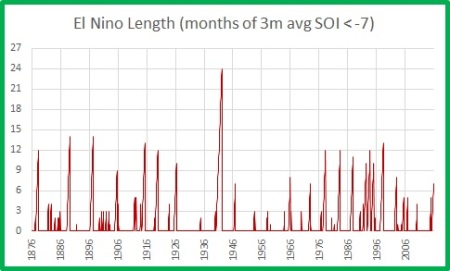
Fig. 2:  El Nino length

EN length -7

Plainly 1941-42 was the one to beat, and El Nino conditions will need to persist for another 18 months to compare. Another four to six months is more likely, and of course there could be a double up of another El Nino next year (as happened in the 1990s).

I next calculate the relative strength of El Nino conditions, by summing the (inverted) SOI values of all months in El Nino i.e. that have a three month mean of -7 or less.

Fig. 3:  El Nino cumulative strength

EN strength -7

Unless we get another six months of values below -20 we won’t beat 1997-98 into fourth place.

Of course, we are only in the seventh month of this El Nino- how does it compare with this stage of previous El Ninos?

Fig. 4: Three month mean SOI value for seventh month of cycle

EN strength 7th mth -7

The November 2015 value is the black dot- in sixth place.

Compared with the strength of previous El Ninos, the seven month value of this one is also in sixth place:

Fig. 5:  Cumulative strength in seventh month of cycle

EN strength 7th mth integral -7

Another interesting method of comparison is to change the definition of “El Nino” to “El Nino or Neutral” i.e. periods between La Ninas.

Fig. 6:  Length of El Nino or Neutral conditions

EN length EN or neut

Note the two periods of nearly seven years without La Ninas in the 1980s and 1990s, separated by a 12 month La Nina- immediately followed by the 1997-98 event, and then another five year period. 2014-15 is not unusual.

The integral of SOI values, as a measure of the strength of El Nino:

Fig. 7:  Cumulative strength, El Nino or Neutral conditions

EN strength EN or neut

Currently this event is in 12th place, and if it runs strongly for another six months it could sneak into seventh place.

Compared with other events, at the 22nd  month this event ranks fourth.

Fig. 8:  Cumulative strength at 22nd month of cycle

EN strength 7th mth integral EN or neut

Conclusion:

The current El Nino event is not going to break any records, unless it continues for several years!

It is nowhere near the most intense, nor the longest, nor the strongest.

It cannot compare with the intensity of previous El Ninos, as measured by three month average values, such as in 1896, 1905, or 1983.

It cannot compare with the length of previous El Ninos, such as the 1941-42 event, or the series of years of El Nino and neutral conditions in the 1980s and 1990s.

Depending on the measure used, it is fourth or sixth strongest for this stage of the cycle. If it continues strongly, its final strength might reach seventh or perhaps even fourth place. But that is unlikely. According to the Bureau, this event will peak before the end of 2015, and finish by mid-Autumn.

Fig. 9:  Model outlooks for El Nino end

Despite the hopes of the global warming enthusiasts, this is just another moderately strong El Nino which may cause a spike in world temperatures in the first half of next year, but is nothing to get excited about.

Extreme La Nina events – an alternative view

January 28, 2015

Yesterday the ABC hyped up their climate alarmism to another new level with their uncritical and unabashed reporting of a claim by the CSIRO that Extreme La Niña events … will almost double in frequency as the climate warms”.

“Lead author Dr Wenju Cai, chief scientist at Australia’s CSIRO Oceans and Atmosphere Flagship, says their work shows La Niña events will occur every 13 years compared with a past frequency of one every 23 years.”

This is the paper:

Increased frequency of extreme La Niña events under greenhouse warming, by Wenju Cai et al., published yesterday.

Time for a reality check.

The authors say they used climate data from 1900 to 2005, and 21 climate models to predict conditions for 2006-2099, and that an extreme La Nina is defined by Central Pacific sea surface temperature anomalies of more than 1.5C below normal.  They claim that an increase in severe El Ninos will lead to an increase in following extreme La Ninas.

In the paywalled article I suspect the Central Pacific region they use is actually the Nino 4 region.  In this analysis I use data from the Nino3.4 region, which is the overlap between Nino 3 and Nino 4, covering Latitudes 5 degrees South- 5 North and Longitudes 170 degrees West- 120 West.  This is the most common data region used.   I downloaded data from http://www.esrl.noaa.gov/psd/gcos_wgsp/Timeseries/Nino34/ and calculated monthly anomalies from the 1961-1990 means.  There are data from 1870, however I chose to use data from 1876 to match Southern Oscillation Index (SOI) data.

Here are the results:

Fig.1: Nino 3.4 anomalies.  Note 1900 & 2005 limits, and +/- 1.5C thresholds.

nino34

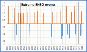
By screening for events of +/- 1.5 or more, we remove the clutter and identify extreme events:

Fig.2: Nino 3.4 data exceeding +/- 1.5C

extreme enso events

The paper claims that the incidence of extreme La Ninas will increase from one per 23 years to one per 13 years.  While there are more extreme La Ninas in the last 45 years, I count seven La Ninas from 1900 to 1999, which is one per 14 years.  There were three very high El Nino peaks since 1970, but there are clusters of extreme El Ninos in the first and last thirds of the record.  So possibly the claim for increased La Nina frequency was for an increase in the frequency of abrupt swings from El Nino to La Nina.

Fig.3:  12 monthly change in Nino 3.4 anomalies. +/- 3C is the threshold for swings from extreme El Nino to extreme La Nina.

12m enso chg

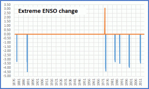
Fig.4: Removing the clutter, change exceeding +/- 3C.

extreme enso change

There we have it.  The extreme changes since 1900 have all been in the last 45 years.  Is this due to Greenhouse warming or natural climate change? Could it have anything to do with the Interdecadal Pacific Oscillation? Or is it an artefact of my arbitrary choice of extreme threshold?

More importantly, does the Southern Oscillation Index (SOI) tell the same story?

SOI data are from the BOM website.

Fig.5:  12 month running mean of the SOI inverted.  Threshold is +/- 8.  Note the historical rises and falls.

 12m soi

Fig.6: Nino 3.4 and 12 month inverted SOI match fairly well, although SOI values lag by up to 2 years.

soi v nino34

Fig.7:  El Nino and La Nina conditions per SOI criteria (+/- 8).  An extreme ENSO event might be +/- 16, although I have not seen that mentioned anywhere.

12m soi tests

Again note the clusters of El Ninos, and the spread of La Ninas, in small groups with large gaps between.

Fig.8:  12 month SOI change exceeding +/- 16.  Horizontal lines indicate the threshold for an annual swing of +/- 24 units, which is associated with some dramatic weather events.

extreme  soi change

I left all of the changes >16, to show the historical spread.  Note there were three extreme La Nina (< -24) changes from 1876- 1916, and three from 1960- 2000, and four from 1973- 2014.  There is no unusual trend.

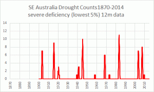
How does this correspond with the observed rainfall record, especially for South East Australia, which is predicted to receive more extremes of rain and drought due to greenhouse warming?

Fig. 9:  Number of months of severe deficiency.

SE Oz severe droughts

Fig. 10:  Number of very wet months.

SE Oz ext wets

Not very alarming.

Queensland is especially susceptible to ENSO events.

Fig. 11:  The match for Queensland wet years is better.

Qld ext wets

Fig. 12:  But not for droughts!

Qld ext dry

Where are the extreme El Ninos?  Call me underwhelmed.

Depending on the index used, the criteria used, and the length of the record used, you can say we’ve had an increase in extreme ENSO swings, or no noticeable change other than a long period (70 to 90 years?) cycle of more and less extreme changes.

My money’s on the latter, but Time will tell.

The Rhythm of Life has a Powerful Beat

January 30, 2014

Here’s a fresh look at global temperatures as calculated by the University of Alabama, Huntsville- the UAH dataset– from satellite measurements of the Temperature of the Lower Troposphere (TLT).

Warwick Hughes suggests that there has been a drift in the measurements since about 2005, such that calculated temperatures are too high, and we await a proposed correction.  However, we can live with that.

Here are plots of TLT for various regions of the globe.

Fig.1:  12 month running means of Global anomalies and Tropical anomalies (the region of the Earth between 20 degrees North and 20 South, which gets the majority of the solar radiation striking the Earth).Glob - Tropics

The two sets move in lock step, with a much larger variation in the Tropics than the world as a whole.

What causes these large variations?

Fig. 2: Global and Tropical anomalies with the SOI inverted, and scaled by a factor of 30.Glob - Tropics v SOI

SOI is the acronym for the Southern Oscillation Index, calculated from pressure differences between Tahiti and Darwin, and is a reasonably good indicator of El Nino or La Nina conditions.  The ENSO cycle (El Nino Southern Oscillation) originates in the tropical Pacific.  El Nino brings warmer temperatures to the world; La Nina is associated with cooler temperatures.  I have inverted the SOI to show this relationship, and scaled it down by 30 to fit on the graph.

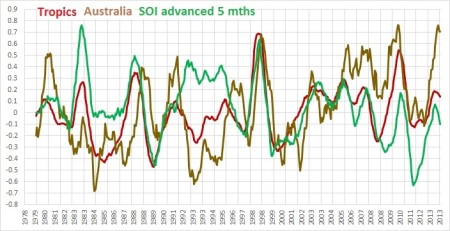
Note how the 12 month mean of SOI precedes the temperature data.  Here’s a plot with the SOI advanced 5 months.

Fig.3:  SOI advancedGlob - Tropics v SOI adv'd

While the peaks (El Ninos) match very closely, I have marked periods following the major eruptions of El Chichon and Mt Pinatubo, which cooled temperatures for several years.  I also suggest that the atmospheric dust and cooler surfaces upset the ENSO cycle as traced by the SOI.  Note also that temperatures in the 2010-2011 La Nina appear higher than expected.

Fig.4: SOI advanced with Tropic and Australian land TLT.Australia

Note how Australian temperatures appear to fluctuate about as much as the Tropics (we’re one third north of 20S after all).  Australian temperatures are influenced by events in the Indian Ocean and Southern Ocean as well as the Pacific, so the match isn’t exact.

I will look at Australian data specifically in another post.

Finally, here’s a way to check on that other “finger print” of the enhanced greenhouse effect, as espoused by Dr Karl Braganza: land areas are expected to warm faster than oceans, supposedly showing that greenhouse gases, not ocean currents, drive global warming.

Fig. 5: Global Land and Ocean TLT.land v oceans

Well of course that proves it- land areas are indeed warming faster than oceans.

However, have a closer look at the timing of the switches between warming and cooling.  If well mixed greenhouse gases are warming both land and oceans, it would be expected that oceans, with higher specific heat and enormous thermal inertia, would take longer to warm.  The land response would be almost immediate.  Oceans would not be expected to warm before the land, and if anything might show a slight lag.

Fig.6: close up of the 1998 Super El Nino.land v oceans 1997-99

The oceans change phase about one month before the land.  They definitely do not lag behind.

And what causes these rapid changes?

Fig.7: Land, ocean, and the SOI advanced 5 months.land v oceans v soi


The world’s temperatures respond to the powerful beat of ENSO events- as well as large explosive volcanic


Summer Rain Outlook Update December 12 2012

December 12, 2012

Progress so far:

So far in December there has definitely not been widespread or heavy rain, so I should stick to forecasting dates when a weather enhancement is more likely rather than how much rain can be expected.  However, the predicted timings line up very well.

graph 12dec12

BOM mentioned instability on the 1st, and a low developed off the coast in the next few days but went south rather than west- northern NSW got this influence.  There were isolated storms about with light rain, and of course the very hot weather around 4th and 5th, with a large change.  So instead of heavy rain we got extreme heat!  Further storms around in the past couple of days- well within the +/- 5 days range.

Outlook for the rest of the year:

It is still very dry, with only coastal showers.  Humidity is building, the monsoon trough has moved south into the Coral and Timor Seas, with cloud streaming down from Indonesia through Western Australia.  The Wet season is getting closer.  We may even have a rain depression or cyclone before the end of the year in North Queensland.

I’m still tipping a major disturbance mid to late December with surges around 18-22 and 26, plus possibly 30 (and probably 2-4 January), all +/- 5 days.  I expect this to bring heavy rain, especially in the week leading up to Christmas- but I’ve been wrong before about rain intensity!

I again mention that rainfall is measured at 9.00 a.m. on the day after it falls.  As well, my method captures the average of 3 day rainfall anomalies across 10 sites in subtropical Queensland.  I do not predict rain for specific locations.

I won’t change my outlook for 2013 for now but there will be some small changes.

SOI 30 day mean (to 12 December) is -2.2 (neutral).

Weekly NINO 3.4 Index (to 9 December) was + 0.37 (neutral).

The Indian Ocean Dipole is currently -0.07 (neutral).

Summer Rain Outlook Update November 27 2012

November 27, 2012

Progress so far:

I remind readers again of my area of interest- subtropical Queensland.

Here’s a summary of my predictions since 1 August, illustrating changes and refinements to my methods as I attempted to be more precise.

On 1 August I predicted enhanced activity for early to mid November and early to mid December.

On 5 September I refined this to November 15 +/- 10 days, December 5 +/- 7 days, and December 16 +/- 7 days.

On 20 September I changed this to November 13 +/- 10 days, November 26(?), and December 4 +/- 4 days, December 20 +/- 8 days, and December 26 +/- 2 days.

On October 5 I included November 7 +/- 3 days.

On 6 November I added November 20 +/- 3 days, and December 9 +/- 3 days.

On 12 November, I predicted enhanced activity with surges around 18, 22, and 25 November, and on 14 November updated this to include “I expect a vigorous disturbance bringing heavy rain in early December (5th +/- 5 days), and another vigorous disturbance with heavy rain around December 20 +/- 5 days and probably extending past Christmas. I expect more rain around the New Year.”

Violent storms passed through south east Queensland on 17-18 November.  There were scattered storms on 22 November (though no rain fell in the rain gauges I monitor) and on the night of 24-25 November a large storm brewed up in south west Queensland around Augathella and moved rapidly north east, reaching the coast at the Whitsundays next morning.  The graph shows this as a small blip, as only 16mm was recorded at only one of my sites (Clermont Aero).  I’m not sure whether to attribute this to the predicted surges for 22 or 25 November- the next couple of days will tell if we get a disturbance from the system bringing rain to Victoria at the moment, but that is more likely to be the 1 December disturbance.

This map is for one day- 25 November:

Outlook for the rest of the year:

There will be further activity in early December (possibly a small event around 1st, with a larger system with widespread rain around 5th +/- 5 days, and 9th  +/- 5 days, most likely 5 to 9 December), and a major disturbance mid to late December with surges around 18-22 and 26, plus possibly 30 (and probably 2-4 January), all +/- 5 days.  I expect this to bring heavy rain, especially in the week leading up to Christmas.  This may include the appearance of the monsoon in north Queensland.  If so the monsoon could return around 30 January and possibly 8 March.

It will be difficult to match individual events with predictions (as they are so close as to overlap, and sometimes enhancements bring cloud but little rain), but I can say early to mid December, and mid to late December will see several rain events.

I should mention that rainfall is measured at 9.00 a.m. on the day after it falls.

Outlook for 2013:

January:  3, 14, 18, 25, and the big one 30-31.

February:  7, 14, 20, and maybe 26th.  (Rain will continue through the first three weeks of February, but with peaks near these days.)

March:  2, 7-8, maybe 13, maybe 17, 20, 31st .

April:  7, 13-14, 19.

All of the above +/- 5 days.

I will concentrate on the accuracy of my algorithm (for want of a better word) for the rest of this year before I improve on forecasts for next year.

SOI 30 day mean (to 25 November) is + 3.51 (neutral).

Weekly NINO 3.4 Index (to 18 November) was + 0.39 (neutral).

The Indian Ocean Dipole is currently +0.44 (neutral).

30 day mean Minimum percentage anomaly for the 10 subtropical Queensland sites I monitor (as at 27 November) was -0.005.  It has been negative for all but 30 days of this year so far.  With 34 days to go for 2012, the 365 day running mean is -0.29 and has been negative since 10 August 2011 so there is no doubt that this has been the coolest year of the last 10.

Final Temperature Prediction- June

June 6, 2012

This page will be reposted around the middle of July, as soon as RAINFALL data for the previous month are available.

The May UAH value is +0.29,  making the running 12 month mean +0.18 +/- 0.1.  April SOI was -2.7 which is neutral ENSO.  The next few weeks will be interesting.  My predictions:

Month

Actual UAH 12 month mean

Predictions

December 2011

+0.15

+0.12

January 2012

+0.15

+0.12

February 2012

+0.14

+0.13

March 2012

+0.15

+0.13

April 2012

+0.17

+0.13

May 2012

+0.18

+0.12

June 2012

+0.12

July 2012

+0.13

August 2012

+0.15

September 2012

+0.15

October 2012

+0.16

November 2012

+0.16

If we enter a new El Nino phase we can expect global 12 month mean temperatures to rise steadily in the last part of 2012 and more rapidly in 2013, peaking about mid-year.  If we remain in a neutral phase, 12 month mean temperatures should stay in the +0.1 to +0.2 range for the next 18 months.  A renewed La Nina will lead to temperatures dropping below +0.1, possibly to below 0.0 if La Nina is strong enough.

However, after closely analysing rainfall and SOI data for a sample of Queensland sites (more on this in a later post), and reading an analysis by Willis Eschenbach, I have come to the conclusion that SOI is not a predictor of ENSO events, merely a symptom, like temperature and rainfall.  Therefore SOI is not likely to have much long term use in predicting temperature.  For this reason, this will be the final post concerning future temperatures, but I will be posting about rainfall in more detail.

Last month I tipped “The next weather enhancement for SE Queensland and NSW will be in about five to seven weeks- late May to early June.”  The weather co-operated, and the following maps show this, and as at 6 June there is heavy rain and wild weather in southern NSW and Victoria.


The next major weather enhancement is likely to be late June to early July.   We are likely to have a wetter than normal winter- at least the ants think so!  These ants regularly build higher chimneys on their entrances before wet weather.  Their chimneys have been rebuilt since the weekend rain.

Global Temperature Predictions- May

May 17, 2012

This page will be reposted around the middle of June, as soon as SOI and UAH data for the previous month are available.

The April UAH value is +0.29,  making the running 12 month mean +0.17 +/- 0.1.  April SOI was -7.1 which is neutral ENSO, but dropping.  The next few weeks will be interesting.  My predictions:

Month

Actual UAH 12 month mean

Predictions

December 2011

+0.15

+0.12

January 2012

+0.15

+0.12

February 2012

+0.14

+0.13

March 2012

+0.15

+0.13

April 2012

+0.17

+0.13

May 2012

+0.12

June 2012

+0.12

July 2012

+0.13

August 2012

+0.15

September 2012

+0.15

October 2012

+0.16

We’ll see how we go with this calculation!

If we enter a new El Nino phase we can expect global 12 month mean temperatures to rise steadily in the last part of 2012 and more rapidly in 2013, peaking about mid-year.  If we remain in a neutral phase, 12 month mean temperatures should stay in the +0.1 to +0.2 range for the next 18 months.  A renewed La Nina will lead to temperatures dropping below +0.1, possibly to below 0.0 if La Nina is strong enough.

Last month I tipped “The next weather enhancement for SE Queensland and NSW  will be in about five to seven weeks- late May to early June.”  As the winter pattern is now established, that appears to hold, but there may be a mid to late June influence.

Here are weekly rainfall maps for the past few weeks.  I was plain wrong about the late April disturbance.

Inter-annual change in SOI and Carbon Dioxide

March 23, 2012

Ken Stewart, March 2012

Last April I demonstrated that changes in temperature precede changes in the concentration of atmospheric carbon dioxide.

Here I look at the increase in CO2 concentration more closely, and how it relates to atmospheric temperature and the Southern Oscillation Index (SOI).

There is no doubt that CO2 concentration has been rising, certainly since 1959, and that isotopic analysis shows this is largely due to fossil fuel burning.

But there’s more to the story.

This is a graph of CO2 concentration for the past 5 years, 2007-2011.

Fig.1

Some points to note:

The regular seasonal wave shows fluctuations.

There is a marked slowdown in February and March 2008 (following the temperature drop in the previous year), and another blip in March 2009 (resulting from the drop in energy consumption in late 2008.)

There is another slowdown in February, March, and April 2011.

The difference between consecutive peaks, and between troughs, varies each year.

These inter-annual differences interest me.

Here is a graph of the inter-annual monthly differences- the difference between the same months in consecutive years, e.g. January 2010 and January 2011.

Fig. 2

2010 was a very good year for CO2 increase.

Note the huge slump in the rate of increase in April 2008, and the even bigger and longer slump around April 2011.  In fact, April 2011 had the lowest inter-annual difference since July 2000.

The recent State of the Climate report claims that “Global CO2 concentrations in the atmosphere increased from 2009 to 2011 at 2 ppm per year” which is correct- the concentration in December of each year has risen by 2ppm. This was entirely due to 2010 however- by December 2011 the annual mean rise in concentration was down to 1.8ppm. 2011 was a below average year for CO2 increase. The BOM and CSIRO failed to mention this, I notice!

By comparison, here’s the same inter-annual rate of change for 1997 to 2001:

Fig. 3

There’s no comparison, is there?

Here’s a graph (2007- 2011 again) showing the relationship between rate of change of temperature and rate of change of CO2.  The temperature change has been doubled, and brought up to the same scale as CO2 change (2 is average).

Fig. 4

Notice once again that rapid temperature change precedes CO2 change by a couple of months. However, other factors may be involved.  Notice mid-2009.

Let’s zoom out and look at the 25 years from 1987 to 2011- actually, these plots show data up to February 2012.

Fig 5.  Temperature change vs CO2

I have marked in the eruption of Pinatubo, and the El Nino event of 1997-1998.  CO2 change can still be seen lagging temperature change.

Now compare temperature change with SOI change. Note that SOI values are inverted.

Fig. 6 Temperature change vs SOI change

Note: temperature change clearly lags SOI change by many months.

It has long been known that there is a link between ENSO events and CO2 concentration.  So can we see a relationship between inter-annual change in SOI and CO2?

Fig. 7 SOI change vs CO2 change

There is at least 10 months lag between SOI and CO2 change.

Now, smoothing with 12 month means:

Fig. 8: CO2, UAH, SOI changes

Applying 10 months lag to the SOI and 4 months lag to temperature:

Fig. 9: lagged SOI and UAH:

A pretty good match. El Ninos cause rapid CO2 increase. La Ninas and volcanoes are associated with slower CO2 increase.

Removing UAH shows the closer relationship between SOI and CO2.  Here the 12 month mean of SOI change has been advanced 10 months.

Fig. 10

Notice that in strong ENSO events the inter-annual change in CO2 can vary by more than 2 ppm per year.

Fig. 11

The 12 month mean of raw SOI (scaled: /20, +2) shows El Ninos occurring nearly a year before CO2 increase; La Ninas have a weaker match.

Here are graphs of SOI vs CO2 since 1959:  There are gaps in the CO2 mean because of missing months of data, after which 12 month means cannot be calculated.

Fig. 12

Notice the same pattern: CO2 change lags SOI change by nearly a year.

Fig. 13: SOI change advanced 10 months. ENSO events are shown as well.

Notice the very close match.

We can conclude that:

  • CO2 concentration is increasing, and the rate of increase has doubled from 1 to 2 ppm per year in the past 50 years
  • There is seasonal fluctuation in concentration
  • CO2 concentration responds not only to temperature change but also to changes in the La Nina- El Nino cycle, nearly a year later.

The ENSO cycles strongly influence changes in CO2 concentration- not enough to overwhelm it, but enough to double or halve the rate of increase. Much more study is needed.


Data used:

http://vortex.nsstc.uah.edu/data/msu/t2lt/uahncdc.lt
ftp://ftp.cmdl.noaa.gov/ccg/co2/trends/co2_mm_mlo.txt
ftp://ftp.bom.gov.au/anon/home/ncc/www/sco/soi/soiplaintext.html