An Audit of Australia’s Temperature Observations
Ken Stewart
March 2012
While the Bureau of Meteorology (BOM) maintains what it insists on calling a “High Quality” dataset of temperature records with which it and the CSIRO analyse Australia’s climate, an independent audit by a team of scientists, statisticians, data analysts, lawyers and engineers has uncovered convincing evidence that the record is decidedly not high quality and is in fact inaccurate and riddled with errors. The results indicate that many High Quality (HQ) sites have recorded large amounts of data in the past 15 years that may be in error by up to 0.50 Celsius, and more than half have recorded erroneous data at some time in the past 40 years. As well, a majority of sites used to compile the HQ Annual Temperature dataset inaccurately recorded observations in the Fahrenheit era by rounding to whole degrees. This alone means that temperatures before September 1972 may be inaccurate by up to 0.25 C. The 20th Century warming in Australia amounted to between 0.6 and 0.7oC in the raw data, so 0.25o would be a significant proportion. If temperatures were predominantly rounded down, or truncated, this would have the effect of making post-1972 temperatures relatively warmer. This audit presents evidence that this may have been the case. The uncertainty in the records of so many sites means that homogenisation as practiced by the BOM’s researchers must be in question, and with it all analyses of Australia’s temperature trends.
Background
Metrication was introduced to Australia in the early 1970s. Before 1 September 1972, all maximum and minimum temperatures were recorded in degrees Fahrenheit. The BOM’s instructions to observers stipulated that temperatures were to be recorded in tenths of a degree Fahrenheit – a very difficult task indeed because of the small size of thermometer graduations.

Following the changeover, the old Fahrenheit data was converted to degrees Celsius. This process involved some rounding – the figures are not exact equivalents. Since 1 September 1972, all temperatures have been recorded in degrees Celsius, again with the instruction to record in tenths. In recent years, many Automatic Weather Stations have been introduced.
When completing their construction of an historical database of Australia’s temperatures, Simon Torok and Neville Nicholls observed:
Another possible source of a non-climatic discontinuity is observer practice in recording temperatures. Some observers, prior to the change to metric units, recorded temperatures in whole degrees Fahrenheit, instead of recording to the nearest tenth of a degree, as specified in directions to observers. If many observers truncated their measurements to the nearest whole degree below the actual measurement, prior to metrication, and after metrication recorded to tenths of a degree, this would result in an artificial warming in the early 1970s. Discontinuities caused by such a practice, if it was wide-spread, would not be detected by the statistical programs used here. Examination of field books does not suggest this practice was sufficiently common to produce a major discontinuity. If only a small number of observers regularly truncated the observations, this would have been detected as a discontinuity by the objective tests in this study.
(Torok, S.J. and Nicholls, N (1996): A historical temperature dataset for Australia. Aust. Met. Mag. 45: 251-260. )
They did not consider this to be a major problem, and apparently had no way of checking.
Theoretically, if temperatures are always recorded in tenths of degrees, for a large volume of data each tenth from .0 to .9 should occur 10% of the time. Beyond a degree of uncertainty, any departures from this theoretical value of 10% each indicate lack of compliance with instructions to record in tenths. If the percentage of observations recorded as whole degrees is unusually large, this indicates that rounding, or truncating, has occurred. For the purposes of this study, uncertainty was assumed to be +/- 5%.
Method
Following the chance discovery by Chris Gillham of large continuous slabs of daily data recorded in whole degrees Celsius at Perth Metro 9225, and then at other sites, analysis showed similar problems with Fahrenheit data from before 1 September 1972 at numerous sites. The only publicly available data from this era is on the BOM Climate Data website and is shown in degrees Celsius.
To test Torok and Nicholl’s assumption that truncating of data was not common in the Fahrenheit era, a very large number of sites would have to be examined. Manual checking of all 134 sites in the Annual HQ dataset and their nearby closed forebears and neighbours would have been possible but impractical. A surprisingly simple yet robust software tool was developed by statistician Ian Hill, with an additional module by software programmer and chemical engineer Ed Thurstan.
Testing of the software tool on varying size samples (up to 40,000 data points) of control data confirmed its robustness and probable error margins. This plot shows the error distribution.
Fig. 1

For volumes of decimal fractions above 1,500, the error margin is less than +/- 5%, with greater confidence for much higher volumes. As the median number of Fahrenheit minima observations is 5,919 and the fraction counts are found to be spread across the range of data volume, the assumed uncertainty of +/-5% is generous.
Minima and maxima data for 237 locations (HQ, previous sites, and close neighbours) were entered into the tool, which converted data before 1 September 1972 into Fahrenheit, producing counts of data sorted into tenths Fahrenheit, and also Celsius for the period 1 September 1972 to 31 December 2011. It also flagged periods of time with more than 10 days in a row of readings rounded to whole degrees. The result is a detailed database of 474 maxima and minima records including 8,580,583 daily observations.
A problem encountered was that this is only a sample of the historical data. Large numbers of sites have data only from 1957, although the BOM has monthly and annual data from far earlier. However, the sample is large enough to indicate if any problems exist.
Another possible problem is that all data available for this sample of sites at the Climate Data website were included. For 52 locations, this went back to years before 1910, even the 1850s. The BOM maintains that only data since 1910 is reliable. Therefore, a check was made on the quality of the sampled data by deleting pre 1910 data in New South Wales. It was found that deleting pre 1910 data makes practically no difference. Further comparison of data quality with year of commencement confirms this. Of greater concern is the quality of data available after 1957.
The proportion of recordings of each tenth as a percentage of total observations at each site, and of the total for Australia, was calculated. The median of percentages for each tenth was calculated as well. Finally, a Compliance Index was created to show how well temperatures were recorded at each site.
Results
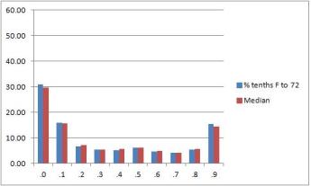
Graphs of the total proportions of tenths of degrees for all 474 sites – Fahrenheit and Celsius. Fig 2.
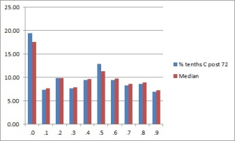
Fig 3
Fahrenheit era observations have higher proportions of .0 than those of the Celsius era. This will be discussed later.
As maxima and minima behave differently:
First, Fahrenheit – Maxima: Fig 4
Minima: Fig 5 Celsius – maxima Fig 6

Minima: Fig 7

The following histograms show proportions of sites with less than 15%, 15 to 30%, and more than 30% whole degrees as illustrated in the above graphs. Blue bars show the percentage of sites that are compliant. Red bars show the sites with up to 30% whole degrees , which is about the median, and green bars show sites greater than 30% whole degrees. (Red and green together are non-compliant.)
Fig 8

Fig 9
Fig 10

Fig 11

The following table summarises data from the above graphs. Compliance means less than 15% of observations as whole degrees- the optimum is 10%..
|
|
Fahrenheit (to 31/8/1972)
|
Celsius (1/9/1972- 31/12/2011)
|
|
|
Max
|
Min
|
Max
|
Min
|
| No. of sites |
177
|
177
|
213
|
213
|
| Total observations |
2 180 050
|
2 171 075
|
2 118 206
|
2 111 252
|
| Raw % whole degrees |
30.07
|
32.02
|
18.82
|
20.11
|
| Median % whole deg |
28.76
|
30.52
|
16.99
|
17.96
|
| Compliant – no. |
31
|
9
|
92
|
75
|
| Compliant – % |
17.51
|
5.08
|
43.19
|
35.21
|
| Non-compliant – no. |
146
|
168
|
121
|
168
|
| Non-compliant % |
82.49
|
94.92
|
56.81
|
64.79
|
The medians indicate that half the sites had more or less than this percentage of each category of tenths. More than half of all sites had at least 30% of Fahrenheit minima rounded to whole degrees (and probably much more – see below.) For minima, 95% of sites had more than 15% of readings as whole degrees and are therefore non-compliant. The figure for maxima is 82.5%.
While the raw percentage of all .0 Celsius maxima readings was 18.82%, only just over the non-compliance benchmark, more than half of sites (57%) in the Celsius era were non-compliant – i.e. had more than the expected 15% of readings in whole tenths. The figure for minima is even worse – 65%, or nearly two thirds.
Discussion
The occurrence of large percentages of .1 and .9 fractions in the Fahrenheit listings suggests this is an artefact of the original conversion from F to C (rounded to one decimal place), then the conversion back from C to F (again rounded), and suggests that the percentage of .0 is in reality much more. Below is a sample of Fahrenheit to Celsius to Fahrenheit conversions:
| Original F Reading |
Converted to C |
Rounded |
Converted to F |
Rounded |
| 67.0 |
19.4444 |
19.4 |
66.92 |
66.9 |
| 68.0 |
20.0 |
20.0 |
68 |
68 |
| 69.0 |
20.5555 |
20.6 |
69.08 |
69.1 |
| 69.1 |
20.6111 |
20.6 |
69.1 |
69.1 |
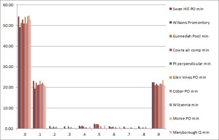
Therefore, any pre 1972 observations now recorded as 20.6C could have been 69.0F or 69.1F originally. This applies for many other temperatures. For example, below is the distribution of tenths at the 10 worst minima sites:
Fig 12
It beggars belief that sites with 50% of observations as whole degrees would have large percentages of .1 and .9 and few others. While there is no way of finding the actual amounts without examining the original paper records, it is highly probable that the values for whole degree observations (.0) are much higher than the raw figures show.
To solve this problem, a Compliance Index was designed. The percentage of .0, .1 and .9 readings is added, then 30% (3 x the expected 10% frequency) subtracted and the result inverted. Figures below zero indicate possible non-compliance. However, to allow for 5% uncertainty for each tenth, the non-compliance benchmark is -15. Sites can then be ranked according to the degree to which they reflect the theoretical distribution of tenths in their observations. Analysis of the results for the Fahrenheit era shows this is a conservative approach as it increases the percentage of compliant sites. It is very likely that the real percentage of rounding to whole degrees is much higher than the figures shown in this paper. For simplicity, from here on “rounding” is defined as the proportion of .0, .1 and .9 fractions identified.
It is also theoretically possible to estimate an approximate value for the percentage of .0F readings resulting from backwards conversion from Celsius. By reducing the values of .1 and .9 to the mean of the .2 to .8 values, the remainder is added to the .0 value. The results of these calculations will be discussed later.
Minima: Fig 13 (Click on image to enlarge)

Maxima: Fig 14

In the Celsius era, a number of sites show that rounding to .5 as well as .0 occurred. The Compliance Index is calculated by adding the percentages of whole degrees and half degrees (.5), subtracting 20% and inverting. The non-compliance benchmark is therefore -10, allowing for 2 x 5% uncertainty.
Minima: Fig 15
 Maxima: Fig 16
Compliance Index Rankings
|
Rank
|
Best sites – maxima F
|
Index
|
Rank
|
Worst sites – maxima F
|
Index
|
|
1
|
Bairnsdale PO |
4.08
|
168
|
Wilsons Promontory |
-61.35
|
|
2
|
Adelaide West Terrace |
0.92
|
169
|
Pt Perpendicular Lighthouse |
-62.39
|
|
3
|
Brisbane Regional Office |
-3.60
|
170
|
Gunnedah Pool |
-63.85
|
|
4
|
Bairnsdale Airport |
-3.90
|
171
|
Cobar PO |
-64.38
|
|
5
|
Mackay Met. Office |
-4.08
|
172
|
Maryborough (Queensland) |
-64.93
|
|
6
|
Cowra Research Station |
-4.15
|
173
|
Glen Innes PO |
-67.28
|
|
7
|
Moree Comparison |
-4.58
|
174
|
Wilcannia |
-67.98
|
|
8
|
Mount Gambier Aero |
-4.68
|
175
|
Cowra Airport Comparison |
-68.98
|
|
9
|
Perth Airport |
-5.45
|
176
|
Moree PO |
-69.73
|
|
10
|
Charleville Airport |
-5.78
|
177
|
Swan Hill PO |
-69.96
|
All the best sites were better than -6 on the Compliance Index. All the worst sites were below -61. i.e. rounding (recording of .0, .1 and .9) approached 100%.
|
Rank
|
Best sites – minima F
|
Index
|
Rank
|
Worst sites – minima F
|
Index
|
|
1
|
Brisbane Regional Office |
-0.80
|
168
|
Normanton PO |
-61.54
|
|
2
|
Cowra Research Station |
-1.48
|
169
|
Pt Perpendicular Lighthouse |
-63.37
|
|
3
|
Adelaide West Terrace |
-3.46
|
170
|
Cobar PO |
-64.42
|
|
4
|
Sydney Observatory Hill |
-3.81
|
171
|
Gunnedah Pool |
-64.47
|
|
5
|
Mt Gambier PO |
-7.64
|
172
|
Maryborough (Queensland) |
-64.79
|
|
6
|
Darwin Airport |
-8.16
|
173
|
Cowra Airport Comparison |
-65.58
|
|
7
|
Mount Gambier Aero |
-8.21
|
174
|
Wilcannia |
-68.31
|
|
8
|
Bairnsdale Airport |
-8.29
|
175
|
Glen Innes PO |
-68.33
|
|
9
|
Charleville Airport |
-8.51
|
176
|
Swan Hill PO |
-69.80
|
|
10
|
Perth Airport |
-9.53
|
177
|
Moree PO |
-69.94
|
The best sites were better than -9.51, while the worst sites were worse than -61. Moree PO had 99.94% rounding.
|
Compliance Rankings – Fahrenheit era
|
|
Compliance Index
|
% recorded as x.0, x.1, x.9
|
Maxima
|
Minima
|
|
No. worse
|
% worse
|
No. worse
|
% worse
|
|
-15
|
45
|
125
|
70.6
|
134
|
75.7
|
|
-20
|
50
|
111
|
62.7
|
118
|
66.6
|
|
-30
|
60
|
83
|
46.9
|
91
|
51.4
|
|
-40
|
70
|
49
|
27.7
|
62
|
35
|
|
-50
|
80
|
30
|
16.9
|
37
|
21
|
|
-60
|
90
|
11
|
6.2
|
14
|
7.9
|
Minima:
Three quarters are below -15 on the Compliance Index (definitely non-compliant as 45% of readings are in whole degrees, .1 or .9).
Two thirds are below -20 (50% rounded).
Half are below -30 (60% rounded).
One third are below -40 (70%).
21% are below -50 (80% rounded).
More than 10% of sites are below -59 and have more than 89% rounded data.
For maxima records:-
70.6% are below -15 and therefore non-compliant.
Nearly two thirds are below -20 and have 50% rounding.
Nearly half are below -30 (60% rounding).
More than a quarter are below -40 (70% rounding).
17% are below -50 which is 80% rounding.
It is obvious that recording of minima is much more prone to rounding than maxima.
Other interesting results for the Fahrenheit era include:-
- Of the 40 worst minima sites, only one (Meekatharra PO) is in Western Australia, one (Snowtown) is in South Australia and one (Cape Bruny Lighthouse) is in Tasmania. Six are in Queensland and 11 in Victoria. The remaining 20 are in New South Wales.
- There is a strong regional bias: in inland NSW and parts of Victoria the practise of rounding is almost universal. This indicates major problems with the accuracy of Fahrenheit era data in broad regional areas.
Following are some plots of the data for representative sites.
Best pre 1972 maxima: Fig 17
10 middle of the road maxima sites (these sites are 85th to 94th): Fig 18
Worst pre 1972 maxima: Fig 19 Best minima: Fig 20
Middle ranking minima: Fig 21
|
Compliance Rankings – Celsius era
|
|
Compliance Index
|
% recorded as x.0 or x.5
|
Maxima
|
Minima
|
|
No. worse
|
% worse
|
No. worse
|
% worse
|
|
-10
|
30
|
103
|
48.4
|
120
|
56.8
|
|
-20
|
40
|
48
|
22.5
|
55
|
25.8
|
|
-30
|
50
|
24
|
11.3
|
26
|
12.2
|
|
-40
|
60
|
11
|
5.2
|
16
|
7.5
|
|
-50
|
70
|
7
|
3.3
|
8
|
3.8
|
|
-60
|
80
|
3
|
1.4
|
4
|
1.9
|
56.8% of minima are below -10 on the Compliance Index and therefore non-compliant. More than 30% of their readings were whole or half degrees.
About a quarter of both minima and maxima are below -20 and have twice the expected percentage of rounding.
For maxima, nearly half are below -10 on the Compliance Index and therefore non-compliant.
12% of minima sites have more than a third of their measurements in whole degrees Celsius.
In the Fahrenheit era, by comparison of whole degree proportions alone, 95% of sites were non-compliant at some times in recording minima, whereas the figure for maxima is 82.5%. Of all minima observations, 63.73% were either whole degrees, .1 or .9. The figure for maxima is 61%.
The Best and the Worst – Celsius Minima
Best; Fig 22
As you can see, there is a problem at Broken Hill.
The worst- Fig 23
Glaring Errors
Some of the data recorded at supposedly “High Quality” stations in the Celsius era – as recently as four years ago- raises questions about the BOM’s quality control methods, as well as the care taken with homogenisation adjustments. There are four sites with more than 55% rounding to whole degrees Celsius. The worst is Katanning in WA, with 75.56% of Celsius era minima rounded to whole degrees. Since January 1999, 3497 days had whole degree recordings, with a big slab ending as recently as 31 May 2008. Its predecessor, Katanning Comparison, had 31.36% whole degrees Celsius and also 14.32% as .5 half degrees, but in the Fahrenheit era had more than 65% of readings as whole degrees, .1 or .9. But Katanning is blitzed by Australia’s worst Celsius era site, Warrnambool Post Office, with 88.49% of Celsius readings as whole or half degrees. Three sites – Palmerville, Bathurst Gaol and Bairnsdale – are close behind and each has more than 81% whole and half degree recordings.
Tamworth Air AWS is perhaps more concerning as it is supposedly more accurate. Between 1996 and 2006 there were 3485 days of whole degree Celsius recordings from an Automatic Weather Station supposed to be highly accurate. It is perplexing that this was not noticed until less than six years ago. Moreover, the data was transferred, as is, into the HQ record. Tamworth is not alone. Similar problems occurred at Walgett AWS and Bourke AWS. Two other NSW airports, Cowra and Orange, have problems. All of these sites are in NSW.
Fig24
Pre-1910 Quality
To assess the quality of pre and post 1910 data compared with the whole record, below is a plot of data for NSW – the worst state for data quality. Blue shows percentages since 1910, red is the whole record.
Fig 25
Another way of showing the relationship between age and quality is by plotting the 20 site running median of the Compliance Index (inverted) with the start-up date of sites.
Fig 26

The median of 20 sites’ Compliance Index (percentage .0+.1+.9, -30) before 1889 reached 46, but sites started before 1910 were largely between 30 and 40 and had 60-70% rounding. Note the large drop due to the number of airports (mainly) that commenced between the late 1930s and 1956. The large increase in the Compliance Index post 1957 is obvious.
While the median of all sites pre-1910 is higher (35.28) than 1910-1972 (25.6), the median from 1957-1972 is worse (35.35).
Deleting pre-1910 data makes very little difference. If anything, it makes the results a little worse. The quality of data from sites commenced prior to 1910 is demonstrably superior to sites with data available from 1957.
Error Reduction
Lest it be argued that the inclusion of sites with small data quantities might skew the results towards greater rounding, sites with raw .0F data counts less than 1,500 were deleted. This ensures that rounding values for all remaining sites have less than +/- 5% error. This is the original graph of all sites across Australia, both maxima and minima:
Fig 27 
This graph shows data excluding sites where raw .0F data counts are less than 1,500:
Fig 28
The proportion of whole degrees counted by the macro has increased from 31.04% to 32.25%, and the median is higher, implying that more sites are worse. Therefore it can be concluded that sample size at individual sites does not have a major bearing on the results of this study, and exclusion of sites with low data counts is not necessary.
Approximate True Values for Rounding
It can be seen in the above two graphs, as well as those of many individual sites, that the values for .1 and .9 are unrealistically high, and are an artefact of the backwards conversion of rounded Celsius figures to rounded Fahrenheit figures, as mentioned above. Calculations of closer approximations of the values for .0, .1, and .9F values by assigning to .1 and .9 the mean of values for .2 to .8, and adding the excess from .1 and .9 to .0, give the following results:
Fig 29
The uncertainty for the large value of .0F (2,249,693) is +/-3%, therefore the proportion of rounding of Fahrenheit readings Australia-wide is very probably between 50.15% and 53.25%. Half of all sites are very probably worse than 47.61% rounded.
It is also clear that the true proportion of rounded Fahrenheit observations at individual sites is very probably much more than the raw figures generated by the software tool.
Geographic Spread
This map show the geographic spread of sites and their inferred percentage of rounding in the Fahrenheit era in NSW, as well as bordering Victorian sites.
Fig 30
This map of NSW shows percentage rounding to .0 and .5 Celsius. (Amounts over the 20% expected are a concern). Fig 31
It is obvious that while there are some serious problems in the Celsius era, the majority of sites have much less rounding than Fahrenheit. For example, in the central west, Wilcannia went from more than 90% rounding to less than 30%.
The Test: Is Artificial Warming Likely?
According to Torok and Nicholls, this is the problem:
If many observers truncated their measurements to the nearest whole degree below the actual measurement, prior to metrication, and after metrication recorded to tenths of a degree, this would result in an artificial warming in the early 1970s.
This audit shows that while Celsius era observations have major problems, rounding is less common than pre September 1972.
However, for a true test, only sites which were open up to 31 August 1972 and continued on from 1 September 1972 need to be considered- ones that closed before this or started years later are not relevant. The following graph shows a comparison of Fahrenheit era rounding with Celsius era rounding at continuing sites, with irrelevant sites deleted. Note that inferred values for rounding, as discussed earlier, are used:
Fig 32

And again, minima were rounded more:
Minima: Fig 33
Maxima: Fig 34
It is highly probable that more than half of all Fahrenheit observations were rounded. If truncation accounted for a significant proportion of these, artificial warming is likely to have occurred in the 1970s. This is illustrated by examination of minima at some individual sites.
Wilcannia, in western NSW, is a good example of the problem recognised by Torok and Nicholls, having very high (97.8%) inferred rounding up to 31 August 1972, and low (17.57%) rounding after that. Four scenarios were considered: no truncation, i.e. no change, all whole degrees have been simply rounded to the nearest whole; 33% truncation, 50% truncation, and 100% truncation. For each of these, new Celsius values were calculated for all annual means from 1910 to 1971, with 8/12 proportions for 1972. From 1973 annual means were kept the same. Means of the 1961-1990 values were used to calculate anomalies for 1910- 2009 for each scenario, and these anomalies were plotted with 100 year trends. It should be noted that these show the effect that would occur if there were no truncations.
Fig 35:
For Wilcannia, the trend with no truncation is +0.5C; with 33%, +0.35C; with 50%, +0.25C, and with 100%, +0.1C. For this low level of rounding post 1972 (17.57%), even 100% truncation of rounded Celsius readings would cause only 0.03C of artificial cooling. At sites with large amounts of rounding, one can expect large proportions of truncation to have a large artificial warming effect. For Wilcannia, the artificial warming effect could be up to +0.4C (the difference between zero and 100% truncation) per 100 years.
Bridgetown Comparison, in the south west of Western Australia, is a site with rounding figures close to the national average: 51.86% before September 1972 and 19.24% after. Similar calculations (with 50% of the truncating effect) produce this result:
Fig 36
Trends are: no truncation, +1.4C; 33%, +1.3C; 50%, +1.3C; and 100%, +1.25C.
Gayndah Post Office, in south east Queensland, has just below the national average of rounding, 47.8% before September 1972 and 18.2% after.
Fig 37
Trends: no rounding, +2.4C; 33%, +2.3C; 50%, +2.3C; 100%, +2.2C.
It should be remembered that 71 sites out of 153 have more rounding than Bridgetown, and 78 sites are worse than Gayndah.
Finally, Darwin Airport, one of the best five continuing sites, has 20.5% rounding before September 1972 and 12.3% after.
Fig 38
Even at a site with very little rounding there is a small amount of artificial warming- up to +0.1oC- caused by truncating.
As more than half of all sites in Australia had rounding probably greater than 50%, truncating at significant levels (33%, 50%, or 100%) before September 1972 would cause artificial warming of between +0.1C and +0.4C per 100 years.
The extent of truncation as a proportion of the rounding is unknown. However, there are reasons for inferring that some significant truncation did occur.
It is clear that minima were rounded more often than maxima. This may indicate a greater tendency to round down than up. One reason may be that observers are more likely to round down from 35.4 than round up from 35.6, with most people recognising that 35 is sort of accurate but 36 is simply wrong.
A more persuasive reason is that as 20th Century warming in Australia is largely the result of minima increasing rather than maxima, the greater rounding of minima found in this study, including some proportion of truncating, may be a partial cause. Comparison of rounding in winter and summer would clarify this issue but is beyond the scope of this study.
Implications for the High Quality Temperature Network
The BOM’s HQ temperature series are constructed by making homogenisation adjustments to the raw data. These involve using overlapping data to combine records, statistical tests including comparing data with that of the median of reference sites (up to 700 kilometres away), finding differences between anomalies at two neighbouring sites, and examining Diurnal Temperature Range. All of these methods are thus dependant on the accuracy of data not only at the candidate site and its neighbours, but also at hundreds of others surrounding. This study shows such data accuracy is not available.
It may be argued that if the inaccuracies are randomly up and down and averaged to create monthly and annual means, inaccurate daily data produce means that are little different from the means of more accurate data. However, there is no way of telling as there are no more accurate data with which to compare. If there were more accurate data, the BOM would have displayed it in their Daily HQ data. Moreover, if this argument is followed logically there is no need for greater accuracy and temperatures should always be measured to the nearest whole degree. This is the practice in the USA.
If, as this study demonstrates conclusively, rounding of temperatures pre-1972 was widespread and in some areas almost universal, and if truncating accounted for a significant proportion of this, the evidence showing less common rounding after 1972 indicates this would have caused an artificial warming since then.
Further, the glaring errors and high percentages of rounded data at a large number of High Quality sites suggest that poor observational and recording procedures occur more frequently than acknowledged and that many sites should be deleted from the HQ dataset.
Most alarming is the evidence of extremely poor quality control in allowing years of obviously non-compliant daily data to be copied into the High Quality record with no checking.
A current example of this: Glen Innes Agriculture Research Station 56013 is continuing to record temperatures in Celsius whole and half degrees, not tenths. It’s not a HQ site, but its record may be needed at some time in the future.
Conclusion
This audit of a large sample of daily temperature observations at all sites associated with Australia’s High Quality Temperature Network provides convincing evidence that the record is of very poor quality and is replete with errors. Many HQ sites have recorded large amounts of data in recent years that may be in error by up to 0.50 Celsius, being rounded to whole degrees, and more than half of the sample studied have recorded erroneous data at some time in the past 40 years. As well, the vast majority of sites used to compile the HQ Annual temperature dataset inaccurately recorded observations in the Fahrenheit era by recording in whole degrees. For nearly half of all sites, this amounts to at least 50% of their total observations. It is probable that more than 50% of all Australian observations were rounded. This alone means that temperatures before 1972 may be inaccurate by up to 0.250 C. If significant proportions of temperatures were rounded down, this would have the effect of making post-1972 temperatures relatively warmer, increasing warming trends by between 0.1oC and 0.4oC. Evidence is presented that this may have been the case. There is also evidence of very poor quality control in compiling the HQ record. The large amount of uncertainty in the records of so many sites means that homogenisation as practised by BOM researchers must be in question, and with it all analyses of Australia’s temperature trends.
“Near enough for a sheep station” may have been the understandable attitude of hundreds of poorly trained weather observers in the past. However, it is NOT good enough for a modern scientific organisation such as the Bureau of Meteorology or the CSIRO, especially when climate analyses based on such poor quality historical data inform government policy on climate change.
A thorough audit of the Bureau of Meteorology’s practices is long overdue.
Acknowledgements
The driving inspiration behind this audit was Chris Gillham. He has written his interpretation of our findings at http://www.waclimate.net/round/rounded-australia.html
This independent audit of raw daily temperature records at 237 High Quality and nearby stations was conducted over seven weeks from January to March 2012. It was a collaborative data validation analysis by:
Ken Stewart
Chris Gillham
Ian Hill
Ed Thurstan
Geoff Sherrington.
Others who contributed are Joanne Nova, Warwick Hughes, Lance Pidgeon, Anthony Cox.
For a description of the origins and process of the audit, see http://www.waclimate.net/round/rounded-background.html
The tabular audit results are available here: http://www.waclimate.net/round/TableofSites-scanned.xls
the tenths distribution macro:
http://www.waclimate.net/round/Tenths-distribution-V6.xls
and scanner:
http://www.waclimate.net/round/Scanner_1.xls
None of the participants in this audit has received any financial reimbursement or other assistance from any third party, corporate or political, and all results are accurate and verifiable.


