Dr Jennifer Marohasy has recently stirred up the Bureau of Meteorology and their usual uncritical apologists with her analysis of three years of parallel data obtained for Brisbane Airport (after years of denial and obstruction by the BOM). This relates to side-by-side recording of temperatures taken from the traditional mercury Liquid In Glass (LIG) thermometer and the repacement Automatic Weather Station (AWS) which show that “41% of the time the (AWS) probe is recording hotter than the mercury, and 26% of the time cooler.”
She also identified a step change in AWS values in December 2019 which she thought represented recalibration of the AWS system. The BOM denied this, “explaining there was a fault in the automatic weather station that was immediately fixed and operating within specifications from January 2020 onwards.”
This post is a further analysis of the parallel data (kindly shared by Dr Marohasy). It shows that:-
- The discontinuity in December 2019 is beyond doubt.
- There was indeed a fault in the AWS in December 2019, but the repair resulted in the “fixed” AWS reading on average 0.23 degree Celsius higher than it was before the fix (for equivalent LIG temperatures) for the next two and a half years.
- Before the AWS was “fixed” it was recording temperatures on average 0.2C cooler than the LIG. After the “fix”, the AWS was on average less than 0.1C warmer.
- Before the “fix”, 3.6% of the AWS recordings were higher than the LIG on the same day, and 86.2% were lower.
- After the “fix”, 47 % of the AWS recordings were higher than the LIG on the same day, and 16.5% were lower.
- 26.7% of all readings before and after the “fix”were outside of the +/- 0.1C range.
- There were seasonal variations in the difference between AWS and LIG.
- Unexplained spikes continued randomly before and after the AWS was “fixed”.
- The “fixed” AWS may have begun to deteriorate again in mid-2022.
In analysing the parallel data I compared same day observations by calculating the difference between AWS and LIG readings. Figure 1 shows daily differences in degrees Celsius as a time series.
Fig. 1: Daily differences (outliers removed)
A 31 day running mean is a good way to see changing patterns:
Fig 2: 31 day running average of differences
There was a sharp dip and sudden rise in values in December 2019 to above zero difference, at the time of the AWS fault and repair. Note the dip below zero in June and July 2022.
Figure 3 shows the daily differences from 31 July 2019 until the “fix”.
Fig. 3: Daily values to 22/12/19. Note large fluctuations from 16thDecember:
I excluded values from 16th to 22nd December when the AWS was faulty.
BOM experts have repeatedly claimed that AWS systems report temperatures that are predominantly within +/- 0.1C of LIG readings. From 31/7/19 to 15/12/19 there were 80 incidences (58%) of the difference of AWS minus LIG being less than -0.1C and 2 incidences (1.45%) of the difference being greater than +0.1C. From 23/12/19 to 30/7/22 there were 30 incidences (3.2%) of difference < -0.1C and 178 incidences (18.8%) of difference > +0.1C. 26.7% of all readings before and after the “fix”were outside of the +/- 0.1C range.
The following plots analyse the data for differences outside this range.
Fig. 4: Running count of days with difference more than +0.1C
The number of days with AWS reading more than +0.1C above LIG rose steadily from 23 December.
Fig. 5: Running count of days with difference below -0.1C
The break in December 2019 is obvious.
A 31 day running count is a good way to see changing patterns:
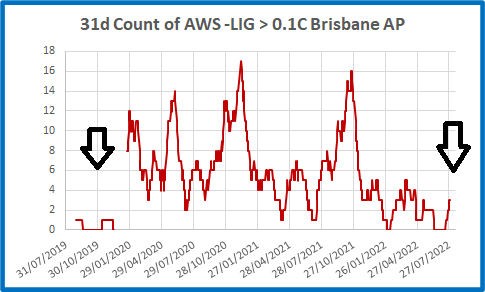
Fig. 6: 31 day count of days with difference more than +0.1C
Before the AWS “fix”, differences over 0.1C were rare. After this, the number immediately increased. Note that the incidence of days with a difference over 0.1C fluctuated in large swings. In early December 2020, 17 out of the previous 31 AWS readings were more than +0.1C higher than LIG, and in October 2021 there were 16. The count continued fluctuating while gradually decreasing, with a drop to zero in early and mid-2022. This may indicate a deterioration in the AWS system.
The fluctuations are also seen in differences below -0.1C.
Fig. 7: 31 day count of days with difference lower than -0.1C
There was clearly a discontinuity in December 2019, followed by fluctuations in the incidence.
Is there a pattern in the months after the AWS was “fixed”?
The next figures plot 31 day counts by month of the year from January 2020.
Fig. 8: Count of differences >+0.1C by month
Higher frequency of differences > +0.1C occur in early winter and summer. Lower counts occur in March, April, July, and August.
Fig. 9: Count of differences <-0.1C by month
Note that there is a clear seasonal pattern: most differences occur in July; least from October to January.
Figures 10 and 11 are timeseries of monthly counts.
Fig. 10: 31 day counts of differences > +0.1C each month
The swings we saw in Figure 6 above are replicated with months more easily identified. There were spring peaks in 2020 and 2021, but there was also a peak in May and June of 2020. Differences were low from December 2021 to July 2022. Was the AWS beginning to malfunction?
Fig. 11: 31 day counts of differences under -0.1C each month
This is (almost) the opposite of Figure 10. There are more days with AWS less than LIG in winter months. However winter of 2022 saw an unusually high number of days with AWS cooler than LIG. In July 2022 up to 42% of AWS readings were more than -0.1C different from LIG.
The next two plots show the frequency (as a percentage) of all differences before and after the “fix”.
Fig. 12: Frequency of differences between AWS and LIG: to 15/12/19
From 31/7/2019 to 15/12/2019 AWS was on average 1.7C cooler than the LIG, as shown.
Fig. 13: Frequency of differences between AWS and LIG: from 23/12/19
The plot of difference values has shifted right. The BOM is correct in that 75% of AWS readings after the “fix” were within +/- 0.1C of LIG, but the average difference increased from -0.17C to +0.05C: about +0.2C.
Also, the range of differences remained large.
Fig. 14: Differences each month before and after the AWS was “fixed”
Apart from the circled values in December 2019 when the AWS was faulty, the range of differences between AWS and LIG was similar after the “fix”. Spiles were even greater.
Greatest difference to 15/12/19: +0.6C
Smallest difference to 15/12/19: -0.5C
Greatest difference from 23/12/19: +0.7C
Smallest difference from 23/12/19: -0.7C
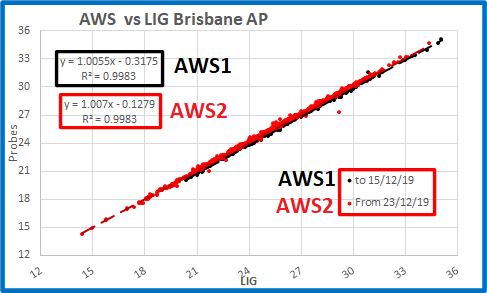
AWS values from 31/7/2019 to 30/7/2022 show a clear discontinuity in December 2019, but the AWS continued to “spike” above and below LIG values. The only change was that the AWS was now reading about 0.2C warmer than before. Figures 15 and 16 show this in a different way.
Fig. 15: Daily AWS values before and after the “fix” for corresponding LIG values
They are very close, but different.
Fig. 16: Zooming in: Daily AWS values before and after the “fix” for corresponding LIG values
The trendlines of the two plots are offset, and the difference is about 0.2C, as shown above.
In conclusion:
My analysis confirms that Dr Marohasy is correct: the AWS system at Brisbane Aero reads higher than the LIG thermometer, and there was a distinct step up after the AWS was “fixed” in December 2019.
The Bureau of Meteorology cannot claim there was no difference following December 2019. One of the two records is accurate, the other is not. If the AWS system was performing within specifications after 23/12/2019, it was definitely not before then.
Tags: adjustments, Australia, bom, Brisbane, Bureau of Meteorology, Dr Marohasy, temperature


May 30, 2023 at 6:29 pm |
And Ken, BoM have now made a tacit agreement to yours and others work and accepting the data for the past 30 years is nonsense…and will replace with UK system
Funny that temps hit maxes in 90’s and 00’s and then hit a plateau…coincident with new RTD instrumentation methodology
https://jennifermarohasy.com/2023/05/bureau-capitulates-but-overseas-model-unlikely-to-solve-all-temperature-measurement-issues/
June 1, 2023 at 4:23 pm |
Ken, I have recently looked at the differences between Glass (LIG) and Probe temperatures at Marble Bar. Over three years, 2003-2005, separate analyses were made of daily maximum and minimum temperatures. https://briangunterblog.wordpress.com/2023/05/21/marble-bar-temperature-comparisons/
For maximum temperatures most daily differences were in the range +0.3C to -0.3C but there were also many outliers; 19 days (1.9%) had differences over 1.0C! The largest difference was 3.8C!
The daily differences in minimum temperatures were mostly in the range +0.1C to -0.6C; indicating lower temperatures from the probe. 26 days (2.6%) range had differences over 1.0C! The largest difference was 4.9C!
Over a month the large daily differences tend to be balanced out. However for monthly mean Tmax differences 16% of months exceeded 0.1C; while for Tmin a massive 84% exceeded 0.1C. The largest monthly mean difference was -0.43C in November 2005.
These results are different in direction and magnitude to those for Brisbane Airport, which I think is significant.
My interest is in assessing long-term temperature trends and therefore consistent data are vital to me. I am well aware of problems with historical manual data (such as station relocation, changes in nearby buildings or trees, changes in the size of the screen box, etc), but they are the only data extending over a century or more. Maybe data using probes should not be used until their consistency has been verified. Stations that have had stable locations, such as Moruya Heads, Giles, Bombala, Yamba and Cape Bruny Lighthouse, may be the most reliable data for trend analyses. Even if most or all of these stations are non-standard in some respect their records would be still be a consistent index of temperature at each location.
Comments from anybody would be appreciated. B
June 3, 2023 at 4:48 pm |
Brian, I’m sorry for the delay, I had to travel for a few days for a funeral and only just got back. I have no idea why your comment gets moderated.
Thank you. I’ve just had a quick look at your post, and I hope to have time for a closer look and analysis shortly. Best wishes, Ken
June 6, 2023 at 4:47 am |
Ken I really like your Figure 15 and 16. These are the charts that matter the most.
The perfect equation for a relationship between two good accurate systems would be Y = 1X + 0
This would give you a line that is actually Y = X because both thermometers are in perfect agreement with each other at all times.
The red or “AWS2” lines in your figures 15 and 16 are closer to Y = X than the black “AWS1” lines. This indicates that there was a problem and the situation did improve after 23/12/19. However while the offset got better, closer to zero the slope got a little worse, further from 1.
If the average annual temperature there was 25.4 then your chart at figure 16 shows a reading of 25.4 on the X or LiG line corresponds to a reading of 25.45 from the repaired system.
The equation produces the same. 25.4 * 1.007 – 0.1279 = 25.4499. Above average temperatures are warmed more.
Prior to 15/12/19 it was reading too cool. 25.4 from the LiG would have corresponded to 25.4 * 1.0055 – 0.3175 = 25.2222 from the AWS.
June 6, 2023 at 5:56 am |
You are absolutely correct.