What’s gone wrong?
In November 2015 in my post “Why are Surface and Satellite temperatures Different?” and two follow up posts I showed that the difference is very largely due to rainfall. You are urged to read these posts in full.
I repeat a key paragraph:
Firstly, surface temperatures are supposed to be different from atmospheric temperatures. Both are useful, both have limitations. The TLT is a metric of the temperature of the bulk of the atmosphere from the surface to several kilometres above the whole continent, in the realm of the greenhouse gases- useful for analysing any greenhouse signals and regional and global climate change. Surface temperature is a metric of temperature 1.5 metres above the ground at 104 ACORN-SAT locations around Australia, area averaged across the continent- useful for describing and predicting weather conditions as they relate to such things as human comfort, crop and stock needs, and bushfire behaviour.
Here are three plots from my 2015 post.
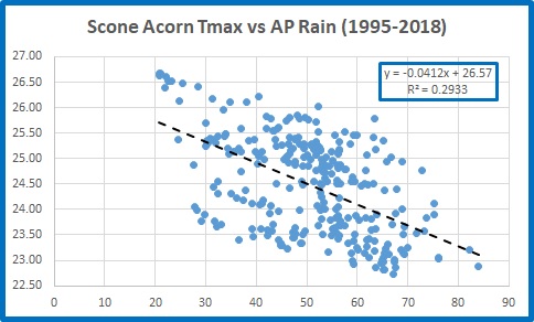
Fig.1: Tmax and Scaled, Inverted Rain (from Figure 7 from my 2015 post)

Dry periods are hotter, wet periods are cooler.
Fig. 2: Surface maxima minus atmospheric temperatures and inverted rain (Figure 10 from my 2015 post)

Fig. 3: Temperature difference compared with rainfall (from Figure 12)

The difference between Australian surface and satellite temperatures was very largely explained by rainfall. However, after five more years of satellite and surface data there is a problem (and I thank Chris Gillham for alerting me to this.)
Fig. 4: Surface maxima minus atmospheric temperatures and inverted rain

Since about 2013 the difference between surface Tmax and satellite data has visibly increased above rainfall.
Now I have a confession to make.
In previous analyses I used running 12 month means in calculating correlation. This can lead to inaccuracy as the means can be highly auto-correlated. From now on I will use annual data, either with calendar years or, as in this post, annual means from December to November (so that summer months and most of the northern Wet season are included in the one datapoint).
I downloaded data from:
Temperature of the Lower Troposphere- Australia Land
As with my 2015 post, I have recalculated rainfall and maxima from 1981-2010 means to match UAH.
In the past five years there have been changes: the Australian maximum temperature record is now based on ACORN-SAT Version 2 instead of Version 1, including new adjustments and some station changes. No doubt UAH has been tweaked a little as well.
However correlation between the difference between the surface maxima as recorded by Acorn and temperature of the lower troposphere (TLT) as recorded by UAH, and rainfall, has decreased.
Fig. 5: Temperature difference compared with rainfall

The close connection between the temperature differences and rainfall became broken from about 2005, as can be seen in Figure 4. Another step up occurred in 2013.
So there appear to be three distinct periods: 1979 to 2004, 2005 to 2012, and after 2013. Plotting temperature differences against rainfall allows us to compare each period.
Fig. 6: Temperature difference compared with rainfall
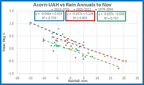
From 1979 to 2004 and from 2005 to 2012 slopes are identical at 0.4 degrees lower temperature for each 10 mm of rain, with 76% and 93% of temperature variance explained by rainfall. The trend lines are parallel but offset by 0.26 degrees indicating either atmospheric temperatures have reduced or surface maxima have increased in the middle period. From 2013 the relationship is different with closer to 0.5 degrees lower temperature per 10mm of rainfall, with rainfall explaining 78% of the variance. Again, the offset shows either UAH has suddenly decreased or Acorn has suddenly increased.
Conclusion: Something has gone wrong with the relationship between rainfall and temperature in Australia. In recent years, and certainly since 2013, the surface- atmospheric temperature difference has rapidly increased relative to rainfall. That should not have happened.
My suspicion is that Acorn’s maxima are to blame. Figure 1 showed Acorn appeared to step up relative to rainfall in 2001 or 2002, or perhaps earlier in 1997, and again in 2013. There can be no meteorological explanation for this.
The accuracy, and therefore usefulness, of the ACORN-SAT adjusted temperature record will be the topic of my next post.
Stay tuned.