Archive for November, 2016

Land and Sea Temperature: South West Australia Part II: TMin

November 29, 2016

This is a quick follow up to my last post, as an update:  I’ve been reminded to show Tmin as well.   My apologies.

In this post I examine minimum temperature for Winter in South-Western Australia, and Sea Surface Temperature data for the South West Region, all straight from the Bureau of Meteorology’s Climate Change time series page .

All temperature data are in degrees Celsius anomalies from the 1961-90 average.

Fig. 1:   Southwestern Australia Winter TMin Anomalies & SST

sw-tmin-sst

Note that TMin roughly matches SSTs, but there are differences from TMax.  CuSums will show this:

Fig. 2:  CuSums of Winter TMin and SST compared:

sw-tmin-cusums

Note that TMin has completely different change points, marked in red.  The major different ones are at 1949, 1956, 1964, 1990, 2000, and 2010.  There is a barely discernible point at 1976 (not 1975), so the next plots will use 1976 to show trends since then.

Fig. 3:  Trends in TMin:

sw-tmin-trends

Cooling since 1976 at -0.36C/100 years.

Detrending the data allows us to see where any of the winters “bucks the trend”.  In the following plots, the line at zero represents the trend as shown above.

Fig. 4:  TMin Detrended:

sw-tmin-detrended

2016 winter TMin is 0.5C below trend, and 0.38C below average, however winter this year in southwest WA was not as cold as 1986, 1990, 2001, 2006, 2008, or 2010- according to Acorn of course.

The action is with TMax.

Land and Sea Temperature: South West Australia

November 29, 2016

This year, the south-west of Western Australia has recorded some unexpectedly low temperatures.  Has this been due to rainfall, cloud, winds, or the cooler than normal Leeuwin Current and Sea Surface Temperatures in the South West Region?

In this post I examine maximum temperature and rainfall data for Winter in South-Western Australia, and Sea Surface Temperature data for the South West Region, all straight from the Bureau of Meteorology’s Climate Change time series page .

All temperature data are in degrees Celsius anomalies from the 1961-90 average.

Figure 1 is a map showing the various Sea Surface Temperature monitoring regions around Australia.

Fig. 1

sst-regions

The Southwest Region is just to the west and southwest of the Southwest climate region, and winter south westerlies impact this part of the continent first.  2016’s winter has seen maxima drop sharply.  In fact, it was the coldest winter since 1993:

Fig. 2:  Southwestern Australia Winter TMax Anomalies

sw-tmax

There is a relationship between rainfall and Tmax- as rain goes up, Tmax goes down, so here south west rainfall is inverted and scaled down by 100:

Fig. 3:  TMax and Rain:

sw-tmax-rain

The next plot shows TMax and the South West Region’s Sea Surface Temperature anomalies (SST):

Fig. 4:  TMax & SST:

sw-tmax-sst

Again, related: both have strong warming from the 1970s.  Next I check for whether there was a real change in direction in the 1970s, and if so, when.  To do this I use CuSums.

Fig. 5:  CuSums of Winter TMax and SST compared:

sw-tmax-sst-cusums

Both have a distinct change point: 1975, with SST warming since, but TMax appears to have a step up, with another change point at 1993 with strong warming since.  Rainfall however shows a different picture:

Fig. 6:  CuSums of Winter Rainfall

sw-rain-cusums

Note the major change at 1968 (a step down: see Figure 3), another at 1975 with increasing rain to the next change point at 2000, after which rain rapidly decreases.

I now plot TMax against rainfall and SST to see which has the greater influence.  First, Rain:

Fig. 7:  TMax vs Rain:

sw-tmax-vs-rain

100mm more rain is associated with about 0.5C lower TMax, but R-squared is only 0.22.

Fig. 8:  TMax vs SST:

sw-tmax-vs-sst

A one degree increase in SST is associated with more than 1.1C increase in TMax, and R-squared is above 0.51- a much closer fit, but still little better than fifty-fifty.

TMax is affected by rain, but more by SSTs.

I now look at data since the major change points in the 1975 winter.  The next three figures show trends in SST, Rain, and TMax.

Fig. 9:  Trends in SST:

sw-sst-trends

Warming since 1975 of +1.48C/ 100 years.

Fig. 10:  Trends in Rainfall:

sw-rain-trends

Decreasing since 1975 at 89mm per 100 years (and much more from 2000).

Fig. 11:  Trends in TMax:

sw-tmax-trends

Warming since 1975 at +2.14C per 100 years.

Detrending the data allows us to see where any of the winters “bucks the trend”.  In the following plots, the line at zero represents the trend as shown above.

Fig. 12:  SST Detrended:

sw-sst-detrended-75-to-16

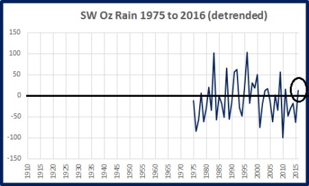
Fig. 13:  Rainfall Detrended:

sw-rain-detrended-75-to-16

Fig. 14:  TMax Detrended:

sw-tmax-detrended-75-to-16

Note that SST in 2016 is just below trend, but still above the 1961-90 average.  Rainfall is only slightly above trend, and still below average.  However TMax is well below trend, and well below average, showing the greatest 12 month drop in temperatures of any winter since 1975.

My conclusions (and you are welcome to comment, dispute, and suggest your own):

  • Maximum temperatures in winter in Southwestern Australia are affected by rainfall, but to a much larger extent by Sea Surface Temperature of the South West Region.
  • The large decrease in winter temperature this year cannot be explained by rainfall or sea surface temperature.  Cloudiness may be a factor, but no 2016 data are publicly available.  Stronger winds blowing from further south may be responsible.

Water World

November 15, 2016

Readers may be aware of the “Cold Blob” which is moving across the northern Pacific Ocean.  In this post I shall show sea surface temperature anomalies, and currents, in all of the world’s oceans, as shown by nullschool.

This is the colour scale for all figures, from -6C to +6C.  Zero anomaly is black.

scale

The Arctic Ocean

arctic-ocean

The Southern Ocean

sthn-ocean

Note the large area of sea ice around Antarctica (black) surrounded by a ring of below average SSTs, with another ring of swirling eddies of warmer SSTs.  Note also the cold blob just below south-western Australia which is working its way east.

The Atlantic Ocean

atlantic-ocean

The North Atlantic is predominantly unusually warm- especially the Gulf Stream.  However the South Atlantic is largely covered by a very large pool of cold water.

The Indian Ocean

indian-ocean

The Indian Ocean Dipole between the west and the east is plain to see.  Note the colder than normal SSTs near south-western Australia which have led to some unusually cold land temperatures this winter and spring.

The Pacific Ocean

pacific-ocean

The El Nino has ended and La Nina appears to be building as the surge of cold water moves west along the Equator.  Note the cold blobs in the North Pacific, and less well defined in the South Pacific.  Note also the high SSTs near South America and around the International Date Line at 30 degrees North.

Note there are large areas of above and below normal SSTs in all ocean basins except the Arctic, where sea ice cover tends to hide water temperature below.  The Arctic ocean atmospheric temperature anomalies have recently shot up to record highs.

I now turn to the seas close to Australia.

australia-sst

Waters around the northern, north-western, and eastern coasts of Australia are generally 1.0 to 1.8C above normal.  This includes the area of the Great Barrier Reef.  The East Australian Current runs down the east coast and can be seen as a warm tongue spilling into the Tasman Sea.  (This is what led to the ABC’s reports about high temperatures in the Tasman Sea.)  But the Tasman Sea has several eddies of cold and warm water.  Note also the cold area to the south of Western Australia, and the cool area just to the east of Tasmania.

Warm waters around northern Australia are likely to generate extra rainfall and probably cyclones, and a strong gradient between north and south will likely lead to strong weather changes and storms.

Conclusion:  Once again, the difference between the Northern and Southern Hemispheres shows itself in sea temperatures.  Apart from the cold blob in the northern Pacific, Northern Hemisphere oceans are predominantly warmer than usual, while those of the Southern Hemisphere have large regions of both warmer and cooler water.  There is a very large cold blob in the South Atlantic, and another surrounding Antarctica.  Ocean currents constantly move thermal energy around, releasing it by radiation and evaporation mainly, and governing land temperatures hundreds of kilometres away.

The next six months should be interesting.

The Pause Update: October 2016

November 12, 2016

The complete UAH v6.0 data for October have just been released. I present all the graphs for various regions, and as well summaries for easier comparison. The Pause has ended globally and for the Northern Hemisphere, and the Tropics, but still refuses to go away in the Southern Hemisphere.

These graphs show the furthest back one can go to show a zero or negative trend (less than 0.1 +/-0.1C per 100 years) in lower tropospheric temperatures. I calculate 12 month running means to remove the small possibility of seasonal autocorrelation in the monthly anomalies. Note: The satellite record commences in December 1978- now 37 years and 11 months long- 455 months. 12 month running means commence in November 1979. The y-axes in the graphs below are at December 1978, so the vertical gridlines denote Decembers. The final plotted points are October 2016.

[CLICK ON IMAGES TO ENLARGE]

Globe:

pause-oct-16-globe

The Pause has ended. A trend of +0.23 C/100 years (+/- 0.1C) since March 1998 is about one fifth of the trend for the whole record.

And, for the special benefit of those who think that I am deliberately fudging data by using 12 month running means, here is the plot of monthly anomalies:

pause-oct-16-globe-monthly

Northern Hemisphere:

pause-oct-16-nh

The Northern Hemisphere Pause has well and truly ended.

Southern Hemisphere:

pause-oct-16-sh

For well over half the record, the Southern Hemisphere still has zero trend.  The Pause may end shortly.

Tropics:

pause-oct-16-tropics

The Pause in the Tropics (20N to 20S) has ended.

Tropical Oceans:

pause-oct-16-tropic-oceans

The Pause has ended for ocean areas.

Northern Extra Tropics:

pause-oct-16-nextt

The minimal trend is creeping up- how high will it go before decreasing again?

Southern Extra Tropics:

pause-oct-16-sextt

The Pause persists.

Northern Polar:

pause-oct-16-np

The trend has increased a lot.

Southern Polar:

pause-oct-16-sp

The South Polar region has been cooling for the entire record- 37 years.

USA 49 States:

pause-oct-16-usa49

No change.

Australia:

pause-oct-16-oz

No change.

The next graphs summarise the above plots. First, a graph of the relative length of The Pause in the various regions:

pause-oct-16-length

Note that the Pause has ended by my criteria in all regions of Northern Hemisphere, and consequently the Globe, and the Tropics, but all southern regions have a Pause for over half the record, including the South Polar region which has been cooling for the whole record.

The variation in the linear trend for the whole record, 1978 to the present:

trends-78-now-oct-16

Note the decrease in trends from North Polar to South Polar.

And the variation in the linear trend since June 1998, which is about halfway between the global low point of December 1997 and the peak in December 1998:

trends-98-now-oct-16

The imbalance between the two hemispheres is obvious. The lower troposphere over Australia has been strongly cooling for more than 18 years- just shy of half the record.

The next few months will be interesting. The Pause may disappear from the Southern Hemisphere soon. The behaviour of the Tropics and the South Polar regions will be crucial.  (I would like to see separate data for the Extra-tropical regions from 20 to 60 degrees north and south.)

Pacific Sea Level One Year On

November 9, 2016

I was reminded by Jennifer Marohasy of my post a year ago (Pacific Sea Levels- Warming, ENSO, or Wind?) in which I showed that “Sea level rise in Kiribati and the Marshalls has nothing to do with climate change and everything to do with the ENSO cycle, and winds in particular.”

I wonder how things are going after 12 months?

Back then I had a brief exchange with one of the commenters, MorinMoss, a Global Warming Enthusiast, part of which included the following:

Me:

So Morin, getting back to sea levels in the Pacific, what do you think sea level at Kiribati will be a year from now- higher, lower, or the same as now, and why? I reckon it will be lower- because of the ENSO cycle. The Pacific will be in neutral or La Nina phase by then, trades will be dominant, with less westerly wind bursts on the Equator.

 MorinMoss:

Hard to say – there’s so much warm water in the Pacific that I think it’s too early to say how the cycle will progress.
We could be looking at a double-dip El Nino or a strong neutral (or would that be weak neutral?) phase, not proceeding immediately to a La Nina.

http://www.nytimes.com/2015/11/03/science/global-warming-pacific-ocean-el-nino-blob.html

 Me:

Good-oh, we shall see!

So 12 months ago I predicted sea level at Kiribati would be lower because of the ENSO cycle.

Time for a reality check.

This was the position in my post last year:

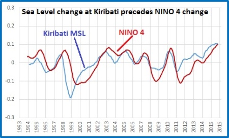
k-msl-v-nino4

And this is the position now.

kiribati-msl-v-nino4

Kiribati sea level change still precedes NINO4 change, and sea level has fallen from the highest it had been in this record to about average.

Q.E.D.

Poles Apart

November 4, 2016

Satellite data from UAH (University of Alabama- Huntsville) are estimates of temperature in the Lower Troposphere, and thus a good indicator of whether greenhouse warming is occurring.  My next post about the length of The Pause in various regions will be ready in a few days’ time.  Meanwhile, I’ve been looking at the data in a different way.

In this post I will be examining how and when temperatures have changed in discrete regions of the globe, including over land and over oceans.  There are no startling revelations, but a different approach reinforces the need to understand climate variability in different regions.  The important regions of course are the Tropics and the Poles, and fortunately UAH data is available separately for just these three regions.

Firstly, Figure 1 shows the regions for which UAH has atmospheric data.

Fig. 1:  UAH Data Regions

regions

The Northern and Southern Extra-Tropics include the Polar regions, so there are three discrete regions which do not overlap: Tropics, North Polar, and South Polar.  It would be very helpful if Dr Spencer provided data for the Extra Tropical regions excluding the Polar Regions.

For this analysis I use CuSum, which is a simple test of data useful for detecting linearity or otherwise, and identifying sudden changes in trend, or step changes.  It can be used for any data at all- bank balance, car accidents, rainfall, GDP, or temperature.  It is simple to use:  find the mean of the entire data, calculate differences for every data point from this mean, then calculate the running sum (Cumulative Sum) of the differences.  If done correctly, the final figure will be zero.  Plot the CuSum usually by time and identify points of any sudden change in direction.  A generally straight or smoothly curving line indicates linearity, but points of sudden change mean a change in trend or a step change.  (Further, data series with identical start and end points, exactly the same number of data points, and anomalies from the same period- such as UAH- should produce directly comparable CuSums.)  These points, and ranges between them, are then checked in the original data. The usefulness of CuSums will become obvious as we go, especially as they are compared.

The next figures show CuSum plots for various regions.

Fig. 2:  UAH CuSums for all regions

cusums-all

Points to note:

The brown line at the top is the South Polar region.  The line wobbles about zero, indicating little relative change in temperature from the mean.  Contrast this with the North Polar region (the blue line at the bottom.)  The Polar regions are conspicuously different from the other regions and from each other.

The spaghetti lines clustered in the middle are CuSums for (in order from top to bottom): Southern Extra-Tropics; Southern Hemisphere; Tropics; Globe; Northern Hemisphere; Northern Extra-Tropics.

The red arrows point to wobbles coinciding with major ENSO events.  These changes in direction indicate trend changes or step changes in the original data.  There are other changepoints, notably 2002-2003.

The vertical red line joins changepoints in all the CuSums in mid-1991 following the eruption of Mt Pinatubo.

Fig. 3: UAH CuSums for the Tropics, South Polar, and North Polar regions

cusums-np-sp-tropics

Note there is little similarity between CuSums for the only regions with discrete data, and you have to look carefully to see North Polar CuSums changing some months after Tropics, but not always.

The next plots show the differing responses of Land and Ocean areas.

Fig. 4:   UAH CuSums for the Globe, Land and Ocean

cusums-land-ocean

Note that Land areas have greater relative temperature changes than the Oceans, and that the Global mean closely mirrors the Ocean CuSums (as the Globe is mostly Ocean).  The major turning point is in 1997-98.

Fig. 5:  UAH CuSums for the Tropics, Land and Ocean

cusums-tropics-land-ocean

Note once again the mean CuSums closely follow that of the Ocean as 20 degrees North to 20 degrees South is mostly water.  The changepoints are very distinct.

Fig. 6:  UAH CuSums for the North Polar region, Land and Ocean

cusums-np-land-ocean

Note that all CuSums are close, but after 1982 Ocean CuSum changes relatively more than Land- the blue line has switched to below the mean.  The main changepoints are 1991, 1993-94, 2002, 2009, and 2015.

Fig. 7:  UAH CuSums for the South Polar region, Land and Ocean

cusums-sp-land-ocean

Now that is interesting.  Note all three CuSums have similar changepoints, but Land varies more than Ocean and after 1992 Land is largely negative, Ocean is largely positive.  The Land CuSum range is about half of the North Polar equivalent.

Remember CuSums in Figure 4 showed Land temperatures must vary more than Ocean (though not in the North Polar region).  The next figures show plots of UAH original data (not CuSums).

Fig. 8:  UAH original data for the Globe, Land and Ocean

graphs-globe-land-ocean

I find a visual representation demonstrates greater relative variation in Land temperatures well.

Fig. 9:  UAH original data for the Tropics, Land and Ocean

graphs-tropics-land-ocean

Note much greater fluctuation with ENSO, and Land varying a little more that Ocean.

Fig. 10:  UAH original data for the North Polar region, Land and Ocean

graphs-np-land-ocean

Note the much greater variation, but Land is more often than not masked by Ocean.

Fig. 11:  UAH original data for the South Polar region, Land and Ocean

graphs-sp-land-ocean

Note the much greater range in Land data, with large non-linear multi-year swings- calculate a linear trend for Land at your peril.

Having found changepoints, we can now analyse periods between them.  One way is to calculate means, and step changes between periods.

Fig. 12:  UAH original data for the Tropics based on CuSum changepoints

steps-tropics

I deliberately ignored the 2001 changepoint- it made very little difference to means and appears to be a continuation of the series starting in 1997.  Note the step changes are very small, and the final step change is reliant on current data and will change.  While I have shown means and steps, the data are decidedly non-linear with sharp spikes and multi-year rises and falls.

Fig. 13:  UAH original data for the North Polar region based on CuSum changepoints

steps-np

Note the large step change in the mid-1990s occurs before the 1997-98 El Nino.  The range is much greater than the Tropics.

As the Land data for the South Polar region looks more interesting, I decided to use Land instead of the mean.

Fig. 14:  UAH original data for the South Polar region (Land data) based on CuSum changepoints

steps-sp-land

Up and down like a toilet seat!

Conclusions:

The data series are characterised by step changes and multi-year rises and falls.

The Polar regions are “poles apart” in their climate behaviours.  Explanations might include: different geography (an ocean almost surrounded by land but subject to warming and cooling currents vs a continent isolated from the rest of the world by a vast ocean); different snow and ice albedo responses; different cloud influences.

The Global mean combines data from regions with very different climatic behaviour.  Averaging hides what is really going on.  The Tropics are governed by ENSO events, and the Poles are completely different.

Please Dr Spencer can you provide separate data for 20-60 degrees North and South?

Comments and interpretations are most welcome.