Archive for the ‘Acorn’ Category

More Indications of Bureau of Meteorology Temperature Nonsense- Update

May 8, 2023

In recent weeks Jennifer Marohasy has demonstrated that the BOM’s preferred method of temperature measurement (its Automatic Weather System, AWS, of probe and data logger) delivers temperatures that are often substantially different from the old Liquid In Glass (LIG) thermometers at the same times in the same Stevenson screen at Brisbane Airport.


The BOM has denied this, as reported in The Guardian:


Plummer says it also aligns with the warming seen in the ocean around the continent, and with “18 other independent data sets around the world, including from satellites looking at the lower atmosphere”.
In one paper, Ayers, who left the bureau 13 years ago, compared the Acorn-Sat warming trend with four other international data sets that use weather balloons, satellites and raw data from the bureau. In all cases, Ayers found a comparable warming trend.


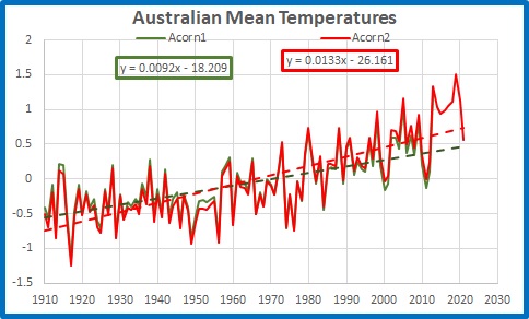
Following from my much older posts in 2015, 2021, and 2022, here is another way of showing how the BOM’s temperature record has thus diverged from reality.

I use the Bureau’s Acorn monthly Tmax data for Australia, their monthly rainfall data, and satellite data for Australia from UAH (the University of Alabama- Huntsville), for the period from December 1978 to March 2023.

I have recalculated Tmax and rainfall anomalies from 1991 to 2020, the same period as the UAH dataset.


Of course, the BOM and other Global Warming Enthusiasts will insist that Acorn and UAH both show similar warming since 1978, and they are (mostly) right, as Figure 1 shows:


Figure 1: Monthly Surface Tmax and Atmospheric Temperatures from UAH

A scatterplot of Acorn Tmax against UAH shows they are “roughly” similar:


Figure 2: BOM Tmax vs UAH

There is correlation, but there are many differences.


As I showed back in 2015, the relationship between Tmax and UAH is governed by rainfall. Figure 3 shows how closely the difference between surface Tmax and atmospheric (UAH) temperatures follows inverted rainfall. I have smoothed the data with a 12 month running average.


Figure 3: 12 month running averages, Tmax minus UAH and Inverted Rainfall

Note the close match! Yet you may also note that before about 1998 the inverted rain value is often above the difference value, while after about 2012 it is mostly below. This implies that the relationship between Tmax and UAH has changed. Which is at fault?


Figure 4 shows the running 120 month correlation between the Tmax-UAH difference and rainfall:


Figure 4: 120 Month Running Correlation between Tmax-UAH Difference and Rainfall

Note that better correlation is at the bottom (closer to -1). The best correlation is in the 10 year period to February 2015. Figure 5 plots the Tmax-UAH difference against rainfall for that period:


Figure5: Rainfall as a factor of the BOM-UAH difference

The equation for the trendline is

Tmax – UAH = (-0.0339 x Rainfall) + 0.1546


So,


Tmax = (-0.0339 x Rainfall) + 0.1546 + UAH


This allows us to calculate an approximation of what the surface Tmax should be for given rainfall.


Figure 6: Monthly Tmax and Theoretical Tmax

Similar, but slightly different. Figure 7 shows the difference:


Figure 7: Tmax minus Theoretical Tmax

The 12 month running mean may help show how the relationship changes:

Figure 8: Tmax minus Theoretical Tmax 12m Averages

No difference is zero. Clearly the official Acorn TMax is too high, and much too high in the last few years- roughly 0.4C to 1C higher than what would be expected given rainfall and atmospheric temperatures recorded by UAH.


The reason? The Bureau’s AWS data collection increased from the 1990s. Before 2000 adjustments have been increasingly applied to original LIG temperatures to match.


The Bureau of Meteorology’s Tmax dataset is a crock.

Extreme Weather Events 3: Sydney

January 29, 2023

Are extreme weather events showing up in Australia’s largest city?

Floods and bushfires might affect smaller areas, but droughts, heatwaves, and very heavy rainfall from large weather systems affect large areas. All of the above have occurred near Sydney in the past few years: surely there should be visible signs in temperature and rainfall.
First, rainfall.


In July and October 2022 flooding affected the western Sydney region again, with The Conversation of course saying “climate change is projected to bring far worse extreme rain events than in the past.”

For long term rainfall I look at Sydney’s longest rain records, at Observatory Hill and the Botanic Gardens. Figure 1 shows their location.


Figure 1: Central Sydney, courtesy of Google Maps

Observatory Hill rain records start in July 1858, but the original data ends in August 2020. I choose not to splice data from old and new gauges. Botanic Gardens start in 1885 but there is a large gap, with continuous data from late 1909 to the present. Figures 2 and 3 plot daily rainfall for each:


Figure 2: Observatory Hill daily rain

Figure 3: Botanic Gardens daily rain (1910 to 2022)

Long term means:


Figure 4: 10 year running means of rainfall at Observatory Hill and Botanic Gardens

Note that the means are similar until about 2010 when they start to diverge. Reasons might include changes to the sites. Rainfall was clearly higher in several previous decades.


Figure 5: 10 year running Standard Deviations

There was much greater variability in Sydney’s rainfall for most of the 50 years from 1950 to 2000. To show Standard Deviation relative to mean rainfall:


Figure 6: 10 year running Standard Deviations divided by 10 year means

Which shows there is little daily variability in rainfall in recent years, and both sites are comparable.


I will now analyse Botanic Gardens data in more detail.


Figure 7: Running 365 day means

2022 was the wettest year on record, followed by 1950.


Rainfall accumulated over several days is a factor in large scale riverine flooding such as occurred in Sydney’s west.


Figure 8: Four day total rainfall

Clearly there were many much greater 4 day rain events in the past than in the latest floods.


I measure “droughts” by counting the number of days with less than 4mm of rain in running 365 day periods.


Figure 9: Running 365 day counts of days with under 4mm of rain

2022 was by far the most consistently wet. There is no sign of increased drought in Sydney.


Conversely, do recent years have more days with high rainfall?


Figure 10: Running 365 day counts of days with over 100mm of rain

No. Only 3 days in 2022, while 1999 had 5, and many others in previous years had more than 2022. It seems that the Sydney region, going by the Botanic Gardens rain gauge, has less extreme rainfall than the past.


I now analyse temperature at Sydney Observatory Hill, using the latest version of Acorn to 2021, and Climate Data Online for 2022 and January 2023 up to Australia Day.


Figure 11: Daily Maxima Sydney Observatory Hill 1910 to 26/1/2023

Maximum temperatures in Sydney, according to the best the Bureau can provide, have warmed at 0.9 degrees Celsius per 100 years. Decadal means show an almost identical trend.


Figure 12: 10 year mean Tmax

Standard Deviation measures daily variability, and 10 year mean Standard Deviations show some interesting patterns:


Figure 13: 10 year running Standard Deviation, Sydney Tmax

Variability is greater with higher temperatures and less with lower temperatures, and temperatures should be related to rainfall- because a dry period will have hotter days and usually cooler nights. Temperature adjustments might interfere with this.


Whatever, there were several past periods with higher Standard Deviations than the past decade, and when divided by the 10 year means the contrast is even greater:


Figure 14: 10 year running Standard Deviations divided by 10 year means

Are days getting hotter? Well, years are, mostly:


Figure 15: 365 day running means of Tmax

Highest and lowest daily maxima in 365 day periods are not co-operating:


Figure 16: Highest Tmax in 365 day periods

The hottest day was back in 1939, and 2022 had the lowest “hottest day” in a 365 day period on record, with the hottest day being 31.9 degrees.


Figure 17: Lowest Tmax in 365 day periods

Several past winters had cooler maxima.


But is Sydney getting more frequent hot and very hot days?

Figure 18: Running 10 year counts of days over 34.9 degrees

Figure 19: Running 10 year counts of days over 39.9 degrees

The last 10 years have had fewer hot and very hot days than in the past.


What about heat waves, when there are strings of hot days? The definition appears to have changed, but if we consider three hot days in a row to be a heat wave:


Figure 20: Running 10 year counts of 3 consecutive days over 34.9 degrees

There is a very small trend (0.8 in 100 years) but there were many more 3 day heatwaves in the past.


Figure 21: Running 10 year counts of 3 consecutive days over 39.9 degrees

There is a decreasing trend of very hot heat waves (more than 3 less per 100 years), with nearly three times as many 3 day heatwaves of 40 degrees or more in the 10 years to 1982 as in the past 10 years.


Conclusion:


Contrary to popular belief encouraged by politicians and the media, in Australia’s largest city it is clear that:


Rainfall and temperature variability is LOWER than in the past


Droughts are NOT increasing


Extreme rainfall is NOT increasing


Dry years are NOT increasing


Very hot days are DECREASING in frequency


Heatwaves are NOT increasing and are very much LESS COMMON than 40 years ago.


If anything, Sydney’s weather is becoming less extreme and more benign. That should be good news.


We are still waiting for the “projections” of more extreme weather to arrive.

Australian Temperature- Satellites or Surface Stations?

May 13, 2022

For years we have been very sceptical about the official Bureau of Meteorology (BOM) temperature record which is based on 104 surface stations in the ACORN-SAT (Acorn) network.  In this post I look at one of the main reasons for doubting the veracity of the surface record- the increasing divergence from the satellite record.

First up I should say that the two records should not necessarily agree, because they measure two completely different things.  Surface stations measure the temperature of the air 1.2 metres above the ground and report the highest and lowest one second samples each day at 104 locations.  These are combined in a grid average to give monthly, seasonal, and annual temperatures.  Satellites measure temperatures of the atmosphere from the ground to many kilometres up, every second, over a wide area for each pass.  These are similarly combined by algorithms to calculate a monthly average for (in this case) the land area of Australia’s Temperature of the Lower Troposphere (TLT). 

They are both useful for different purposes but are not easily compared.  Because minimum surface temperatures poorly match TLT, mean surface temperature is also a poor match.  Maxima are a better match, but still not perfect.

For this post I use data from the University of Alabama (Huntsville) (UAH) which calculates anomalies from 1991 to 2020 means.  I have converted Acorn data from anomalies from 1961-1990 means, to anomalies from 1991-2020 means, to match.

Figure 1 shows monthly Acorn maxima data and UAH means from December 1978.

Figure 1: Monthly Surface Tmax and UAH data

Although surface maxima have a much larger range than TLT anomalies, they plainly follow similar trajectories.  12 month running means smooth the data and allow easier visual comparison.

Figure 2: Running 12 Month Means: Surface Tmax and UAH data

Similar, but different at several times.   Annual means show that in some years Tmax and TLT are close to identical, while in other years they have large differences.

Figure 3: Annual Means: Surface Tmax and UAH data

In 2015 I showed the reason for these differences (but not the difference in trends).  The differences between the two datasets are very largely due to variations in rainfall.  In wet years surface maxima are relatively much cooler than TLT; in dry years surface maxima are much warmer.  In Figure 4 I have calculated rainfall anomalies scaled down by a factor of 20 and inverted, to compare with the difference between Tmax and TLT.

Figure 4: Running 12 month Means: Surface Tmax minus UAH and Inverted Rainfall

The match is close.  Figure 5 shows annual values, and trend lines.

Figure 5: Annual Means: Surface Tmax minus UAH and Inverted Rainfall

While annual rain has been slightly increasing (it’s inverted, remember) the relative difference between surface temperature and atmospheric temperature has been increasing at a rate of one degree per hundred years.  That’s odd.  Figure 6 shows the relationship between the temperature difference and rainfall.

Figure 6: Annual Surface Tmax minus UAH versus Scaled Rainfall

For every extra 20mm of rainfall, the difference between surface maxima and TLT decreases by 0.85 degrees Celsius.  The trend lines in Figure 5 should be close to parallel, not diverging.

As well, as rainfall increases, Tmax should decrease, as Figure 7 shows.

Figure 7: Surface Tmax as a Product of Rain

But as we saw in Figure 3, Tmax is increasing faster than UAH.

Furthermore, as surface Tmax increases, TLT should be increasing as well, which it is, but at a slower rate.

Figure 8:  Atmospheric Temperature as a Product of Surface Tmax

Is the atmospheric temperature lagging behind surface temperature?  Figure 9 shows the last two years of monthly values.

Figure 9:  Monthly Atmospheric Temperature and Surface Tmax, January 2020-March 2022

The values are mostly synchronous, with sometimes a delay in one or the other of one month.  (Remember, we are comparing data from 104 stations scattered across the continent, with that of the atmosphere with constantly changing and circulating winds).  When the land warms, the atmosphere warms with it; when the land cools, so does the atmosphere.

Conclusion:

Tmax should not be increasing faster than atmospheric temperature.  There is no real delay in any temperature change, as the atmosphere is heated each day by the land.  Therefore it appears that there must be some fault with the maximum temperatures reported by ACORN-SAT, which appears to be warming too rapidly.

Explanation of the mechanism for rainfall moderation of surface-atmospheric temperature differences:

In wet years more moisture carried upwards condenses, releasing heat, thus warming the atmosphere, while the surface is cooled by cloud cover, evaporation, and transpiration.  In dry years much less moisture is convected, so less heat is released in the atmosphere, while the surface is hotter because of less cloud cover and less evaporation and transpiration.  Thus dry years have a greater relative difference between Tmax and TLT than wet years.

The only energy source is solar radiation heating the land surface in daylight hours, which in turn heats the atmosphere by conduction and convection.  At night as radiation to space rapidly cools the earth, convection also rapidly decreases, so maxima, not minima, are responsible for the relationship with TLT. 

A complication is that in summer (and more so in very wet La Nina years) large volumes of very moist air from the tropical seas to the north converge over northern Australia and penetrate even into southern Australia.  This warm moist air cannot heat the surface but through condensation transfers heat to the upper atmosphere- therefore the difference between surface and atmosphere is even smaller.

More Problems With Australia’s Temperature Record: Part 3

April 13, 2022

We have seen in Parts 1 and 2 that every extra year of annual data can decrease the temperature trend at a weather station by from -0.02 to -0.03℃ per decade, and that less than half (47% actually) of Australia’s weather stations used for climate analysis have data from 1910, and three of them have insufficient data to calculate trends.

Figure 1 shows a map of non-urban Acorn stations with enough data to calculate trends, at 1910.  The others I have blanked out.

Figure 1: Acorn stations with data for 1910

The network is very sparse.  To estimate a national temperature for 1910 enormous weighting must be given to the values of a few remote stations like Alice Springs, Boulia and Kalgoorlie, so we hope they got the adjustments right!  Unfortunately, in 2015 I found adjustments at Kalgoorlie and Alice Springs were very problemmatic.

The Bureau explains the process of calculating average temperatures here.

Figure 2 shows the BOM map of trends from 1910 to 2020:

Figure 2:  Australian Tmean trends 1910-2020

Note that there a few “bullseyes” which surround stations whose temperature trends are out of phase with areas around them- e.g. Boulia is warmer, Marble Bar is cooler. 

Now here is a paradox.  As the years go by and more stations have data available, the area weighting for each station will decrease, however trends at the newer stations will show increased warming compared with the older ones.  However they will also have more variability.  This will result in oddities as I shall show, and reveals something of the difficulties with the BOM methods.

 Figure 2 is a plot of mean temperature from 1970 to 2020.

Figure 2:  Australian Tmean 1970-2020

The Acorn 2 trend is now +0.23℃ per decade or +2.3℃ per 100 years- a full degree more than the trend from 1910.

Now let’s look at the trend map for 1970 to2020:

Figure 3:  Australian Tmean trends 1970-2020

Note the little “bullseye” around Victoria River Downs, the little “balloon” around Halls Creek to the south-west of VRD, and the little surge to the south-southwest of VRD of 0.05 to 0.1℃ per decade.  Note also that north-eastern Arnhem Land, with no stations, has a warmer pocket.  Figure 4 is the BOM data for VRD.

Figure 4: Annual mean temperature at Victoria River Downs

VRD opened in 1965 and has too much data missing for BOM to calculate a trend.  The area weighting algorithm still gives it a cooling trend of between minus 0.05 and 0℃ per decade (Figure 3).  Que?

With more than 27% of data missing I wouldn’t calculate a trend either, but with only six of 43 years missing I can calculate a trend from 1978:

Figure 5: Annual mean temperature at Victoria River Downs

The trend is -0.09℃ per decade, which is a bit more cooling than the trend map (Figure 3) shows.  Now let’s look at trends from 1980 to 2020.

Figure 6:  Australian Tmean trends 1980-2020

There are more bullseyes, and I have shown temperature trends for some- Carnarvon, Meekatharra, Forrest, Thargomindah, and Gayndah.  But remember Figure 3’s little surge to the SSW?   It now has its own bullseye, and that is Rabbit Flat.

Figure 7: Annual mean temperature at Rabbit Flat

Rabbit Flat opened in 1970 and has a trend of +0.08℃ per decade, which agrees with the trend map in Figure 3.  Now from 1980:

Figure 8: Annual mean temperature at Rabbit Flat

What a difference a few years make in a short timeseries.  The trend of -0.06℃ per decade also agrees with the 1980-2020 trend map.

However, just 328km away Halls Creek shows a warming trend of +0.17C per decade from 1980 – 2020:

Figure 9: Annual mean temperature at Halls Creek 1980-2020

But from 1970 to 2020 Halls Ck is warmer still at +0.19C per decade:

Figure 10: Annual mean temperature at Halls Creek 1970-2020

And at Tennant Creek 441km away the 1970-2020 trend is +0.19C per decade:

Figure 11: Annual mean temperature at Tennant Creek 1970-2020

From 1980 it is +0.06C per decade.

Figure 12: Annual mean temperature at Tennant Creek 1980-2020

Temperatures are trending in different directions and wildly different rates at the closest stations: they can’t all be right!

The method of drawing trend maps is to use anomalies of temperatures of all years of all stations whether or not an individual trend can be calculated, then calculate a gridded average, and from that calculate trends, then spread those trends hundreds of kilometres in every direction- even across the Gulf of Carpentaria from Horn Island to Arnhem Land, as seen in Figures 3 and 6- averaged with the trends propagated by other stations.  If a site has data missing, the grid is infilled with the weighted data from other sites.  

In recent decades this causes great variability because of the short records, which leads to grave doubts about the reliability of some records.  Further back in time, there is less variability because there are more stations, and the longer records smooth and decrease the trends- however the weighting has to be much greater because of the large areas with no data at all for many years. 

The problem is: we can have either a long record, or an accurate record, but not both.

This leads to the obvious conclusion:

The official temperature record since 1910 is just a guesstimate.

More Problems With Australia’s Temperature Record: Part 2

April 10, 2022

My colleague Chris Gillham at WAClimate uses 58 long term weather stations for his analyses.

And with good reason.  Here’s why.

Figure 1 is a screenshot of the annual mean temperature record at a typical Acorn station, Longreach (Qld) with the linear trend shown.

Figure 1: Annual mean temperature at Longreach

The linear trend is +0.12℃ per decade.  Nine (9) of the 111 years of data from 1910 to 2020 are missing, leaving 102 years.

Australia’s official climate record is based on 112 sites like Longreach.  Of those, 8 are not used for seasonal and annual analyses because they are affected by Urban Heat Island (UHI) effect.  Five (5) of the non-urban stations have more than 20% of their data missing, so the BOM does not calculate trends for them. Of those remaining, only 50 started in 1910, and another 8 before 1915.  What is the effect of different length records on our understanding of how temperatures have changed over the years?

Figure 2 is a plot of the trends of mean temperatures per decade as a factor of the number of years of annual temperature data on record at those 107 Acorn stations with enough data to calculate trends.

Figure 2:  Trend as a factor of amount of data

Stations with  longer data records have lower trends.  The trends at stations with shorter records vary wildly, with some obvious outliers. 

At those stations with UHI effect, the relationship is even stronger.

Figure 3:  Trend as a factor of amount of data at sites with UHI

These sites are in larger towns and cities, possibly with better maintenance and observation practices (although not necessarily better siting).

The slope of the trendlines in the above two figures show that for every additional year of data, temperature trend decreases by about -0.02 to -0.03℃ per decade. In 100 years that could make a difference of as much as three degrees Celsius 0.3C at a well maintained site.

Figure 4 is a map of trends across Australia from 1910 to 2020.  I have shown the years of available data at each site (locations only approximate) and I have circled in blue those 5 sites that have insufficient data.

 Figure 4:  Years of data contributing to 1910 to 2020 trend map

Trends in different regions vary from less than 0.1C per decade to up to 0.3C per decade.  As you can see there is a large variation in the amount of available data in each different coloured band.  That’s for 1910 to 2020.  Note that there are only three (3) non-urban stations with no missing years- Carnarvon, Esperance, and Mt Gambier- which I have circled in red.  There are some big gaps.

In Part 3 I will look at some individual stations and how trends vary in the 51 years from 1970 to 2020.

More Problems With Australia’s Temperature Record: Part 1

April 8, 2022

Since 2010 I have been documenting problems with different versions of Australia’s official temperature record as produced by the Bureau of Meteorology (BOM).  Since the High Quality (HQ) dataset was quietly withdrawn in 2012 we have seen regularly updated versions of the Australian Climate Observation Reference Network- Surface Air Temperature (ACORN-SAT or Acorn).  We are now up to Version 2.2.  In this Part I shall show the effect of these changes on temperature trends.  In Part 2 I will show how record length affects trends, and in Part 3 I will look at the record since 1970 at some individual stations.

Figure 1 is from the BOM Climate Change Time Series page.

Figure 1:  Australian Official Temperature Record 1910 to 2021

The linear trend is shown as +0.13℃ per decade, or 1.3C per 100 years.  My colleague Chris Gillham of WAClimate has provided me with archived Acorn 1 annual mean temperature data to 2013 which allows this comparison:

Figure 2:  TMean: Acorn 1 and Acorn 2

The result of introducing Acorn 2 has been a much steeper trend:  Acorn 1 trend to 2013 was 0.9℃ per decade.  The trend has now become 0.13℃ per decade. (The extra 9 years have added an extra 0.017C per decade to the trend.)

Figure 3 shows when and how large the changes were:

Figure 3:  Difference between Acorn 1 and Acorn 2

Acorn2 is cooler than Acorn 1 before 1971 and warmer in all but three years since.  Since these were based on the same raw temperatures (with some small additions of digitised data and a couple of changes to stations) the changes were brought about entirely by adjustments to the data.

I calculated running trends from every year to 2013 for both datasets.  As trends shorter than 30 years become less reliable I truncated the running trends at 1984.  Figure 4 compares thre trends to 2013 of Acorn 1 and Acorn 2.

Figure 4:  Acorn 1 and Acorn 2 running trends per decade to 2013

The weather fluctuations of the mid-1970s to 1980s played havoc with trends.

Figure 5 shows the difference between the trends.

Figure 5:  Difference between Acorn 1 and Acorn 2 Trends

The difference ranges from +0.024C per decade for 1910 to 2013, to +0.039C for 1950 to 2013.  Having increased warming by from 0.25C to 0.4C per 100 years (just by making different adjustments) Acorn 2’s trend is much more alarming than Acorn 1’s.

Conclusion:

This is from the BOM’s explanation for Acorn:  

“A panel of world-leading experts convened in Melbourne in 2011 to review the methods used in developing the dataset. It ranked the Bureau’s procedures and data analysis as amongst the best in the world. ‘The Panel is convinced that, as the world’s first national-scale homogenised dataset of daily temperatures, the ACORNSAT dataset will be of great national and international value. We encourage the Bureau to consider the dataset an important long-term national asset.’” ACORN-SAT International Peer Review Panel Report, 2011.

 Acorn 1.0 was apparently such an important long-term asset that it was quickly superseded by Acorn 2 with a much more alarming trend.