My colleague Chris Gillham at WAClimate uses 58 long term weather stations for his analyses.
And with good reason. Here’s why.
Figure 1 is a screenshot of the annual mean temperature record at a typical Acorn station, Longreach (Qld) with the linear trend shown.
Figure 1: Annual mean temperature at Longreach

The linear trend is +0.12℃ per decade. Nine (9) of the 111 years of data from 1910 to 2020 are missing, leaving 102 years.
Australia’s official climate record is based on 112 sites like Longreach. Of those, 8 are not used for seasonal and annual analyses because they are affected by Urban Heat Island (UHI) effect. Five (5) of the non-urban stations have more than 20% of their data missing, so the BOM does not calculate trends for them. Of those remaining, only 50 started in 1910, and another 8 before 1915. What is the effect of different length records on our understanding of how temperatures have changed over the years?
Figure 2 is a plot of the trends of mean temperatures per decade as a factor of the number of years of annual temperature data on record at those 107 Acorn stations with enough data to calculate trends.
Figure 2: Trend as a factor of amount of data
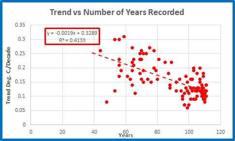
Stations with longer data records have lower trends. The trends at stations with shorter records vary wildly, with some obvious outliers.
At those stations with UHI effect, the relationship is even stronger.
Figure 3: Trend as a factor of amount of data at sites with UHI
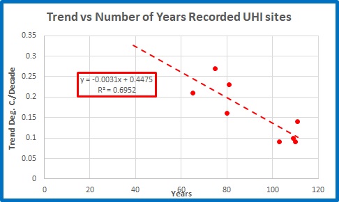
These sites are in larger towns and cities, possibly with better maintenance and observation practices (although not necessarily better siting).
The slope of the trendlines in the above two figures show that for every additional year of data, temperature trend decreases by about -0.02 to -0.03℃ per decade. In 100 years that could make a difference of as much as three degrees Celsius 0.3C at a well maintained site.
Figure 4 is a map of trends across Australia from 1910 to 2020. I have shown the years of available data at each site (locations only approximate) and I have circled in blue those 5 sites that have insufficient data.
Figure 4: Years of data contributing to 1910 to 2020 trend map
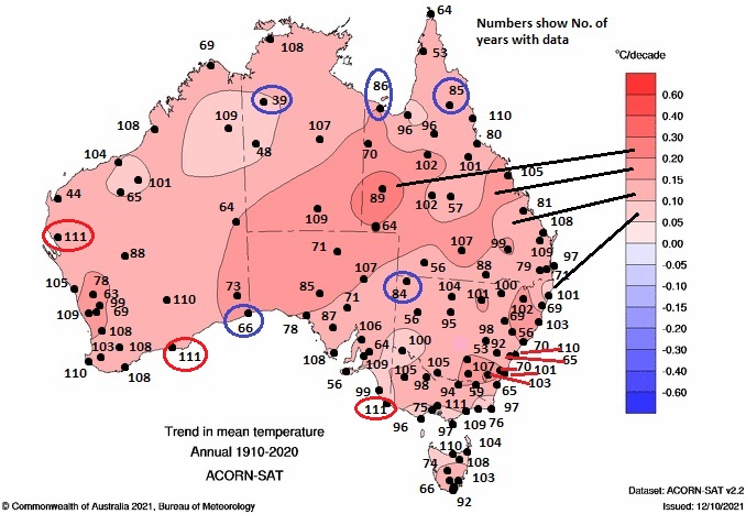
Trends in different regions vary from less than 0.1C per decade to up to 0.3C per decade. As you can see there is a large variation in the amount of available data in each different coloured band. That’s for 1910 to 2020. Note that there are only three (3) non-urban stations with no missing years- Carnarvon, Esperance, and Mt Gambier- which I have circled in red. There are some big gaps.
In Part 3 I will look at some individual stations and how trends vary in the 51 years from 1970 to 2020.
Tags: Acorn, adjustments, Australia, bom, Bureau of Meteorology, temperature

April 10, 2022 at 1:53 pm
As a Mitcham Melbourne resident, our local paper and the ABC delight in quoting Monash Uni “climate experts” and ABOM(inable) types reporting increased temperature maximums, less rain days (rather than less rain total) etc, all since 1970, only 50 years ago. They ignore proper discussion of Urban Heat Island effects due to the huge increase of population, the huge decrease in open land areas, the vastly increase road areas sealed, the huge increases in energy consumption in both winter and summer. So your charts are a breath of fresh air that demonstrates that they are using misleading figures that exaggerate temperature trends by a factor of at least 2.
April 10, 2022 at 2:30 pm
While this kind of science is kinda purist for my mud grabbing intellect, I am under no illusions as to why climate crisis is peddled.
This was very apparent by 2009 when both David Rockefeller and Rupert Murdoch made almost identical capitulations to global warming alarmism, pointing out that it was critical that influential people did their part to protect life on this planet.
Yeah, a couple of psychopaths hold life sacred. I sent their statements to my Greens member researcher In Mullumbimbi and was confronted by a stunned silence that lasted some three weeks.
She was not amused, and not a person to get on the wrong side of. I am sure a few AGW campaigners felt the sharp side of her tongue.
That was when a whole host of climatologists and other scientists lost their jobs for asking awkward questions or, like Monkton, pointed to documented globalist ambitions of the supporting scientists and IPCC; much to the annoyance of then Super AGW Warrior Kevin Rudd.
Ken’s data will one day become invaluable in the prosecution of unscientific scientists.