We have seen in Parts 1 and 2 that every extra year of annual data can decrease the temperature trend at a weather station by from -0.02 to -0.03℃ per decade, and that less than half (47% actually) of Australia’s weather stations used for climate analysis have data from 1910, and three of them have insufficient data to calculate trends.
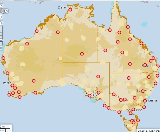
Figure 1 shows a map of non-urban Acorn stations with enough data to calculate trends, at 1910. The others I have blanked out.
Figure 1: Acorn stations with data for 1910
The network is very sparse. To estimate a national temperature for 1910 enormous weighting must be given to the values of a few remote stations like Alice Springs, Boulia and Kalgoorlie, so we hope they got the adjustments right! Unfortunately, in 2015 I found adjustments at Kalgoorlie and Alice Springs were very problemmatic.
The Bureau explains the process of calculating average temperatures here.
Figure 2 shows the BOM map of trends from 1910 to 2020:
Figure 2: Australian Tmean trends 1910-2020

Note that there a few “bullseyes” which surround stations whose temperature trends are out of phase with areas around them- e.g. Boulia is warmer, Marble Bar is cooler.
Now here is a paradox. As the years go by and more stations have data available, the area weighting for each station will decrease, however trends at the newer stations will show increased warming compared with the older ones. However they will also have more variability. This will result in oddities as I shall show, and reveals something of the difficulties with the BOM methods.
Figure 2 is a plot of mean temperature from 1970 to 2020.
Figure 2: Australian Tmean 1970-2020

The Acorn 2 trend is now +0.23℃ per decade or +2.3℃ per 100 years- a full degree more than the trend from 1910.
Now let’s look at the trend map for 1970 to2020:
Figure 3: Australian Tmean trends 1970-2020

Note the little “bullseye” around Victoria River Downs, the little “balloon” around Halls Creek to the south-west of VRD, and the little surge to the south-southwest of VRD of 0.05 to 0.1℃ per decade. Note also that north-eastern Arnhem Land, with no stations, has a warmer pocket. Figure 4 is the BOM data for VRD.
Figure 4: Annual mean temperature at Victoria River Downs

VRD opened in 1965 and has too much data missing for BOM to calculate a trend. The area weighting algorithm still gives it a cooling trend of between minus 0.05 and 0℃ per decade (Figure 3). Que?
With more than 27% of data missing I wouldn’t calculate a trend either, but with only six of 43 years missing I can calculate a trend from 1978:
Figure 5: Annual mean temperature at Victoria River Downs

The trend is -0.09℃ per decade, which is a bit more cooling than the trend map (Figure 3) shows. Now let’s look at trends from 1980 to 2020.
Figure 6: Australian Tmean trends 1980-2020

There are more bullseyes, and I have shown temperature trends for some- Carnarvon, Meekatharra, Forrest, Thargomindah, and Gayndah. But remember Figure 3’s little surge to the SSW? It now has its own bullseye, and that is Rabbit Flat.
Figure 7: Annual mean temperature at Rabbit Flat

Rabbit Flat opened in 1970 and has a trend of +0.08℃ per decade, which agrees with the trend map in Figure 3. Now from 1980:
Figure 8: Annual mean temperature at Rabbit Flat

What a difference a few years make in a short timeseries. The trend of -0.06℃ per decade also agrees with the 1980-2020 trend map.
However, just 328km away Halls Creek shows a warming trend of +0.17C per decade from 1980 – 2020:
Figure 9: Annual mean temperature at Halls Creek 1980-2020
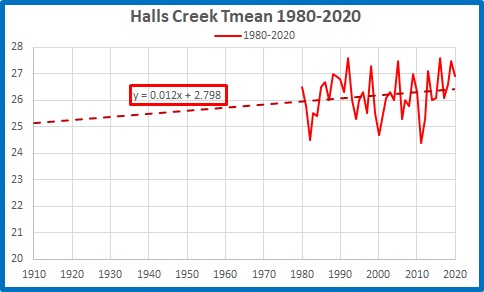
But from 1970 to 2020 Halls Ck is warmer still at +0.19C per decade:
Figure 10: Annual mean temperature at Halls Creek 1970-2020

And at Tennant Creek 441km away the 1970-2020 trend is +0.19C per decade:
Figure 11: Annual mean temperature at Tennant Creek 1970-2020

From 1980 it is +0.06C per decade.
Figure 12: Annual mean temperature at Tennant Creek 1980-2020

Temperatures are trending in different directions and wildly different rates at the closest stations: they can’t all be right!
The method of drawing trend maps is to use anomalies of temperatures of all years of all stations whether or not an individual trend can be calculated, then calculate a gridded average, and from that calculate trends, then spread those trends hundreds of kilometres in every direction- even across the Gulf of Carpentaria from Horn Island to Arnhem Land, as seen in Figures 3 and 6- averaged with the trends propagated by other stations. If a site has data missing, the grid is infilled with the weighted data from other sites.
In recent decades this causes great variability because of the short records, which leads to grave doubts about the reliability of some records. Further back in time, there is less variability because there are more stations, and the longer records smooth and decrease the trends- however the weighting has to be much greater because of the large areas with no data at all for many years.
The problem is: we can have either a long record, or an accurate record, but not both.
This leads to the obvious conclusion:
The official temperature record since 1910 is just a guesstimate.
Tags: Acorn, adjustments, Australia, bom, Bureau of Meteorology, temperature

April 13, 2022 at 1:42 pm
This is all very interesting information and probably reflects variations over the whole world. These changes in temperature reflect effective movements of energy from region to region, the best known of which are the changes across the Pacific in the El Nino/La Nina “cycles”which cause sequential cooling and warming of the globe. In these changes, the energy entering the globe remains constant in spite of changes in CO2 and perhaps very small changes in sunlight intensity.
However, changes in the accumulation of energy in different regions as happens when the SOI changes, provides for a very natural variation in the associated mean temperature. This can be seen in a very simple example of such transfer between two regions of the same area but different mean temperatures – say 280 and 320 K, the mean being 300 K, which arise from incoming power and produce related radiation intensities in equilibrium of 348.51 Wm-2 and 595.54 Wm-2, a total of 943.05 W and average 471.525 Wm-2. If the total intensity (943.05) is redistributed to provide an equal intensity to each region, the mean temperature which is now equal to that of each area, is 301.98 K – almost 2 C higher. I believe that changes in the global mean temperature may arise from similar but usually much smaller redistributions of energy, perhaps between polar regions and the tropics. John
April 13, 2022 at 2:06 pm
Ken
Can I draw your attention to an anomaly that irritates the shit out of East Arnhem Landers. Perhaps “irritate” is too mild a word considering we are concerned about being killed.
Basically, Darwin has one climate, but Nhulunbuy has another, which is more similar to North Queensland. So much for “Top End weather patterns”.
But the BOM data for Gove Peninsula is grossly misleading. The weather readings are taken at the Gove Airport, 15 minutes fast drive to the East, which has the same weather as Yirrkala. My guess is that they have two to three times more rain than Nhulunbuy.
West of Nhulunbuy is the Muthamul/Nyinyikay peninsula and Wessel Islands, which have an entirely separate weather system altogether, and I can only guess that they have double the rainfall of Nhulunbuy, but experience higher temperatures.
Why bother to even maintain such a useless Gove met station?
Who cares?
It can make a massive difference to project planning.
For example, using official data, Ranger uranium mine was constructed in the expectation of quite moderate total annual rainfalls, with the result that the tailings pond breached, sending saline water into the Majella Flood Plain. This could have had catastrophic consequences, which locals had warned about two years previously.
Likewise, in Gove, what has been lauded as Australia’s new civilian aerospace facility is in fact a missile launching platform for Raytheon and LockheedMartin, which will distribute chlorine gas and other toxic substances into the atmosphere over the Gulf of Carpentaria, which the strong south-easterly winds will blow back across dozens of communities in North East Arnhem Land.
This is why the 1987 Commonwealth Study into rocket launching in the Top End was forever banned, it then being recognised that it was too dangerous for human populations.
What was not mentioned at the time was the damage also done to the ozone layer.
Actually, even if the missile base was purely civilian, the same problem applies. But being US military, it will also become a reprisal or preemptive target for China to aim at, as US belligerency intensifies. Thus we get either poisoned, or blown to bits, or both.
We cannot even begin to launch defensive measures when we have little empirical data about the weather in our region. And believe, me, this is forefront on our minds right now with the first missile launch scheduled for June.