Posts Tagged ‘Energy’

All Our Electricity Generation Is Weather Dependent

July 17, 2023

The OpenNEM website gives access to several ways of viewing Australia’s electricity usage.  One I like shows Flexibilty.  Figure 1 shows plots for the week to Tuesday 11th July of consumption sourced from Variable (wind and solar), Fast Flexible (gas, hydro, diesel, battery), and Slow Flexible (black coal and brown coal). I chose this period because it includes Tuesday 4th, Friday 7th and Saturday 8th, and illustrates just how variable the Variables can be.

Figure 1: Screenshot of Flexibilty, NEM

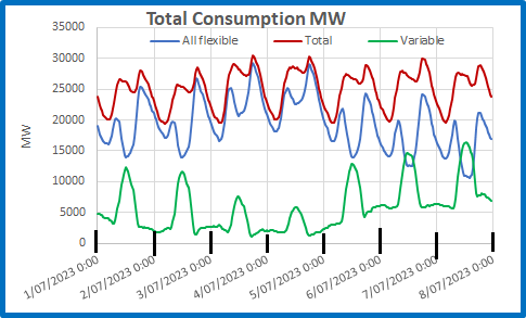
Obviously, when Variables are high Flexibles are low and vice versa.  Notice that Variables have one peak at noon each day, as solar generation far exceeds wind- in daylight hours, but Flexibles have two peaks each day, morning and evening.  Figure 2 is my plot for the first week of July, combining all non-variables and showing the total consumption:

Figure 2:  Total Consumption 1-7 July 2023

The total (red) shows the two peaks, morning and evening, and the overnight dip to baseload at about 20,000 MW.  Note that variable generation (green) has a midday peak due to solar that rapidly descends with the sun to a night time level far below baseload.

Note also that on the evenings of the 3rd and 4th total consumption is made up almost entirely of flexible generation- variable was only 3.4% of the total on the 3rd and 3.9% on the 4th.

The next figures contrast conditions on the best day of the week for variables with those on the worst day.

Figure 3:  4th July Consumption- Worst for Variables

Monday and Tuesday, the 3rd and 4th, saw extensive cloud cover and rain over much of eastern Australia, especially Queensland, while winds were very light in the south. This was the worst day for wind and solar, peaking at about 6,000 MW at 12.30, dropping to 1,170 MW at 6 pm.  Conversely, it was the best day for coal generators who could maintain steady generation all day.  Contrast this with the 7th:

Figure 4:  7th July Consumption- Best Day for Variables

The sun was out and the wind was fair. This was a great day for wind and solar, producing 60% of all electricity needed in the middle of the day.  Note how coal fired generators had to decrease then increase very rapidly (nearly 80% increase from 3 pm to 6.30 pm).  That’s not how they were designed to operate.

Electricity statistics for the first week of July show how thoroughly weather-dependent are wind and solar. However, they also show the resilience of non-variable generation, and show the excellent Capacity Factor that coal can achieve.  Capacity Factor is the actual generation as a percentage of nameplate capacity.

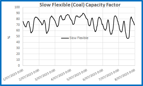
Figure 5:  Coal generation Capacity Factor 1 -7 July 2023

Even with Callide C out of action until next year, coal’s capacity factor dropped below 50% only on the 8th.  It peaked at over 80% on every day of the weak, averaged 73.6% and reached 90% on the 4th.  While wind’s capacity factor was at 94% on the evening of the 7th, at 5.30 pm on the 3rd it was only 9.7%, and at that same time solar capacity factor was practically zero.

Thank goodness for variable generation, which adjusts to the vagaries of wind and solar.  In Australia, even fossil fuelled electricity is dependent on the weather.

In my next post I will show why you shouldn’t expect batteries and hydro dams to come to the rescue anytime soon.

(Source: OpenNEM)
Coal Generation Sets New Record After Liddell Closes!

May 2, 2023

The National Electricity Market lost 2,000 MW of generating capacity last Friday.  In spite of this, coal fired generation increased its share of total generation, to a record for the year to 30 April, of 67.52%, as Figure 1 shows:

Figure 1: Percentage of Total NEM Generation: Coal, Wind, Solar

The other immediate result was that the Capacity Factor of the remaining coal generators suddenly increased by about 5%. 

Figure 2: Running Average Coal Capacity Factor % 1 April -1 May 2023

The remaining coal fired stations ramped up their generation to make up for the shortfall- mainly Eraring in NSW:

Figure 3:  Eraring Electricity Generation 27-29 April: average 69%

Eraring maintained a Capacity Factor of around 95% for most of Saturday until Sunday morning when it dropped to 37% during daylight, then back up Sunday night and most of Monday.

Figure 4:  Eraring Electricity Generation 30 April – 2 May: average 72.1%

Why couldn’t wind and solar fill the gap left by Liddells’s closure?  Because there was not much wind or sunshine!  Figures 5 and 6 show Saturday to Monday generation at Stockyard Hill wind farm and the New England solar farm- two of the biggest:

Figure 5:  Wind Generation at Stockyard Hill: average 3.4% Capacity Factor

Figure 6:  Solar Generation at New England: average 6.7% Capacity Factor

Of course, in the coming winter there will be increased demand, and coal generators will need to be maintained.  We are not out of the woods, but the above graphs show how resilient, reliable, and efficient our much-maligned coal fired power stations are.

Could we lose 2,000 MW of solar or wind generation and have the rest immediately increase production?  Not likely!

And are Batteries and Hydro capable, and how efficient are they?

Figure 7: Battery Capacity Factor (Percent)

Batteries nearly reached 0.1 % of their stated capacity.

Figure 8: Hydro Capacity Factor (Percent)

Hydro did better- but even when producing over 28% of total NEM generation could only reach a Capacity Factor of nearly 0.4%. 

These dams and batteries are very inefficient for their cost.

Let’s see what the future holds!

(Source: OpenNEM)

Electricity Generation: The Impact of Rooftop Solar

March 20, 2023

Capacity Factor of an electricity generator is its actual generation as a percentage of its installed capacity.  A generator with an installed capacity of 1,000 Megawatts that generates 500 Megawatts has a Capacity Factor of 50%.  Obviously it is a good idea to have CF as high as possible as that will give a better return for the time, money, and effort used to build and run it.

In this post I am looking at Capacity Factors of all generators in the National Electricity Market (NEM), firstly excluding rooftop solar, then looking at CF when rooftop solar is included.

I use data available from Open NEM for the week from 8th to 15th March.

Firstly, Figure 1 shows the total of all major generators in Queensland, New South Wales, Victoria, Tasmania, and South Australia.

Figure 1:  Total NEM Generation 8-15 March

Solar and wind get preference, such that coal is curtailed when the sun is shining, but has to ramp up to meet demand from late afternoon to breakfast time.  Hydro and gas follow the same pattern at a much lower level, while wind generation adds its two bob’s worth at unpredictable times.

Figure 2 shows the Capacity Factor for the whole network (if there was no rooftop solar):

Figure 2: Capacity Factor NEM (excluding rooftop solar)

During this week CF varied in a regular cycle, from 27.9% to 43.8%.  Figure 3 shows this daily cycle:

Figure 3: Capacity Factor by Time of Day- NEM excluding rooftop solar

The NEM is at its most efficient- makes best use of generation resources- between 6pm and 7pm at night.  There is a lower peak in CF at 7am to 7.30am.  There is a drop in CF in the early morning (at baseload time), but the lowest CF is between about 11.30am and 12.30pm on several days.

Capacity Factors for coal, gas, and hydro have cycles reflecting that of the NEM without rooftop solar.

Figure 4: Capacity Factor by Time of Day: Coal, Gas, Hydro

By contrast, wind’s CF, which on the afternoon of the 8th was briefly over 50%, could be as low as 2.4% and averaged 20.5% for the week.

Figure 5: Capacity Factor by Time of Day: Wind

Decidedly unreliable and inefficient.

Solar generation is much more reliable (in the sense of predictable) as we see in Figure 6.

Figure 6: Capacity Factor by Time of Day:  Solar

Solar CF is between about 40% and 60% in the middle of the day.  Note that utility solar, with tracking panels, reaches close to maximum CF by mid-morning and maintains higher CF than rooftop at nearly every 30 minute period of daylight.  Between sunset and sunrise, CF is zero.  All those millions of panels are useless.

When we include rooftop solar in the generation mix, see what happens to the CF for the whole NEM grid:

Figure 7: Capacity Factor by Time of Day- NEM excluding rooftop solar

Maximum CF is now in the middle of the day.  Figure 8 shows the difference rooftop solar makes to the CF of the whole network:

Figure 8: Change in Capacity Factor by Time of Day with Rooftop Solar

Before 9am and after 3.30pm the system is worse off. While the CF for the whole network has been increased in the middle of the day by between 2% and 6%, the average has been reduced by 4.5%, at baseload times by about 6.5%, and in the evening by nearly 10%.  Every additional panel will reduce CF even further, and this is not even considering the additional network capacity needed to keep the system balanced with such a wildly fluctuating supply.  Not a bad effort for a generating system with an average CF last week of 14.9%.

The final two figures compare actual generation at 12 noon and 4am.

Figure 9: 12 Noon Generation 8-15 March 2023

That’s all the renewables enthusiasts see: solar outperforming coal.  They are willfully blind to baseload needs:

Figure 10: 4:00 a.m. Generation 8-15 March 2023

When the remaining 1,500 MW of Liddell are lost in April, and 2,880 MW at Eraring in August 2025, the 4,330 MW gap in supply at 4:00 in the morning won’t be filled by rooftop solar or by solar farms: it will be made up by the remaining coal units working even harder (giving coal an even higher CF) until the strain is too much and they break down, and by gas and hydro.  Inevitable result: higher prices and probable blackouts (sorry- load shedding).

People of my generation often say we have lived through the best of times.

What will the coming generation say?

(Source: OpenNEM)

The Surprising Cost of Electricity

March 1, 2023

Using data from OpenNEM here is a plot of the cost per MegaWatthour of the main sources of electricity across eastern Australia since 1999.

Figure 1: Historical Cost of Electricity

Plainly the price of electricity supplied by major generators rocketed up in 2022.  Gas and coal were far more expensive than wind and solar. 

QED, would say Chris Bowen and Albo.

But hydro was more expensive than coal- and has been for most of the last 24 years.  Snowy Hydro 2.0 might not be such a good idea.

However, which generation had the biggest percentage increase in price from 2021 to 2022?  Gas?  Get ready for a surprise!

Figure 2:  Percentage Increase in Market Value per Megawatthour from 2021 to 2022

Blame the Russians or evil gas and coal exporters as much as you like- our saintly renewable generators had the largest increases.  Wind generated electricity increased the most- by a country mile.

They’re not above making a fast buck at the expense of Australian consumers.

(Source: OpenNEM)

A Snapshot of the National Electricity Market

February 15, 2023

Here is a point in time snapshot of electricity generation across the eastern states of Australia, in five simple plots.

Figure 1:  Total Installed Capacity of all Electricity Generators at 14 February 2023

Note that while coal is still king, rooftop solar capacity is rapidly gaining.  Figure 2 shows relative capacity in a pie chart:

Figure 2:  Percentage of Total Capacity

If you are any good at Maths you will see that fossil fuels account for just over 45% of generation capacity while renewables (including hydro) account for almost 55%.

Figure 3 looks at actual generation for the year from 14/2/22 to 6/2/23- 52 weeks- in a pie chart.

Figure 3:  Percentage of Total Generation over 52 weeks

Now that is interesting: coal supplied 58% of electricity generation from just 30% of generating capacity.  Renewables, with 55% of capacity could only manage 36% of actual supply.  Gas made up the remaining 6%.

What about in one 24 hour period?  Monday 13 February had close to ideal conditions for renewables: fine, sunny weather with the monsoon far to the north, moderate winds, and dams full.  Figure 4 shows the percentage of total generation for one day:

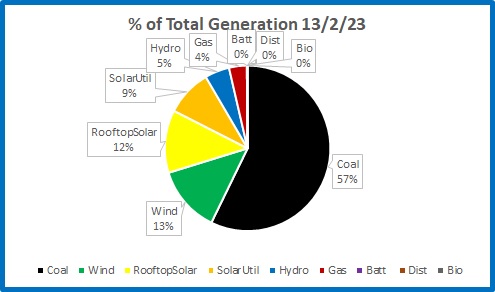
Figure 4:  Percentage of Total Generation on one day

Coal has slipped by one percent, gas by two percent for a total of 61%.  In ideal conditions, renewables provided 39%. 

Knowing the installed capacity for all generators and the actual electricity supplied we can calculate the capacity factor of each:

Figure 5:  Capacity Factor for all Generators 13/2/23

Coal                       62.13%

Wind                     32.93%

Solar (Utility)       32.85%

Hydro                    19.60%

Rooftop Solar      17.29%

Gas                        8.24%

Battery                  3.38%

Distillate               1.14%

Bioenergy           -0.15%

(-0.15% for bioenergy?  That’s not a typo: when sugar mills are not crushing, bioenergy is a drain on the network.)

Solar farms are nearly twice as efficient as roof top solar, for the simple reason that rooftop panels are usually fixed while panels in solar farms track the sun.  Maximum capacity factor for a solar farm could in theory approach 50%, while that of household solar, no matter how much installation increases, won’t get much higher than now.

You can be assured that wind and solar are generating as much as possible.  Coal and gas must reduce supply to allow for this- if it wasn’t for renewables they would have a much higher capacity factor.  This is a problem renewables will never be able to solve- wind and solar energy are too diffuse to be much more efficient.

I hate waste.

We will see how this compares in winter, with much less sunshine and Liddell coal fired power station closed.

(Source: OpenNEM)

Australia’s Energy Future

January 17, 2023

What are the likely prospects for electricity supply in 2023? In a nut shell, much higher prices, but we may avoid blackouts-just.


In April, Liddell coal fired power station will close. Data from OpenNEM shows an extra 2,827 MW of wind and 1,895 MW of solar farm capacity will come on line during the year, and as well rooftop solar will continue to grow rapidly. There will be an extra 154 MW of gas generation at Snapper Point in South Australia. There will be no change to hydro capacity. Figure 1 shows the changes in installed capacity from 2022 to 2023.


Figure 1: Installed Capacity

Across the National Electricity Market, generation and consumption are virtually the same (hydro pumping and battery charging accounts for much less than 1 percent.) Over 24 hours, daily consumption in Gigawatt hours in 2022 is shown in Figure 2.


Figure 2: Daily Electricity Consumption

Capacity factor is actual generation as a percentage of installed capacity.


Figure 3: Daily Capacity Factor

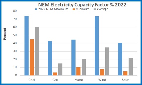
Note that in optimum conditions wind has a capacity factor almost as high as coal; low wind results in capacity factor dropping to 7.6 %. On average wind’s capacity factor is 34.9 %. Wind generation varies, and is mostly greater at night.


While there is a massive amount of solar generation each day, depending on cloud conditions, after sundown solar energy is virtually zero. At the early morning and early evening peaks, and all through every night, the amount of daily solar generation is irrelevant, and the nation relies on coal, gas, hydro, and whatever wind is available. When wind energy is very low, fossil fuels and hydro have to increase generation.


In Figure 4, projected consumption for 2023 is calculated from 2022 average capacity factors and 2023 installed capacity.


Figure 4: Projected 2023 Daily Consumption

Assuming there is no increase in demand in 2023- in other words, no population increase, no new electric vehicles or other gadgets, no economic growth- we can directly compare 2022 consumption with 2023. It is likely that the economy will slow, which might be the only thing to save the NEM. Here are three scenarios for 2023 after Liddell closes.


Figure 5: Third Worst Case

If we have a year with winds similar to last, on average there will be 6.8 GWhr less electricity per day. In 2022 there were 197 days when wind generation was below average. Of course, coal, gas, and hydro will easily increase generation to cover this shortfall, but at greater cost than 2022.


But that is the average day. We need to look at hour by hour demand and generation during each day.


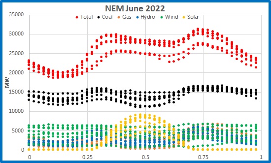
Figure 6 is a plot of electricity supply by source for 30 minute periods for the week of 29 May to 3 June 2022.


Figure 6: Electricity Generation 29 May to 5 June 2022

Battery, biofuel, and diesel generation are not shown as they are tiny. Note the morning and evening peaks, the early morning base of about 19,000 Megawatts, and the daily solar curve, which decreases to virtually zero at local sundown.

Figure 7 shows the above data just for 2nd June.


Figure 7: Electricity Generation 2 June 2022

I am interested in electricity supply at 6.00 p.m. (the down arrow) as this is close to the daily peak. At 6.00 p.m. solar was irrelevant; and wind generation was extremely low all day- but wind generation can be much lower. In 2022 there were 18 days with less wind generation than that.


What if similar conditions occur in June 2023?


In the next figure I assume identical weather conditions- temperature, cloud, rain, and wind- and use the planned capacity increases for gas and wind, and the decrease for coal, to estimate generation for a similar day in 2023.


Figure 8: Second Worst Case- similar conditions to June 2022

773 MW short. Coal is already at its maximum output for the year. The shortfall can only come from hydro and gas. Gas can generate an extra 320 MW or so to equal the maximum for the year, and of course can go beyond this (theoretically, but impossible, an extra 4,255 MW to maximum installed capacity); hydro can contribute extra (theoretically, but impossible, an extra 3,454 MW to maximum installed capacity) – but there is a physical limit. This will drive prices even higher.


Which brings us to the Worst Case Scenario:


Worst Case: less wind than 2022 at peak times and anything less than maximum coal, gas, and hydro generation.


After April, electricity supply will be tight. If the wind blows strongly enough, we will be able to manage. Wind must be able to produce at least 1,100 MW every hour at peak times. However, the wind is unlikely to co-operate. Therefore, we will have higher prices.


But to avoid blackouts:


Coal generators must produce at or above the 2022 maximum capacity factor, with minimal planned stoppages and no unplanned breakdowns.
Gas generators will have to increase supply- this will of course result in higher prices.
Hydro dams will have to stay full, with no droughts or floods.


Good luck with that.

(Source: OpenNEM)

Electricity Prices, Reliability and Ideology

December 10, 2022

So, apparently we will have electricity prices reduced by a cap on the price of gas and coal and by installing more renewables, and we will have more reliability by installing more batteries and hydro.  And Chris Bowen says anyone who denies renewables are cheaper is a liar “This crisis is caused by gas and coal prices, anybody who says it’s caused by renewables is lying..”

Time for a reality check.

All data has been downloaded from OpenNEM.

Figure 1 shows the fluctuation in daily generation of electricity for the National Electricity Market for the year from 3/12/2021 to 3/12/2022, as supply kept up with demand:

Figure 1: Daily electricity generation, NEM

There is a weekly curve with less demand on weekends, showing as the down spikes.

Figure 2 shows how generation was provided by all fossil fuels and all renewables including hydro and batteries:

Figure 2: Daily electricity generation, NEM, fossil fuels and renewables

(Renewable energy advocates will point out how renewable generation rose at the end of October to record levels.  Bully for them.)

Figure 3 shows the daily price of electricity for the same period:

Figure 3: Daily price of electricity

Note prices began to rise sharply in April and fell back again at the end of July, and there were several large spikes that had nothing to do with the price of gas or coal, but the realities of supply and demand.

So are renewables cheaper?  Well yes, apparently some are.

Figure 4: Average daily price of electricity ($ per GigaWatthour)

Clearly, diesel powered generators are by far the most expensive so are only used for small scale or emergency generation.  Black coal is in the middle, and solar power is cheapest.  Chris Bowen and other renewable advocates will NOT be happy to learn that brown coal is cheaper than wind.

The maximum price of electricity is reached when demand is high but supply is struggling to keep up- those spikes in Figure 3.

Figure 5: Maximum daily price of electricity ($ per GigaWatthour)

Renewables are cheapest, with coal next.  All others including hydro are above a million dollars a Gigawatthour.  Diesel is the stand out.

But how much of each is actually used?

Figure 6:  Average daily electricity generation

Coal is king.

Figure 7:  Maximum daily electricity generation

For short periods wind overtakes brown coal.

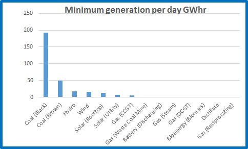
Figure 8:  Minimum daily electricity generation

The backbone producers of the NEM are the only ones visible- the others are backup only.

The next figures show plots of data at half hour intervals for the first week of December (1/12/22 to 8/12/22).

Figure 9:  Price per MegaWatthour by time of day (in an average early summer week)

This is the daily picture of supply and demand.  Maximum prices are reached in the early evening – 6 pm to 8 pm- and prices are lowest in daylight hours.  Notice that prices are frequently negative between 6.30 am and 4 pm.  Some generators are paying up to $50,000 per GWhr for the NEM to take their power.  They have to make up these losses when demand is higher.

How does this match with generation?

Figure 10: Total generation by time of day

Demand is highest in afternoons when air conditioners are working hard.  Demand is still above 17,000 Megawatts in the early morning hours.  That is baseload.  (The bottom two rows are Saturdays and Sundays, when people sleep in.)

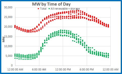
Here is the problem for Chris Bowen and our energy ministers: how long until renewables plus storage can keep the lights on?

Figure 11: Total generation and renewables + storage by time of day

Not for a very long time, even on an average summer day, let alone if the wind fails, or there’s heavy cloud, or extremely hot or very cold weather.  What’s the point of “cheap” electricity if it can’t do the job?

Here’s why.

Figure 12: Solar generation by time of day

Most solar farms have panels that track the sun, so they quickly reach near maximum capacity.  Rooftop solar, being fixed, follows the irradiance curve.  But note that while solar electricity is cheapest, it cannot be bought for any price at night.

Figure 13: Wind generation by time of day

Solar power is predictable compared with wind, which can vary from less than 1,000 MW to over 6,000 MW.

In a fit of ideological fantasy, Chris Bowen and our energy ministers think they can firm up renewable supply without using coal or gas.  Figure 14 shows hydro, battery, and biofuel generation on a typical early summer day:

Figure 14: “Green” firming by time of day

You can forget about batteries and biofuel (that’s mostly from burning bagasse in sugar mills during the crushing, so is only available for about eight months).   Hydro is the only source worth considering.

Figure 15:  Fossil fuel generation by time of day

Fossil fuels do the heavy lifting, 24 hours a day, helped by hydro. 

Figure 16:  Gas generation by time of day

Gas helps maintain supply when renewables fluctuate because generators can ramp up relatively quickly.  A lot of the time they are on standby, so have to make money when demand is high.

Figure 17:  Coal generation by time of day

Black coal generation can vary by nearly 50 percent in a few hours, every day.  They’re not designed to do that forever.  Break downs are more likely.  Brown coal is not as flexible as black coal but keeps up a reliable supply 24 hours a day.

There is a huge gap- about 10,000 MW- before renewables and storage can begin to provide for our needs.  Excluding coal and gas from firming supply- to maintain electricity supply when time and weather won’t co-operate- will make the task impossible.  Fossil fuelled generators have to make up for losses or lack of income when solar and wind supply is abundant by higher prices when demand is higher.  Supply and demand is the main reason for high electricity prices- but Chris Bowen and Albo have never run a business.

There is nothing but pain ahead, and things will get worse before they get better.

I’ve bought a generator.

(Source: OpenNEM)

Queensland’s Energy and Jobs Plan

October 1, 2022

Last Wednesday Queensland Premier Anastasia Palaszczuk released her $62 billion Energy and Jobs Plan

I can feel an election coming on.  This is pure political spin, pie in the sky stuff, that can’t and won’t work, designed to woo the city voters.  If I’m wrong and she’s serious, Queensland is in for big trouble.

However, part of it I can agree with.

It will involve building 1,500 km of 500 KVA transmission lines to strengthen the grid between north and south Queensland.  That I do applaud.

More from the statement:

The super grid will support 22 gigawatts of new wind and solar power, from between 2,000 and 3,000 more wind turbines and 36 million solar panels.

There will be another $2.5 billion to top up the $2 billion Queensland Renewable Energy and Hydrogen Jobs Fund.  That’s now $4.5 billion.

The government will finance 3 new wind farms, a new battery at Swanbank power station, and

A new hydrogen-ready gas peaking power station at Kogan Creek.

This project will provide power initially from gas blended with hydrogen with the future ability to use 100 per cent renewable hydrogen.

This will provide 3GW by 2035.

Pure hydrogen?  What can possibly go wrong?

Pumped Hydro:

However, the big ticket item is pumped hydro – $17 billion.  This will involve enlarging and redesigning Borumba Dam near Gympie to supply 2GW of electricity.  The major one is the Pioneer-Burdekin pumped hydro scheme.

Why am I concerned about this?

A sudden change of heart:

A government that is reluctant to build dams for agriculture (Rookwood Weir took years for approval) can suddenly build dams purely for renewable energy.

Poor record in dam building:

Let’s hope these dams are better designed and built than Paradise Dam, where 58% of the storage had to be released to lower the water height to a safe level. 

Effect on Community, Agriculture, and Environment:

The Pioneer-Burdekin project will involve two dams on the western side of the Clarke Range and a dam at Netherdale at the top of the Pioneer Valley.

Quoting from the Brisbane Times,   

A map of the site shows the lower reservoir — from which water would be pumped into higher dams to be released back down when energy is needed — would inundate a community of about 100 people, including cattle and cane farms, at the locality of Netherdale.

Figure 1:  Official map

I used to live close to Netherdale.  It is a beautiful part of the world, in most picturesque surroundings, in a high rainfall area.

Figure 2: Looking down the valley from Eungella

Figure 3:  Aerial image from Google Maps

To appease the greens and environmentalists,  no national park land will be affected- just farms, houses, and people.

In an indication that the Netherdale plan may not be politically viable, the government has announced that alternative sites are being considered “in the event the project is unable to proceed”.

Flooding Danger:

This proposal is not just dumb, it is dangerous.  This is a high rainfall area.  Nearby Dalrymple Heights has no BOM data since January 2010, but had 1264mm in December 1990, 1246 mm in January 1991, and 1520mm in February 1991.  That’s 161 inches in 3 months.  In February 1958 there was 1737mm and in March 1955 there was 1804mm.  In a wet season with a cyclone knocking out wind and solar farms, and cloud reducing rooftop solar over most of eastern Queensland, all these three reservoirs will be overflowing and the Pioneer River will be in flood.  Any attempt to release enough water to “keep the lights on” will cause much greater flooding.  But that’s OK- it will be caused by climate change.

The Premier claims that this plan is proof the government is returning taxes to the regions, but the pumped hydro plan will do nothing for agriculture, water supply, or flood mitigation.  It’s purely for a renewable dream that can’t and won’t work.  Here’s why.

Limited Size:

The Pioneer-Burdekin hydro project will supposedly produce 5 Gigawatts (GW) for 24 hours, or 120 Gigawatt hours (GWhr).

The Borumba Dam will produce 2 GW, or 48 GWhr.

The next plots use data from OpenNEM.

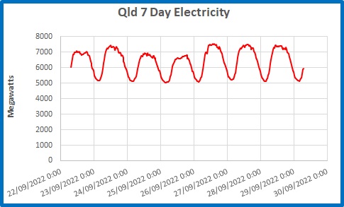
Figure 4:  Total Qld Electricity Use to 29 September

In the week to 7.30 a.m. on 29 September, Queensland’s baseload electricity usage (generation less exports) was a touch over 5 GW, the lowest being 5.036 GW at 3:30 a.m. on Sunday 25th September.  That wasn’t to “keep the lights on”.  That was to run hospitals, electric trains, street lights, traffic lights, cold stores, mines, aluminium smelters- and all before sunrise or a normal working day.  Baseload power is the minimum amount of electricity that has to be maintained for 24 hours a day every day- that is at least 120 GWhr.  Pioneer-Burdekin could do that for just one day.

Figure 5: Electricity Usage for the Year to 27 September.

In the past year, Queensland’s average daily usage was 165.2 GWhr.  (That rose to more than 180 GWhr for most of summer).  Just 31 GWhr on average was produced by solar and wind generation, with up to 39.6 GWhr of solar on one day last summer, but only 4 GWhr on July 4 .

Our grand hydro “batteries” would last for just over 24 hours, at today’s usage. 

Inefficiency:

How efficient would the pumped hydro scheme be?  From the Premier’s own Statement:

Each megawatt of pumped hydro energy storage unlocks investment in another three megawatts of wind and solar generation.
That’s because more renewable energy is needed to pump water up hill during the day storing renewable power for when it’s needed.
Supporting around 21 gigawatts of renewables – or more than 150 new wind and solar farms.

There it is: to store 1 GW of existing renewable energy we need an additional 3 GW of wind (at about 33% efficiency) and solar (at 15 to 20% efficiency).

Transport and Industry Needs:

Further, we’re supposed to be transitioning to electric vehicles.  According to Budget Direct’s Fuel Consumption Survey & Statistics 2022 in 2021 Queensland used 3,343 billion litres of petrol (excluding diesel).  At roughly 9 KWhr equivalent per litre, if only 10% of cars are electric in 2035, another 310 566.5 GWhr of electricity per year would be needed. Include diesel and the figure is 1,020 GWhr. (I’m not confident about my calculation- but this will need a huge amount of electricity.)

And Queensland is meant to be supplying hydrogen for industry as well, so the demand will be much, much greater.

Conclusion:

I am pleased with the proposal to improve Queensland’s electricity grid.  However, the rest of the plan- especially the pumped hydro- is nonsense.

Hello, Anastasia- Queensland voters aren’t so gullible.  If it sounds too good to be true, it probably is.

Power Gaps = Blackouts

September 2, 2022

On Wednesday the Australian Electricity Market Operator (AEMO) gave a warning that should not have come as a surprise to anyone with half a brain, but it made the headlines, including at the ABC:

AEMO warns of power ‘gaps’ in Australia’s biggest grid within three years as coal exodus gathers pace

Planned coal fired power station closures and increasing demand will lead to shortages from 2025 in NSW, Victoria in 2028, Queensland in 2029, and South Australia early next decade.  Of course this is seen as a wake-up call that we need more renewables, more storage, and more transmission lines.  Sceptics will say “We told you so”.

In fact, readers may remember my post from 18 June titled “The Gap”, with this figure.

I have crunched the numbers for daily electricity consumption in the eastern states for the 12 months from 1 September 2021 to 31 August 2022.  Here’s that gap again, in GigaWatthours.

(The wobbles in the Total show the weekend drops and the Christmas- New Year “silly season”, the summer and winter demand peaks, and the spring and autumn “Goldilocks” periods.)

The gap is currently at the very least 307 Gigawatthours.  The average over 365 days is 418 GWhr- and we are supposed to be converting most of our transport to electric (or hydrogen!) in the next few years. 

Hydro produced a maximum of 99 GWhr.  Snowy 2.0 will only produce another 48 GWhr, and you can forget about batteries- minuscule.

Good luck with filling that gap.

How did fossil fuels compare with renewables over the past year?   The next figure shows the percentage of total consumption supplied by coal, gas, and wind plus solar.

Coal had a short period where supply dropped to 52.3%, but averaged 59.9% over the year, rising to 68.9% on Wednesday this week.  The plotted trendline shows a decrease of 0.9% over the year. 

Renewables decreased by a whopping 6.24%- so much for the renewable transition!

Gas filled the gap, with an increase of 6%.

Just so that you are clear that the crisis we narrowly avoided early this winter was NOT caused by unreliable coal fired stations, here is a plot of renewable supply expressed as daily deviation from the 12 month average- anomalies if you like:

Wind and solar were producing much below expected- and erratically- from mid-March to mid-July.

Finally, the next figure shows seven day averages of the major energy suppliers and the total, overlaid with price per MegaWatt.

The high prices coincide with gas and hydro increasing generation when renewables were unable to meet their average supply- let alone the increase in demand.

Mind the gap.

(Source: OpenNEM)

Cheap, Reliable, and Renewable: July 2022

August 2, 2022

Some more plots from the National Electricity Market (NEM) for the month of July to illustrate the problems we continue to face. Figures 1 and 2 are updates of similar figures from June, but Figures 3 and 4 are new and hopefully show the problem even more clearly.
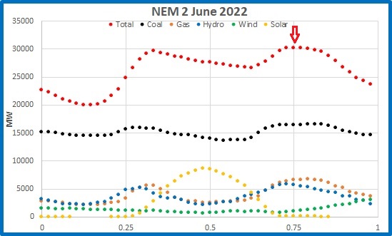
Figure 1: July consumption: all sources (Gigawatts)

Note the dip in consumption every weekend is even more marked than in June.

Figure 2 shows the relative contribution of all major sources, (but including battery, if you can see it).

Figure 2: July consumption as a percentage of total: all sources

Coal usage increased mid month to provide over 60% of all electricity.  The contrast with all other sources is obvious.

For the next plot I calculated anomalies from the monthly means of all energy sources. I have calculated totals for Renewables (Wind and Solar) and for Coal, Gas, and Hydro- the main sources we rely on to keep our electricity system stable. To allow for days when total consumption was up or down, I subtracted Total energy anomalies from Coal, Gas, and Hydro.

Figure 3: July consumption anomalies: renewables and non-renewables

Figure 4 shows how Non-renewables are controlled by Renewables:

Figure 4: Coal, Gas, and Hydro as a Function of Renewables

Wind and solar can sell to the market as much energy as they produce, so on days (and hours) when they can supply more, coal, gas, and hydro must cut back. However, at those times when the sun doesn’t shine and the wind is not as strong, the shortfall has to be made up by non-renewables- and with gas in short supply, that means higher costs.

The average daily price in July was $376.73.

(P.S.- Hydro is normally included as a renewable, but really it isn’t. In drought years, there’s not enough water to power the turbines, and in wet years- like 2022- water release through the turbines causes downstream flooding, so needs to be curtailed.)