Archive for the ‘adjustments’ Category

Distance Records for Temperature Adjustments

October 6, 2020

Trigger Warning:  ridicule of the Australian Bureau of Meteorology below!

The official Australian climate record is developed from ACORN-SAT– the Australian Climate Observation Reporting Network- Surface Air Temperatures.  This is relied on by governments and industry and so should be completely trustworthy and free from any problems that might lead to lack of confidence.

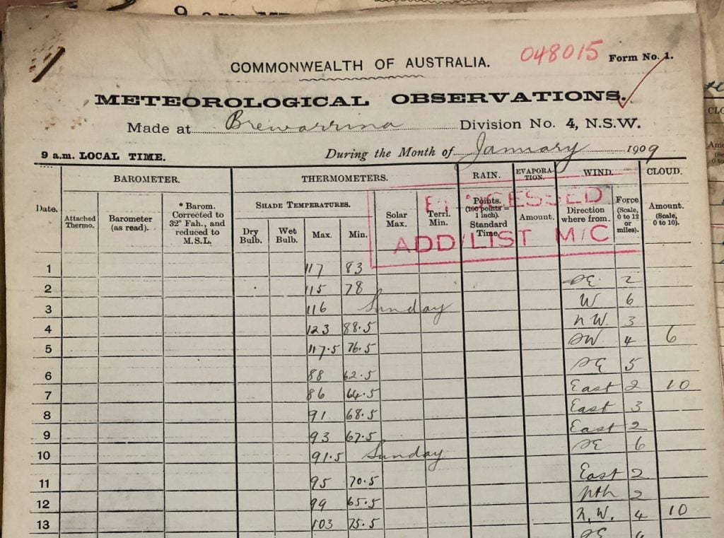
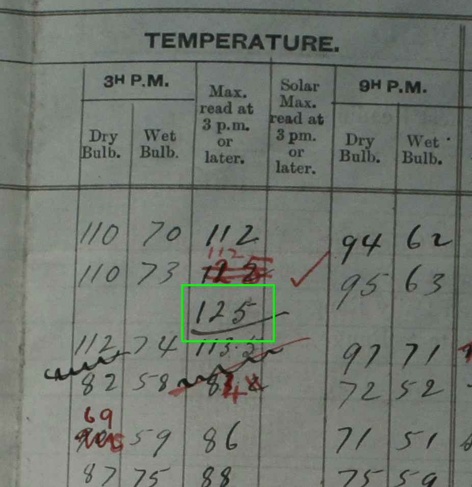
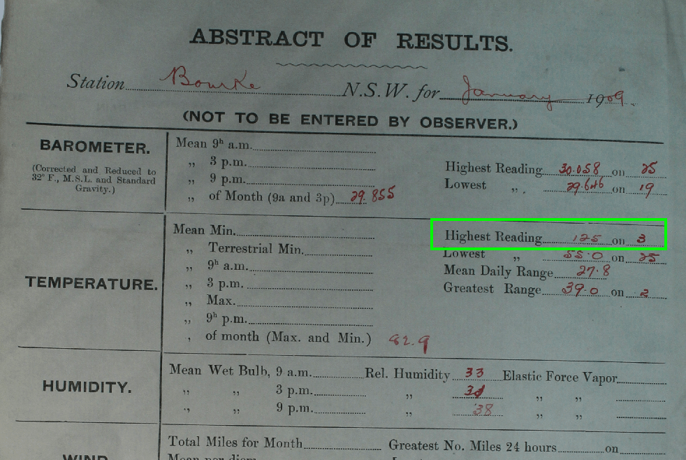
The Acorn stations have had their temperature records adjusted to account for any discontinuities or irregularities.  This is done by comparing Acorn stations’ data with those from a selection of comparative stations. 

The Bureau says:

The process of homogenisation seeks to answer a very simple question: what would Australia’s long-term temperature trend look like if all observations were recorded at the current sites with the current available technology? Homogenisation means we can compare apples with apples when it comes to temperature trends.

One might expect that, with the aim being to “compare apples with apples”, stations used for comparison and making adjustments would be physically not too distant- ideally, neighbouring.  

Not so.

For many stations, not even remotely so.

Australia is a very big country with vast areas of sparsely inhabited desert.  There are very large distances between towns in the outback, so it is not surprising that it is often difficult to find suitable comparative stations.

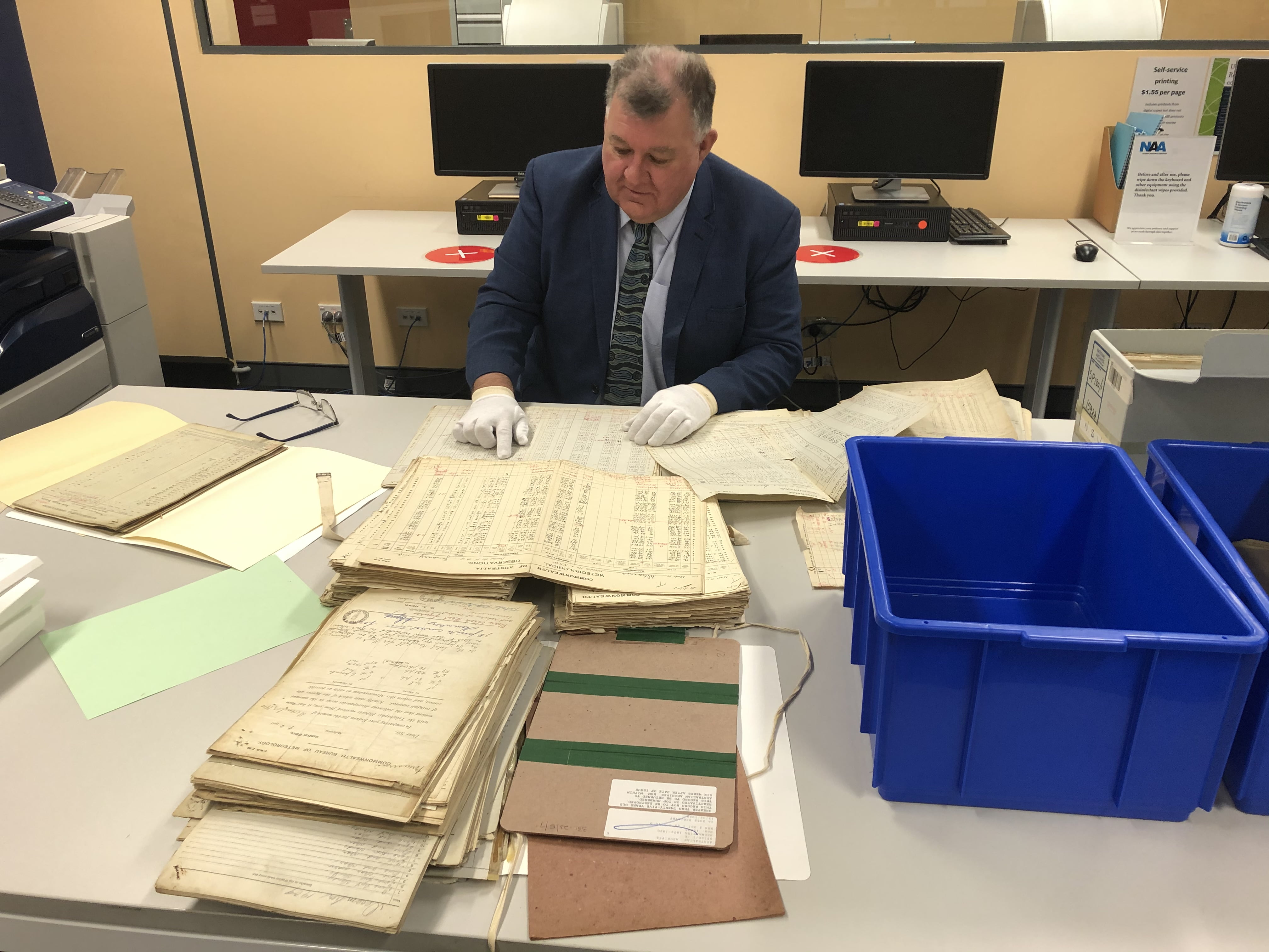
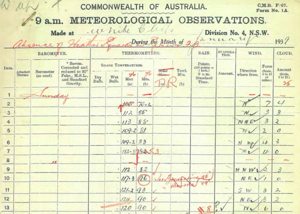
But the Acorn Station Catalogue, which has helpful lists of comparative stations used for adjustments, has some absolute doozies.  Here are some for your amusement.  (Obviously most stations have many comparative sites.)

Carnarvon, in Western Australia, has been adjusted by reference to a number of stations hundreds of kilometers away, including Southern Cross, only 897km away.

Camooweal, Queensland, “ “ “  Thargomindah, 1,067km away.

Boulia, Qld, “ “ “  Walgett, New South Wales, 1,130km

Halls Creek, WA, “ “ “  Boulia, Qld, 1,370km

Tennant Creek, Northern Territory, “ “ “   Charleville, Qld,  1,443km

Mount Gambier, in South Australia, has been adjusted with the help of Lismore in northern New South Wales, 1,526km away.  (And it’s not as if there is a shortage of sites in this well populated part of South Australia.)

But the gong, the gold medal, the record breaking achievement for the Bureau, goes to…….

Alice Springs, in the Northern Territory, which has been adjusted using data from Collarenebri in New South Wales,  1,590 kilometres away.

And they want the public to trust them.

More Questionable Adjustments- Cape Moreton

October 5, 2020

Here’s another Acorn station with interesting adjustments- Cape Moreton (40043) minimum temperatures.

Cape Moreton Lighthouse is on the north-eastern tip of Moreton Island, 65 km north-east of Brisbane.  It is not compliant with siting specifications. 

Figure 1 is the adjustment summary shown by the Bureau in its Station Catalogue.

Figure 1:  Adjustment summary for Cape Moreton

Two points to note:  The Bureau has TWO adjustments applied to the same date- 1/01/1946; and there are four comparative stations used to make these adjustments at this Acorn station.

Figure 2 shows the neighbours the BOM used for comparison. 

Figure 2:  Google Maps image showing Cape Moreton and its neighbours

There are many neighbouring stations the Bureau could have used for comparison, but the Bureau chose those with the “best correlation” during the comparison period (the late 1940s):  Brisbane Regional Office 65km away, and probably affected by Urban Heat Island effect; Yamba, also coastal but 267km south; Dalby Post Office on the Darling Downs 220km west; and Miles Post Office 330km west.

Figure 3 shows the annual average minima for these weather stations.

Figure 3:  Annual minima, Cape Moreton and neighbours

UHI at Brisbane is visible as the plot line rises faster than the others after 1950.

The next figure shows Acorn’s adjustments have increased the rate of warming from +1.2 degrees Celsius per 100 years to more than +1.5 C.

Figure 4:  Cape Moreton Minima

Figure 5 shows the difference between the original raw record and Acorn.

Figure 5:  Cape Moreton adjustments

It is plainly obvious that the Acorn adjustment summary shown in Figure 1 is wrong.  The first adjustment was applied from 01/01/1948 (not 1946) and decreased the annual minima for 1946 and 1947 by -1.2C.  The second adjustment was applied from 01/01/1946 and increased previous annual minima by +0.8C or +0.9C. The raw minima were decreased by -0.3C or -0.4C, but that is not how the Bureau describes the adjustment process:

Date applied: data prior to this date was adjusted for the reason (cause) cited. Adjustments are superimposed on each other; for example, if two adjustments are shown, one for 1/1/2000 and one for 1/1/1988, data prior to 1/1/1988 has both adjustments applied to it, data between 1/1/1988 and 1/1/2000 only has the first adjustment applied, and data after 1/1/2000 is not adjusted at all.”

The documentation of Acorn is a mess.

In order to compare data from stations with varying temperatures we need to calculate their anomalies from their means for the same period.  Figure 6 shows Cape Moreton’s and comparison stations’ anomalies from their 1931-1960 means.

Figure 6:  Minima anomalies, Cape Moreton and “neighbours”

Hard to follow, there is too much variability.  You may note that by comparison with the periods before 1948 and after 1960, the 1950s show much agreement.  The next figure shows the period from 1930 to 1960.

Figure 7:  Minima anomalies, Cape Moreton and “neighbours” 1930-1960

Notice that in 1946 and 1947 (indicated by the arrow) Cape Moreton is far too warm- the reason for the adjustment; however Yamba’s record is just as erratic or more so, being too low in 1933, 1934, 1940-1944,  and 1947; and too high in 1950.  This suggests firstly that the 1946 and 1947 adjustments were justifiable for those two years, and secondly that Yamba is not a good comparison station.  The next figure, with Yamba excluded, clearly illustrates this point.

Figure 8:  Cape Moreton and comparison stations, excluding Yamba

Apart from 1946 and 1947 Cape Moreton’s record is not greatly dissimilar from the three remaining stations. 

The object of adjusting temperatures using neighbours for comparison is to endeavour to produce a record that more truly reflects climate trends of the area.  The resulting record should be more like the neighbours than the original raw record.  We can test this by plotting the differences between Acorn and the raw record and the average of the neighbours.  If the comparison is good, while individual years’ differences may vary, the trend should be close to zero: the station should not be warming or cooling more than the neighbours.  Figure 9 shows the results for Cape Moreton minima for the period before the 1946 adjustment, excluding Yamba from the average.

Figure 9:  Differences between Cape Moreton and Qld neighbours

You will note that the blue trend line, showing the trend of the difference between Cape Moreton’s annual data and the average of Brisbane, Dalby, and Miles, has a trend of about +0.3 degrees per 100 years, indicating Cape Moreton is already warming more than the others.  The “raw” record already compares fairly well with the neighbours, considering that they are inland stations, unlike Cape Moreton.  In contrast the red trend line shows the adjusted data is warming more than three times faster, indicating a poor reflection of the climate of the area.

Conclusion

The Bureau has not followed its own methodology in its adjustment summary.

Documentation of adjustments is incorrect.

Three comparison stations are hundreds of kilometres away and another is subject to Urban Heat Island effect.

One comparison station (Yamba) has a record more erratic than Cape Moreton’s and should not have been used.

The adjustments have increased the difference between Cape Moreton and its neighbours, and has increased the warming trend by 30%.

Garbage in, garbage out.

Sources for annual minima data:

Acorn: http://www.bom.gov.au/climate/change/hqsites/data/temp/minT.040043.annual.txt

Raw:

Cape Moreton:

http://www.bom.gov.au/jsp/ncc/cdio/weatherData/av?p_nccObsCode=38&p_display_type=dataFile&p_startYear=&p_c=&p_stn_num=40043

Brisbane Regional Office: http://www.bom.gov.au/jsp/ncc/cdio/weatherData/av?p_nccObsCode=38&p_display_type=dataFile&p_startYear=&p_c=&p_stn_num=40214

Dalby Post Office:

http://www.bom.gov.au/jsp/ncc/cdio/weatherData/av?p_nccObsCode=38&p_display_type=dataFile&p_startYear=&p_c=&p_stn_num=41023

Miles Post Office:

http://www.bom.gov.au/jsp/ncc/cdio/weatherData/av?p_nccObsCode=38&p_display_type=dataFile&p_startYear=&p_c=&p_stn_num=42023

Yamba Pilot Station:

http://www.bom.gov.au/jsp/ncc/cdio/weatherData/av?p_nccObsCode=38&p_display_type=dataFile&p_startYear=&p_c=&p_stn_num=58012

Garbage In, Garbage Out- Horn Island

September 27, 2020

After last year’s major project of checking the compliance of 666 Australian weather stations with the guidelines set out by the Bureau of Meteorology, and finding that nearly half did not meet siting specifications, I decided to take a break from analysing BOM climate data.

It might now be time to re-enter the fray.

The pride of the BOM climate fleet, Version 2 of the Australian Climate Observation Recording Network- Surface Air Temperatures (ACORN-SAT, or Acorn 2) was launched with no fanfare at all in late 2018 and now is the basis for the Bureau’s climate claims and predictions.  I summarised many of its faults in May 2019.

Now I am going to look at some individual examples of Acorn 2 nonsense- firstly, Horn Island’s minimum temperatures.

Horn Island is our most northerly Acorn site.  It is the airport for Thursday Island and is closer to Port Moresby than any other Australian town except Weipa and of course TI.  Figure 1 shows the station’s only neighbours on Cape York Peninsula the BOM used for comparison. 

Figure 1:  Google Maps image of Cape York Peninsula showing Horn Island and its neighbours

Figure 2 shows the annual average minima for all of these weather stations.

Figure 2:  Annual minima, Horn Island and neighbours

Horn Island 27058 has a very limited data record commencing in March 1995.  To construct a longer record back as far as 1951, BOM merged Horn Island’s observations with those of Thursday Island Township 27021 and Thursday Island Meteorological Office 27022.  Figure 3 shows the result of the BOM’s merge.

Figure 3:  Horn Island and Thursday Island minima

The 27022 TI Met Office annual average Tmin has been reduced in Acorn by 0.5 or 0.6 degrees for all years before 1993.  (The Adjustment Summary claims there was an annual impact of -0.53 degrees.)  There were other adjustments at 01/01/1967 and 01/01/1958, but the 1993 adjustment has the largest effect.

Unfortunately, there are only 6 months of overlap between 27021 and 27022 (September 1992 to February 1993), and 11 months between 27021 and 27058 (March 1995 to January 1996), as figure 4 shows.

Figure 4:  Extent of overlaps in monthly minima

In September, October, and November 1992 TI Township 27021 recorded minima 1.1 to 1.4 degrees cooler than the Met Office site in “a relatively exposed location” on top of the hill 900 metres west.  However, Acorn tracks 27021 and approximately splits the difference from 27022.

Figure 5:  Extent of overlaps in monthly minima, including Acorn 2

To do this, the BOM uses two comparative stations, Lockhart River 28008 and Coen Airport 27006.  Coen is 385km from Horn Island. 

Figure 6 shows a plot of monthly anomalies from 1981 to 2010 means for these stations.

Figure 6:  Monthly minima anomalies from 1981-2010 means, all stations

Note that 27022 is close to 27021 from December 1992 to February 1993, but not before, while Coen is nothing like either.  I cannot see the justification for the adjustment.

I constructed a merge of annual data using 27021 for 1993, 1994, and 1995, joined to 27022 and 27058 with no adjustment to construct a “raw” record.  This is entirely artificial, but no more so than Acorn.  Figure 7 shows plots of both with annual trends.

Figure 7:  Horn Island minima, Acorn 2 and “raw”

Note Acorn has enormously increased the warming trend.  Figure 8 plots the differences between Acorn and my “raw” record.

Figure 8:  Horn Island minima adjustments

The earlier adjustments were also large and based on “statistical” breakpoints.

The object of adjusting temperatures using neighbours for comparison is to endeavour to produce a record that more truly reflects climate trends of the area.  The resulting record should be more like the neighbours than the original raw record.  We can test this by plotting the differences between Acorn and the raw record and the average of the neighbours.  If the comparison is good, while individual years’ differences may vary, the trend should be close to zero: the station should not be warming or cooling more than the neighbours.  Figure 9 shows the results for Horn Island minima for the period that the 1993 adjustment applied.

Figure 9:  Differences between Horn Island and two neighbours

You will note that the blue trend line, showing the trend of the difference between annual data merged with no adjustment and the average of Coen and Lockhart River, is almost flat, indicating the “raw” record already compares well with the neighbours.  In contrast the red trend line shows the adjusted data is warming faster than the neighbours, indicating a very poor reflection of the climate of the area.

Conclusion

The Horn Island record should never have been merged because of the lack of suitable overlap.

Once merged, it should never have been adjusted downwards so much.

 Lockhart River and Coen are far too distant to be suitable for comparison.

The result is nonsense.

Garbage in, garbage out.

Hottest Day Ever in Australia Confirmed: Bourke 51.7°C, 3rd January 1909

July 11, 2020

reposted from Jennifer Marohasy

The Australian Bureau of Meteorology deleted what was long regarded as the hottest day ever recorded in Australia – Bourke’s 125°F (51.7°C) on the 3rd January 1909. This record* was deleted, falsely claiming that this was likely some sort of ‘observational error’, as no other official weather stations recorded high temperatures on that day.

However, Craig Kelly MP has visited the Australian National Archive at Chester Hill in western Sydney to view very old meteorological observation books. It has taken Mr Kelly MP some months to track down this historical evidence. Through access to the archived book for the weather station at Brewarrina, which is the nearest official weather station to Bourke, it can now be confirmed that a temperature of 50.6°C (123°F) was recorded at Brewarrina for Sunday 3rd January 1909. This totally contradicts claims from the Australian Bureau of Meteorology that only Bourke recorded an extraordinarily hot temperature on that day.

Brewarrina Meteorological Observations Book, January 1909 — photographed by Craig Kelly MP. Note 123F recorded at 9am on 4th January 1909.

Just today, Friday 10th July 2020, Mr Kelly MP obtained access to this record for Brewarrina, the closest official weather station to the official weather station at Bourke.

He has photographed the relevant page from the observations book, and it shows 123°F was recorded at 9am on the morning of Monday 4th January 1909 – published here for the first time. This was the highest temperature in the previous 24 hours and corroborates what must now be recognised as the hottest day ever recorded in Australia of 51.7°C (125°F) degrees at Bourke on the afternoon of Sunday 3rd January 1909.

The Meteorological Observations Book for Bourke for January 1909 records 125°C for 3rd January. Photograph taken on 26th June in 2014 at the Chester Hill archive by Jennifer Marohasy.

That the Bureau of Meteorology denies these record hot days is a travesty. Is it because these records contradict their belief in catastrophic human-caused global warming?

The temperature of 50.6°C (123°F) recorded back in 1909 which is more than 100 years ago, photographed by Mr Kelly today at the National Archives in Chester Hill, is almost equivalent to the current official hottest day ever for Australia of 50.7 degrees Celsius at Oodnadatta on 2nd January 1960. These are in fact only the fourth and third hottest days recorded in Australia, respectively.

Not only has Mr Kelly MP tracked-down the meteorological observations book for Brewarrina, but over the last week he has also uncovered that 51.1°C (124°F) was recorded at White Cliffs for Wednesday 11th January 1939. This is the second hottest ever!

The evidence, a photograph from the relevant page of the White Cliff’s meteorological observations book, is published here for the first time.

This photograph from the White Cliffs Meteorological Observation Book shows the second hottest temperature ever recorded in Australia using standard equipment in a Stevenson screen.

Until the efforts of Mr Kelly MP, this second hottest-ever record was hidden in undigitised archives.

It is only through the persistence of Mr Kelly to know the temperatures at all the official weather stations in the vicinity of Bourke that this and other hot days have been discovered.

If we are to be honest to our history, then the record hot day at Bourke of 51.7°C (125°F) must be re-instated, and further the very hot 50.6°C (123°F) recorded for Brewarrina on the same day must be entered into the official databases.

Also, the temperature of 51.1°C (124°F) recorded at White Cliffs on 12th January 1939 must be recognised as the second hottest ever.

For these temperatures to be denied by the Bureau because they occurred in the past, before catastrophic human-caused global warming is thought to have come into effect, is absurd.

At a time in world history when Australians are raising concerns about the Chinese communist party removing books from Libraries in Hong Kong, we should be equally concerned with the Australian Bureau of Meteorology removing temperature records from our history.

If global warming is indeed the greatest moral issue of our time, then every Australian regardless of their politics and their opinion on greenhouse gases and renewable energies, must be honest to history and these truths.

____

* This temperature (125°F/51.7°C on the 3rd January 1909) was recorded at an official Bureau weather station and using a mercury thermometer in a Stevenson screen. Hotter temperatures were recorded in 1896 but the mercury thermometers were not in Stevenson screens, which is considered the standard for housing recording equipment.

The feature image shows Craig Kelly MP at The Australian National Archive, Chester Hill, just today examining the Brewarrina Meteorological Observations book.

The following YouTube video is of me being interviewed on Sky Television by Chris Smith last December 2019.

I have previously blogged on the record hot day at Bourke being deleted by the Bureau here:
https://jennifermarohasy.com/2017/02/australias-hottest-day-record-ever-deleted/

Mysterious Jump in Ocean Temperatures

May 31, 2020

Back in 2018 Jo Nova publicised Dr John McLean’s exposé of the many ridiculous flaws in HadCruT4, the global temperature dataset, which included until a year ago the oceanic component, HadSST3. That was bad enough, with some data from positions 100km inland from the nearest sea. But in June 2019 the long awaited HadSST4 was released, in which many corrections were made to reduce “problems” in the sea surface temperature record.


Corrections indeed.


Figure 1 is a comparison of HadSST4 with HadSST3.

Figure 1: HadSST3 and HadSST4 since 1850

And figure 2 shows the extent of the “corrections”.

Figure 2: Adjustments: HadSST4 minus HadSST3

You will no doubt note how the “corrections” have made the past cooler, as is standard practice for all those curating temperature records. Indeed, apart from a small foray in the 1940s, the whole 100 years from 1875 to about 1975 has been made ever so slightly- up to a tenth of a degree- cooler.


But in an interesting move, all temperatures since then have been corrected, and, would you believe, upwards. Who would have thought that the average sea surface temperature measured just a couple of years ago in September 2017 was 0.1875 degrees too cool, and needed revising upwards?

Figure 3: HadSST3 and HadSST4 since 2010

Modern thermometers just aren’t what they used to be.

Australia’s Wacky Weather Station Comparison 4: Penrith (NSW)

February 20, 2020

After surveying 666 weather stations across Australia and finding nearly half (49.25%) are not compliant with Bureau of Meteorology siting specifications, in this series of posts I compare daily temperature data from pairs of compliant and non-compliant stations. Here’s the first in this series.

Penrith and Richmond RAAF

These stations are in western Sydney, 16km apart.

Fig. 1:  Penrith map location per Google Maps

Fig.2:  Penrith and Richmond

Penrith Lakes AWS 67113 is beside a large area of excavation and bare soil, and 200 metres from a large artificial lake.

Fig. 3:  Penrith (Google satellite image 2019)

Richmond RAAF 67105 is at an Air Force base. It is open, flat, and at least 50 meters from any concrete or tarmac.

Fig. 4:  Richmond RAAF site plan 2016

Fig. 5:  Richmond RAAF (Google satellite image 2020)

Richmond is 6 metres higher than Penrith.  Both are Automatic Weather Stations with electronic temperature probes transmitting data every minute. While there can be no observer error, as we shall see there can be instrumental error.

Richmond RAAF is an ACORN station. The Bureau says in its Station Catalogue: “The region is a major growth corridor for Sydney and there is evidence of anomalous warming of minimum temperatures in recent years.”

If we plot all daily maxima from 2010 to 2019 for Richmond against Penrith, we see that temperatures match quite closely:

Fig. 6:  Tmax at Richmond as a function of Tmax at Penrith

Richmond is on average cooler than Penrith. A time series of the 31 day centred mean of the daily difference between them shows more detail:

Fig. 7:  31 day mean daily difference Penrith minus Richmond Tmax

Values above zero mean Penrith is warmer than Richmond; below zero, Penrith is cooler.  Most summers Penrith is warmer, and winters slightly cooler, though the record appears to have breakpoints in early 2012 and early 2016, and some unusually high values.

This is a plot of mean differences by month:

Fig. 8: 31 day mean daily difference Penrith minus Richmond Tmax by month

Penrith is warmer in every month, especially in summer, though there are some cooler values in every month.

Minimum temperatures at Richmond are much cooler than Penrith:

Fig. 9:  Tmin at Richmond as a function of Tmin at Penrith

Fig. 10:  31 day mean daily difference Penrith minus Eichmond Tmin

Penrith is 2C to 2.5C warmer in cooler months and up to 0.5C warmer in summer.

Fig. 11: 31 day mean daily difference Penrith minus Richmond Tmin by month

A note on accuracy:

The centred 31 day running correlation is useful for detecting inconsistencies.

Fig. 12:  Centred  31 day running correlation between Penrith and Richmond maxima

Fig. 13:  Centred  31 day running correlation between Penrith and Richmond minima

The much poorer correlation in the summer of 2013-2014 shows in Figures 7 and 10. Here are the actual minimum temperatures recorded:

Fig. 14:  Daily minima at Penrith and Richmond Summer 2013 – 2014

It appears that the Richmond probe began malfunctioning in mid-December and failed completely in mid-January. It failed again a few months later.

In recent years, Penrith Lakes AWS 67113 has recorded generally warmer maxima than Richmond RAAF 67105 in summer and comparable or slightly cooler maxima in winters. Minima are always much warmer at Penrith. This may be due to the proximity to the large artificial lake.

In this example, siting non-compliance has a large effect on temperature.

***

This will be the last comparison, as it is very difficult to identify non-compliant stations with nearby compliant sites with similar environment. We can conclude however that non-compliance with siting specifications affects temperatures recorded, which varies between locations. Sometimes maxima are much warmer, sometimes minima. Temperatures at 329 non-compliant stations cannot be regarded as reliable for weather or climate analysis.

Australia’s Wacky Weather Station Comparison 3: Echuca (Vic)

February 18, 2020

UPDATE 20/02/2020: As reader Phil has reminded me and as I said after Figure 5 below, Kyabram appears to be irrigated and so should be added to the non-compliant list (making 329 or 49.25% of checkable stations). Therefore these sites are not suitable for comparison as factors other than siting (e.g. cooling due to evapo-transpiration following irrigation) will affect temperature difference. It is very difficult to find compliant sites that are near enough to non-compiant stations- but these are still interesting sites.

After surveying 666 weather stations across Australia and finding nearly half (49.25%) are not compliant with Bureau of Meteorology siting specifications, in this series of posts I compare daily temperature data from pairs of compliant and non-compliant stations. Here’s the first in this series.

Echuca and Kyabram

These stations are about 170km north of Melbourne, about 33km apart.

Fig. 1:  Echuca map location per Google Maps

Fig.2:  Echuca and Kyabram

Echuca Airport 80015 is right beside a large gravel parking area and less than 40 metres from the tarmac aircraft parking area.

Fig. 3:  Echuca Airport (Google satellite image 2019)

EchucaAir aerial

Kyabram 80091 is at a former research station in an open paddock as the 2008 plan shows:

Fig. 4:  Kyabram site plan 2008

Fig. 5:  Kyabram (Google satellite image 2020)

Kyabram is 9 metres higher than Echuca.  Again, an important difference is that Echuca is a manual station with liquid-in-glass thermometers, while Kyabram is an Automatic Weather Station (installed 1998) with an electronic temperature probe transmitting data every minute. The satellite image shows the enclosure is not well maintained with what appears to be long grass. The area around the enclosure is probably irrigated so this station should probably be classified as non-compliant as well.

If we plot all daily maxima from 2010 to 2019 for Kyabram against Echuca, we see that temperatures match quite closely:

Fig. 6:  Tmax at Kyabram as a function of Tmax at Echuca

The trend equation shows Kyabram is on average cooler than Echuca. A time series of the 31 day centred mean of the daily difference between them shows more detail:

Fig. 7:  31 day mean daily difference Echuca minus Kyabram Tmax

Values above zero mean Echuca is warmer than Kyabram; below zero, Echuca is cooler.  Note that apart from a few brief episodes, Echuca is always warmer than Kyabram.

This is a plot of mean differences by month:

Fig. 8: 31 day mean daily difference Echuca minus Kyabram Tmax by month

Echuca is warmer in every month- apart from those brief periods shown in Figure 7.

Minimum temperatures don’t match as closely…

Fig. 9:  Tmin at Kyabram as a function of Tmin at Echuca

Fig. 10:  31 day mean daily difference Echuca minus Kyabram Tmin

Echuca is generally warmer. There are several examples of odd deviations.

Fig. 11: 31 day mean daily difference Echuca minus Kyabram Tmin by month

A note on accuracy:

The centred 31 day running correlation is useful for detecting inconsistencies.

Fig. 12:  Centred  31 day running correlation between Echuca and Kyabram maxima

Fig. 13:  Centred  31 day running correlation between Echuca and Kyabram minima

The weaker correlation in 2011 is coincident with the unusual difference as seen in Figure 10 and is worth a closer look.

Fig. 14:  Daily minima at Echuca and Kyabram Winter 2011

Here we see probable examples of temperatures being recorded on the wrong date.

In recent years, Echuca 80015, a manual station that does not comply with site specifications, has warmer maxima than its neighbour Kyabram 80091 except for brief episodes, and mostly warmer minima.

In this example, siting non-compliance has a large effect on temperature, but may affect both sites.

Australia’s Wacky Weather Station Comparison 2: Wagin (WA)

February 16, 2020

After surveying 666 weather stations across Australia and finding nearly half (49.25%) are not compliant with Bureau of Meteorology siting specifications, in this series of posts I compare daily temperature data from pairs of compliant and non-compliant stations. Here’s the first in this series.

Wagin and Katanning

These stations are about 200km south-east of Perth.

Fig. 1:  Wagin map location per Google Maps

Katanning is in a paddock 48.7km south-east of Wagin.

Fig.2:  Wagin and Katanning

Wagin 10647 is in the middle of a small town. The screen has a bare dirt path leading to it. It is 10 metres from a bitumen street. A colourbond fence is to the north-east and an 18 metre tree is less than 20 metres away. More trees are to the south.

Fig. 3:  Wagin (Google satellite image 2019)

Katanning 10916 is in an open rural setting, on a slope as the 2013 site plan shows:

Fig. 4:  Katanning site plan 2013

Fig. 5:  Katanning (Google satellite image 2020)

Katanning is 64 metres higher than Wagin, but the surrounding country is similar- dry, flat or gently sloping.  Again, an important difference is that Wagin is a manual station with liquid-in-glass thermometers, while Katanning is an Automatic Weather Station (installed 1998) with an electronic temperature probe transmitting data every minute.

If we plot all daily maxima from 2010 to 2019 for Katanning against Wagin, we see that temperatures match quite closely:

Fig. 6:  Tmax at Katanning as a function of Tmax at Wagin

The trend equation shows Katanning is on average more than 0.5C cooler than Wagin. A time series of the 31 day centred mean of the daily difference between them shows more detail:

Fig. 7:  31 day mean daily difference Wagin minus Katanning Tmax

Values above zero mean Wagin is warmer than Katanning; below zero, Wagin is cooler.  Note that apart from a brief episode in 2012, Wagin is always warmer than Katanning.

This is a plot of mean differences by month:

Fig. 8: 31 day mean daily difference Wagin minus Katanning Tmax by month

Wagin is warmer in every month- apart from a three month period in 2012 which shows in the black ellipse.

Minimum temperatures don’t match as closely…

Fig. 9:  Tmin at Katanning as a function of Tmin at Wagin

Fig. 10:  31 day mean daily difference Wagin minus Katanning Tmin

Wagin is warmer in summer but cooler in winter. Possibly, due to the sloping ground at Katanning, cold air flows downhill away from the screen in cool months, keeping recorded minima higher than in Wagin.

Fig. 11: 31 day mean daily difference Wagin minus Katanning Tmin by month

A note on accuracy:

The centred 31 day running correlation is useful for detecting inconsistencies.

Fig. 12:  Centred  31 day running correlation between Wagin and Katanning maxima

Fig. 13:  Centred  31 day running correlation between Wagin and Katanning minima

Although there are a couple of obvious inconsistencies in maxima, the correlation in minima has been much worse every year.

Fig. 14:  Daily difference in maxima

There are examples of up to 6 degrees difference on some days, and some much larger, possibly due to observation or recording error- for example, by recording temperature on the wrong day, or recording 19.6 instead of 29.6.

In recent years, Wagin 10647, a manual station that does not comply with site specifications, has warmer maxima than its compliant neighbour Katanning 10916 all year round, and has warmer minima in summers. 

In this example, siting non-compliance has a large effect on temperature.

Australia’s Wacky Weather Station Comparison 1: Keith (SA)

February 15, 2020

After surveying 666 weather stations across Australia and finding nearly half (49.25%) are not compliant with Bureau of Meteorology siting specifications, in this series of posts I compare daily temperature data from pairs of compliant and non-compliant stations.

The difficulty is to find pairs of sites in close physical proximity and similar surroundings.  Large numbers of non-compliant stations especially in WA and SA have no compliant neighbours. 

Another difficulty is that it is impossible to control variables other than siting.  Screen maintenance, enclosure maintenance, probe or thermometer accuracy, are some of the variables that may adversely affect comparisons.  Never-the-less, we shall try.

I have restricted analysis to the last 10 years (2010 – 2019).

Keith and Munkora

These stations are in the far south-east of South Australia, not far from the Victorian border:

Fig. 1:  Keith map location per Google Maps

 They form the closest pair of stations I have found, just 2.66 kilometres apart, as this map shows.

Fig.2:  Keith and Munkora (Keith West)

Keith 25507 is in the middle of town between the highway and the rail line between Adelaide and Melbourne.

Fig. 3:  Keith (Google satellite image 2019)

Munkora 25557 is in an open rural setting, but is really “marginal” rather than compliant, as the grass in the enclosure is up to 0.5m high, and the surrounding paddock has at times been a cultivation, as the 2017 site plan shows:

Fig. 4:  Munkora site plan 2017

Still, it’s better than Keith.

Fig. 5:  Munkora  (Google satellite image 2020)

There is only 2 metres difference in altidude.  However, an important difference is that Keith is a manual station with liquid-in-glass thermometers, while Munkora is an Automatic Weather Station (installed 2001) with an electronic temperature probe transmitting data every minute.

If we plot all daily maxima from 2010 to 2019 for Munkora against Keith, we see that temperatures match quite closely:

Fig. 6:  Tmax at Munkora as a function of Tmax at Keith

A time series of the 31 day centred mean of the daily difference between them shows more detail:

Fig. 7:  31 day mean daily difference Keith minus Munkora Tmax

Values above zero mean Keith is warmer than Munkora; below zero, Keith is cooler.  Note that Keith is warmer in cooler months but Munkora is warmer in summer and autumn.  Note also strange things happen in the summers of 2010-2011, 2014-2015, and 2015-2016.

This is a plot of mean differences by month:

Fig. 8: 31 day mean daily difference Keith minus Munkora Tmax by month

Keith is warmer in cool months (May to September).  However, the warmer maxima at Munkora in warmer months may be due to the rapid response of the AWS probe to sudden temperature changes which an LIG maximum thermometer will not detect.  The BOM denies this happens.

Minimum temperatures don’t match as closely…

Fig. 9:  Tmin at Munkora as a function of Tmin at Keith

But minima at Keith are consistently warmer (averaging about 1.5 degrees C) than 2.7km out of town, and the differences are much greater:

Fig. 10:  31 day mean daily difference Keith minus Munkora Tmin

Keith is warmer in all seasons, especially spring and summer.

Fig. 11: 31 day mean daily difference Keith minus Munkora Tmin by month

A note on accuracy:

The centred 31 day running correlation is useful for detecting inconsistencies.

Fig. 12:  Centred  31 day running correlation between Keith and Munkora maxima

Fig. 13:  Centred  31 day running correlation between Keith and Munkora minima

Although there are a couple of obvious inconsistencies in maxima, the correlation in minima has been getting worse over the years and was much worse in 2019.

Fig. 14:  Daily difference in minima

There are examples of up to 10 degrees difference on some days, possibly due to observation or recording error- for example, by recording temperature on the wrong day.

In recent years, Keith 25507, a manual station that does not comply with site specifications, has warmer winter maxima but cooler summer maxima than the AWS at Munkora 25557 just 2.66km out of town, and has warmer minima all year round. 

Keith, with a population of just over 1,000, appears to have an Urban Heat Island (UHI) effect, due to its poor siting.

In this example, siting non-compliance has a large effect on temperature.

Australia’s Wacky Weather Stations: Final Summary

January 16, 2020

(Updated 17/01/2020)

Australia, being a wealthy, modern, western nation with a very well-resourced Bureau of Meteorology (BOM), might be expected to have weather stations that set a high standard of siting and reliability.

Unfortunately, that is far from the case.  This pie chart shows the percentage of weather stations that comply with siting specifications, don’t meet those specifications, or are “marginal”- not fully compliant but not as bad as some.

Nearly half do not comply with siting guidelines as outlined in Observation Specification No. 2013.1 (drafted in January 1997).

Less than a third comply and may be relied on (assuming that the screen and the immediate area around it is kept well maintained with a few centimetres of natural grass, and the surrounding environment does not change).

The marginal stations may or may not be reliable.

In Australia it is apparently quite OK to have thermometers beside houses, in bitumen carparks, in a vegetable garden surrounded by a corrugated iron fence, beside incinerators, behind 6 metre prison walls, beside piles of human excrement, in the middle of a dirt road, on the roof of a wharf shed, beside a multi-lane highway, shaded by trees, or in screens that are covered in spider webs, invaded by mud wasps, or used by cattle as a back-scratcher.  The area around the screens can be dusty bare dirt, overgrown with grass and weeds, or sprayed out to bare ground.

This map, thanks to Lance Pidgeon, shows the locations of weather stations audited.

As you can see, removing non-compliant and marginal sites leaves very large gaps.

Australia’s climate analysis is based on 112 stations in the ACORN-SAT network.  I surveyed 111 Acorn stations.  (Wittenoom stopped reporting in July 2019 and is now apparently closed).  Here is a pie chart of Acorn station compliance:

Again, thanks to Lance, this is a map of Australian Acorn stations….

…and this map shows the layout of the Acorn network with non-compliant stations removed, leaving marginal and compliant sites.

Only New South Wales has a decent density of compliant sites.  There are huge gaps in Queensland, Western Australia, and South Australia.  No wonder the Bureau is desperately defending their realm!

Here are the non-compliant Acorn sites.

Adelaide (Kent Town)Mackay
Albany AirportMarble Bar
BarcaldineMarree Airport
BridgetownMelbourne (Olympic Park)
CamoowealMerredin
Cape BordaMildura
Cape BrunyMiles
Cape LeeuwinMorawa Airport
Cape MoretonMoruya Heads
Cape OtwayNuriootpa
Charters TowersPoint Perpendicular
Coffs Harbour AirportRichmond (Qld)
Cunderdin AirportRobe
DalwallinuRockhampton
DeniliquinRutherglen
Geraldton AirportScone Airport
GilesSnowtown
Halls CreekSydney – Observatory Hill
HobartTownsville
KalumburuWandering
KerangWilcannia Airport
KyancuttaWilsons Promontory
Larapuna (Eddystone Point)Woomera
LongreachYamba

Summary

Of 666 weather stations I was able to identify and survey, nearly half (328) did not comply with siting specifications.

Less than a third (209) fully comply (assuming that the screens and surroundings are well maintained).

Another 129 are marginal- not fully compliant but not as bad as the non-compliant sites.

48 of the 111 remaining Acorn stations are not compliant, and a further 22 are marginal.

The Bureau of Meteorology starts its climate analysis using Acorn from 1910.  Reasons given are that the network, especially in remote areas, and also Western Australia and Tasmania,  was extremely sparse before this, and except in Queensland and South Australia (where Clement Wragge had instituted Stevenson screens and standardised practises by the mid-1890s) temperature observations and instrument siting were non-standard.  Temperature records before 1910 are not recognised by the Bureau.  For example, the hottest temperature recorded, 53.1C at Cloncurry on 16 January 1889 is discounted as it was not recorded in a Stevenson screen; and the temperature of 51.6C in Bourke on 3 January 1909 is discounted, even though it was in a Stevenson screen.  How can we be any more confident in current temperatures recorded at non-compliant sites?

With only 209 stations of the 666 surveyed fully complying with specifications, doubt must be raised not only about the modern network coverage but also the reliability and comparability of modern and historical temperature records.

The next step:

Over some time, I will be comparing data from several pairs of compliant and non-compliant stations to see if siting has any detectable effect on temperatures recorded.

Appendix:- Background and details of survey: 

In July 2019 I commenced a 6 month long survey of 666 weather stations that currently report temperatures to the Latest Weather Observations pages for each state (also to Climate Data Online and to international weather and climate agencies).  Many are used to make adjustments to Acorn stations. Of the 753 stations listed (and these change from time to time) I was able to identify and examine 666. 

I did not include offshore island territories or islands far distant from the mainland (e.g. Willis island) but islands close to the coast were included.  Other stations not included were those in the National Tidal Centre network, which are located on wharves and breakwaters and have beehive screens instead of Stevenson screens; Lucas Heights nuclear facility; a number of recent defence stations that were impossible to locate; stations in areas where satellite imagery has poor resolution, and a number of sites that have not yet been included in the BOM metadata and thus have no site plans and can’t be located- a good example is Wellcamp Airport in southern Queensland. (See below for the full list.)

The process I used is outlined  in my post “How to check for yourself”.  I also made use of information and photographs supplied by colleagues with local knowledge.

There are 328 examples of stations that are not compliant with specifications, listed by state here.

This is an example of a compliant station:  Amberley AMO  40004 which is an Acorn station.

Google satellite image: 

This is an example of a marginal station:  Nullo Mountain 62100

Google satellite image: 

It has patches of rougher/ longer vegetation nearby and a large tree about 20 metres away.

(And the more I look at marginal sites the more I find that I should really have classified more as not compliant.)

These are the marginal stations (Acorn marked *):

Adelaide AirportMiddle Point
ArmidaleMilingimbi
BatchelorMoomba Airport
Batemans BayMortlake
Bathurst *Moss Vale
Boulia *Mount Boyce
Bourke *Mount Bundey North (Defence)
Bowen Airport AWSMount Crawford
Bradshaw-Angallari Valley (Defence)Mount Ginini
BrisbaneMount Ive
Brisbane Airport *Mount Magnet Airport
BulmanMount Moornapa
Burketown Airport *Mudgee
Cape GrimNambour
Cape SorellNeptune Island
Central Arnhem PlateauNew May Downs
CerberusNgayawili (Elcho Island)
CharltonNgukurr AWS
CombienbarNhill Aerodrome *
CooktownNoarlunga
CoonawarraNoonamah
CootamundraNullo Mountain
Cowley Beach (Defence)Oakey
Cultana (Defence)Oodnadatta *
Darwin Airport *Orbost *
DerbyPalmerville *
Devonport AirportParramatta
Dum In MirriePearce
DwellingupPort Augusta
Eildon Fire TowerPort Fairy
ElliottPortland Airport
Esperance AirportRedland (Alexandra Hills)
Essendon AirportRhyll
Eucla *Sheffield
FingalSheoaks
Forrest *Shepparton
Fowlers GapSt George *
Gabo Island *Stawell
GelantipyStenhouse Bay
Grafton AirportSwan Hill
Grove *Sweers Island
Hamilton IslandSydney Olympic Park
Horn Island *Tabulam
Hume ReservoirTarcoola *
Hunters HillTaree Airport
Jervis Bay AirfieldTemora
JervoisTennant Creek *
kunanyi / Mount WellingtonTerrey Hills
Kununurra AirportThargomindah *
Lake JuliusThe Monument
Lake Macquarie – CooranbongTibooburra Airport *
Lake St ClairTocal
Lancelin (Defence)Townsville Air Weapons Range (Defence)
Launceston Airport *Trepell
Laverton (WA)Tunnack
Legendre IslandTurretfield
Leigh CreekVictor Harbor
Leonora AirportWadeye (Port Keats)
LombadinaWarruwi
LostockWhite Cliffs AWS
Low Head *Windorah
Luncheon HillWoolbrook
Mackay AirportYanakie
McArthur River MineYoung
Melbourne Airport

These are the stations listed in Latest Weather Observations that I did not use (plus offshore island territories). You are welcome to try- let me know if you have any success.

Adele IslandMelville Water
Arlington ReefMiddle Percy Island
Banana BankMount Buller
Barrow IslandMount Bundey South (Defence)
Bedout IslandMount Hope
Bradshaw-Koolendong ValleyMount Hotham Airport
BrewonMount Keith
Broome PortMount Read
Browse IslandMulurulu
Bulga DownsNoona
Burnie PortNorth Head
Busselton JettyNorth Island
Canungra (Defence)Oberon
Cape FergusonOcean Reef
Cape WesselOuter Harbor (Black Pole)
Christmas CreekPaynes Find
Colpoys PointPoint Avoid
CoondewannaPort Kembla Harbour
Croker Island AirportPortland Harbour
Darwin HarbourPuckapunyal-Lyon Hill (Defence)
Degrussa AerodromeRosslyn Bay Harbour
DoonganRowley Shoals
Edi UpperSellicks Hill
Esperance HarbourSmithville
Evans HeadSolomon Airport
Fawkner BeaconSouth Channel Island
Fort DenisonSpitfire Channel
Fortescue Dave ForrestSpring Bay
FrankstonSt Kilda Harbour RMYS
GluepotSwan Island
Gooseberry HillSydney Harbour
Hay PointThevenard Island
Heron IslandThursday Island
Hillarys Point Boat HarbourTownsville – Fanning River (Defence)
Hindmarsh IslandTroughton Island
Inner BeaconUrandangi
Kingfish BVaranus Island
KurnellWarburto Point
Little BayWarburton
LochingtonWattamolla
Low Rocky PointWellcamp Airport
Lucas Heights (ANSTO)West Roebuck
Maatsuyker IslandYampi Sound (Defence)
Maitland Airport