The complete UAH v6.0 data for September have just been released. I present all the graphs for various regions, and as well summaries for easier comparison. The Pause has finally ended globally and for the Northern Hemisphere, and the Tropics, but still refuses to go away in the Southern Hemisphere.
These graphs show the furthest back one can go to show a zero or negative trend (less than 0.1 +/-0.1C per 100 years) in lower tropospheric temperatures. I calculate 12 month running means to remove the small possibility of seasonal autocorrelation in the monthly anomalies. Note: The satellite record commences in December 1978- now 37 years and 10 months long- 454 months. 12 month running means commence in November 1979. The y-axes in the graphs below are at December 1978, so the vertical gridlines denote Decembers. The final plotted points are September 2016.
[CLICK ON IMAGES TO ENLARGE]
Globe:

The Pause has ended. A trend of +0.18 C/100 years (+/- 0.1C) since March 1998 is about one sixth of the trend for the whole record.
And, for the special benefit of those who think that I am deliberately fudging data by using 12 month running means, here is the plot of monthly anomalies:

Northern Hemisphere:
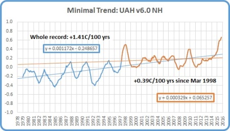
The Northern Hemisphere Pause has ended.
Southern Hemisphere:

For well over half the record, the Southern Hemisphere still has zero trend. The Pause may end shortly.
Tropics:
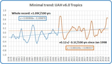
As expected, the Pause in the Tropics (20N to 20S) has ended.
Tropical Oceans:

The Pause remains (just) for ocean areas.
Northern Extra Tropics:

The minimal trend is creeping up- how high will it go before decreasing again?
Southern Extra Tropics:

The Pause is one month longer.
Northern Polar:

Another big increase in temperature in this region but the minimal trend is still one seventh that of the whole record.
Southern Polar:

The South Polar region has been cooling for the entire record- 36 years 11 months.
USA 49 States:

One month shorter.
Australia:

No change.
The next graphs summarise the above plots. First, a graph of the relative length of The Pause in the various regions:

Note that the Pause has ended by my criteria in all regions of Northern Hemisphere, and consequently the Globe, and the Tropics, but all southern regions have a Pause for over half the record, including the South Polar region which has been cooling for the whole record.
The variation in the linear trend for the whole record, 1978 to the present:

Note the decrease in trends from North Polar to South Polar.
And the variation in the linear trend since June 1998, which is about halfway between the global low point of December 1997 and the peak in December 1998:

The imbalance between the two hemispheres is obvious. The lower troposphere over Australia has been strongly cooling for more than 18 years- just shy of half the record.
The next few months will be interesting. The Pause may disappear from the Southern Hemisphere soon. How long will the Pause last in the Southern Extra Tropics and South Polar regions? ( I would like to see separate data for the Extra-tropical regions from 20 to 60 degrees north and south.)
Tags: climate, global warming, Pause

October 21, 2016 at 3:57 am
[…] The Pause Update: September 2016 […]
October 25, 2016 at 9:30 am
Ken, just a nit pick. You say that the globe is warming at 0.18 c per 100 years since March 1998, but the last trend graph shows the warming since June 1998 to be over 0.2 c per century.
Does the extra 3 months make a difference of perhaps 0.03 c per century? I know that’s zip diff in one hundred years, but just thought I’d ask.
October 25, 2016 at 10:39 am
Yes that’s correct. It’s such a short record that a couple of months does make some difference. The point of that graph and the one before is to show the massive difference in trends in most regions between the whole record and the last 18+ years. The Pause- hiatus-plateau-slowdown is undeniable.