UAH v6.0 data for September were released on Wednesday. Here are updated graphs for various regions showing the furthest back one can go to show a zero or negative trend (less than +0.01C/ 100 years) in lower tropospheric temperatures. The strongest El Nino since 1997-98 is affecting some regions more than others. Note: The satellite record commences in December 1978. The entire satellite record is 36 years and 10 months long.
[CLICK ON IMAGES TO ENLARGE]
Globe:

There has been zero trend for exactly half the record.
Northern Hemisphere:

Southern Hemisphere:

For more than half the record the Southern Hemisphere has zero trend.
Tropics:

Ditto!
Tropical Oceans:

Even longer!
North Polar:

Only 13 years and 7 months worth of Pause here.
South Polar:

So much for a fingerprint of warming due to the enhanced greenhouse effect being greater warming at the Poles!
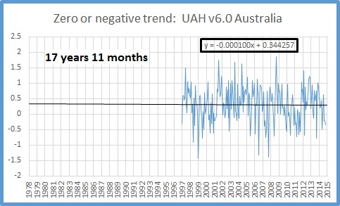
Australia:
USA 49 states:

The Pause continues. To borrow a phrase, our children won’t know what warming looks like!
Tags: climate

October 17, 2015 at 6:21 am
Reblogged this on Mbafn's Blog and commented:
..and now Ladies and Gentleman, the “non existent warming act!!” Directly from Gaia H/Q the great……..
October 17, 2015 at 6:29 am
Well done Ken, I am sure that one of the warmist Guru will be on the ABC, sooner or later, telling all how warm it has been and how much warmer will get… I am still trying to estimate the rise of the Acheronte due to all of those fires burning in hell and the absolute rise of “sinners” doing time. Thank you
October 18, 2015 at 10:48 am
I wonder what the weather balloon data tells us since 1958 ( I think) and the RSS data from 1978? Just asking.
October 18, 2015 at 4:49 pm
Sorry, I don’y know!
October 18, 2015 at 9:25 pm
Ken, I think you may be playing a very short sighted game here. I hope you will continue to provide a monthly update until the current El-Nino plays out, especially as UAH typically lags El-Nino by about 6 months. The development of this El-Nino seems to closely parallel the extreme 1997-98 event.
At this stage of the previous major event in September 1997 event EL-Nino was approximately the same (Nino 3.4 was 2.20 and UAH v6.3 was low at 0.05 ). As Nino 3.4 increased and reached a maximum value in November 1997 UAH temperatures did not show any significant increase until December 1997 and then skyrocketed until April 1998 (0.74) . This past September also had a Nino3.4 value of 2.2. If the current El-Nino continues to develop then UAH may well follow 1998 footsteps and reach similar values in 2016. If this does happen, then by early next year the opportunity for even the most astute cherry pickers to pick dates that show negative slopes will be severely curtailed.
Ken in this case you may be a victim of a climate change induced cherry famine. Instead of nice juicy cherries corresponding to claims of pauses of 15 years or more, you will be stuck with stunted produce of limited duration (a month at the best).
The other interesting aspect of your post is that you are using UAHv6.3 satellite data. This data has been massaged so many times since the days of UAH v1, it is amazing that there is any flesh left. Every year or two there is a new version.
You have complained loudly and incessantly about the B.O.M. massaging their Australian data using homogenization. They are complete amateurs compared to the deep massage experts of Spencer and Christy.
To put this into context, as you have rightly pointed out the homogenisation by the bureau has increased the temperature trend for Australia from about 0.07 (raw) to approximately 0.1 degree per decade (homogenised).
In comparison UAH v5.6 reported a trend for Australia of 0.16 degrees per decade (from 1979 till present) which is much greater than even the bureaus manipulated data and over twice the bureau’s raw data.
Bizarrely the new version UAH v6.3 shows a trend for the same period of 0.24 degrees per decade for Australia (see http://vortex.nsstc.uah.edu/data/msu/v6.0beta/tlt/uahncdc_lt_6.0beta3 ).
So going from one version of UAH to the next has resulted in increase in trend by a factor of 1.5 ! The 0.24 degree per decade value is over three times the rate of increase of the bureau’s raw data! Something is clearly very wrong here. Either the scientists at the bureau have joined the climate change skeptics and are massively under reporting the true rate of global warming or the UAH data is totally unreliable. Which is it? I can hazard a guess but I am interested in Ken’s opinion.
Anyway Its a mugs game predicting the weather and even so more for the climate. Perhaps the current El-Nino will fizzle and those who like low hanging fruit may still be able to indulge themselves at least for a couple more months. Enjoy it while it lasts.
As for the UAH data it looks like it needs yet another rework. As Roy Spence stated about the need for version 6 –
“One might ask, Why do the satellite data have to be adjusted at all? If we had satellite instruments that (1) had rock-stable calibration, (2) lasted for many decades without any channel failures, and (3) were carried on satellites whose orbits did not change over time, then the satellite data could be processed without adjustment. But none of these things are true. Since 1979 we have had 15 satellites that lasted various lengths of time, having slightly different calibration (requiring intercalibration between satellites), some of which drifted in their calibration, slightly different channel frequencies (and thus weighting functions), and generally on satellite platforms whose orbits drift and thus observe at somewhat different local times of day in different years. All data adjustments required to correct for these changes involve decisions regarding methodology, and different methodologies will lead to somewhat different results. This is the unavoidable situation when dealing with less than perfect data.”
Sounds awfully familiar? Homogenization by any other name still smells the same.
October 19, 2015 at 10:10 am
Hello again Mike, haven’t heard from you for a while.
As you say, “Anyway Its a mugs game predicting the weather and even so more for the climate.” Who are the mugs then?
You notice I’m not the one predicting anything here, and I’m not cherry picking either- the data extend back as far as it is possible to get zero or negative slope to the present. In the case of the South Polar region, that is to December 1978.
I’m well aware of the lag in global temperature behind ENSO. And remember, after this El Nino there will be a La Nina.
Now the global temperature may very well show a step change as it did to 2001 then plateau again. Or it may stay the same. Or step down. Time will tell.
In the meantime, squirm, baby, squirm.
October 19, 2015 at 1:56 pm
I note with interest that you have not responded or even acknowledged the reference in my post regarding the lack of reliability of the UAH data which underlies your cherry picking.
That’s a pity as it undermines any residual credibility of your posts regarding this matter.
October 19, 2015 at 2:19 pm
By the way Ken, how did you know I have been squirming?
I am susceptible to squirming when I discuss matters that are more appropriately the province of scientists who are experts in the matter of climate change, which I readily acknowledge I am not.
I do have some, admittedly limited, knowledge of psychology. Those who lack the expertise and do not squirm, ( I hope you are squirming) obviously have high self regard and confidence in these matters. In these cases there is a high probability that they are displaying symptoms of the Dunning Kruger effect ( https://en.wikipedia.org/wiki/Dunning%E2%80%93Kruger_effect ).
So personally I am quite happy to squirm away but please do not discuss this particular topic further as it may divert your attention away from addressing my previous post regarding the reliability (or lack of reliability) of the UAH data.
October 19, 2015 at 7:12 pm
Not a great worry of mine. I’m quite aware of the provenance of UAH and RSS. Perhaps you should be directing your concerns re the reliability of UAH to Roy Spencer, who would be able to give you much a much more informative response than I ever could. Then maybe you could publicise your findings, and yourself, as the person who alerted the world to the failures of the two satellite datasets. The BOM would be interested to hear of this, as UAH is specifically used in CTR-050 as a support for the credibility of their Acorn dataset.
Now as regards your next comment, re squirming, and your resort to psychology- it seems like I might have been on the money.
October 19, 2015 at 10:52 pm
Ken,
Thanks for the above suggestion. I have posted similar comments re UAH v6 on Dr Spencer’s web site. I will await his response.
In the mean time you seem to be avoiding, for some unknown reason, the issue with the major discrepancies that the UAH data provides.
Are you are happy with the highly alarming trend figure of +0.24 degrees per decade? At this rate Australia’s goose will truly be cooked.
If indeed you are satisfied with the UAH v6 data , you are now an honorary member of the global warming club.
October 20, 2015 at 7:40 am
Good try. You seem to be missing the point. Globally there was very mild warming of about +0.03 per decade for the first 15 years, then distinct warming- +0.16 per decade- up to 2001, which was followed by an equally distinct pause- plateau- hiatus, since then (-0.02). This pause- the length of time that will generate zero or negative trend- is of different lengths in different regions, but everywhere is undeniable since about 2001 (or very early 2002 in the case of the North Polar region). Australia had a trend of +0.03 for the first 15 years and -0.13 per decade for the last 15 years (since September 2000)- and zero trend for nearly half of the satellite record.
October 20, 2015 at 7:42 am
Here is a 2014 study by McKitrick and Vogelsang showing the temp in the trop troposphere from 1958 to 2012. BTW isn’t that single jump the 1976 PDO change? So where is the impact from Co2?
And here is that interesting quote——-
“This is a guest post by Ross McKitrick. Tim Vogelsang and I have a new paper comparing climate models and observations over a 55-year span (1958-2012) in the tropical troposphere. Among other things we show that climate models are inconsistent with the HadAT, RICH and RAOBCORE weather balloon series. In a nutshell, the models not only predict far too much warming, but they potentially get the nature of the change wrong. The models portray a relatively smooth upward trend over the whole span, while the data exhibit a single jump in the late 1970s, with no statistically significant trend either side.”
October 20, 2015 at 9:09 am
Ken,
Unfortunately you have made a few errors in your reply. I can understand this as I am also fairly tired.
My Excel calculations agree with your value for the slope of +0.03 degrees per decade for the first 15 years. However the values for the next 7 years until 2001 have a ridiculous trend value of +0.63 degrees per decade which is then followed by a -0.078 degrees per decade for 2001 until present. Let me know if you disagree with these numbers.
I would have thought you would have picked up these obvious errors as all three values you quote are all well below the +0.24 degrees per decade for the entire period.
The value of +0.63 degrees per decade from about 1994-2001 beautifully illustrates the dangers of short piecewise approximations to noisy data (and also to the inherent hazards in the cherry picking of such noisy data).
October 20, 2015 at 11:21 am
Don’t get excited- it all depends which month you start from- October 2001 to September 2015 is -0.13.
The large value for the 1994-2001 period illustrates the step up in temperatures from a flat period to another flat period.
Anyway you’re getting bogged down in trying to pick nits.
Flat- step change- flat. Flat for half the record globally. A fairly simple concept which some people can’t accept.
October 20, 2015 at 2:52 pm
“Don’t get excited- it all depends which month you start from- October 2001 to September 2015 is -0.13”
Exactly Ken, it does depend on which month you start from! From Jan 2000 until the present date the trend is +0.013 degrees per decade for the Australian UAH data . Ken, I can be just as silly as you by cherry picking an appropriate starting date.
Actually I have even more opportunities for silliness than you, as for the 322 months that correspond to dates prior to 10 years ago, 247 months have positive trends while there are only 75 starting date that have negative trends.
Interestingly from your last sentence, you have changed tack from looking at the Australian data back to the global data so I have had another look at this data.
For this data,you can reduce the short term noise by smoothing by means of a LOESS filter. The advantage of using a LOESS filter to smooth data can be found at https://en.wikipedia.org/wiki/Local_regression.
For smoothing equivalent to any smoothing value of 3 years or more (LOESS parameter: alpha>0.08) then you do not get any negative slopes for any possible start dates that are selected for a trend fit.
If you smooth with a LOESS filter equivalent to smoothing over 12 years (LOESS parameter: alpha=0.33), which essentially eliminates EL-Nino/La-Nina fluctuations, you get several ranges that could be approximated as piece wise linear functions using appropriate break point analysis via segmented analysis and then testing for statistical significance.
Did you do this to support your claim “The large value for the 1994-2001 period illustrates the step up in temperatures from a flat period to another flat period”? I suspect you may have eyeballed it which would have been extremely difficult without strongly smoothing the data.
But like you, I will be less than rigorous and rather than performing break point analysis, one can readily identify four regions, just by eyeballing the Loess smoothed result. They are
1. the period 1979-1985 which has very slightly decreasing slope (slope =-0.01 degree/decade).
2. the period 1985-2001 for which the temperature is increasing strongly except for a small inflection point from 1990 to 1993 (slope =+0.19 degree/decade from 1985 until 2001)
3. the period from 2001-2010 there is a region of slightly decreasing temperatures (slope =-0.03 degree/decade) and
4. for the period from the start of 2010 until present the curve is rising rapidly again (slope =+0.13 degree/decade).
It will be interesting to see how much larger the trend value for region 4 will become over the next few months when the effect of the current EL-Nino starts to impact the UAH data.
Again, you cannot possibly cherry pick from this relatively noise free data, no matter how hard you try, to support the ‘no global warming since…’ thesis. The data simply has no short term fluctuations that allow this kind of nonsense.
Anyone who is following this discussion can check for themselves the veracity of my post by downloading an Excel add on for the Loess filter at http://peltiertech.com/loess-utility-for-excel/. and apply it to the current UAH data from Spencer’s site.
Finally you claim that I am nit-picking, but it is very easy to make sweeping assertions. Unfortunately for you Ken, it is much harder to make a case that is able to withstand scrutiny. As they say the devil is in the detail.
However I do appreciate the integrity you display by allowing me to contribute to the comments section even if the nature of my material is at odds with your belief system.
October 21, 2015 at 7:48 am
OK, enough is enough Mick. I’ve gone along with you mainly for entertainment but I don’t have the time or patience to continue. There is a reason you are not so welcome at other sceptical sites. You are a troll, whose determination to hijack discussion is exceeded only by your verbosity. Your comments above illustrate what to look for in troll behaviour. Consider yourself blocked. Goodbye and good luck.
October 23, 2015 at 9:57 am
The 2014 Concordia Uni study found that there has been about 0.56 C of warming since 1800 attributable to the top 20 countries. Therefore according to this study total warming would be about 0.68 C over the last 215 years.
Not a lot of warming considering the planet’s recovery from one of the coldest periods over the last 10,000 years. I’ve read that many studies show that glacier advance was at the highest Holocene point during the LIA.
So how much of this slight warming is attributable to human Co2 emissions and why? I ‘ve read that the IPCC states that attribution starts after 1950. Here’s a reference to the study————–
http://berc.berkeley.edu/ranking-global-warming-contributions-by-country/
October 23, 2015 at 10:04 am
[…] After the presentations there was some discussion of the satellite data at the request of the committee chair, Craig Kelly MP. Luckily, I had a supplementary slide showing the last 17 years of data for Australia to September 2015, that I had downloaded the day before from Ken Stewart’s blog, https://kenskingdom.wordpress.com/2015/10/16/the-pause-september-update/ […]
October 23, 2015 at 2:51 pm
Here’s a question for anyone to answer. I just made this comment at Jennifer Marohasy’s blog.
In the book “Taxing Air” the authors tell us that the IPCC prefers the Had 4 temp data. I’ve tried this before, but can anyone tell me why the alarmists get a free pass trumpeting their so called CAGW? Here’s the 3 warming trends used by Phil Jones in the 2010 BBC interview, but I’ve extended the 1910 to 1940 trend to 1945. That’s 36 years (inclusive), so the 2 early trends shown here are 1860 to 1880 and 1910 to 1945. Both are clearly before the 1950 impact from human co2 emissions.
The later warming trend is from 1975 to 1998 and should be impacted by extra co2 emissions. Please can anyone tell me the difference in the last warming trend? It looks very similar to me and Jones agreed that there was no SS difference during the interview.
http://www.woodfortrees.org/plot/hadcrut4gl/from:1860/to:1880/trend/plot/hadcrut4gl/from:1910/to:1945/trend/plot/hadcrut4gl/from:1975/to:1998/trend
October 23, 2015 at 6:33 pm
[…] The Pause September Update […]
October 24, 2015 at 8:03 am
Another top post from Werner Brozek at WUWT. The S polar region hasn’t warmed for the entire satellite record, using both RSS and UAH V 6. In fact RSS shows a slight cooling for nearly 37 years. So how is this possible if co2 is their dangerous driver of CAGW? The poles should show the greatest warming according to AGW theory.
October 24, 2015 at 9:33 am
Judith Curry and her readers easily pull apart the latest junk science nonsense from the delusional extremists.
December 12, 2015 at 1:42 am
[…] The Pause September Update […]