The effect of adjustments made to create the official Australian temperature record is an increase in warming trend of 66.6% for minima, and 13% for maxima.
Given that minimum temperatures are particularly sensitive to Urban Heat Island (UHI) effects and also enhanced greenhouse warming (where greater night time than day time warming can be attributed to higher concentrations of greenhouse gases), this result is extraordinary. Any analysis of UHI or greenhouse warming signal is rendered impossible as the true signal is distorted by the adjustments.
Background
Included in the supporting papers for the Australian Climate Observations Reference Network- Surface Air Temperatures (ACORN-SAT or Acorn) is this statement concerning the balance of adjustments:
“There is an approximate balance between positive and negative adjustments for maximum temperature but a weak tendency towards a predominance of negative adjustments (54% compared with 46% positive) for minimum temperature.”

(Techniques involved in developing the Australian Climate Observations Reference Network – Surface Air Temperature (ACORN-SAT) dataset. (CAWCR Technical Report No. 049 ), Blair Trewin , March 2012, p.62)
Four years ago in 2010 I posted my analysis of Australia’s so-called High Quality (HQ) temperature dataset. This was a temperature record which the highest officers of the Bureau of Meteorology (BOM) assured me had adjustments that were on average neutral across the whole network. My analysis of the mean HQ temperatures compared with the data available at Climate Data Online showed a warming bias of over 40%.
HQ was quietly abandoned with the introduction with some fanfare in March 2012 of the Australian Climate Observations Reference Network- Surface Air Temperatures (ACORN-SAT or Acorn). This is a homogenised dataset based on daily temperatures, from 112 observing stations around Australia. 104 of these are used for climate analysis, being non-urban. Acorn data is readily available as daily, monthly, and annual data.
Figure 1: The Acorn network 
The 8 yellow dots are locations dubbed “urban” and are not used in temperature analyses. These stations are: Townsville, Rockhampton, Sydney, Richmond NSW, Melbourne, Laverton RAAF, Adelaide, Hobart.
The median position of all 104 Acorn stations is about 200km north-east of Broken Hill in NSW.
I studied a sample of 10 Acorn sites in May 2012, which convinced me that the Acorn dataset has many defects. However, I have now decided to study the whole network, comparing Acorn data with the station data from which it is derived, to discover whether the approximate balance between positive and negative adjustments has any influence on long term trends of the original data. I did not concern myself with the individual adjustments themselves, but with the effect these adjustments have had on the temperature record.
Methods
I downloaded annual minima and maxima data for each Acorn site from Site Networks at the BOM’s Climate Change page, and also downloaded corresponding data for the same and preceding sites from Climate Data Online (CDO). I am therefore comparing the effect on trends of publicly available data from two sections of the BOM website.
When an observing station closes and is superseded by a new station, the two temperature series may be combined or spliced to form a continuous series that is in theory homogeneous- that is, the series shows a smooth transition with no discontinuities or spurious jumps or drops from the old to the new. The previous data, all else being equal, may be compared with the later data, and temperature trends derived. I do this only for stations with at least 24 months of overlap and no more than 30km apart, by adjusting previous data up or down by the mean difference from the new data for from 24 months to the first five years during the overlap period. The Acorn series are constructed from sites sometimes with much less than 24 months, and sometimes no overlap, and occasionally by combining records many kilometres apart, by comparing with up to 40 sites to detect discontinuities, and up to 10 sites to adjust the record. (See CAWCR Technical Report No. 049 for full details.) A check on the validity of my adjustment for station change was the difference between my values and those of Acorn for the same period at ransition. In all but a couple of cases, my values matched identically, or occasionally with a difference of +/- 0.1 degree. Instances of mismatch were due to additional homogenisation by Acorn after or during the transition not related to the overlap adjustment.
I made no other adjustments. Because of this major difference caused by my conservative decision not to combine records with less than 24 months of overlap, I was unable to compare trends at a number of sites. Further, at several sites, Acorn shows data for many years for which there is no corresponding CDO data, so comparison was not possible. Of the 104 possible sites, I compared temperature trends for 83 minima sites and 84 maxima sites.
Another complication was different length series, in particular different start and end points. To ensure trends were accurately compared, I removed up to three additional years at the start to ensure both Acorn and minimally adjusted series had the same start date. As well, Acorn displays annual data for 2013 for nearly all stations, even though CDO data has not yet been quality assured and therefore not published. I removed all 2013 Acorn data unless CDO also provides it. Doing this decreases the warming in Acorn, making it closer to the ‘raw’ warming. I did not remove intermediate data that did not match. For example, Acorn removes several spurious annual means in the 1930s for Palmerville (Qld) which remain in CDO- the effect is slightly less warming in Acorn than CDO. My object was to compare Acorn with minimally adjusted data for the same length of period, so intermediate data adjustments, replacements, and deletions, are relevant.
For each Acorn site for which comparison could be made, I calculated trend in degrees Celsius per 100 years for Acorn and ‘raw’ data (CDO data, only adjusted for overlapping data) for the period 1910 to 2013.
I also calculated annual anomalies from 1961 -1990 means for each site, and calculated annual means for the whole network from these.
Results
Mean of the trends of the ‘raw’ data at the 83 minima sites was +0.82 degree Celsius per 100 years. The Acorn mean trend was +1.18 C.
The mean difference in trends (Acorn minus raw) of the 83 minima sites was +0.37 degree Celsius. That is a 44.8 % warming bias.
Figure 2 shows the range in the difference in trend caused by Acorn adjustments (from greatest cooling to greatest warming) across the 83 sites I was able to compare.
Figure. 2: (click to enlarge)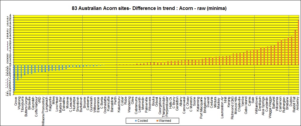
However, the practical effect of the Acorn adjustments is on the long term annual temperature trend. Here is BOM’s official graph of minimum temperatures (calculated as anomalies) 1910 – 2013, based on 104 Acorn sites.
Figure 3:
BOM calculates a trend of +0.1C per decade (or 1 degree per 100 years).
Figure 4 shows my plot of annual mean minima for the same period (calculated as a straight average- the BOM graph is area averaged) for 83 sites ‘raw’ compared with Acorn.
Figure 4:
Note: the ‘raw’ trend is +0.63C per 100 years. The adjusted trend is +1.05C. The difference of +0.42C represents an increase of 66.6 %.
Figure 5 is a plot of the annual average difference in temperatures.
Figure 5:
Note there is only one year (1959) before 1971 that has on average greater positive adjustments, and there are no years after 1971 of average adjustments below zero. In other words, the record before 1971 is cooled and after 1971 is warmed.
Is my comparison robust? In particular, how do trend values calculated from a straight mean of annual data for 83 sites compare with those for 104 sites, and how does a straight mean compare with area averaged data? Figure 6 is a comparison of the straight average of Acorn data at my 83 sites, with my calculation of the straight average of official Acorn minima for the whole 104 sites (excluding 2013), and the official area averaged data for 104 sites.
Figure 6:
The comparison is made clearer by plotting the difference between straight averaged 104 and 83 site series, and the difference between area averaged and straight averaged 104 site series.
Figure 7:
Note that area averaging appears to increase extremes, but the trend is almost the same. The straight average trend of 104 sites is +1.03C per 100 years, almost identical to that of the 83 sites. Therefore, my comparison is valid, and area averaging which decreases the trend in Acorn by 0.03C to +1 C should apply proportionately to the ‘raw’ trend for exactly the same sites.
What about mean temperatures?
If the mean is calculated as (Tmin + Tmax) / 2, then unless maxima are massively cooled, the result will be a significant increase in the mean trend.
Figure 8: Annual mean maxima for 84 sites (‘raw’ vs Acorn)
Acorn adjustments have increased the maxima warming trend by +0.09C, or 13 %.
Therefore, the minima adjustments are not balanced by the maxima, and mean temperatures are also artificially warmed.
Conclusion
While the number of positive and negative adjustments made by the creators of Acorn may be balanced or nearly so, their effect on the minimum temperature record is enormous. Analysis of a not insignificant sample of 83 of 104 Acorn sites shows a warming bias in adjustments to minima of 45 %, which has the effect of increasing the network-wide temperature trend by 66.6 %. The adjustments have predominantly cooled pre-1971 temperatures and warmed post-1971 temperatures. For maxima, the increase in trend is 13 %. This result casts doubt on the veracity of the Acorn temperature record, and its usefulness for climate analysis.
Please note: I make no judgement about the justification or lack of it for the individual adjustments. Nor am I claiming that my calculation of +0.63C per 100 years is the true trend in minima for Australia. Far from it: that figure is based on only 83 stations, not evenly distributed, many of which have much less than 100 years of data and/or many years of missing data. I’m saying no one knows for sure, but that the adjustments to the ‘raw’ data at CDO, in order to create the Acorn dataset, result in a massive and unexplained difference.
I welcome any comments or arguments that can show how I may remove errors from this finding, or how I may improve my analysis.
Notes:
1. Stations excluded from comparison:
Eddystone Point, Mt Gambier, Port Lincoln, Tarcoola, Marree, Darwin, Tennant Creek, Eucla, Forrest, Meekatharra, Port Hedland, Horn Island, Weipa, Normanton, Charters Towers, Bundaberg, St. George, Bourke, Nowra, Walgett, Moree.
Mt Gambier is included in maxima comparison only.
2. Some readers have expressed interest in Rutherglen, Victoria. Here is the comparison for Rutherglen.
Figure 9:
But Rutherglen is not the worst example. That title belongs to Amberley in Queensland:

3. ‘Raw’ data is not raw. Data at Climate Data Online is as close as we are likely to get, but has been observed, scribbled down, transcribed to monthly reporting sheets/ registers, transmitted, quality assured, converted from Fahrenheit to Celsius (pre-1972 data), and digitised. Much can go wrong.

May 16, 2014 at 1:43 pm
Crikey! Ken what is your opinion on how this affects DTR decrease which is a fundamental prediction of AGW?
May 16, 2014 at 2:53 pm
Well Anthony, as I said above it ” casts doubt on the veracity of the Acorn temperature record, and its usefulness for climate analysis.” A further point is that the most positive adjustments (increasing Tmin warming from raw) are concentrated in inland SE Australia, the very region in which even the official adjusted Acorn data do not support a decrease in DTR.
May 16, 2014 at 9:39 pm
Ken. Thank heavens somebody such as yourself is examining in detail the “adjustments” put forward by organisations such as the BOM and CSIRO. An enormous amount of work is involved to let the light shine on misleading data such as that in Table 6 of Australian Climate Observations Reference Network- Surface Air Temperatures as quoted.
While these figures are truthful as far as they go, they are deliberately designed to deceive by non-disclosure of the full story. These once great organisations are now little more than spin doctors, at least as far as “catastrophic global warming” is concerned.
May 17, 2014 at 9:56 am
Again, Ken, some great work. The 1971 cut off point for reducing temps is particularly interesting because it means that the post 1971 temps have not been compared with nearby stations. Does the BoM have an explanation for this?
Your Amberley Aero discrepancy shows up also in GISS NASA.
First is v1.
http://data.giss.nasa.gov/cgi-bin/gistemp/show_station.cgi?id=501945680000&dt=1&ds=1
Next is v4.
http://data.giss.nasa.gov/cgi-bin/gistemp/show_station.cgi?id=501945680000&dt=1&ds=14
May 17, 2014 at 8:33 pm
A little OT but haven’t got time to check all the ACORN record against the raw data.
Weatherzone reports;
‘Since 1859, Sydney has only had 21 days in May where it has reached 25 degrees, making it a one in every seven year event. Including Saturday, five of the next seven days are forecast to reach 25, highlighting just how unseasonably warm it is.’
I checked Sydney Obs’ raw temps for the 20 warmest Mays and found 57 days over 25C.
There were 7 days over 25C in 1957, again in 1958 and again in 1990.
When you check ACORN records, 1957 had 6, 1958 had 5 and.lo and behold, 1990 had 7 (as you point out in your post).
The +25C temps in 1958 have been reduced by 0.5C. Enough said.
May 17, 2014 at 11:11 pm
[…] Read the full article at https://kenskingdom.wordpress.com/2014/05/16/the-australian-temperature-record-revisited-a-question-o… […]
May 18, 2014 at 7:44 am
Re my post above about Sydney’s May temps.
Weatherzone is saying 21 days over 25C in May, but apparently WZ meant to add ‘for the second half of May’ (not the whole of May they imply in their statement). Wild goose-chase because of poor WZ editing.
May 20, 2014 at 1:59 pm
Ken, thanks for keeping the bastards honest.
I am also interested in looking at some of the data myself. I am finding it hard to download much of the data from the weathet bureau site.
Any chance you could attach the spreadsheet or a link to it? Hopefully without graphs it wont be too large.
Again thanks for all the hard work,
Mark.
May 22, 2014 at 10:49 am
Mark
I’ll see if I can get to this shortly. There are a number of large files, it may be difficult.
May 22, 2014 at 6:34 pm
Thanks for your post on ACORN Ken.
For me a boring but necessary topic . Good to have independent assessors and auditors.
Thanks for the ‘hard yards ‘ you have obviously put in
I have linked your blog to
May 23, 2014 at 7:46 am
An incredible amount of work you have done Ken. Required even if the truth had not become a political football. With big green now worth far more than big oil. The blind eye should not be turned. The potential for dishonesty to reap a large proceed from Joe average’s pocket and do long lasting damage to economys and brains is far too serious. These things need to be checked and deviations from reality like this need to be corrected. Further reoccurence of problems like these need to be prevented by the threat of exposure.
Do they have a good explanation?
Good Job!
May 27, 2014 at 9:08 pm
Whoa! Big job Ken. Well done for taking it on. I was looking at Acorn Kent Town data today, and the rise for max temps appears to be only about 0.3C over the 113 years. Can this be right? Have I calculated this correct? The old HQ was reporting 1.2C per century for Adelaide (KT). So this is not far off (still greater by 0.1C) than I calculated from the raw data last year. I did note as well that most of the data has been altered from raw right up to 2001. After that they are the same as reported at Bom. Quite bizzarre the changes per day. Almost looks like the alterations come from a random number generator.
Eg. Here re the changes from Raw to Acorn for Jan 1910. Anyone capable of working out this algorithm?
-0.3
-0.2
-0.3
-0.1
0.3
0
-0.3
-0.3
0.9
-0.1
0
-0.1
0.2
-0.2
-0.3
0.2
0.2
1
-0.1
-0.1
0
-0.3
0.9
-0.2
0.3
0.3
0.2
0.4
0.4
0.1
May 28, 2014 at 10:36 am
You’re correct, Acorn Tmax trend is +0.3C per 100 years. Acorn Adelaide is made from West Terrace and Kent Town spilced together with West Terrace cooling at -1.62, but Kent Town (since 1978) strongly warming at +3.04. Adelaide is not used in climate analysis as it is an urban site with lots of UHI.
May 28, 2014 at 8:12 pm
Thanks Ken. The UHI is clearly evident in the Min record as would be expected. I was surprised that this record (almost) reflects reality as originally recorded.
Ps Is anyone volunteering a possible algorithm for the changes yet?
May 29, 2014 at 6:35 am
There is almost a balance in warming-cooling adjustments in maxima- the difference is less than 5 %, so nearly as many sites were cooled as were warmed. Even so this led to a 13% warming bias nation wide.
“Reality” is difficult to define in Australian temperature records.
Regarding the algorithm- read CAWCR 049 (referenced in the post) for a description of Percentile Matching. Have fun.
May 30, 2014 at 8:29 am
An interesting aside to this CDO(raw) v ACORN predicament are the anomalies it throws up.
At the moment, Sydney Observatory looks as if it will have a record May max mean temp. The old raw record was set in 1958 but according to ACORN, the record was in 1923. This was achieved by adjusting 1958 down (-0.2C) and adjusting 1923 up (+1.0C).
At the moment, Sydney Obs is warmer than all other nearby w/s, even out to western Sydney – unusual given Sydney Obs’ long-term mean May temps are below those w/s.
Will this be identified later as an ‘outlier’ that will be adjusted in the ACORN record? Time will tell.
May 30, 2014 at 4:29 pm
[…] Read the full article at https://kenskingdom.wordpress.com/2014/05/16/the-australian-temperature-record-revisited-a-question-o… […]
June 2, 2014 at 9:12 am
[…] Continue here: https://kenskingdom.wordpress.com/2014/05/16/the-australian-temperature-record-revisited-a-question-o… […]
June 12, 2014 at 9:27 am
Ken, does my simple mind understand correctly that both Rutherglen and Amberley show cooling trends over the last decade in the raw data, only to emerge as warming trends after “adjustment”?
How many other stations have been reversed?
June 12, 2014 at 1:05 pm
Dave, neither show cooling trends over the last decade, but over the whole length of the records the raw data showed cooling, now reversed. 11 stations were reversed from cooling to warming, 1 had it’s cooling trend reduced. Only one (1) had a warming trend reduced (by 0.09).
June 12, 2014 at 2:13 pm
Thanks Ken, my mistake – I meant century.
So how many stations show a cooling trend over the last century in the raw data?
June 12, 2014 at 5:14 pm
14.
June 12, 2014 at 11:34 am
I agree the raw data is not necessarily raw. The 1988 monthly summaries we were given for Woomera recently reveal that, subsequent to then, minimums in the mid 1960s were adjusted downwards, with one month in particular “revised” down by 0.6C.
There was no site change at Woomera until 1991, so there must have been another reason for the adjustments.
June 12, 2014 at 1:09 pm
You’re right- and still continuing. It’s called “quality assurance” of course.
June 15, 2014 at 3:23 pm
[…] Part 1 of this series I showed a 66.6% increase in warming trend of Australian annual minimum temperatures […]
June 24, 2014 at 1:24 am
You do yourself a disservice by your method of calculating percentages. You are making good points, but temperature percentages are meaningless, unless you convert to Kelvin first.
Celsius and Fahrenheit scales have arbitrary zero points, so you must use Kelvin. K = °C + 273.15
So, the % diff between 0.63 C and 1.05C = [(1.05+273.15)-(0.63+273.15)] / (0.63 + 273.15) = 0.42 / 273.78 = 0.15% not 66.6%
One way to know this is true is buy performing the calculations in both Celsius and Fahrenheit. You will get different results event though they are describing the same temperature. Its because of the arbitrary placement of zero. For example, at 0 C, a 1 deg change is not 1/0 % as this is infinite.
Cheers,
Andy
June 24, 2014 at 9:45 am
Sorry to disappoint you Andy but the trends per 100 years and percentage change in trend are the same, no matter what scale is being used.
June 24, 2014 at 12:06 pm
My mistake. I thought you were comparing temperatures. You were, in fact comparing trends, which is not impacted by the temperature scale. You inititially stated +0.82 degree Celsius per 100 years, but thereafter would drop the “per 100 years”. I kept seeing only Deg C and stopped reading at that point.
I’m on your side, so I’m not dissapointed.
Cheers,
Andy
June 24, 2014 at 1:34 pm
No worries!
June 27, 2014 at 12:10 pm
Well done, Ken.
May I add a few contextual comments for those who will be asking themselves… “why all this insanity”?
(1) The IPCC structure and rationale was designed by Rothschild protege, Maurice Strong, a co-investor with Al Gore, David Blood, and David Rockefeller. Another is IPCC Chairman, Rajenva Pachauri. Ergo: cui bono?… who profits? Follow the money trail, dudes. Gore and Co estimated ETS would yield profits of $3.2 trillion. And, hey, here is Gore in Oz with Clive Palmer (who, bless his chubby heart, has conned the conmen, in true Aussie style).
(2) Incorruptible NSW farmer’s records show 1934, not 1998, was the warmest year.
(3) Urban sprawl towards met stations raises temperatures, not only due to heat retention, but because of urban convection.
(4) The geopolitical drive for AGW and its ETS’s, carbon taxes, is only strategy of one element of 17 thus identified in the grand globalisation plan, first designed by Nelson Rockefeller from 1934 to 1937. I once wrote three volumes on this but, realising that nobody had time to read these, or the inclination, I condensed it all to 50 pages, which can be perused on oziz4oziz.com/ at ‘How Australia was Globalised’.
Keep up the stentorian work, Ken.
June 30, 2014 at 8:29 am
http://data.giss.nasa.gov/gistemp/station_data_v2/
The raw GISStemp v2 data for Amberley from 1941 – 2011 (note that this does not have over 15 years of reporting).
Sometimes the direct link works but the clickable map at the bottom gives you a list of sites near your click to help you select sites. Here is the direct link to the site that works currently for me
http://data.giss.nasa.gov/cgi-bin/gistemp/show_station.cgi?id=501945680000&dt=1&ds=1
Even the current version does not have all the data for that site.
Current version of that is 1944 – 2011 removing the 1941 temperature spike that is also seen in places like Darwin if I remember rightly.
http://data.giss.nasa.gov/gistemp/station_data/
http://data.giss.nasa.gov/cgi-bin/gistemp/show_station.cgi?id=501945680000&dt=1&ds=14
August 23, 2014 at 2:50 pm
[…] Click for further examples and background. […]
August 24, 2014 at 2:13 am
[…] temperature of an area. Ken Stewart was the first to notice this anomaly and many others when he compared the raw data to the new, adjusted ACORN data set. Jennifer Marohasy picked it up, and investigated it and 30 or […]
September 13, 2014 at 2:12 pm
Thank you for your hard work sir. I am disgusted by this scandal .
October 28, 2014 at 5:27 pm
A disgrace. I’m watching the weather channel on Fox right now and it is reporting a record temperature for Amberley today 28/10/14.
December 14, 2014 at 11:27 pm
Everything is very open with a clear explanation of the challenges.
It was truly informative. Your site is very useful.
Thank you for sharing!
February 9, 2015 at 5:04 pm
[…] further information and full explanation see https://kenskingdom.wordpress.com/2014/05/16/the-australian-temperature-record-revisited-a-question-… […]
July 4, 2015 at 2:04 am
Ken,
An interesting analysis. My question regards these parts of your exposition:
“When an observing station closes and is superseded by a new station, the two temperature series may be combined or spliced to form a continuous series that is in theory homogeneous- that is, the series shows a smooth transition with no discontinuities or spurious jumps or drops from the old to the new…
In all but a couple of cases, my values matched identically, or occasionally with a difference of +/- 0.1 degree. Instances of mismatch were due to additional homogenisation by Acorn after or during the transition not related to the overlap adjustment.
I made no other adjustments. ”
Am I correct that your examination is about the splicing of data from ol and new data stations, but does not deal with the “homogenisation” Used by the BoM to even out discrepancies between nearby data stations?
The BoM claims:
“We have studied the impacts on large-scale extreme temperature data of changing station networks, different statistical techniques, homogenised versus non-homogenised data, and other uncertainties that might arise.
Our data on extreme temperature trends show that the warming trend across the whole of Australia looks bigger when you don’t homogenise the data than when you do. For example, the adjusted data set (the lower image below) shows a cooling trend over parts of northwest Australia, which isn’t seen in the raw data.”
The BoM is not referring to maxima and minima temperatures here here but extreme temperature trends, so this may be a bit like comparing apples and oranges, but does this account for the apparent discrepancy?
https://theconversation.com/no-the-bureau-of-meteorology-is-not-fiddling-its-weather-data-31009
July 4, 2015 at 6:52 am
I made adjustments only for combining old and new records at one site if there was 2 years of overlap or more, then compared the resultant record with that of Acorn with its many other homogenisation adjustments. Extreme trends are completely different from temperature trends and should not be compared, as the BOM spokesman well knows. See my later (recent) posts on Acorn vs AWAP. I don’t go near The Conversation, it’s pathetic.
July 7, 2015 at 10:30 pm
I understand Jo Nova has passed on to you a submission that she refused to post on her blog.
Part of her refusal to do so is that I criticised your comment regarding the Conversation, which she declared an “ad hom’. On rereading your comment this was not a reason you gave for rejecting the BoM analysis, so I apologise for any such imputation. However, I have noticed that skeptics routinely reject anything that is on a blog they do not like, even when the blogs are simply hosting posts from entirely credible sources such as Lisa Alexander, Chief Investigator ARC Centre of Excellence for Climate System Science and Senior Lecturer Climate Change Research Centre at UNSW Australia and Andy Pitman Director of the ARC Centre of Excellence for Climate System Science at UNSW Australia.
https://theconversation.com/no-the-bureau-of-meteorology-is-not-fiddling-its-weather-data-31009
Here is a version of that post which I put up on Andrew Bolt’s blog, where I omitted that comment. I have left out the part responding to personal criticism of me by a poster there (that I am a liar for referencing the BoM site, before I was even aware of your work, (which as you agree is not comparable to your work anyway):
I have received a reply from blogger Ken regarding a claim that an analysis of the temperature records by him shows that the BoM’s defence of its homogenization methods is in error.
My comment on Ken’s blog basically asks this question (not my only question but it will do for starters):
“Am I correct that your examination is about the splicing of data from old and new data stations, but does not deal with the “homogenisation” used by the BoM to even out discrepancies between nearby data stations?
The BoM is not referring to maxima and minima temperatures here here but extreme temperature trends, so this may be a bit like comparing apples and oranges, but does this account for the apparent discrepancy?”
Ken replied:
“I made adjustments only for combining old and new records at one site if there was 2 years of overlap or more, then compared the resultant record with that of Acorn with its many other homogenisation adjustments. Extreme trends are completely different from temperature trends and should not be compared, as the BOM spokesman well knows. See my later (recent) posts on Acorn vs AWAP. I don’t go near The Conversation, it’s pathetic.”
In short my understanding of how Ken’s methods differ from BoM’s are confirmed.
There are a number of reasons for considering that Ken has it wrong.
Ken says that the rise in Australia’s temperature for the last century is o.6 C. The BoM’s figure is 1.05 C.
Since globally land/ocean temperatures have risen by 0.9 C over the last century, and land temperature increases are larger than land/ocean temperatures, there is a prima facie case for considering that the BoM, not Ken has it right.
Furthermore, it should be noted that Roy Spencer’s says of his own adjustments to UAH data, “ going from Version 5.6 to 6.0 the Australia trend increased from +0.17 to +0.24 C/decade”
This puts the increase in temperature for the last 36 years at 0.86 C. Already more than Ken’s figure and only requiring 0.19 C from 1915 to 1979 to bring it into line with the BoM.
http://blogs.news.com.au/heraldsun/andrewbolt/index.php/heraldsun/comments/tips_for_monday_july_61/#commentsmore
Would be pleased to hear a response on this.
July 7, 2015 at 11:38 pm
PS. I post as “Dr Brian” when discussing science on Mr Bolt’s blog. Brian is my first given name and I tired of responding to comments from the punters like “You clearly know nothing about science/statistics/Popper/etc/etc”, with ” Well, actually I do… (I have a PhD in nuclear magnetic resonance and a graduate diploma in history and philosophy of science). I hoped the “Dr” would at least make them think twice, but it only seems to annoy them more, which is in itself enough reason to keep using it.
July 7, 2015 at 11:42 pm
PPS Ms Nova wants me to make this clear:
“As I said Phillip, make sure you mention that I published 1640 comments from you and personally advised you on ways you could continue to post. You didn’t/can’t change your pattern of commenting. I simply can’t afford any more time. Sorry. – Jo”
July 8, 2015 at 9:08 am
Phillip. Any comments posted that have too many links automatically go into moderation.
You miss the point of my post. Extremes, UAH trends, global trends are not relevant. From above ” the adjustments to the ‘raw’ data at CDO, in order to create the Acorn dataset, result in a massive and unexplained difference.” That is all. You have made any contribution to this discussion.
July 8, 2015 at 9:54 am
No problem about the moderation bit, did not think any significance about it being held over.
I do understand your point and actually agree with it in my original post. That the BoM piece on extreme temperatures and your analysis are like apples and oranges, not directly comparable. I was however interested in whether you had used a wider type of homogenisation and you cleared that up. Thank you.
I recognise that you are being cautious in your conclusions, and that unless one knows the justification for the adjustments at each station, it is difficult to evaluate how justifiable they are.
This is the extra bit I was asking for comment on.
There does seem to be support for the BoM’s overall figure of 1.05 C when it is compared with global land ocean and land only land only data for the last hundred years and Roy Spencer’s own adjusted data for Australia, but I recognise that his version 6 is still a work in progress and not properly evaluated yet. But even his old version gives a rise of 0.61 C since 1979. True, the rate of warming has increased as the last century wore on, but I don’t think the warming from 1915 to 1979 was effectively zero.
On Mr Bolt’s blog I provided the following further information to someone who said that GISS data did not support my argument:
Giss land/ocean data from 1915
Trend: 0.88 ±0.11 °C/century
Global land only data from 1915:
Berkeley Trend: 1.10 ±0.21 °C/century
NOAA Trend: 1.18 ±0.15 °C/century
July 8, 2015 at 5:03 pm
Pardon. The BoM site I referred to was the conversation article. I do not in fact peruse that blog myself, but my attention was drawn to that particular link by a comment over at Bolt.
I note your comment regarding the relevance of UAH and global trends in your last reply, so if you have nothing further to add a further reply is not necessary.
Thanks for the responses though. I found them useful. I will look at your argument in more detail when I have more time.
May 4, 2018 at 3:14 pm
[…] Read the full article at https://kenskingdom.wordpress.com/2014/05/16/the-australian-temperature-record-revisited-a-question-o… […]