In today’s Australian there was another article by Graham Lloyd, “Climate scientists defend data changes”. The Bureau of Meteorology is quoted as claiming that “statistical analysis of minimum temperatures at Rutherglen indicated jumps in the data in 1966 and 1974….. These changes were determined through comparison with 17 nearby sites”.
Two and a half years after being asked to explain the reasons for the myriads of changes to the data, the Bureau has finally given up some of the information it should have released in 2012. I have been given the names of these 17 sites. They are:
74034 Corowa, 82053 Wangaratta, 82002 Benalla, 72097 Albury Pumping Station, 82100 Bonegilla
74106 Tocumwal, 81049 Tatura, 81084 Lemnos, 72023 Hume Reservoir, 82001 Beechworth
72150 Wagga Wagga, 74114 Wagga Research Centre, 80015 Echuca, 74039 Deniliquin (Falkiner Memorial)
74062 Leeton, 74128 Deniliquin, and 75032 Hillston.
This at last allows me to understand how they went about turning a cooling trend of -0.33C per 100 years into a warming trend of +1.74C.
Fig. 1: Rutherglen unadjusted data vs adjusted, 1913 – 2013

I checked the monthly unadjusted minimum data for Rutherglen, the adjusted data for Rutherglen, and the unadjusted data at all 17 of the listed neighbours, in the period 1951 – 1980, which according to the Bureau is the critical period containing the 1966 and 1974 break points. 30 years is a suitably long period for analysis. For the technically minded, I calculated monthly anomalies from the 1951-1980 means for each record, then 12 month averages. This should allow us to see the problems around 1966 and 1974.
Here is a chart of the results. Can you spot the outlier?
Fig. 2: Rutherglen raw (unadjusted), the 17 neighbours’ raw data, and Rutherglen Acorn (adjusted)

You won’t be able to pick out the light blue line of Rutherglen raw data in the spaghetti lines of the neighbours, but you should be able to see the dark red of the adjusted data peeping above and below the others.
For a clearer picture, here is the same information, but with the 17 neighbours averaged to a single orange line.
Fig. 3: Rutherglen unadjusted (blue), average of the 17 neighbours (orange), and Acorn- the homogenised version of Rutherglen (dark red).
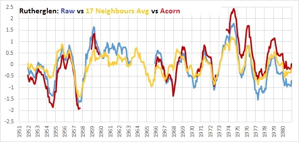
Forgive me, but I thought the idea of “homogenising” was to adjust the data so that it is not so different from the neighbours. That happens in1966. They got that right, but not in 1974, where the adjustments have increased the difference, and have produced warming. Odd things also happen in 1952, 1954, 1957, 1969, and 1975-80.
It is clear that the changes to the temperatures at Rutherglen do not “homogenise” them. They make the differences from the neighbours greater, and change a cooling trend into a warming one.
This is not unique to Rutherglen- adjustments warm the temperature trends at 66 of the 104 Australian sites, and warm the national mean temperature trend by around 47%.
But what would I know- I’m just an amateur according to Professor Karoly.
Tags: Acorn, adjustments, Bureau of Meteorology, Rutherglen

September 2, 2014 at 7:46 pm
This is such a critical issue for Australia’s temperature record – and the former Government policy that followed – why wont BOM release the adjustment details in full?
Or does this glimpse of the problems in their methodology tell us why they wont?
Time for a FOI request on such an important issue.
September 3, 2014 at 11:19 am
You’ve hit the nail on the head, Dave. If their algorithms make such an obvious error, then there is something seriously wrong with the entire process and none of the adjustments can be trusted. ACORN is not high quality, nor accurate.
It is also apparent from Figure 3 that Rutherglen has been adjusted far lower than its raw and neighbours’ averages in the 50’s and higher as we move towards the present, thereby making the trend steeper.
So, two errors: the algorithms fail to adjust the temp’s closer to the mean of their neighbours, then additionally introduce overcooling of the past and overwarming of the present.
September 3, 2014 at 5:00 pm
The adjustments are all from 1974 back, as you can see from Fig. 1. Using the 1951-80 period for anomalies makes the anomaly data pivot about 1966. Non-biased adjustments should still between the blue and orange lines.
September 2, 2014 at 7:50 pm
Ken, reminds me of the logic in “You have nothing to fear but fear itself.”
“Neighbouring stations give nothing to adjust but Rutherglen itself”.
It is not just the red line that pokes up at right through the spaghetti, it’s also the red line that pokes down at left. Double whammy, but not science.
September 2, 2014 at 8:05 pm
Ken… 17 stations in 12 hours! records broken, but not in temperatures. well done! cheers,
September 3, 2014 at 4:51 am
Great work Ken –
September 3, 2014 at 5:28 am
[…] latest article by Ken Stewart – Rutherglen: Spot the Outlier – builds on the momentum started by Dr Jennifer Marohasy who was a key to articles in The […]
September 3, 2014 at 6:33 am
Ken,
Keep up the good work!
Re “But what would I know- I’m just an amateur according to Professor Karoly”
Origin of Karoly
http://www.surnamedb.com/Surname/Karoly
Reminds me of one session of My Word where the theme was “Charlie is my darling”
where the excepting was made for “Lady Diana Spencer, where my darling is a Charlie”
September 3, 2014 at 7:11 am
Thanks, Ken. Your efforts are much appreciated.
And very much needed.
September 3, 2014 at 8:02 am
Another great piece of work, Ken.
September 3, 2014 at 11:06 am
Good work again, Ken.
[BTW, Tony Heller (aka Steve Goddard) is trying to discombobulate the Australian temperature record. If you have time, would you mind popping over to help him out? https://stevengoddard.wordpress.com/ ]
September 3, 2014 at 11:07 am
That is to say, he’s trying to “combobulate” the record!
September 3, 2014 at 3:36 pm
Great work Ken!!
We appreciate your persistence and huge effort.
September 4, 2014 at 11:05 am
Using some Tmax data I was working with in 2013, the median difference between Hillston and Rutherglen during the period 1957-2012 was 2.7C. This was obtained from 17967 days when both stations recorded observations. It excluded Nov 1959-Dec 1964 when there were no observations available for Rutherglen.
Dividing this into lots of 2000 days, the median difference (Rutherglen subtracted from Hillston) is as follows: 2.6, 2.5, 2.4, 2.5, 2.6, 3.1, 2.6, 2.9 and 2.7 (1967 days).
The 3.1C median applies from 5/12/90 to 31/5/96. There appears to be something of significance occurring then which caused a 0.6C increase in variation to occur, given that the median before then was 2.5C. It had remained at a higher level since.
It would be interesting to do the same analysis with Tmin.
September 4, 2014 at 1:30 pm
Interesting comment Ian. I’m doing pair-wise differencing between Rutherglen and the 17 neighbours, Hillston well down the list so haven’t been able to cross check with other sites, but for Tmin, Rutherglen 1991-1998 is >0.3C cooler than Hillston, from 1999- 2006 is 0.15C warmer. From 2007-12 Rutherglen is 0.4C warmer.
From 1976 – 1999 Rutherglen is 0.3C cooler but 2000-2012 0.3C warmer. Step change in 2000.
September 4, 2014 at 3:13 pm
The number of days for Tmin is 17849, 118 fewer than for Tmax.
Looking at Tmin but using the same Tmax time intervals (ie slight variation from 2000 days in each for Tmin) reveals:
3.3, 3,3, 3.5, 4.2, 4.0, 4.1, 3.5, 3.5, 3.3, with Hillston always warmer.
Overall the median is 3.6C, with a standard deviation of 3.18C
(STDEV for Tmax was 2.44C)
The trend is different to Tmax, with an increase of nearly a whole degree during 26/10/79 to 29/5/85 which is maintained until mid 1996 when it reverts back to the former level. Both Tmax and Tmin reveal a shift in 1996.
Ken your numbers are an order of magnitude smaller.
September 4, 2014 at 5:37 pm
I am using annual anomalies from the 1913-2013 mean.
September 4, 2014 at 6:02 pm
Thanks Ken. Mental block there! 🙂
September 5, 2014 at 1:08 pm
I don’t know who I find funnier, you who thinks he has stumblem across a conspiracy, or the dimwits that believe you.
September 5, 2014 at 2:22 pm
Hi Sarah, welcome. I don’t think I mentioned a conspiracy here. Just the facts, ma’am, just the facts… Please argue or disagree with the data, the method, the results, or my conclusions, and I will gladly engage.
September 5, 2014 at 8:33 pm
Ken you are very patient. Sarah seems like the classic provider of harassment as you would expect from the lower orders of an abusive cult when its doctrines are threatened by sound logic. All the symtoms are there.
http://www.apologeticsindex.org/72-deprogramming
September 8, 2014 at 7:47 am
Ken
I came across an interesting ‘anomaly’ when revisiting Bourke temps recently.
From Dec 1998 to Aug 2002 at the Bourke AWS (048245), CDO has all max & min daily temps rounded off to the nearest degree.
So I checked the ACORN record and the same temps are mirrored in its data for max temps but minimums have been adjusted.
Although this appears to be an oversight by the Bureau, is it not another nail in the ACORN coffin?
Ken, have you found any other examples of homogenisation of the raw temp data say in the past 20-30 years (i.e. differences in the ACORN data from the CDO data)? I seem to recall a mention that there had been no ‘adjustments’ since the early 1970s.
Thanks.
September 8, 2014 at 8:51 am
There are few adjustments in the last 15 – 20 or so years but yes they are there. Can’t think of any off the top of my head. And yes those rounded readings are copied straight in. Not much else they can/ should do. Accuracy has to be +/- 0.5c.
September 8, 2014 at 4:42 pm
Thanks, Ken. I wonder why there are so few ‘outliers’ now as compared to the past?
Sydney Obs just recorded its highest May max mean on record. Its mean of 23.2C was higher than all the neighbouring Sydney stations even though Sydney Obs has the lowest long-term mean of them all. It also recorded the highest daily May 2014 temp for all of Sydney.
I wonder if the BoM will treat it as an ‘outlier’ and reduce the temps when updating the ACORN record?
September 8, 2014 at 3:05 pm
[…] A Reality Check on Global Warming « Rutherglen: Spot the Outlier […]
October 5, 2014 at 6:25 am
[…] data of individual weather stations having a warming adjustment bias (e.g. Reykjavik and Rutherglen) along with the national data sets of USA (Steve Goddard) and Australia (Jennifer Marohasy and […]
February 9, 2015 at 12:20 pm
[…] R package is motivated by exploration of the Rutherglens extreme trend divergence (image above from KensKingdom) between the raw Climate Data Online (CDO) version and the Australian temperature reference network […]
February 13, 2016 at 2:26 pm
sadahatama Oba Mage
Rutherglen: Spot the Outlier | kenskingdom