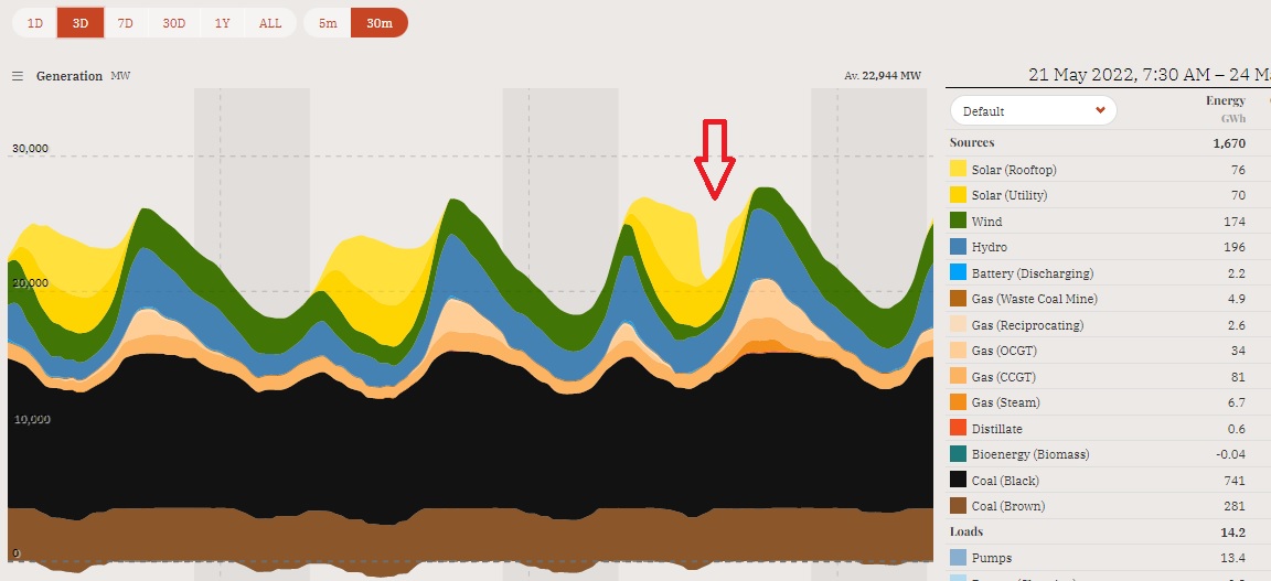
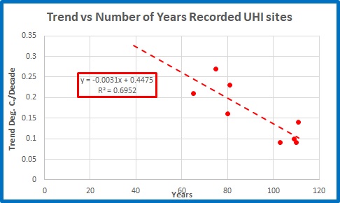
Weather Outlook 14 May 2013- Update 16 May!

May 14, 2013

(Update:- Oops!  I’ve found a glitch in my calculations which I have corrected.  This has the effect of changing and adding some predicted events- see below.)

Firstly, my apologies for not attending to this blog more regularly.  Retirement certainly doesn’t mean having more time.

This is what I predicted back in April:

Meanwhile, refined predictions for April to early May (>90% certain) and long range predictions to early September (about these dates, plus several others), for weather changes (cold change, pressure drop, or rain):-

April:

3-4-5-6-7-8-9; 10-11-12; 13-14-15 (A succession of small changes)

17-18-19-20; 22-23-24

25-26-27-28

May:

April 30-1-2-3-4-5

7-8-9-10-11-12-13-14 (unsettled for the first 2 weeks).

April-may check

(Pink is Tmax, dark red is Tmin, blue is rain, black is inverted mean sea level pressure.)

11 Correct, 1 Wrong.  91.6%. (I could be persuaded that there were only 10 major changes, which makes it 83%).  Moreover, my prediction of a succession of small changes in early April and unsettled conditions for the first two weeks of May was definitely correct.

So far this year, my short term (up to 40 days) predictions fared as follows:

Predictions of changes

Correct

No change

Unpredicted changes

33

32

1

2

That’s 91.4 %.

160 day predictions (from 27 November and 2 January)

“April: 7, 9, 11, 13, 15, 19, 27.

May: 4, 9, 13, 19, 29”

up to today, were for 25 events so far this year, of which 23 occurred as predicted (later refinements removed one of the predicted events).   92% correct for the year, 80% for April and May so far.  That is also 67.6% of all events.

I note the BOM forecast is for fine weather this weekend, whereas from 2 January I have been predicting a change for 19 May.

My predictions for sub-tropical Queensland for the rest of May and up to mid-October (temperature change, pressure drop, or rain) are as follows:

Unsettled with several successive events for the next several weeks:

May

17-18-19-20, 21-22-23, 24-25-26-27-28-29-30-31-1-2 June

June 5-6-7-8-9-10-11, 13-14-15-16-17, 20-21-22-23, 27-28-29-30

July

2-3-4-5-6-7, 9-10-11-12, 15-16-17-18-19-20-21, 25-26-27-28-29-30

August

1-2-3-4-5-6-7-8-9, 11-12-13-14, 15-16-17-18-19-20-21, 23-24-25, 27-28-29-30-31

September

1-2-3-4-5-6-7-8-9, 12-13-14-15, 18-19-20, 22-23-24-25-26-27-28

October

September 30-1-2, 8-9-10-11, 14-15-16.

Do you know of anyone else predicting a weather event (probably storms) for 15 October 2013?

I am still working on an objective test for my predictions, which I am close to finalising.  One thing I have found is that the frequency of weather changes does vary from about 22 to 38 in a 90 day period, which means there are often lengthy periods of changes occurring at least once every three days, which would make accurate forecasting much more difficult.  In a future post I will also show how my 160 day predictions are even more accurate for individual locations than when averaged over a whole region.

The Missing Fingerprints of Greenhouse Warming: Part 2

April 19, 2013

What the climate scientists tell us:

In my previous post I checked two of Dr Karl Braganza’s “fingerprints” of climate change he listed in an article in The Conversation on 14/06/2011(my bold):

These fingerprints show the entire climate system has changed in ways that are consistent with increasing greenhouse gases and an enhanced greenhouse effect. They also show that recent, long term changes are inconsistent with a range of natural causes…..

Patterns of temperature change that are uniquely associated with the enhanced greenhouse effect, and which have been observed in the real world include:

  • greater warming in polar regions than tropical regions
  • greater warming over the continents than the oceans
  • greater warming of night time temperatures than daytime temperatures
  • greater warming in winter compared with summer
  • a pattern of cooling in the high atmosphere (stratosphere) with simultaneous warming in the lower atmosphere (tropopause).

 Time for another reality check.  I will look at the 1st point above, that is greater polar than tropical warming.  I am particularly interested in the Southern Hemisphere.  This time I am using publicly available data from the University of Alabama (Huntsville) satellite record (UAH).

What the satellite record tells us:

Someone forgot to tell the observations.

The satellite record from UAH has data for many different regions of the globe.  As well as global data, there are data for polar regions (60 degrees North and South to 85 degrees North and South); Tropical regions (20 S to 20 N); extra-tropical regions (20 S to 85 S and 20 N to 85 N); and separate data for land and ocean areas of these regions (as well as data for Australia and USA).  It looks daunting until you plot it on a graph.  Then you find some very surprising things.

From December 1978 to March 2013, it is plainly obvious and widely known that averaged global atmospheric temperatures have warmed about +0.3 degrees Celsius.  However I like to dig and delve into the data.

The Northern Hemisphere is warming much more rapidly than the Southern Hemisphere:sh v nh

The Tropics have warmed at a little over +0.2C:tropics

The Northern Extra-Tropics (20 N to 85 N) are warming much more rapidly than the Southern Extra-Tropics:extra-tropics

The Northern Polar Region (60 N to 85 N) is also warming rapidly:N Polar

And this is obviously the “proof” of Dr Braganza’s contention that polar regions are warming more than tropical regions, and this is uniquely associated with the enhanced greenhouse effect”.

But let’s look at the Southern Polar Region:S Polar

Not warming at all, in fact cooling!

I’ve used a 12 month running mean to smooth the Polar and Tropical data.

Here’s the North Polar- Tropical comparison:NP v Tropics

Very scarey, hey.

South Polar- Tropical comparison:SP v Tropics

Oops!  Not only not warming more than the tropics, going in the opposite direction.

And here are the two extremes of global temperatures:NP v SP

There’s no comparison.  It appears there’s a very good reason for the increasing Antarctic sea ice.  Moreover, the Antarctic ice mass is unlikely to melt anytime soon.

As warming is supposed to be greater towards the poles, one might expect that we would see evidence of this (naturally to a smaller degree) in a comparison of the surface temperatures of northern and southern regions of a large area such as Australia.  Let’s see:north aust

south aust

Nope- the BOM says Northern Australia is warming (slightly) faster than Southern Australia.

Conclusion:

Dr Karl Braganza has failed to reveal that the climate record is much more complex than most people realise.  Yes, the Northern polar regions are warming.  However, despite recent claims of rapid Antarctic warming (actually from the Antarctic peninsula), the satellite record shows that the Southern Hemisphere polar regions (from 60 S to 85 S) are cooling while the tropics are warming.  As well, northern parts of Australia are warming more than southern parts.

THREE of Dr Braganza’s five fingerprints are missing.


Australia: The Missing Fingerprints of Greenhouse Warming

April 12, 2013

What the climate scientists tell us:

Dr Karl Braganza in The Conversation on 14/06/2011 lists the “fingerprints” of climate change (my bold).

These fingerprints show the entire climate system has changed in ways that are consistent with increasing greenhouse gases and an enhanced greenhouse effect. They also show that recent, long term changes are inconsistent with a range of natural causes…..

Patterns of temperature change that are uniquely associated with the enhanced greenhouse effect, and which have been observed in the real world include:

  • greater warming in polar regions than tropical regions
  • greater warming over the continents than the oceans
  • greater warming of night time temperatures than daytime temperatures
  • greater warming in winter compared with summer
  • a pattern of cooling in the high atmosphere (stratosphere) with simultaneous warming in the lower atmosphere (tropopause).

 And later

Similarly, greater global warming at night and during winter is more typical of increased greenhouse gases, rather than an increase in solar radiation.

 Time for a reality check.  I will look at the 3rd and 4th points above, that is, Diurnal Temperature Range and winter warming.   Again, I am using publicly available data directly from the Bureau of Meteorology’s Time Series Graphs datasets at

http://www.bom.gov.au/cgi-bin/climate/change/timeseries.cgi?graph=dtr&area=aus&season=0112&ave_yr=0

What the Australian climate record tells us:

From 1910 to 2012, on an annual basis it is absolutely true- the Diurnal Temperature Range for Australia has indeed decreased:

dtr annual

But here’s a 4th order polynomial trend line:

dtr annual polynomial

So let’s check DTR since 1950:

dtr ann 1950-12

Decreasing Diurnal Temperature Range, one of the “fingerprints” of climate change, “uniquely associated with the enhanced greenhouse effect”, is not happening in Australia.  For 63 years, well and truly long enough to determine a trend, DTR has been flat- in fact slightly increasing.

Dr Braganza made his statement in June 2011, so here is the data from 1970 to 2010.

dtr ann 1970-2010

It is plain that there was NO decrease in DTR for the previous 41 years.  By 14/06/2011 Dr Braganza, as Manager of Climate Monitoring at the Bureau of Meteorology, would have had access to this data, so he certainly should have known.

What about winters warming more than summers?  Annual means 1910 to 2012:

summer v winter 1910-2012

To 2010 (available to Dr Braganza):

summer v winter 1910-2010

Can you tell the difference?  Very slightly, by the tiniest margin, there was more winter warming to 2010- but remember the Bureau’s goal is to reduce temperature uncertainty to +/- 0.2C, so this increase is indistinguishable from no difference at all.  Greater winter than summer warming is not detectable in the Australian data.  Dr Braganza knew this too.

While winter maxima have been increasing, winter minima have been dead flat for 34 years:

tmin winter 79-12

and annual minima have been decreasing for 27 years, while maxima have been increasing:

tmax v tmin 1986-12

and summer and winter trends are similarly diverging:

summ v win 1986-12

These trends will have to reverse drastically for the fingerprints of diminishing DTR and relatively warmer winters to appear.   No doubt Dr Braganza is not hoping for any more “Angry Summers” as those record maxima tend to smudge the fingerprints.

Conclusion:

Dr Karl Braganza has failed to reveal that there is absolutely no evidence for the enhanced greenhouse effect in DTR and winter warming trends in Australia.

The Australian data are NOT consistent with an enhanced greenhouse effect.  There is evidence that it has been smothered by negative feedbacks.

Two of Dr Braganza’s five fingerprints are missing.

Two down, three to go before the enhanced greenhouse effect is acquitted for lack of evidence.

h/t to Lance

What warming?

April 6, 2013

In the wake of the scarey stories being put about by the Climate Commission, here are a couple of graphs that ought to perplex those who blindly put their faith in the “science” of global warming as espoused by the Bureau of Meteorology, the CSIRO, and the Climate Commission.  The data from these graphs is directly from BOM’s Climate data Online  Time Series Graphs.  Their own data.

The heat is getting more extreme right?  Summers are getting hotter, right?

bom tmax sum 1979-12

Sorry to disappoint you!

What about winter?  Greenhouse theory suggests that warming should be enhanced at night, in winter, and towards the poles.  Winter minima should be warming.  So winters are getting milder, right?  According to the ABC’s Catalyst, vineyards are moving south, right?

bom tmin 1979-12

Nope.  The winter data are inconsistent with greenhouse warming over the past 34 years.  And summers are not hotter than they used to be.

The graphs above show data since 1979.  That is because I do not trust surface data from any official Australian source before the satellite era.

More details in future posts.

UAH Data for Australia now available

April 3, 2013

Dr Christy has just announced that the UAH (University of Alabama- Huntsville) tropospheric dataset now includes a listing for Australia, which includes Tasmania. “This will include temperature anomaly and trend data going back to the beginning of the UAH dataset in December 1978,”  Dr Christy said.

The data is available (at the very right hand side) at

http://vortex.nsstc.uah.edu/data/msu/t2lt/uahncdc.lt

This should be of immense interest to Australian analysts.

Weather Outlook and Evaluation- April 3 2013

April 3, 2013

How did I go for the first 3 months of this year?   On 27 November, I wrote:

“Outlook for 2013:

January: 3, 14, 18, 25, and the big one 30-31.

February: 7, 14, 20, and maybe 26th. (Rain will continue through the first three weeks of February, but with peaks near these days.)

March: 2, 7-8, maybe 13, maybe 17, 20, 31st .

April: 7, 13-14, 19.”  (Back then, I was looking at a range of +/- 5 days.)


On January 2, I refined this to:-

“An enhancement (weather change, temperature change, or rain) on these dates +/- 5 days:

January: 3, possibly 8, 14, 18, possibly 21, 25, 30-31.

February: Possibly 4, 7, 14, 20, and 26.

March: 2, possibly 5, 7-9, maybe 13, 17, 20, 31.”


On February 20 I tried a different method and predicted changes for:

“February 24-25-26-27 28

March 1-2-3-4; 6-7-8-9-10-11-12-13-14-15-16; 17-18-19-20-21. ( I think there’ll be 2 major events, 6-11 March and 12-16 March with a follow up on 19 March.) and 27-28-29-30-31- 1 April.”  (Only 2 extra discrete events predicted- the others are within a day of previous predictions.)


Results:  (click on image for a closer look)qld march progress

Every predicted date matches events often exactly, mostly within 1 day, and (three times) within 2 days.

November 27 predictions:- 15 out of 15 correct.

January 2:-  4 out of 4 extra correct.

February 20:-  2 out of 2 extra correct.

Predictions of changes

Correct

No change

Unpredicted changes

21

21

0

2

91.3% accuracy.  From 27 November, using only the long range (160 days, without the 40 day refinements) the accuracy is still 65.2%.

I am satisfied that my method works.

160 days out, 100% of predicted changes happen.

40 days out, additional changes are predicted accurately.

These account for 91% of observed weather events.  (There have to be additional events, or weather patterns would never change.)

Learning as I go, I am going to refine predictions by trying Mean Sea level Pressure (MSLP) and Tmin  lagged 40 days instead of rain.  I am also now using the 2nd derivative of Tmin advanced 160 days (looking for de-celeration of temperature rise) to assist forecasting.  I am in the process of developing an objective method of testing the accuracy of my predictions.  More later.

Meanwhile, refined predictions for April to early May (>90% certain) and long range predictions to early September (about these dates, plus several others), for weather changes (cold change, pressure drop, or rain):-

April:

3-4-5-6-7-8-9; 10-11-12; 13-14-15 (A succession of small changes)

17-18-19-20; 22-23-24

25-26-27-28

May:

April 30-1-2-3-4-5

7-8-9-10-11-12-13-14 (unsettled for the first 2 weeks)

16-17-18-19-20

22-23-24

26-27-28-29-30-31-1June

June: (more instability)

4-5-6-7-8-9-10

12-13-14-15

19- 20-21-22-23-24

27-28-29-30-1 July

July:

4-5-6-7

9-10-11-12

14-15-16-17

19-20-21-22

24-25-26-27-28

August:

3-4-5-6-7

9-10-11-12-13

15-16-17-18-19

21-22-23-24-25

28-29-30-31-Sept 1-2

September:

4-5-6-7-8-9

An alternative method of predicting changes using second derivatives is shown here (up to 11 May), which may be easier to follow.  You’ll notice most dates are one day after those above.  We’ll see which method is better.  Allow +/- 1 day, but remember, by definition changes cannot be on consecutive days.April-may pred

And longer term (there will be extras, not discernible until 40 days out).May-Sep pred

I will now leave it at that while I concentrate on some other projects (including objective evaluation).

Warming Has Paused, BOM Says!

March 19, 2013

Ken Stewart, 19 March 2012

Sorry, that title is a little misleading, isn’t it.  The Bureau of Meteorology didn’t actually say this, but the BOM’s own data does.  Loudly and clearly.Acorn 1995-2012

The Bureau’s brand-new, best quality dataset, ACORN-SAT (Australian Climate Observation Reference Network- Surface Air Temperatures) clearly shows the linear trend has been flat for 18 years.

So what of the Climate Commission’s report on “The Angry Summer” ,  and the Bureau’s apparent fixation with maximum temperatures in the past summer?

In the past, the BOM has been at pains to make clear that trends in climate can only be analysed over long periods of time. See for example, http://www.bom.gov.au/climate/glossary/climate.shtml   Three cold months have barely rated a mention in the past for this very good reason.  So why all the fuss over three hot months?  And if it is now OK for them to use a three month period in this way, surely it is OK for sceptics to point to a “pause” in warming over the past several years. A period of 18 years is 72 times longer than the “Angry Summer”!

In my last post I demonstrated how well Acorn annual mean anomalies from the 1981-2010 mean, match with UAH (the dataseries of atmospheric temperatures since late 1978 compiled by the University of Alabama- Huntsville):Acorn UAH 79-12 new

I was astounded that some commenters at the various sites where this was published had doubts about the accuracy of the UAH data.  You can’t help some people.  That’s why I decided to play the warmists’ at their own game, by using only the Bureau’s own data, which shows, among other things, that there has been zero trend in the data since 1995.

Finally, as the Climate Commission is not likely to mention these, here are some other not so widely known facts straight from Acorn:

  • 2012 had the coldest winter minima since 1983 Acorn winter min
  • 2012, at +0.11C, was the 36th warmest year- equal with 1995, just ahead of 1957.
  • The past three years- 2010, 2011, and 2012- were the coolest of the decade.
  • 2012 was cooler than 9 of the previous 10 years- beaten by 2011.  2011 was exactly at the median anomaly for the past 103 years, at -0.13C, according to Acorn’s homogenised record.

Meanwhile the Climate Commission would have us believe that because a three month period has been a record, this is somehow proof of man-made global warming.

Why?  Because that’s all they’ve got left.

How Angry Was Summer?

March 17, 2013

Ken Stewart, 17 March 2012

 We’ve all heard about the Climate Commission’s report, “The Angry Summer”.

Tom Quirk has been able to obtain UAH lower atmospheric data for Australia, and has put together a comparison of BOM and UAH data for Australia and his conclusions are correct- there has been no significant warming since 2002.

Fig. 1Tom's graph1

I have used Tom’s work to compare the ACORN annual data with that of UAH.  I have to thank Tom- without his initiative I would not have been able to obtain UAH lower atmospheric data for Australia.

To compare Acorn with UAH I calculated approximate Acorn anomalies from a 1981-2010 climatology (the same as UAH), instead of BOM’s 1961-1990 climatology.

Fig. 2Acorn UAH 79-12 new

The reasonably close match is remarkable, and confirms Tom’s finding.

This is in spite of all of our reservations about Acorn’s shortcomings, so it’s still good for something!

We may conclude that if BOM sticks to its 112 Acorn stations and maintains them, and if BOM manages to reduce the uncertainty in their data to +/-0.2C, then we can generally rely on their annual data into the future.   Note to believers in man-made global warming: do not read too much into this: it is “near enough for a sheep station”, but not near enough for predictions of doom.

That bears repeating: BOM’s Acorn annual data matches UAH satellite data reasonably well.

Let’s look at the Angry Summer- in fact all summers in the satellite era.

Once again I re-calculated approximate Acorn summer anomalies from the 1981-2010 mean, as UAH does.  Figure 3 shows the Acorn data for summers compared with UAH:

Fig. 3Aust uah v bom 1981-10 means

According to BOM last summer was a record, yet the satellites say it was pretty ordinary- 14th warmest out of the last 35.  The last time there was such a large discrepancy was 1983- the two series since then have been reasonably similar.

Again I ask: what’s going on?

A Tale of Two Records

March 3, 2013

The Bureau of Meteorology, in its recent media release, accepted and repeated by the media, made an astonishing claim:

Bureau of Meteorology confirms it’s been the hottest summer on record

Where did they get the data to make this claim?  Well, in their media release they said:

“Of the 112 locations used in long-term climate monitoring, 14 had their hottest day on record during the summer of 2012/13..”

112.  Not the 700+ of the AWAP (Australian Water Availability Project) used to make the claim about January 7 being the hottest day on record.  112 is the number of sites in the ACORN dataset.

So I’m sure all journalists reporting this claim would have referred to the BOM’s Time Series Graphs on their website, which use the ACORN data, to confirm just where this summer was the hottest on record.  Forgive the sarcasm- they plainly didn’t.  Let’s take a look.

First, here is the plot for the summer mean temperatures for all of Australia 1910-2012 (which includes January and February 2013):summer1213austYep, the 2012-13 summer mean was definitely the highest on (this) record.  There are 6 regions and 7 states/territories in Australia:summer1213  regionsLet’s see how each of these performed.

Northern Australia:summer1213  N austNope!

Southern Australia:summer1213  S austNope!

Eastern Australia:summer1213  E austSouth Western Australia:summer1213  SW austSouth Eastern Australia:summer1213  SE austMurray-Darling Basin:summer1213  MDBWhat’s going on?

I am reminded that one way of calculating mean temperature is to average the minimum and the maximum.  Here’s the summer maximum for Australia:summer 1213 max austAs expected.  Now the minimum:summer 1213 min austSo we can blame the record mean on the record maximum temperatures.  Let’s look at the different regions.

Not Northern Australia.summer 1213 max N austIt’s Southern Australia:summer 1213 max S austBut not Eastern Australia.summer 1213 max east austNot South Western Australia.summer 1213 max SW austNot South Australia (the State):summer 1213 max SANot Western Australia (the State):summer 1213 max WASo the only part of Australia left that could be responsible for the summer maximum record, and consequently the mean, is this bottom part of WA not in the south west corner, or perhaps as well the southern portion of Queensland:summer1213  regions responsibleIt must have been a tad warmer than average there!summer max map

It doesn’t look to be hotter than South Australia or Victoria. By the way, this is Victoria:summer 1213 max VicThe problem:

The summer mean temperature for all of Australia, according to BOM, was the highest on record.  They confirm this with their graph of ACORN data.

The summer minimum was not a record by a long way.

Only Southern Australia’s maximum temperatures show this record.  No other regions were hotter this summer.  And this includes none of the smaller regions within Southern Australia.

Therefore we can conclude that BOM is flicking between two methods of calculating temperature and two datasets to find the “record” that fits their global warming mantra.

Please explain.


h/t Andrew Barnham

2013 Outlook- Update 20 February

February 20, 2013

I predicted changes for February 4-8, 11-15, and 17-21.  Here’s the plot of temperatures, rainfall, and mean sea level pressure for the 10 sub-tropical Queensland sites I monitor.  I’ve marked the expected dates for weather changes in green, including the range.Feb 20 actual

All changes were within the time periods I predicted- but I’m not happy with last week.  There was definitely a change on February 13 with cooler, cloudy weather on the coast as expected, but the plot shows a change on February 11 (still within the predicted range) that seems separate.  I missed this one through inattention to small details.  While the rain and pressure matches the predicted event peaking February 19, this was a little earlier too- Tmin peaked on February 16.  Possibly this shows in the data because there was a combination of two separate inland and coastal systems, and a blocking high in the Tasman Sea kept feeding cooler, moist winds onto the coast. Therefore I’ll claim 10 out of 10 correct predictions for the year, and count one missed change on the 11th.

Changes were at the right times but appear to be preceded by ripples.  Was this a chance disruption or is there a permanent shift in timing, perhaps co-incident with the changing seasons (as the indicator I used was the temperatures back in mid-September last year)?  If the latter is the case then we can expect all events for the next couple of months to be a couple of days earlier than predicted.  In any event I am going to keep a closer eye on inland vs coastal parts of the region.

For the rest of February and March, I’m expecting changes at these times (shown in orange in the plot above):

February:

24-25-26-27 February.

March:

I’m having trouble interpreting data for March.  Unstable conditions I think with frequent small changes from 24 February to 16 March.  Is this the rather late wet season?  The monsoon is certainly strengthening again.

Feb 28-1-2-3-4

6-7-8-9-10-11-12-13-14-15-16- 17-18-19-20-21.  ( I think there’ll be 2 major events, 6-11 March and 12-16 March with a follow up on 19 March.)

27-28-29-30-31- 1 April.

Cluttered, isn’t it?   That’s what my “model” tells me.  And to those who say I can’t be wrong because so many days are covered-  I can be wrong indeed if the weather is stable and clear with few changes.  For example if there are no changes/ rain events between March 6 and 21 I’ll be wrong 3 times.    It’s easier to prove me wrong than right!

And indications for July are 16, 21, and 26.


Follow

Get every new post delivered to your Inbox.

Join 31 other followers